bentax1978
4 of a Kind
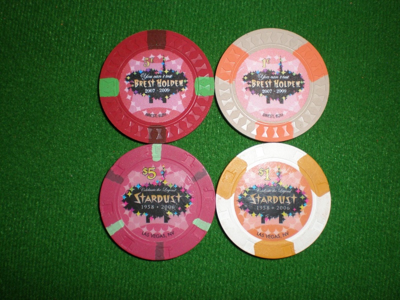
Looking to solicit some opinions on my plans to relabel a large quantity of Stardust Mansion T100 chips into a single chip limit set. I really really like the chips themselves (colors and simple 314 spots), and the fact that they're like-new makes it even nicer. I'm not typically a fan of house molds, especially for a relabel project, but overall I actually do like this particular mold.
I had three thoughts on directions to take this project. One thought was to do nothing and leave them as-is. The upside is that it would cost nothing, take no time, and the inlays themselves aren't offensive (and actually attractive IMO). The downside is that they're T100 tournament chips and for this application I'd prefer something without a denomination (and the without the word "tournament". I'll call this option 0.
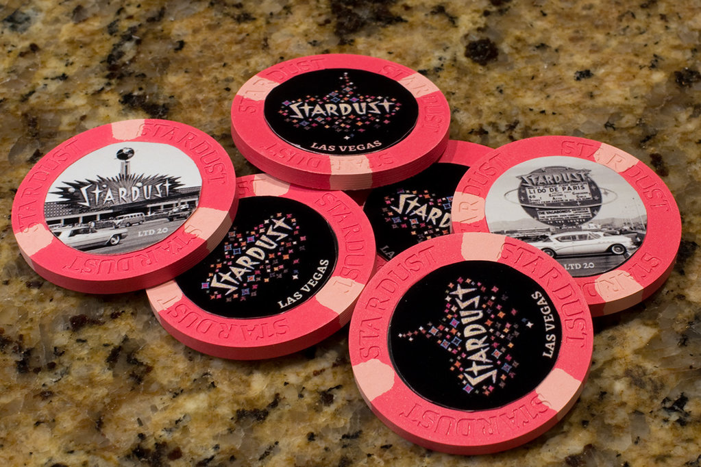
So the two relabel options I had in mind were to either (1) keep the Stardust Mansion theme and use a modified cash chip inlay design, without a denomination, or (2) do a Stardust-Vegas tribute chips and play off the house mold even if it's not really the Vegas Stardust.
Option 1 has the advantage of being able to also use the chips with a Stardust Mansion cash set. For example, the $1 SDM chips could be used as antes when using the non-denomination relabeled chips as $3 chips. I could also use the relabeled chips as $5 chips (along with the $1 chips) for a 1/2 game with a ton of $5 chips.
Option 2 would be the total redesign. No real practical advantages here in terms of coordination with the SDM chips, although I would have no issue also relabeling the SDM $1 chips too as additional non-denomination chips to go with the limit set. I'm considering this option because if I'm going to go through the time and expense of relabeling thousands of chips, I wanted to consider other options as well and not just restrict myself to the existing design.
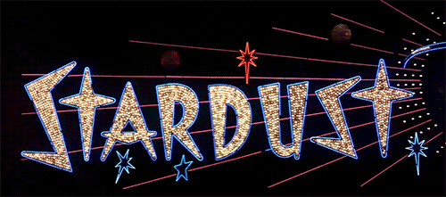
Edit: There's also another design I was working on, but had sort of put it aside as I didn't know how viable it would be printed on a label. It's basically just an image of the STARDUST sign at night, tweaked a little bit. I think it makes a cool image, but not 100% sure how it would look on the chip.
So below are a few ideas that I, along with some very helpful assistance from @p5woody, put together.
Any opinions/advice would be greatly appreciated")


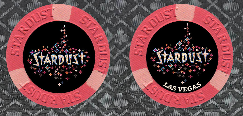
Option 6 comparison, with and without "Las Vegas"
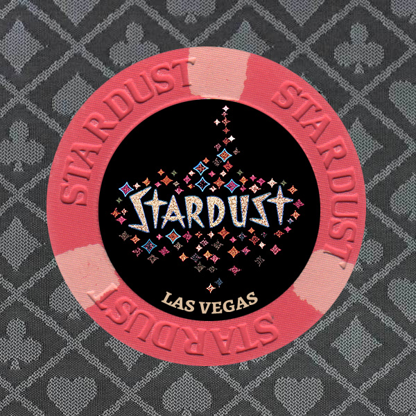
latest mockups
I had three thoughts on directions to take this project. One thought was to do nothing and leave them as-is. The upside is that it would cost nothing, take no time, and the inlays themselves aren't offensive (and actually attractive IMO). The downside is that they're T100 tournament chips and for this application I'd prefer something without a denomination (and the without the word "tournament". I'll call this option 0.
So the two relabel options I had in mind were to either (1) keep the Stardust Mansion theme and use a modified cash chip inlay design, without a denomination, or (2) do a Stardust-Vegas tribute chips and play off the house mold even if it's not really the Vegas Stardust.
Option 1 has the advantage of being able to also use the chips with a Stardust Mansion cash set. For example, the $1 SDM chips could be used as antes when using the non-denomination relabeled chips as $3 chips. I could also use the relabeled chips as $5 chips (along with the $1 chips) for a 1/2 game with a ton of $5 chips.
Option 2 would be the total redesign. No real practical advantages here in terms of coordination with the SDM chips, although I would have no issue also relabeling the SDM $1 chips too as additional non-denomination chips to go with the limit set. I'm considering this option because if I'm going to go through the time and expense of relabeling thousands of chips, I wanted to consider other options as well and not just restrict myself to the existing design.
Edit: There's also another design I was working on, but had sort of put it aside as I didn't know how viable it would be printed on a label. It's basically just an image of the STARDUST sign at night, tweaked a little bit. I think it makes a cool image, but not 100% sure how it would look on the chip.
So below are a few ideas that I, along with some very helpful assistance from @p5woody, put together.
Any opinions/advice would be greatly appreciated
Option 6 comparison, with and without "Las Vegas"
latest mockups
Last edited: