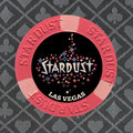
Stardust Single Chip Limit Set (9 Viewers)

This is my favorite as well. along with some LE labels in grayscale like below

I will definitely add a few of the LE labels into the mix. I'll work on tweaking some of those in the next few days and posting some additional ideas.

I like number 6 easily. How about just losing the Las Vegas completely? It is a different font then Stardust and tilts me a bit. No location and that label is the tits.

It's funny, my original mock-ups before I got the chips in hand didn't have any location listed. I added later because I thought it needed it to look more like actual inlays as opposed to a picture stuck on a label. But I agree that it would look cleaner without it. And to be honest, I didn't spend anytime picking the font or trying to match as I figured I could play around with that before finalizing the design if I went in that direction.

I like all the ideas here. I would favor a more simplistic design. These look great when blown up on my monitor. However, I think a lot of that detail will muddy the overall image in pots and in stacks.

I share this concern, and I will certainly have a better idea of how much of an issue this is after getting some sample printed up.
 
I have to admit, I hate to see relabel projects, thinking about the original chip you destroy in the process. I forget who started the relabel craze back at CT, and I felt I wanted to do it too, but never have. I know good results can come out, but you also lose something in the process.
 
  • Like
Reactions: H|Q
I have to admit, I hate to see relabel projects, thinking about the original chip you destroy in the process.

Depends what you mean by destroy. If you meant physical damage, then not to worry, the chip isn't going to be damaged in any respect by this process. The @Gear labels come off just as easily as they go on. No damage to the underlying inlay, no residue, no worries.

If you meant more along the lines of taking away the integrity of the original, I do somewhat understand where you're coming from. However in this case, I'm taking a chip that has no real purpose and giving it a purpose. The coral T100 can't effectively be used as-is. It's too close in color to the T500 (pink) chip to be used in a Stardust Mansion tournament set, which is why I assume the dark blue T100 chip was purchased and used by the casino. As a result, there's a large number of underutilized coral colored T100 chips that serve no useful purpose in their unaltered state.

In this case especially, I look at relabeling them as a good thing as it gives them an opportunity to hit the felt as opposed to going unused.
 
Last edited:
Depends what you mean by destroy. If you meant physical damage, then not to worry, the chip isn't going to be damaged in any respect by this process. The @Gear labels come off just as easy as they go on. No damage to the underlying inlay, no residue, no worries.

If you meant more along the lines of taking away the integrity of the original, I do somewhat understand where you're coming from. However in this case, I'm taking a chip that has no real purpose and giving it a purpose. The coral T100 can't effectively be used as-is. It's too close in color to the T500 (pink) chip to be used in a Stardust Mansion tournament set, which is why I assume the dark blue T100 chip was purchased and used by the casino. As a result, there's a large number of underutilized coral colored T100 chips that serve no useful purpose in their unaltered state.

In this case especially, I look at relabeling them as a good thing as it gives them an opportunity to hit the felt as opposed to going unused.
I guess since you put it like that, with no damage, and putting the chip in use, I look forward to the results
 
I have to admit, I hate to see relabel projects, thinking about the original chip you destroy in the process. I forget who started the relabel craze back at CT, and I felt I wanted to do it too, but never have. I know good results can come out, but you also lose something in the process.

Disagree with this. Those red T100s were a bad color choice and also make great T5s. I have a couple of racks of mint Aquarius 1s that will be quarters in a Terrible's set. What is being destroyed? Labels come off and the chip restored to their original state. There are great sets missing some denoms and labels help make use of racks that have no playable sets around them, the Aquarius are a great example as no higher denoms exist outside of the casino in playable numbers.
 
Disagree with this. Those red T100s were a bad color choice and also make great T5s. I have a couple of racks of mint Aquarius 1s that will be quarters in a Terrible's set. What is being destroyed? Labels come off and the chip restored to their original state. There are great sets missing some denoms and labels help make use of racks that have no playable sets around them, the Aquarius are a great example as no higher denoms exist outside of the casino in playable numbers.

You make a good point. There were not as many $5 chips available for this set. These would fit that relabel role very well. However, a non-denom label, and a couple of racks of 1s would make this a very versatile limit set.

If you go traditional SPM label you will have chips that others may want to buy from you if you decide to sell.

I considered that as well, including their potential use as a $5 chips with a cash SDM set. You could certainly label them as non-denom and still use them as a $5 chip too, and have them used as the workhorse in both a limit game and a 1/2 NL game. Lots of options :)

Option 1 has the advantage of being able to also use the chips with a Stardust Mansion cash set. For example, the $1 SDM chips could be used as antes when using the non-denomination relabeled chips as $3 chips. I could also use the relabeled chips as $5 chips (along with the $1 chips) for a 1/2 game with a ton of $5 chips.
 
Cleaned up the graphic a bit (fixed some previously cut off stars and increased the size of the font a little).

Also removed "Las Vegas" to see how it looks.

Let's call this options "6b"

Option 6b.jpg
 
Ok, so now that the graphic is cleaned up, I download a font that looks somewhat similar to the mold font.

Just wanted to see what people thought looking at a side by side comparison of the chip with and without "Las Vegas".

compare 6 and 6b.jpg
 
looks cleaner without, that background is already busy as is, the location would just take away from it
 
Seeing them side-by-side...I prefer without also.
 
6b

However, if you decide to go with the new LAS VEGAS font with the intent of matching the STARDUST mold, don't use the oversize caps for L and V (or use all oversize caps for all letters). But I'd drop it completely.
 
I like either but I'm leaning towards no location too.
 
6b

However, if you decide to go with the new LAS VEGAS font with the intent of matching the STARDUST mold, don't use the oversize caps for L and V (or use all oversize caps for all letters). But I'd drop it completely.

compare 6 and 6d.jpg
 

Attachments

  • Option 6d.jpg
    Option 6d.jpg
    240.9 KB · Views: 87
I actually like the Vegas on there. Maybe a slight bit smaller though or a darker color.

I'll play around with the font size tonight while I'm taking you down in the p* tournament ;)

Just have to find the right balance between not having the Vegas line too large in comparison to the Stardust line, but also keeping the Vegas line legible when printed out on a small 1" label (as compared to a large image on the screen.

I kept going back and forth on how light or dark to make the Vegas line. I was originally shooting for something that was an average of the pixels in the Stardust line, but initially that looked to dark, so I ended up using something that was on the upper end of the pixels in Stardust. But looking at it now, maybe it is a bit too light and is drawing a little too much attention away from the main graphic. I did try other colors (blue, pink, orange), but all of those options made it worse in terms of drawing too much attention to the bottom.

Take me downo_O? Good luck with that! :ROFL: :ROFLMAO:

What about matching the color of vegas to the chip itself?
 
Take me downo_O? Good luck with that! :ROFL: :ROFLMAO:

I feel like you aren't sincerely wishing me good luck :p

What about matching the color of vegas to the chip itself?

I did match it to the edge spot color when I was going through different options, but I haven't try the base color yet. I'll give it a try tonight and see how it looks.
 
I like both of the designs in post #52. Las Vegas does look much better to me with all the letters having the same height. The size looks good, and I agree that the color of the LV text should be more muted. The text adds some "weight" (for lack of a better term) to the bottom of the design, which appeals to me. That said, you can't go wrong picking one over the other. Nice work!
 
I like both of the designs in post #52. Las Vegas does look much better to me with all the letters having the same height.

100% agree. My original chip in the OP ("option 6") with "Las Vegas" has it in all caps. It was an oversight/mistake on my part when I changed the font that it got changed.

The size looks good, and I agree that the color of the LV text should be more muted.

I agree, it shouldn't draw attention away from the main graphic/text.

The text adds some "weight" (for lack of a better term) to the bottom of the design, which appeals to me.

This is the main reason I am leaning towards including the Las Vegas line. I feel like it balances and grounds the layout, if that makes sense.

That said, you can't go wrong picking one over the other. Nice work!

Thanks! For the record, you seeded the notion of a limit set when I asked you why you were buying so many $1 PCA secondaries a couple months back ;)
 
I really like the one on top(yellow), the matching one just isn't doing for me like i thought it would.
 

Create an account or login to comment

You must be a member in order to leave a comment

Create account

Create an account and join our community. It's easy!

Log in

Already have an account? Log in here.

Back
Top Bottom