Poll for ceramic set (3 various design options) (2 Viewers)

Which main design of these 3 would you pick?

  • Option 1

    Votes: 37 59.7%
  • Option 2

    Votes: 16 25.8%
  • Option 3

    Votes: 9 14.5%

  • Total voters
    62

Frode789

Two Pair
Joined
Nov 7, 2016
Messages
278
Reaction score
283
Location
Norway
EDIT:
So I have improved the first option, which was the most preferred one. Leaving the rest of the OP below for reference.

Improved option 1. The one that has been sent to the printer for samples.
Hanoy_KCGProof39mmCustom_v3[1538].png


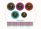
Previous iteration of this design, with different edges/colors:
Screenshot 2021-10-17 091446.png


--------------------/----------------------/------------------------------
Hi.
Previous discussion:
https://www.pokerchipforum.com/threads/working-on-custom-ceramic-tournament-set.69835/

I wanted to do a poll for my 3 options, to gauge what people thought. (didn't seem like I could add it to the existing thread).

Which of these 3 main designs you would pick. If you have feedback as to WHY, please let me know. =) Disregard one of them being 43mm, they will all be 39mm.

Also, if you have thoughts about the colors/spots etc or anything that you would change (eg. a different color here xx), feel free to share that as well.

Option 1 (the original design)

Design pC% sjetonger.jpg


Option 2

Design sjetonger (003).jpg


Option 3

Design sjetonger siste.jpg
 

Attachments

  • Hanoy_KCGProof39mmCustom_v3 (2).png
    Hanoy_KCGProof39mmCustom_v3 (2).png
    332.3 KB · Views: 132
Last edited:
My general opinions:

Version 1:
- nice and simple, straightforward, but does not really take advantage of versatility of full face printing of ceramics
- rolling edge does not require alignment with face
- subtle tone pattern outside of "inlay" area too subtle and a little unbalanced
- good, sharp contrast for "inlay" background and text/graphic elements

Version 2:
- simple pattern, better use of printable face
- rolling edge requires alignment with face to look decent, increasing cost
- rolling edge "tries too hard" to mimic a compression clay
- two different shades of green spots in adjacent denoms not great; consider turning one yellow
- some loss of contrast within "inlay" area, but should still be quite readable

Version 3:
- uses full face printing to the max, but looks much too complicated with spots and two separate patterns of flourishes
- rolling edge requires alignment with face to look decent, increasing cost
- uses full rolling edge printing to the max, but again looks overly complicated
- black art/text on rolling edge not very clear on top of the base colours as shown
- some loss of contrast in "inlay" with graphic against background, but outline text does enhance readability
 
I think the subtle rim design on Option 1 is unique, interesting, and handsome which makes it an outstanding choice for customs IMHO. As per @allforcharity it's perhaps even a little too subtle; I think you could strengthen it a little bit (but not too much!) and it would hold up just fine. It is unbalanced and asymmetrical, and while normally I don't like that, I think it absolutely works here, and is a well-executed feature of that design.

Option 2 does nothing for me. I suppose some people might enjoy it for its classic simplicity.

Option 3 is cool, but is also perhaps a bit too much. I like it, but not as much as I like Option 1.
 
Thank you guys for excellent feedback. I will now look it over and see if I need to do some changes =)
 
Interesting. When I looked at the top 3, I was clearly a fan of #1. I found #3 interesting, but the design made it hard to process what you were looking at.

Thoughts for your current design:
1. I like having the denomination in a different color. It help the chip holder to quickly identify and process the most vital information- what denomination am I holding- especially helpful in tournaments. Red seems to be favored, but I’m not sure that’s what you want here. White?

2. I really love the simplicity. Mountain, no name. It’s bold and daring, saying “I don’t need to tell you my name, if you don’t know it, that’s for a reason.” Keep it.

3. The color matching line seems hard to process. At times, the contrast with the background isn’t strong (500), requiring extra brain cycles to process. I like what you did, just not sure that color combo works or how it will print. I like it, just curious if it executes well.

4. The outer edge ring design is interesting. Again, not much contrast, almost none, making it hard to discern what’s going on. Not sure where to go here or how to help realize that, except maybe going a different color with more contrast- like a spot color?

5. Edge design. Similar comments to number 4. The addition of the gold sits funny. I’d see what a non-aligned edge spot in the same color as the outer-ring “mountain” would look like. Maybe that color is the denomination color as well to keep it clean?
 
Last edited:
Thanks! Good feedback. Need to do some thinking now hah.

I think I like the how the denom number and logo is the same and matching, but I see your point.
 
I’m just one perspective. Goal is to get you thinking and getting comfortable so you’ll love them for a long time. :)
 
Last edited:
Without gold on the rolling edges.
And with red instead of orange. I really like the red there (not a huge fan of orange poker chips), but the red-purple-pink are sort of similar. Another color that might fit well on the T25K that you think would be good? Purple and red are great colors that I would prefer to keep.

Hanoy_KCGProof39mmCustom_v2.png
 
Last edited:
Agree that you have too much red. White, yellow? Maybe split the 5000 into more distinctive blue and green?
 
I think the subtle rim design on Option 1 is unique, interesting, and handsome which makes it an outstanding choice for customs IMHO. As per @allforcharity it's perhaps even a little too subtle; I think you could strengthen it a little bit (but not too much!) and it would hold up just fine. It is unbalanced and asymmetrical, and while normally I don't like that, I think it absolutely works here, and is a well-executed feature of that design.

@CrazyEddie Thoughts on the new option 1? :)
 
I like it! It's a nice mix. It's not as radical a concept as my previous favorite #1, but it's simple and elegant and bold.
 
For the two rolling edge options, it's hard to tell just from the artwork which is going to work better, with or without the gold stripe. I think you'll need to get samples in hand to make your decision properly. :)
 
Not trying to be a design Nazi, I think the inlays are off center? (option 1)

The design as a total looks absolutely amazing!

EDIT: OPTION 1 IS FIRE
 
Agree that you have too much red. White, yellow? Maybe split the 5000 into more distinctive blue and green?

White T25K! Looks pretty fine!
Hanoy_KCGProof39mmCustom_v3 (2).png


For the two rolling edge options, it's hard to tell just from the artwork which is going to work better, with or without the gold stripe. I think you'll need to get samples in hand to make your decision properly. :)

True, that would be ideal. Sadly BRPro stated that the rolling edges they would need to do a full roll (25). So for both options I'd need to do a 50 chip sample.. :\
"We can't print the rolling edges on just one chip, but we can do samples with front & back printing. If you'd like to see the rolling edge printing, we would need to do at least 25 of one color."
That new option 1 looks awesome! I especially like the slanted edge patterns (very tiki king-esque). Would be interesting to see how they look in a stack!

Thanks! =) Yeah I also really like the slated edges, can't wait to see them once stacked!

Not trying to be a design Nazi, I think the inlays are off center? (option 1)

The design as a total looks absolutely amazing!

EDIT: OPTION 1 IS FIRE

They are? :p
Thanks, I'm happy with the design direction as well =)
 
True, that would be ideal. Sadly BRPro stated that the rolling edges they would need to do a full roll (25). So for both options I'd need to do a 50 chip sample.. :\
"We can't print the rolling edges on just one chip, but we can do samples with front & back printing. If you'd like to see the rolling edge printing, we would need to do at least 25 of one color."
Sad but true. If you'd like to know why, here's how they actually get printed:


It might be possible for them to print a sleeve of 25 of one denom while splitting up the rolling edges so that half are printed with one style of edge and the other half are printed with the other style. They'd still all go into the press at the same time, but the dye-sub wrapper would be half one style and half the other. Then again, it might not be possible to do that for any number of reasons. But you could ask!
 
I believe so! I eye-balled them from further away from the screen. Then I realized the inlay is closer to the left side than the right? (Look at the inlay lined up with the outer accents)

Yeah I can see it now.. Ever so slightly :p Thanks man!

Sad but true. If you'd like to know why, here's how they actually get printed:


It might be possible for them to print a sleeve of 25 of one denom while splitting up the rolling edges so that half are printed with one style of edge and the other half are printed with the other style. They'd still all go into the press at the same time, but the dye-sub wrapper would be half one style and half the other. Then again, it might not be possible to do that for any number of reasons. But you could ask!

Ah I see.. I think I will go ahead and do 25 pcs of the non-gold rolling edges :) And then samples with front/back of the other denoms.
 
And this one has been given green light for samples =) Looking forward to checking them out!
I ordered 25 of the red ones (which will have the rolling edges), and of course one of each of the other denoms.

Hanoy_KCGProof39mmCustom_v3[1538].png
 
Samples are in!

Stacked T1Ks with rolling edges.
20211116_164015 (2).jpg


All the denoms together. (all except the T1K has blank edges, because sample).
20211116_164123 (2).jpg


Splashed pot with T1Ks.
20211116_162153 (2).jpg
 
I think they look pretty good! Simple, elegant.

The aesthetic strikes me as functional and utilitarian rather than decorative, but only by contrast with typical casino chips, i.e. they aren't plastered with the name of the casino or a lot of other text or graphical elements. They're - in a certain sense - generic, and could be used in any setting. I think that's good! It's an underutilized concept IMHO.

That said, for "generic" and "functional" chips they have just the right amount of bling to raise them above the merely functional. And I think the bling you've used is quite handsome!

I like the rolling edges, but I feel like they'd be better with the gold stripe incorporated somehow; they're just a bit too plain as is. But instead of your original version with the gold stripe, how about something like this:

1637079895575.png


or this:

1637080576481.png


or maybe this:

1637079935135.png


One possible issue: it might just be the lighting in your photograph, but the 100 and the 500 look uncomfortably similar to me.

I gotta say, I really like where this design is ending up. I'd even think about buying a full set of these myself, and I don't live anywhere near a mountain! :) If you'd consider offering samples when your design goes into production, I'd certainly love to get a sample set.
 
Thank you for excellent feedback and kind words! Glad to hear you also like where this is going ^^ Very happy with the outcome. Samples are definitely a possibility. :tup:
I agree trying to mix in the gold on the edge would be really cool. I like the rolling edges, so definitely keeping those, but it could use something extra there to make those edges pop a bit more on the table.. Hmm.

Re. the 100s and 500s, that's just my shit photo skills :wtf: They are very easy to differentiate in real life on the table I think = )
 

Create an account or login to comment

You must be a member in order to leave a comment

Create account

Create an account and join our community. It's easy!

Log in

Already have an account? Log in here.

Back
Top Bottom