You are using an out of date browser. It may not display this or other websites correctly.
You should upgrade or use an alternative browser.
You should upgrade or use an alternative browser.
Picking Fracs could use input (1 Viewer)
- Thread starter Wheeler Assembly
- Start date
RocAFella1
Royal Flush

I think the lighter pink works better. But a nice yellow would be best I think.
I still think VLV $50 (and others like it) would be a great fit both color wise and spot wise.

RocAFella1
Royal Flush
Too complex IMHOI still think VLV $50 (and others like it) would be a great fit both color wise and spot wise.
View attachment 1291519

OP
OP
Wheeler Assembly
Flush
Yellow
RocAFella1
Royal Flush

RichMahogany
Straight Flush
Out of you two pics, the darker pink is hot but yellow would always be my default in non Cali sets
MrCatPants
Full House
Pink is too close to the red.
Vegas color set. Yellow or standard pink (not hot pink) solids, in that order. If you want to get frisky, blaze or arc yellow, although they’re way more rare/expensive (rightfully so) and the former two are preferable.
I don’t think it’s actually that close or tough of a debate with Badlands’ colors already present in the set. Yeller.
I wouldn’t overthink this one.
I don’t think it’s actually that close or tough of a debate with Badlands’ colors already present in the set. Yeller.
I wouldn’t overthink this one.
elemeno
Pair
I like this too so you don’t use a color on other chips.Yellow
OP
OP
Wheeler Assembly
Flush
I have the following racks coming to look at as well…


RichMahogany
Straight Flush
Please don’t mill the fuchsia. I think they’re cameo casino fracs
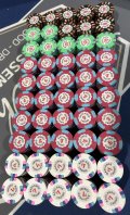
Brown fracs with red fives are the nut low.I have the following racks coming to look at as well…View attachment 1291555View attachment 1291556View attachment 1291557
This makes so much sense yet no sense at the same time. Love itBrown fracs with red fives are the nut low.

RocAFella1
Royal Flush
This makes so much sense yet no sense at the same time. Love it

I actually tried it once. They played annoying AF.This makes so much sense yet no sense at the same time. Love it
Saditsfact
Pair
Alright, in my honest opinion, I think you should NOT use fracs with this set...Working on picking a Frac for the Badlands Casino set. I’ve got pics of light pink and bright pink so far…. Have bought a lot of others that haven’t arrived yet.
Thoughts on these combos so far?
View attachment 1291508View attachment 1291512
The Badlands Casino set is perfect the way it is and I think if you use it, you need to be starting your denominations at $1.
Save the fracs for your other chip sets, people that use fracs don't deserve to be using this set of chips (even though I use fracs and I bought a sample set).
The point is, you should be playing at least $1/$1 to be able to put these beauties in play.
Again this is just my opinion. And my opinion probably doesn't go that far being a member less than 2 months... but I do have a doctorate degree.
OP
OP
Wheeler Assembly
Flush
Well, that’s one theory…. I probably won’t listen, but I respect it.Alright, in my honest opinion, I think you should NOT use fracs with this set...
The Badlands Casino set is perfect the way it is and I think if you use it, you need to be starting your denominations at $1.
Save the fracs for your other chip sets, people that use fracs don't deserve to be using this set of chips (even though I use fracs and I bought a sample set).
The point is, you should be playing at least $1/$1 to be able to put these beauties in play.
Again this is just my opinion. And my opinion probably doesn't go that far being a member less than 2 months... but I do have a doctorate degree.
Saditsfact
Pair
If you are absolutely sold on fracs for this set, which I think downgrade the set (based on what I've seen so far).
Here's my opinion:
1. The lighter pink base is better than the bright pink, but a color that's not in the spots or other bases might look better (but not brown, even though it does kind of match the $100 spots). I think it's good to put them in front of the sets and make sure the whole set is pictured unlike the bright pink.
2. For the spots, I'm a bit torn because it seems like they all have 3 colors for each spot (assuming the $5 and the $25 have the same color twice with one different and the $25s third color is the same as the base). So the tri color on the VLV set might not be too complex except for what I put for #4.
3. As for the inlay shape, the $1 already has a basic circle, followed by different shapes for the higher denominations. This is also why I'm against the fracs because you will have another basic circle, Unless there is a different shape that can go before a basic circle.
4. Writing on the inlay for the Badlands Casino is curved and in black text, with a white background, which I think is important to try to make uniform for aesthetics. Also the denomination is in a red text, which ideally you would want to be the same as well.
It is likely impossible for all these conditions to be met with previous chips which are no longer made the same anymore, which is why in my opinion, I do not think you should use fracs for this set.
As a side bar, this is why I think hot rods and mixed hot stamp sets work because at least the font is the same color and they don't really have to match inlays etc, but when done right inlays can be beautiful like this Badlands Casino set.
Get another rack of 1s and play $1/$2.
I don‘t know how you‘ll reach over 20k in
cash with a frac game…?
Nice set!!
I don‘t know how you‘ll reach over 20k in
cash with a frac game…?
Nice set!!
OP
OP
Wheeler Assembly
Flush
If you find another rack of ones, please let me know!!
#TeamYellow
Ok i get you!If you find another rack of ones, please let me know!!
Is this the reason why you looking for fracs?
How about Tiger sec $5 as a yellow frac?
Too complex?
NotRealNameNoSir
4 of a Kind
Save the fracs for your other chip sets, people that use fracs don't deserve to be using this set of chips (even though I use fracs and I bought a sample set).
The point is, you should be playing at least $1/$1 to be able to put these beauties in play.
Similar threads
- Locked
- Replies
- 4
- Views
- 404
- Locked
- Replies
- 5
- Views
- 306