Rush4Rod
High Hand
I took some suggestions from the intial thread (Check it out here: http://www.pokerchipforum.com/showthread.php/4575-My-Design-for-Tower-and-Spear-chips ) and made some revisions. Here is the original mock up.
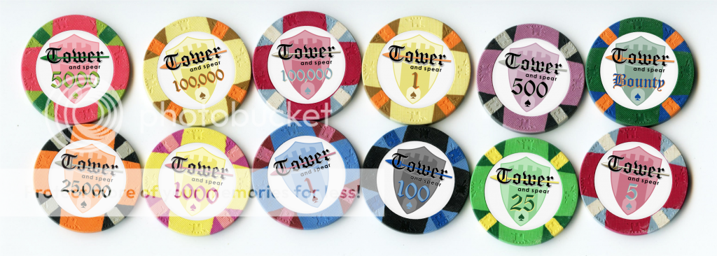
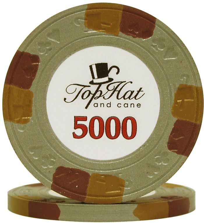
Many of the critiques were regarding the font and the 5 and 100K being hard to see. I kept the font since it is part of the theme but I fixed the "w" in "Tower" and removed the shadows. I change the design around so that the text is on the whiteish background and the layout now kinda resembles Paulson World Top Hat and Cane chips. I also revised the shield.
I think it's cleaner now. Let me know what you think.


")