Match the same chip color in the inlay... (1 Viewer)

CarlosStorm

3 of a Kind
Joined
Sep 17, 2020
Messages
699
Reaction score
844
Location
Barcelona
Hi everyone.

I've been working with my CPC custom cash set for a while, and I've drawn a lot of different inlays. But this will be my first set and I have a doubt about if it's a good idea to match the chip color in the inlay. I think is hard to achieve the exact same color, and I will always see this tiny difference between the color in the inlay and the chip. So, I'm thinking in use a more neutral color in the inlay and using the same color for all the chips, no matter what color has the chip.

What do you think about it?
I will be glad if you add some pictures!!!
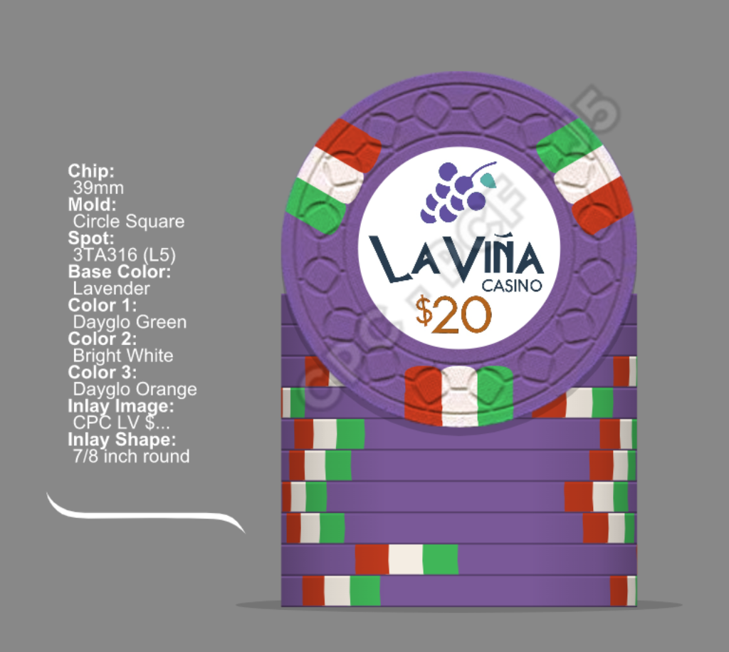
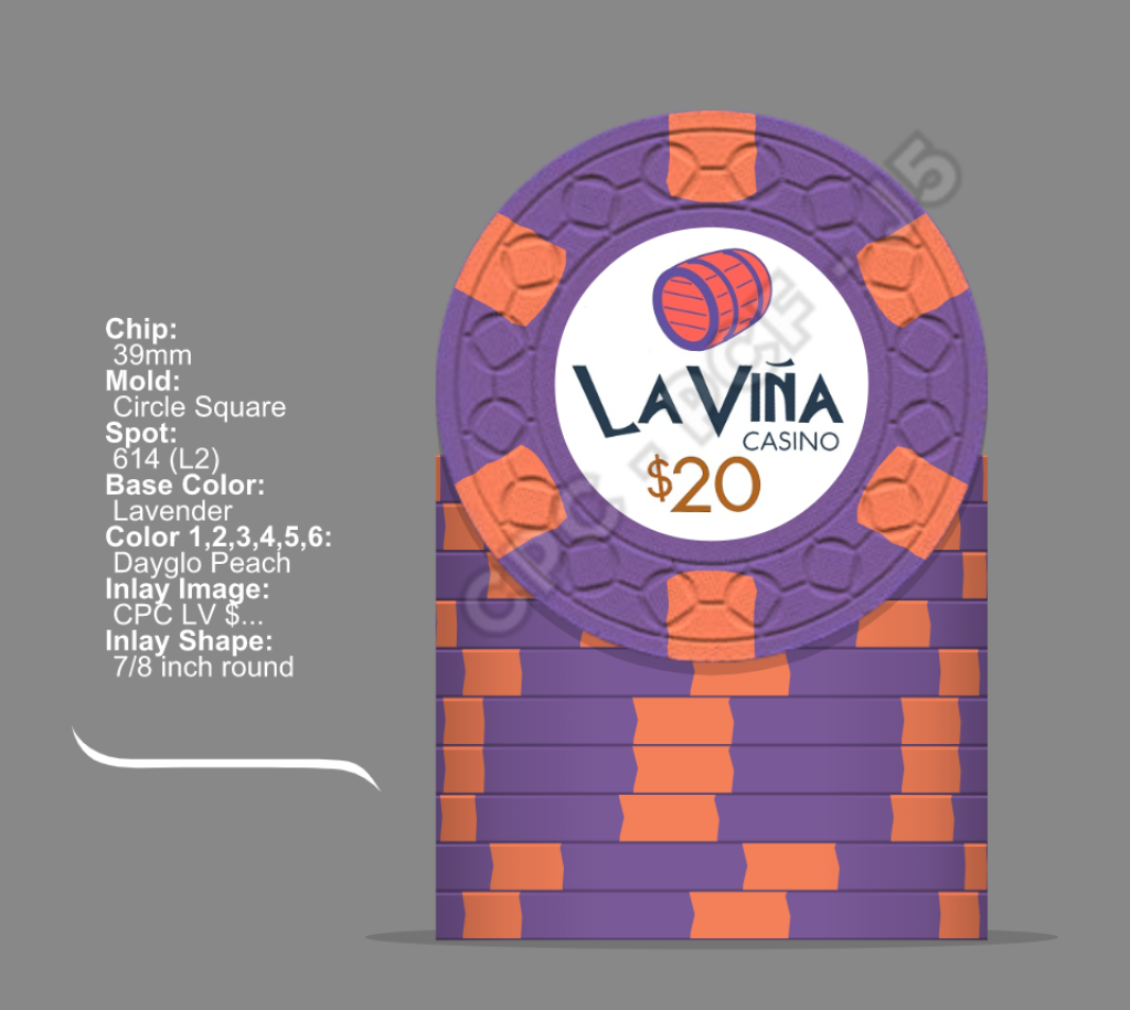
This is one of mine:
Mock up CPC La Viña $20 v1.png
Mock up CPC La Viña $20 v2.png


Thanks,
Carlos
 
You could color "match" by using the same-but-lighter/darker. In my mockups for a hopefully-eventual cards mold custom order, I have cocktail umbrellas that "match" one of the colors on each chip but it's either lighter (for the brown chip, I chose orange because a light brown didn't really work) or darker (blue, yellow, green). That way you don't have to worry about an exact match but it still brings something unique, though you already have that with the different graphics for each denom.

(Chose red for the black and white chip because neither black nor white nor any shade of grey looked good for a cocktail umbrella. Have to bend/break the "rules" sometimes...)
 
It’s been done, and done well. I’ve found that less is more in this regard. So, a neutral background color on the inlay and then matching a key color of the inlay design to the base chip color or one of the edge spots, or something similar. The designers on here and CPC are very good at getting the colors as close as possible.
 
I agree with @BNM here that less is absolutely more. I have color matched three of my custom sets to one degree or another and it can work if used in concert with a tidy design. Most recently:

https://www.pokerchipforum.com/threads/a-d-s-devils-nest-cpc-customs.78031/

If I had to do those over again, I might skip the color fade on the edge of the front and use the faux-parchment background there, but I'm still happy with how those turned out.

The two others that I used color matching on.

https://www.pokerchipforum.com/thre...-with-pr0n-of-over-200-sets.13031/post-213105

https://www.pokerchipforum.com/thre...-with-pr0n-of-over-200-sets.13031/post-213107

Color matching the dayglo colors doesn't work as well as one might hope as (to my understanding) the printing process doesn't reproduce the high gamut colors that are in the clay. (note the DG pink in my Arizona Club $5s for an example).
 
Exactness of color matching is not a big deal if the color on the inlay does not have direct contact with the edge. In fact it may even be better to deliberately divert from an exact match in some cases - e.g. desaturating the color.

I wouldn't try to use color matching at all costs, but if it looks good then go for it.

Color matching some random vector artwork can look bad when the result looks unnatural. For example I definitely would not color match the barrel. That thing needs to be brown like wood and stay brown, same goes for the rings with silver, like iron. The grapes you could color match against the purple chip instead of taking a random shade of purple, but I would definitely not color match them against a different chip base color on other denominations.

Color matching some text, like the denomination, is much less critical. If you want it bold then color the text directly. If you want it a little more subtle, you can e.g. work with a color matched outline, or glow, or shadow.

paradise-detail-all.png
 
Exactness of color matching is not a big deal if the color on the inlay does not have direct contact with the edge. In fact it may even be better to deliberately divert from an exact match in some cases - e.g. desaturating the color.

I wouldn't try to use color matching at all costs, but if it looks good then go for it.

Color matching some random vector artwork can look bad when the result looks unnatural. For example I definitely would not color match the barrel. That thing needs to be brown like wood and stay brown, same goes for the rings with silver, like iron. The grapes you could color match against the purple chip instead of taking a random shade of purple, but I would definitely not color match them against a different chip base color on other denominations.

Color matching some text, like the denomination, is much less critical. If you want it bold then color the text directly. If you want it a little more subtle, you can e.g. work with a color matched outline, or glow, or shadow.

View attachment 807754
Whoa, that $25!
 
It seems that when a casino matches the inlay color collectors take notice and it is almost always in a positive light.
 
5F9E0255-38F7-453E-8E46-C933FF14CC5B.jpeg


I was worried- but totally didn’t need to. The CPC HEX colors here are darn close. If they work well this close to each other, they’ll work well elsewhere in the inlay.

There’s something about that slight change per chip that gives it a bit of spark. I can’t recall a single case here where matching failed. As subtle as you were aiming for- I’d feel confident about doing it.

(Note, I applied a texture to the outer ring color to give it an old school production sense and to help mask any color differences. Again, I needn’t have worried.)
 
Thanks to everyone!

Here there is a lot of useful information. I have some work to do this weekend :)

Another question about inlay. Do you think is better a white background in the inlay? Or maybe some cream / neutral / light color?
 
wanted somewhat of a color match on one of my CPC sets so I went with gradient colors. I knew it would be very difficult to get an exact match so this was a way around that. They turned out great. Just an idea.
I think it will be difficult with my 'La Viña' inlay :unsure: :rolleyes:
 

Create an account or login to comment

You must be a member in order to leave a comment

Create account

Create an account and join our community. It's easy!

Log in

Already have an account? Log in here.

Back
Top Bottom