"The Drunk Panda" Cards Mold Concept/Mockup (1 Viewer)

TheOffalo

Full House
Tourney Director
Joined
Sep 26, 2021
Messages
4,347
Reaction score
7,556
Location
Los Angeles, CA
@crussader in my "Third Friday Poker" suggested that the name might be too specific, and even though I'll stick with it, as it's the name of our group regardless of which nights we play, I decided to riff on the panda theme with a concept that isn't tied to a particular home game name, thus "The Drunk Panda"!
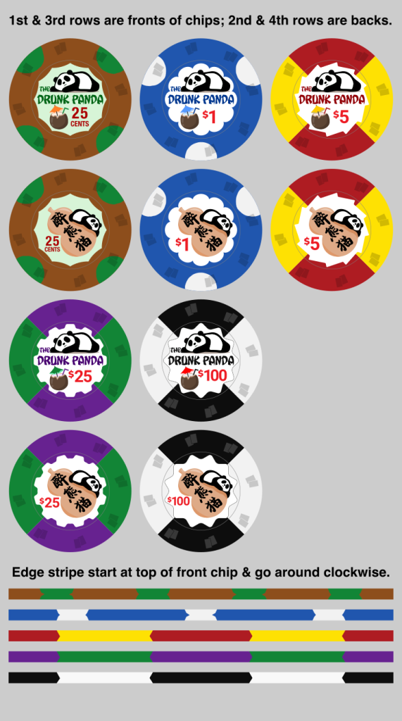
drunkpandachips_v1.0.png

(Yes, I did try adding "X" to the "eyes" of the panda to convey the "drunk" part, but it just looked a bit too much.)

Been working on this for the last couple days, adding a back for each chip and fleshing out the concept a bit more with the tropical drink in the front next to the denoms, which allowed me to add a colorful element to the front of the chips with the drink umbrellas. Still playing around with the sizing of the panda and name and other elements on the front...

Constructive feedback welcome!
 
Love the concept. Loving the design. My only feedback is to switch the quarter and $1. Have the quarter be tri-circle and the $1 be quad-circle (someone can correct my nomenclature for those spot patterns).

In my mind that allows for a bit of edge progression since 4>3.

Also, what does the text on the back of the chip say? And how many times will your players ask you that same question?
 
@HeWhoWouldPun Thanks! I originally had the $1 as a quarter pie like the other dollar denoms, but decided to change it to a solid color with edge spots.

I like the quarters with the 4 moons (I think that’s the name) because 4 quarters/4 moons. Decided on 3 for the $1 I guess just because. I could try switching them or do something else with the $1 but I don’t mind the “backward” progression.

The back says “Drunk Panda” in Chinese. Hopefully my players will just have to ask once. The translation is on the other side! :ROFL: :ROFLMAO:

And the panda is lying on a bottle made from a dried calabash squash that the Chinese (and other cultures) used to store liquids, including ones that might get a panda inebriated. :)
 
Love the concept. Loving the design. My only feedback is to switch the quarter and $1. Have the quarter be tri-circle and the $1 be quad-circle (someone can correct my nomenclature for those spot patterns).

In my mind that allows for a bit of edge progression since 4>3.

Also, what does the text on the back of the chip say? And how many times will your players ask you that same question?
Yeah, definitely swap the edge spots on both of those chips for progression's sake.

I absolutely LOVE the inlay design — who's responsible for it, out of interest?

For me, I'd look to change the shade of green on the 25c edge spot to something that pops a little more, too.

Edit: white inlay on the frac for consistency throughout the entire set, too?
 
Last edited:
Thanks @jr8719! I am responsible for the design. I’m not an artist so I started with a panda image I found, converted it to vector and started tweaking it. I made the bottle on the back and tweaked the panda to look like it was draping itself over the side.

Added the tropical drink later—found the graphic and removed some extraneous stuff and redrew the umbrella.

I used a non-white inlay to further differentiate the frac from the other denoms but maybe that’s not necessary (same with the more muted colors). Will continue to play with the quarter and dollar edge designs!
 
Revised my design based on feedback. Didn't want to swap the tri-moons away from the dollar, so decided just to make the quarters tri-moon as well (flipped so the single moon is at the top of the chip). I figured no progression is better than "backwards" progression. (The other denoms don't have edge spots to "progress" anyway.)

Shrunk down various inlay elements so the chip didn't feel as crowded. Simplified the coconut and enlarged the umbrella slightly.

On the back I rotated the calabash bottle slightly to make more room for the denoms and added "Chinatown" and "NCV" text; kinda-sorta like the former, but will probably remove the latter text.

Also included some alternate designs in the $100, using "Drunken" instead of "Drunk" and changing the theme slightly w/"Drunken Panda Social Club". (Added Xs to the eyes in the last one. Still don't really like it.)

drunkpandachips_v1.1.png
 
Last edited:
Love the design!

1. I would change the color on the frac, maybe a brighter green and a lighter brown. The frack and the $25 have the same green and a dark base, dirty stack potential even with the different spot patterns.
2. I never like when "NCV" is on custom chips, just my opinion. I don't think it is needed and it won't save you any jail time if the cops bust your game somehow.
 
Thank you @ktran & @pluto. I'm shifting gears a bit. Have procured some Spirit Mold chips which will hopefully arrive next week, so I made a mockup of the chip colors (hope I can color match the labels to the chips) and will try making my own labels. Wish me luck!

I also tweaked the label design, fleshing it out a little more, adding more details around the panda and tropical drink and the calabash gourd bottle. Put the name in English on the back too, took out the "NCV" and put a "location" in. Actually two: "Chinatown" and "Formosa".

drunkpanda_spiritmold_chinatown.png
drunkpanda_spiritmold_formosa.png


(Obviously the 25¢ and $100 chips would not be in-play together. This would be a hybrid cash set that can accommodate games as small as 25¢/25¢ up to $1/$2...)

Not sure which to pick. Both have their pros and cons. "Chinatown" is generic (that can either be good or bad), while "Formosa" is more specific and personal (my family is Taiwanese). Maybe I'll have some chips be "from" one "location" and some from the other, like mixing chips from sister casinos... ;)

FEEDBACK WELCOME!
 
Thank you @ktran & @pluto. I'm shifting gears a bit. Have procured some Spirit Mold chips which will hopefully arrive next week, so I made a mockup of the chip colors (hope I can color match the labels to the chips) and will try making my own labels. Wish me luck!

I also tweaked the label design, fleshing it out a little more, adding more details around the panda and tropical drink and the calabash gourd bottle. Put the name in English on the back too, took out the "NCV" and put a "location" in. Actually two: "Chinatown" and "Formosa".

View attachment 813270 View attachment 813271

(Obviously the 25¢ and $100 chips would not be in-play together. This would be a hybrid cash set that can accommodate games as small as 25¢/25¢ up to $1/$2...)

Not sure which to pick. Both have their pros and cons. "Chinatown" is generic (that can either be good or bad), while "Formosa" is more specific and personal (my family is Taiwanese). Maybe I'll have some chips be "from" one "location" and some from the other, like mixing chips from sister casinos... ;)

FEEDBACK WELCOME!
nice never had spirit molds, but I'd assume they are like china clays, but with squared edges?
 
nice never had spirit molds, but I'd assume they are like china clays, but with squared edges?
Yes, they are early generation CCs that feel and sound closest to Paulsons (supposedly, I've never handled one), and can have nice edges if in good condition. The main issue with them is durability; apparently the solid color and single-color edge spot chips can crumble or be broken easily with one hand. The paired-edge spot chips are supposedly more durable. So I'm taking a chance on them.

Wish I had more colors of chips to choose from, but I just have the four. The pink is most numerous, so that's why two denoms. Figure I'd do Cali colors, so blue $1 and yellow $5 (I have the fewest of this color). Don't love white for $25s, thought about making them $20s, but decided against that.
 
Last edited:
Thank you @ktran & @pluto. I'm shifting gears a bit. Have procured some Spirit Mold chips which will hopefully arrive next week, so I made a mockup of the chip colors (hope I can color match the labels to the chips) and will try making my own labels. Wish me luck!

I also tweaked the label design, fleshing it out a little more, adding more details around the panda and tropical drink and the calabash gourd bottle. Put the name in English on the back too, took out the "NCV" and put a "location" in. Actually two: "Chinatown" and "Formosa".

View attachment 813270 View attachment 813271

(Obviously the 25¢ and $100 chips would not be in-play together. This would be a hybrid cash set that can accommodate games as small as 25¢/25¢ up to $1/$2...)

Not sure which to pick. Both have their pros and cons. "Chinatown" is generic (that can either be good or bad), while "Formosa" is more specific and personal (my family is Taiwanese). Maybe I'll have some chips be "from" one "location" and some from the other, like mixing chips from sister casinos... ;)

FEEDBACK WELCOME!
May I suggest using 醉熊熊 instead, it make it sound more Taiwanese this way

Also I will suggest trying to get another spirt mold colour for your $100. 25c & $100 do come in play at 50c/$1 stake game during certain nights

Or you can just allow $100 bill in play and avoid using $100 denom in play when using 25c
Wouldn't 醉熊熊 just mean drunk bear? Though you make a good point; in Taiwan I believe it's 猫熊 (cat-bear) instead of 熊猫 (bear-cat). :wtf:

Thanks for the feedback! My regular home game is 25¢/50¢, so $100 chips almost never come into play.

I don't really like 50¢/$1 stakes; I'd prefer to play $1/$1 (if I don't want to go to $1/$2) and avoid fracs completely if play higher stakes than 25¢/50¢.
 
Taiwanese like to stack 2 word of the same together to a lot of thing too. Famous 泡泡茶 (bubbles tea) is a good example of it, it was called 珍珠奶茶 (milk tea) before it get famous
 
Taiwanese like to stack 2 word of the same together to a lot of thing too. Famous 泡泡茶 (bubbles tea) is a good example of it, it was called 珍珠奶茶 (milk tea) before it get famous
I know, it makes everything sound too cutesy. :sick::ROFL: :ROFLMAO: (I don't speak much Chinese, but FWIW I say "boba 奶茶".) I definitely want to include the 猫 in the Chinese characters to differentiate it from a regular bear. But I will use the Taiwanese character order instead of the mainland character order...
 
Last edited:
First attempt (well after several misfires) at making the labels and color matching w/the Spirit Mold chips. Need to darken the blue inlay color a bit. The yellow's a good match but the gear isn't very easy to see at normal distances. May tweak a few things here and there. Any ideas or feedback (before I go into "mass" production soon)?

drunkpandasample.png


Printed on vinyl sticker, and then a clear laminate on top, before cutting with a Cricut.
 
Printed on vinyl sticker, and then a clear laminate on top, before cutting with a Cricut.

My wife just got a Cricut, and I'm wanting to make labels for my Spirit Molds. Would you by any chance have any suggestions / tips / how-tos? I've got vinyl label sheets and lamination sheets, and I've successfully made laminated labels that I've cut out by hand as a proof-of-concept. I'm now wondering about, for example, how to make a Cricut cutting template and how to align it with the printed labels.
 
Your design is awesome, btw! My daughter just saw it and squee'd over how cute it is. :) I like the color-matched umbrellas! I agree that the yellow gear-shape seems to get lost; not sure what you could do about that, though.
 
First attempt (well after several misfires) at making the labels and color matching w/the Spirit Mold chips. Need to darken the blue inlay color a bit. The yellow's a good match but the gear isn't very easy to see at normal distances. May tweak a few things here and there. Any ideas or feedback (before I go into "mass" production soon)?

View attachment 820264


Printed on vinyl sticker, and then a clear laminate on top, before cutting with a Cricut.
They looking nice :tup:
 
My wife just got a Cricut, and I'm wanting to make labels for my Spirit Molds. Would you by any chance have any suggestions / tips / how-tos? I've got vinyl label sheets and lamination sheets, and I've successfully made laminated labels that I've cut out by hand as a proof-of-concept. I'm now wondering about, for example, how to make a Cricut cutting template and how to align it with the printed labels.
Sure! I'll try to write something up in the next day or two. Probably won't be super comprehensive, I'm still learning myself, but you can hopefully benefit from my trials and errors (and errors)! :ROFL: :ROFLMAO:
 
Your design is awesome, btw! My daughter just saw it and squee'd over how cute it is. :) I like the color-matched umbrellas! I agree that the yellow gear-shape seems to get lost; not sure what you could do about that, though.

Thank you! Yeah I liked adding in those touches like the color matching umbrella (and straw). Glad your daughter liked them! Hopefully they aren't too cutesy for my poker buddies :LOL: :laugh: who are all 50+ curmudgeons, though all of them have daughters too and are softies on the inside.

They looking nice :tup:

Thanks! Still need to tweak some more, but 99.9% there! Then lots of shouting and cursing when I mess up printing the labels on the wrong side of the vinyl sticker sheet, putting the laminate on the vinyl and getting creases/bubbles, etc. Still a long road ahead. :rolleyes:

Black outline for the Gear shape

Was thinking that too! Will give it a try! Thanks!
 
@SeanGecko I noticed the recessed area size is not super consistent across colors. Did you notice that too with your Spirit Mold chips?
 
First attempt (well after several misfires) at making the labels and color matching w/the Spirit Mold chips. Need to darken the blue inlay color a bit. The yellow's a good match but the gear isn't very easy to see at normal distances. May tweak a few things here and there. Any ideas or feedback (before I go into "mass" production soon)?

View attachment 820264


Printed on vinyl sticker, and then a clear laminate on top, before cutting with a Cricut.
That 25c chip is absolutely incredible. Awesome colour matching.
 
That 25c chip is absolutely incredible. Awesome colour matching.
Thanks! The pink chips already have the labels removed, so I'll probably start with them first. Have a big home game on 12/11 (or 11/12 where you're at--a week from Saturday) and I'm not sure I'll be able to make enough labels to fully replace my cheapo slugged 25¢/25¢ cash set's higher denoms, but should be able to get enough done to introduce the 25¢ chips into the game. Excited to surprise the guys with these!
 
Front and back shots of each "location"...

drunkpanda25cs.png

drunkpanda1s.png

drunkpanda5s.png

drunkpanda25s.png

I will probably change out the color of the $25s as they kinda got lost when stacked near/with the yellow $5s in not bright lighting. I just didn't have any other colors I could use at the time I needed to make these.

Bonus: My WSOP-inspired "Third Friday Poker" tournament chips:

tfpwsopsamples.png
 

Create an account or login to comment

You must be a member in order to leave a comment

Create account

Create an account and join our community. It's easy!

Log in

Already have an account? Log in here.

Back
Top Bottom