Looking for feedback... (1 Viewer)

Zogster

Sitting Out
Joined
Dec 31, 2020
Messages
22
Reaction score
85
Location
London, UK
Hi folks,

Happy new year, btw, and good riddance to 2020! Hope you all have a better 2021.

So I decided that new chips and cards for our home poker game should be my next lockdown project, and I've after getting quite a few ceramic and other samples I've ended up here and looking at the CPC website, and resigned to spending WAY more than I'd originally planned. But I think it'll be worth it, so I'm working on possible designs for CPC

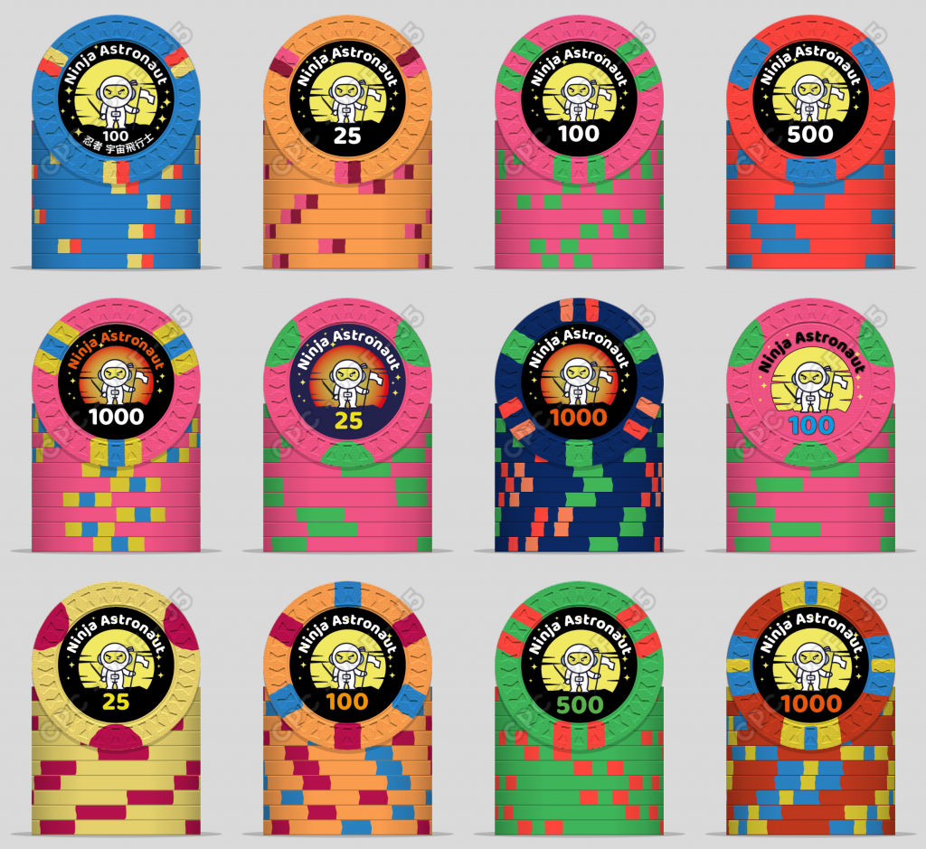
I'd appreciate any feedback on the attached possible looks (these are still a bit sketchy, but there will be four chip values: 25, 100, 500, 1000). One thing I'm not sure about is the merits of a white background for the insert vs. black background - I feel like that's the kind of thing that might be quite hard to judge just from a screen/web interface visual, but someone with experience of these chips could maybe speak to. Also I'm thinking of using colours on the chip values, but I'm not sure how easy it will be to match the chip colours, especially if Im using dayglo chip colours. But close is probably good enough.
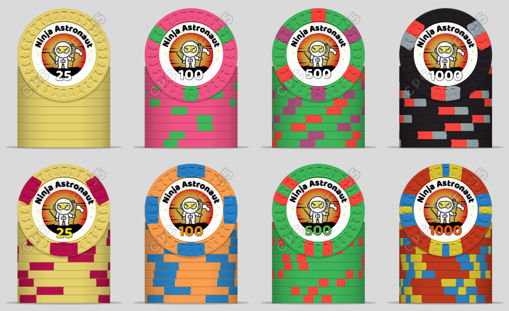
CPC chips White BGs.png
CPC Chips black BGs.png


ps. I should mention that I'm not sure I'll go with the hourglass mould - may go with A-crest instead, but I figure I need the biggest insert area possible, which rules out some options such as the H-mould which would otherwise look quite appealing
 
If you’re looking for big inlay area I would go with the FDL mold. Far superior from those other two imo. I really recommend getting sample sets though to decide for yourself, both color and mold.
 
Definately invest the time and extra money to get mold and color samples first. Before you're spending thousands of dollars, make sure it's exactly how you want it. CPC produces amazing chips, but they have strengths and weaknesses especially in the color department, play to those strengths.

Concerning your mockups:
Cool inlay design!
I like the black background. When you're going for confetti colors, it makes them pop and has an outer space feel to it.
 
Last edited:
You’ll hear this from everyone, but get samples for sure to see them in person. The different molds have different “feels”. I personally am not a fan of the hourglass mold, but if it fits a theme it could be a good choice. I prefer small crown which would still give you a decent sized inlay to work with.

Regarding the inlay, when I was designing my set, I literally printed off dozens of to-scale inlays of my artwork as I tweaked it overtime and cut them out and placed them on the chip to help visualize what it looks like. It takes time but worth it IMO. Like you, I went back and forth about what color matching I wanted (if any). I decided to match color match the writing to the base chip color and then a couple small details like the door and smoke to the edge spot colors. I think I was able to do it fairly successfully. It is a different ballgame when you try to do a gradient that blends with base chip color. It can look fantastic when done right, but I think also can really ruin a chip if it doesn’t match perfectly. High risk, high reward I think.

I found this info from @timinater to be very helpful when trying to do my color matching

https://www.pokerchipforum.com/threads/cpc-colour-code-matching-list.52094/

My personal opinion on your inlay is that I like the darker background. Usually I much prefer clean white inlays, but the darker background works for you. It makes the stars and text stand out better. I would suggest to have some consistency in your color choices like having a black background for all chips and then inserting some pops of color by maybe having the denomination number match the base chip color and/or have the stars match an edge spot color.

Keep tweaking, put it down for a while and come back and tweak again.

Good luck!
 
I am not experienced creating CPC sets and you will get lots of better feedback. But do you want the largest inlay possible for readability concerns? Either way, I would not overlay the denomination on a line/border like this. I believe it will create readability issues, I actually prefer white backgrounds myself, but on the white background versions they all have the denom overlaying a line/border.

Capture4.PNG

Capture5.PNG
 
Personal fav of your designs would be the black bordered inlay with the color matched denoms, on chip set #2.
 
Thanks chaps! All very helpful.

Re. samples, yup, I have some on the way, too big a decision to make without handling chips in person.

Monkey: I'm planning to do just as you suggest re. test prints and thanks for that colour reference link - saves me getting hold of a CMYK swatch book ;-)

I'll keep y'all posted…
 
Ah, too many options… after browsing a couple of other threads like this one…

https://www.pokerchipforum.com/threads/post-mockups-for-fun-science.8283/

…I'm really getting into the look of some of the 1/4-pie designs, which I've tried below. (Credit to Puggy for the original work). I think the FDL mould would work well for those, or possibly the A-mould

Insert-wise, I'm going to go with a black background, coloured text for the values, though some other details I need to review on hard copy colour prints before I can make decisions. (eg exact size and location of elements, solid vs gradient in BG disc)

Eloe2000: yup, good point re. thin outlines and overlapping borders and shapes. I may run the 'Ninja Astronaut' so that it just overlaps the edge of the yellow or gradient-filled disk, but I think that case works differently - the text is big enough that it swamps the line/border in the background

A few more ideas (inserts are bit of a mixed bag)

Pie set 02b.png
Pie Set 01b.png
 
A couple of the colours on the denominations are wrong, btw! Pretty clear which ones ;-)
 
A couple of the colours on the denominations are wrong, btw! Pretty clear which ones ;-)
lol, "wrong" implies there is a set standard. Custom designs can be whatever you like! But I see which ones you are referring too.
 
I like the darker inlay overall and especially the color matched denoms on the 2nd quarter pie lineup, that produces a pretty cool effect. Also like the orange gradiant background in the inlay vs the solid yellow.

You may already be aware but fyi just be mindful that some of the spot patterns you have mocked up here are level 9+, they're going to be pricey. :)
^ this.
 
Yeah, I'm not hung up on using colours that match any particular convention, but they have to at least make sense on each chip ;-)

Good point re. the spot patterns… I should really try and keep it to Level 3 so as to merely break my original budget rather than set it on fire and jump up and down on it in hob-nailed boots.
 
*checks pricing table, grits teeth* OK, maybe level 4's my limit
Assuming these are going to be a forever set, stretch to get what you absolutely love if you can. The last thing you want (IMO) is to spend this much and have even a tiny bit of regret every time you see/use them!
 
Oh absolutely - it would be silly to compromise the right look for a small price difference. It will probably be the only time I do this, so it's worth doing well, and despite being several times the cost of the chips I'd started looking at a few week ago, I'm sure I'll feel like they're good value. But still… expensive enough that I should keep an eye on the budget!
 
So I've had samples for a few days, printed several designs to see how they look at 100% size on paper, and I think I'm going to go with this:

BetaChipDesign_Jan12.png


Getting the colour samples persuaded me that, for example, the blue chip should be another Dayglo colour as it works better alongside the others than the pale blue. I'm going to wait to see if these still look as good in a couple of days before I order, but I think they'll work a treat.

Also, I have cards on the go:
Poker Card print 01.png
 

Create an account or login to comment

You must be a member in order to leave a comment

Create account

Create an account and join our community. It's easy!

Log in

Already have an account? Log in here.

Back
Top Bottom