Le Gold tournament set (1 Viewer)

LeGold

Full House
Site Vendor
Joined
Jan 31, 2020
Messages
4,031
Reaction score
11,966
Location
Norway
My LEGO hotel (as shown earlier in this thread) is in desperate need of tournament chips for its minifigure guests!

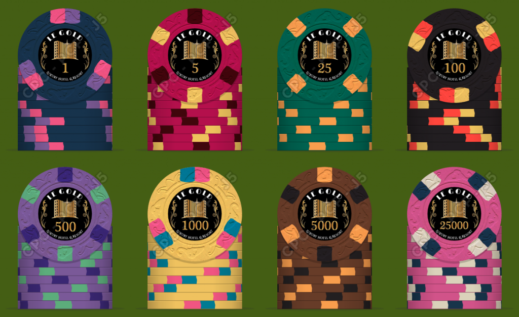
I'm happy to present my thoughts to this great community, hoping to get valuable feedback. I like the classic style, and have been playing with this for a while now. I used the Atlantic Club as a starter, but did a number of changes both to the base colors and the edge spots. I do have a color sample on the way from CPC, to see the real colors before taking the final choice.

A few notes/thoughts/questions:
  • Blue or white 1. Originally I went for white, but later figured out that blue would work well in this particular combination of base colorsf.
  • The last two chips are not needed for the game and I only want them to have a more complete set (will only get 25 of each, and boost up the quantities of the rest).
  • There is a reasoning behind the patterns of edge spots (all 1s have 3 spots/groups, all 5s have 6, all 25s have 4). I am, of course, open to suggestions for improvements. For instance, are pot colors on 1 and 1000 perhaps too similar? They do seem to work well on those particular base colors, but any suggestions for improvements are more than welcome.
  • Not sure whether the small text on the inlays will be readable. It is part of the original name/logo though, so it would be nice to keep it.
  • If I do go for inlays, what would be the best color/pattern to simulate shiny gold with CPC inlays?
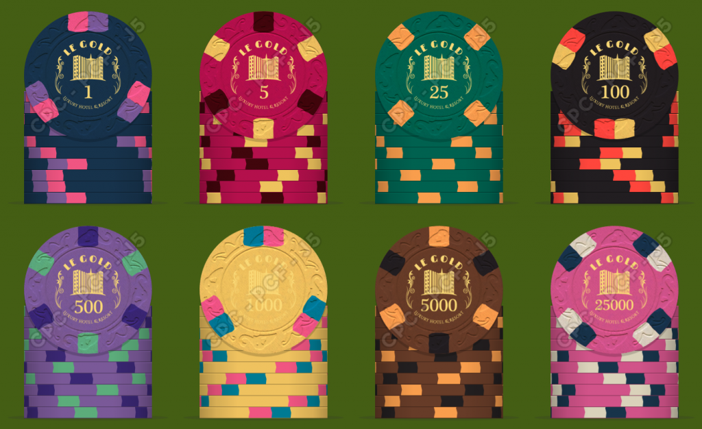
  • I am aware that the hot-stamp version might be too detailed for this scale, not sure. But it will definitely be too expensive with 8 dies, so I might need to opt for a common logo hotstamp on one side and plain stock denomination on the opposite side (25k won't be an option then, if I've understood correctly). That would get the whole set to approximately the same price as the version with inlays. Any thoughts on this?
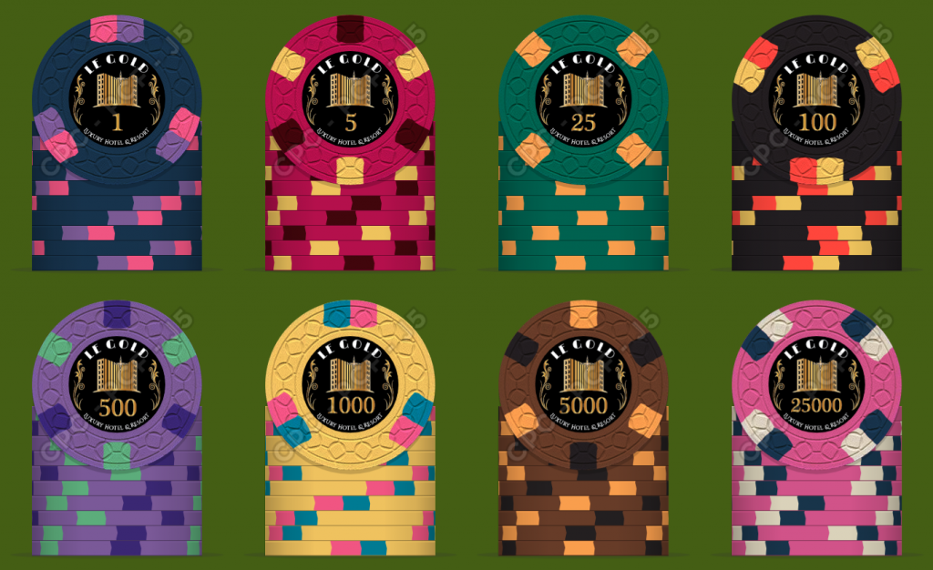
  • Mould: waiting for samples to arrive, but I do like the smoothness of E&C. I do like CS as well, much more concrete (and more affordable and shorter lead time), so I'm perplexed here.
  • Breakdown (800 chips): 150/200/150/100/100/50/25/25
Thoughts/comments/suggestions/criticisms are more than welcome! I know it is my set, my taste and my investment (or, more precisely, pure expense), but I'm new with this, and I've seen more than once people here coming with comments on things the OP would never have thought of, which is wonderful.

Logo:
LeGold_v02b_gold.png

Inlay E&C:
LeGold_set_v2_nc1.png


Hot stamp:
LeGold_set_v2_hs1.png


CS mould:
LeGold_set_v2_cs_nc1.png
 
They all look awesome!! I really like the HS version, but I'm on a hot stamp kick at the moment.

The bottom text might be to small to read?
 
Agreed bottom text may be a little small, I personally like the CS mould, I love hot stamps but prefer the black labels in this case. Tough choice though, those hot stamps are looking super classy. The chip colors are beautiful!!
 
The more I look at these the more I like them! looking forward to see which route you go.

Seem a bit yellow heavy maybe try to get in a couple different edge spot colors in?
 
Would be a shame if that cool logo wasn't on both sides. I would go inlay if I couldn't swing the stamping and die cost to have the logo on both sides.
 
You won’t be able to get anywhere near that fine of detail into a hot stamp. For the design you’re forced into inlays
 
The hot stamp is great. May consider less colors in lower denomination
 
Yeah, love the hot stamps myself... but as @Frogzilla says, it might be impossible to achieve (even if I somehow could justify myself spending $1k on just dies). And if I compromise on the design to remove the detail level, then the whole point might be lost.

CS mold - I hear you. I am close to accepting the switch, will see after I receive the samples.

Edge spot colors - not sure, I tried playing around with other combinations (yes, a it is bit yellow heavy), but individually these still look best to me.

Edge spot pattern - 3D14 is my favorite (love it especially on the 1 and 100), but feel if all chips have it that it might be a bit boring. Like 3DS316 as well, how would these two work together?
 
Well if you consider changing background color on labels to match chip base color you can get similar result as hotstamp.
 
Well if you consider changing background color on labels to match chip base color you can get similar result as hotstamp.
Except for the shiny golden foil part, which (at least to me) is the main point of having a hot stamp :)
 
Could the t1000 be white in the hot stamp version?
Would the gold foil stand out on the yellow base?
 
I've seen photos of hotstamped yellow chips and they looked very nice. I'll be able to verify this myself when the samples arrive.
 
Did some more pr0ning with the designer (will it ever be good enough?!). I figured out that the T1 I ended up liking most was very similar to the Top Hat T1... not directly a problem (there are a few others I'd seen before, but then again, there are only so much combinations one can do with the given pallette).

Here is a fresh version with a white 1 and several changes in edge spots (both colors, progression, and fewer similar colors). I know at least I should check when the samples arrive whether DG Yellow and White work together. Any comments? Any of these I should revert to a previous version?

LeGold_set_v2_nc3.png


A view of the stack:

LeGold_set_v2_nc3_stack.png
 
The yellow spot on white 1 is pretty hard to see. Rest of chips and color progression looks great.
 
Yeah, I'm aware it might be a problem, it's impossible to know for sure by only looking at the digital version.
 
Just received the samples from CPC and yes, had to do some changes due to quite significant mismatch between the colors in the designer tool and the reality. I must say I was a bit disappointed with the yellows, none of them was love at the first sight (even Canary).

Then I figured out the only way to see how the chips might look like was to take photos of the samples and do some heavy photoshopping (including changing the mold since all the samples are A mold :) ). Not perfect as the photos were taken with a mobile phone and at different angles, without correct WB, but still beats the designer tool. Next time I'll take photos of all the colors in a controlled environment (unless someone else has already done it?).

Anyhow, here is the result, with the current version:
  • The edge spot progression is much more clear.
  • White 25k instead of pink.
Any thoughts with regards to colors, suggestions for improvements?

Chip_All.jpg
 
I love the colors and spots, and inlay. One thing I do think about when planning a set is to not have so many dark base colors next to each other. Have a lighter shade thrown in here and there to have more contrast on the table. Not the biggest deal, just what I like to do
 
My LEGO hotel (as shown earlier in this thread) is in desperate need of tournament chips for its minifigure guests!

I'm happy to present my thoughts to this great community, hoping to get valuable feedback. I like the classic style, and have been playing with this for a while now. I used the Atlantic Club as a starter, but did a number of changes both to the base colors and the edge spots. I do have a color sample on the way from CPC, to see the real colors before taking the final choice.

A few notes/thoughts/questions:
  • Blue or white 1. Originally I went for white, but later figured out that blue would work well in this particular combination of base colorsf.
  • The last two chips are not needed for the game and I only want them to have a more complete set (will only get 25 of each, and boost up the quantities of the rest).
  • There is a reasoning behind the patterns of edge spots (all 1s have 3 spots/groups, all 5s have 6, all 25s have 4). I am, of course, open to suggestions for improvements. For instance, are pot colors on 1 and 1000 perhaps too similar? They do seem to work well on those particular base colors, but any suggestions for improvements are more than welcome.
  • Not sure whether the small text on the inlays will be readable. It is part of the original name/logo though, so it would be nice to keep it.
  • If I do go for inlays, what would be the best color/pattern to simulate shiny gold with CPC inlays?
  • I am aware that the hot-stamp version might be too detailed for this scale, not sure. But it will definitely be too expensive with 8 dies, so I might need to opt for a common logo hotstamp on one side and plain stock denomination on the opposite side (25k won't be an option then, if I've understood correctly). That would get the whole set to approximately the same price as the version with inlays. Any thoughts on this?
  • Mould: waiting for samples to arrive, but I do like the smoothness of E&C. I do like CS as well, much more concrete (and more affordable and shorter lead time), so I'm perplexed here.
  • Breakdown (800 chips): 150/200/150/100/100/50/25/25
Thoughts/comments/suggestions/criticisms are more than welcome! I know it is my set, my taste and my investment (or, more precisely, pure expense), but I'm new with this, and I've seen more than once people here coming with comments on things the OP would never have thought of, which is wonderful.

Logo:
View attachment 401109

Inlay E&C:
View attachment 401108

Hot stamp:
View attachment 401107

CS mould:
View attachment 401110


Very impressive graphics. Can anybody point in there right direction/ link to find out more about the customization process? Who customizes, what manufacturing process is used? Etc. ?
 
ovo said:
One thing I do think about when planning a set is to not have so many dark base colors next to each other. Have a lighter shade thrown in here and there to have more contrast on the table.
I see your point. But I so love the retro colors! :unsure:
 
Last edited:
  • Like
Reactions: ovo
In reality, the difference between Retro Blue and Retro Red is is much bigger than on the image (the red is brighter), so I'll probably keep those two. However, changing Retro Green to Green did help!
 
Very impressive graphics. Can anybody point in there right direction/ link to find out more about the customization process? Who customizes, what manufacturing process is used? Etc. ?
If I understand the question correctly, the manufacturer is Classic Poker Chips (you can find a lot of details there). As to the customization - you are the designer (or you hire one), you put your designs into their Poker Chip Design Tool, then you spend months agreeing with yourself on what you like best (at the same time saving hundreds of bucks a month for when you'll eventually be ready), then you place the order and wait a few more months :)
 

Create an account or login to comment

You must be a member in order to leave a comment

Create account

Create an account and join our community. It's easy!

Log in

Already have an account? Log in here.

Back
Top Bottom