You are using an out of date browser. It may not display this or other websites correctly.
You should upgrade or use an alternative browser.
You should upgrade or use an alternative browser.
Le Gold tournament set (1 Viewer)
- Thread starter LeGold
- Start date
Cheers. And you are correct (brown = chocolate).i really, really like the 5000 - what are the colors? brown w/ DG arc yellow/black?
Cheers. And you are correct (brown = chocolate).
right, right - chocolate.
i would be remiss to not also comment on how much i like the 25,000 as well - looks vaguely familiar...
*edit* proof pic deleted to protect the innocent
Last edited:
Love it! Wonder how this pattern would work in my setup 
As for the colors, it is a pure coincidence - I was playing with different combinations, including red & blue, and figured that charcoal might look nice on white. Turned out I liked it much better than blue (and I avoided the standard red/white/blue combination).
As for the colors, it is a pure coincidence - I was playing with different combinations, including red & blue, and figured that charcoal might look nice on white. Turned out I liked it much better than blue (and I avoided the standard red/white/blue combination).
Love it! Wonder how this pattern would work in my setup
As for the colors, it is a pure coincidence - I was playing with different combinations, including red & blue, and figured that charcoal might look nice on white. Turned out I liked it much better than blue (and I avoided the standard red/white/blue combination).
hilarious, because i started out with red & blue as well, then went down the exact same path! you know what they say about great minds...
So, played a bit more. Changes made:
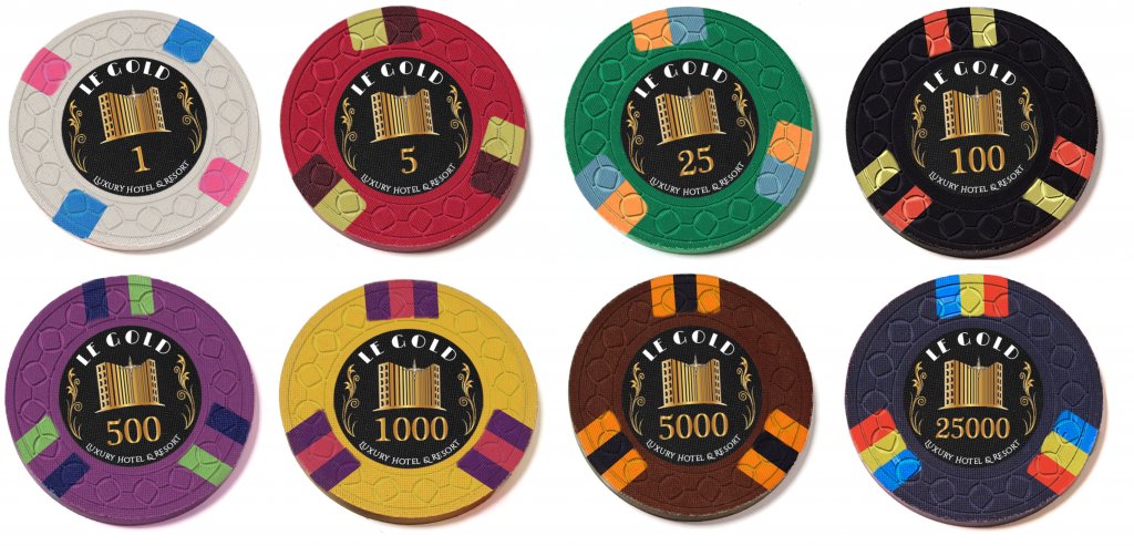
Still considering Yellow 314 as an alternative, it seems to be dark enough on White (also in reality):
- Changed 25 from Retro Green to Green (slightly brighter)
- Swapped White and Retro Blue, gives more contrast on the 1, less on the 25k compared to 5k, but I really love that base color and these probably won't ever be in play anyway
- Adjusted the spots on 1 and 25k accordingly; too bold colors? Should the 414 be straight instead of rotated?
Still considering Yellow 314 as an alternative, it seems to be dark enough on White (also in reality):
CPC aligns all there labels a certain way in relation to the edge spot pattern, so if you want it rotate I believe you will have to make a very specific request.
25k takes the cake for me. I too prefer white/yellow combo however the set is already fairly yellow heavy. Perhaps try a variation of orange?
CPC aligns all there labels a certain way in relation to the edge spot pattern, so if you want it rotate I believe you will have to make a very specific request.
Thanks for the heads-up, I'll check it with them.
You mean the one from post #21 in combination with Black? (albeit with Yellow instead of DG Yellow)I think I prefer the yellow 3D14, but there is already a lot of yellow in the set. but then again that does fit the theme of the set. both look great though, quite the dilemma!
I agree, it is a bit yellow heavy set. And yes, it does fit the theme but then all chips would need to have it
You mean the one from post #21 in combination with Black? (albeit with Yellow instead of DG Yellow)
I agree, it is a bit yellow heavy set. And yes, it does fit the theme but then all chips would need to have itI can try to play with T5 and find an alternative there to compensate for the yellowness in T1.
sorry, no - I meant 314, the one from post #36. adding the D was just a brainfart.
what did you have in mind for removing the yellowness of the 5?
Steamtrain
3 of a Kind
Have a blue cHip beEn tried?
DG Pink + DG Green do seem to work together nicely (tried also DG Peacock, also nice but there's a blue on the 25 right next to it...)
View attachment 413416
if you want to keep the pink and blue from the $1 together, try swapping the blue from the $25 to the $5 and the DG green from the $5 to the $25. and this just so happens to result in one of my favorite CPC combos - green w/ DG green & DG arc yellow!
Been entertaining the idea of switching back to the E&C mold which is less busy and more classy (and more expensive, longer waiting time...). I haven't found many E&C examples here on the forum - is there an E&C pr0n thread? What are people's experiences with it?
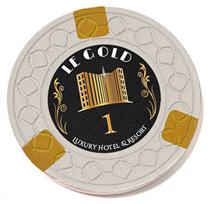
Also, the $1 is ok but a bit... plain. Maybe use a 314 with DG Tiger or, as in the following example, a split 212. What say you?
Also, the $1 is ok but a bit... plain. Maybe use a 314 with DG Tiger or, as in the following example, a split 212. What say you?
Last edited:
cascadiapoker
Two Pair
My opinion is I would definitely go CSQ over elephant head, personally. More importantly, I have to be honest and say that I prefer your first CSQ mockup the most by far. The reason being is that both the inlay itself, “Le Gold” and being black and gold, and the classy theme it implies goes much better with the colors and edge spots of that first mockup. The later mockup colors and edge spots seem a little more reminiscent of the Outlaw ABS plastic poker chips:
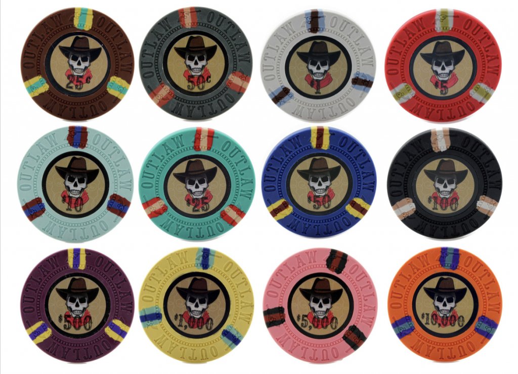
I don’t think the colors of the newer mockups work well with that inlay. The colors from the first mockup are much more cohesive to the inlay. Only some minor tweaks here or there would warrant looking into.
So going off the first CSQ mockups and edge spots, maybe I’d make these tweaks?:
$1 chip - lighten the dark blue base color to imperial blue
$100 chip - lighten the orange edge spot to dayglo peach
$5,000 chip - change the black edge spot to dayglo green or green
$25,000 chip - brighten the pink base color to dayglo pink, and then lighten the blue edge spot to imperial blue
Ultimately always take any suggestions here with a grain of salt, maybe some will help and some won’t, some will be based on those who only prefer chips 1 certain way at all times, and some could be just completely wild and off the wall. At the end of the day, you should go with what makes you truly proud and that you’ll know you can enjoy for a lifetime.
Damn, you're not making it easy for me, aren't you? 
I appreciate the very detailed comments and suggestions, and I'll certainly give'em a thought. Even though the design has changed a lot since the 1st CSQ version, it's still one I would be happy with. Well, all the versions I posted are ones that I would be happy with... but I'm still looking for one that I would really love.
I appreciate the very detailed comments and suggestions, and I'll certainly give'em a thought. Even though the design has changed a lot since the 1st CSQ version, it's still one I would be happy with. Well, all the versions I posted are ones that I would be happy with... but I'm still looking for one that I would really love.
Steamtrain
3 of a Kind
I like the 5, 25 and 25,000
although the 5,000 and 25,000 are both dark
Not feeling the elephant mold here but they are your chips
although the 5,000 and 25,000 are both dark
Not feeling the elephant mold here but they are your chips
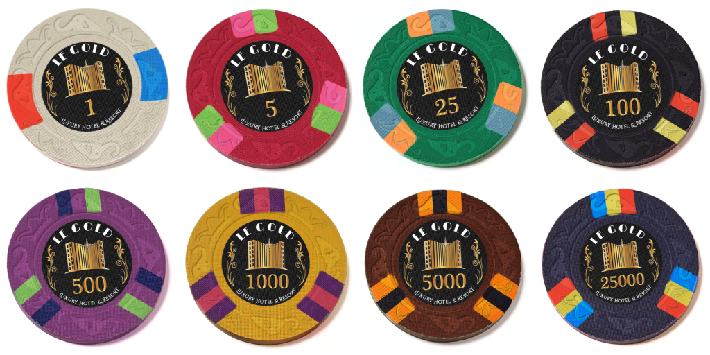
Playing a bit more with other molds, this time Scroll. Pros for scroll: somewhat classy, less busy than CSQ, matches the scrolls on the inlay (as well as some decorations on the LEGO model). My two main problems with CSQ (even though I *do* like it) are that it feels a bit too busy/distracting, and has too much of a Rounders feel... the latter is also why I changed the overall spot design since the earliest mockups).
Also did some fixes in spot sizes on the photo mockup to better match reality (suddenly everything looks better and less Outlaw-ish!), as well as a few color changes on the 1k & 5k, to better match the pattern on the 25k.
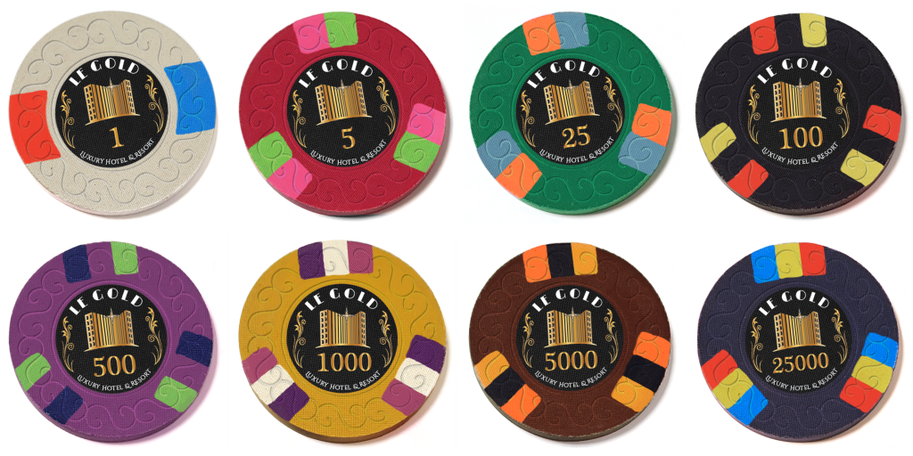
Also did some fixes in spot sizes on the photo mockup to better match reality (suddenly everything looks better and less Outlaw-ish!), as well as a few color changes on the 1k & 5k, to better match the pattern on the 25k.
Last edited:
Have you tried DISQ mold?
I'd be interested in seeing this progression with the 5 and 25 spots switched and the 1000 and 25000 spots switched.
I'd be interested in seeing this progression with the 5 and 25 spots switched and the 1000 and 25000 spots switched.
cascadiapoker
Two Pair
I was going to ask if you had tried the Scroll mold out.
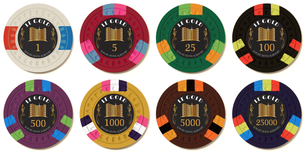
Here is a DISQ version (using a better template as well, making it easier for me to test changes). Tried swapping the spots between 1k and 25k, but it didn't work as well. Also, swapped 1 spot on 5 and 25 + minor changes.
Last edited:
cascadiapoker
Two Pair
I’m not going to comment much with critiques unless I truly believe it is helpful to you. The biggest reasoning being that I don’t want to lose track of giving helpful suggestions and instead just end up giving “suggestions” of how I’d want the chips in my own personal tastes. Personally I’m not a big fan of the tri-edge spot designs much save for rare occasions, in which cases have been on a single chip in a mockup. And I’m starting to realize how very picky I am on color combinations, lol. There’s some combinations here I love, and some I’m not such a fan of, but overall there’s nothing really wrong and it all looks good. So I guess your journey has also been one of self discovery for me too!
The only truly non-biased suggestion I have right now is to reiterate that you remember to develop it to what you can be proud of personally, and do so both the whole mockup, and each individual chip. If there are chips that you are most proud of, keep them. And then you can work on the others to get them to that level. Once you can be equally proud of each individual chip, you’re there! I’m still watching intently and can’t wait to see what you end up with as your final choice!
The only truly non-biased suggestion I have right now is to reiterate that you remember to develop it to what you can be proud of personally, and do so both the whole mockup, and each individual chip. If there are chips that you are most proud of, keep them. And then you can work on the others to get them to that level. Once you can be equally proud of each individual chip, you’re there! I’m still watching intently and can’t wait to see what you end up with as your final choice!
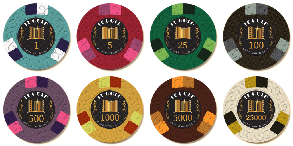
I could(!) do something drastic and change the design completely, like 3D14 all over (potentially my favorite spot pattern), perhaps with spot colors matching the base. This could also be a secondary set. Or primary. I would lose some nice color combinations that I really like from the previous design, but then again, I would gain others.
Last edited:
cascadiapoker
Two Pair
I like the switch to blue on the $1 chip. Personally I’m a fan of Imperial blue for this set but you could still totally pull off the really dark blue as well. I absolutely loved the color schemes of the $25, $500, and $5k chips on the previous mockups, and I usually don’t even like brown. Though I do have to say that the newest $5 k chip, I love even more. I like the $100 chip much better on the newest mockup, but maybe that light gray could be white for better contrast? The orange was really throwing me off on that in the previous chip, and same with that previous $25k chip. Some helpful info on your 1k chip: the base color is perfect with this set as it signifies gold. And that’s probably where you’ll continue to struggle with color schemes, again mostly because of the inlay. It inadvertently sets a precedent where really, the only colors that will work are the basic neutral colors that usually go with gold, white, gray, black and in some occasions, green or pink.
I like where you are going on both your last 2 mockups regarding the lighter/darker tone color edge spots, form the most recent, but the ones I personally loved most had both 1 lighter or darker tone color and the other was a complimentary or within the complimentary color range. I think that on every chip could really work well, but maybe only use 1 lighter or darker tone and not 1 of each.
Ok so some of those were my own personal preferences but at least I prefaced them as such, lol.
Last edited:
It's always about preferences  I appreciate all the input.
Indeed, Imperial Blue might work better in this case, maybe as the base, giving me better options for light/dark combination. Also, it "releases" the white so that it can be used on black.
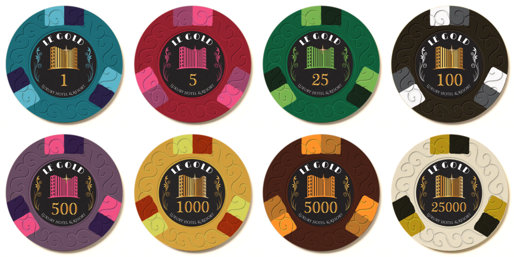
Also, I wonder whether changing the inlays a bit to match the bright spots would make everything nicer. Here are a few different examples (only flourishes, also hotel, keeping the star gold...)
cascadiapoker
Two Pair
If anything, keep the building gold! Lol. I do Like the idea of matching the scrolls to the bright spots. But keep “Le Gold” and “Luxury Hotel & Resort” white, and keep the building and the denominations gold. The only minor issue is you kind of lose that effect on the last 3 chips since they all kind of just blend into the same color. So maybe just keep it to the original?
And a couple last suggestions based on personal preference, lol.
On the $500 chip, change the pink edge spot to retro red?
And then on the $1k chip, ditch that red edge spot altogether, and replace it with the base green color of the $25 chip?
And a couple last suggestions based on personal preference, lol.
On the $500 chip, change the pink edge spot to retro red?
And then on the $1k chip, ditch that red edge spot altogether, and replace it with the base green color of the $25 chip?
cascadiapoker
Two Pair
Or any green for that matter.
Marius L
4 of a Kind
Do you have a mold sample set from CPC? I have heard that the feel of the different molds are quite substantial. If I were you I would try to get like 5-10 chips on each of the mold you are considering to get a better feel of how the different molds handle.
Similar threads
- Replies
- 15
- Views
- 505
- Replies
- 4
- Views
- 249
- Replies
- 20
- Views
- 820
- Replies
- 30
- Views
- 785
