Help Me Fix a Costly CPC Custom Order Mistake (Mine not Theirs) (1 Viewer)

ChipEnvy

Full House
Joined
Mar 28, 2013
Messages
3,042
Reaction score
5,506
Location
Washington
TL/DR version. Will the new quarter work?

So I made a mistake when I ordered my dream custom set from CPC. I wanted to make MY chips so I didn't look for input from anyone other than @Quicksilver-75 who did the artwork for me (Steve is amazing btw, I hope his break from PCF is short as he is an asset to the community). It ended up biting me in the ass. I made chips that looked great, but didn't pay close enough attention to how the chips would play together. From the stack pics the design tool offers, I thought I was golden...

image.jpeg


However when I got them in play, my players had a hard time telling the $.25 from the $1, and there were more than a few dirty stacks. Splash pot pron for reference...
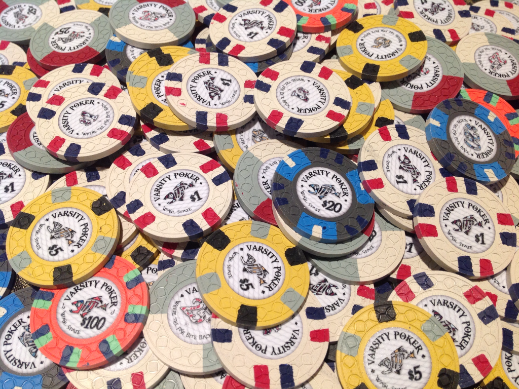
image.png


It was what I can only assume is every custom chip owners worst nightmare, I was no longer in love with my chips. It bothered me every time I looked at them and It bothered me even more because these were the chips that I (and @Quicksilver-75) had spent so much time obsessing over.

I spent what I consider an ungodly amount of money on this set, and my Varsity Poker chips are my J.V. set. I don't like settling so it didn't take me long to decide that it was the quarter that would need to be changed. I took out my CPC color sample set and decided that the only base color that would fit nicely would be Gray. It was a no brainier to use the Aria $100K chip as inspiration, so I hit up Steve to mock up some new artwork for me one more time and he knocked it out of the park.

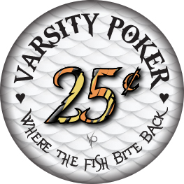
image.jpeg
image.jpeg


Not wanting to make the same mistake twice, I asked @Ray-Col if he wouldn't mind creating a render of my new chip so I had some piece of mind, that this would be my final quarter... That dude is a wizard!
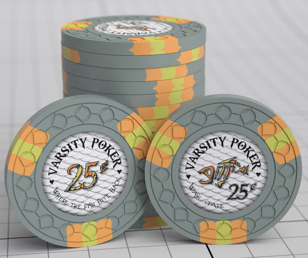
image.jpeg


It is amazing to see your chip before it's made. As if that wasn't enough, he went a couple steps further and created a splash pot render and a dirty stack render as well...
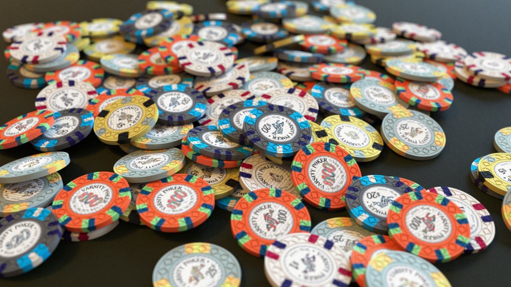
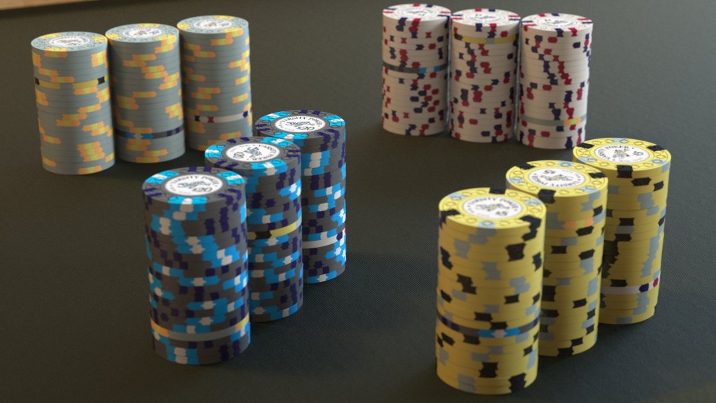
image.jpeg


image.jpeg


I'm pretty much sold that this chip will not only work, but will bring the set together the way I wish I would have done to start with.

However like I said before, I don't want to make the same mistake twice. So to do my due diligence, what do you all think of the new quarter? Would you tweak it at all? If so, how?

Thanks,
Tom H.
 
Last edited:
It is much better, but I still would prefer to get away from gray as the base color. It is a very light color and can easily blend with white. Your spot colors are much better too which will help a ton compared to the original version as well.

The grey could also cause some problems with your charcoal $20 and Yellow $5 as they both have shared color tones.

When I was looking at the dirty Stack picture it took a little while to spot the 25c chip in the $5 stack.

Retro lavender would fit in the color palate you have nicely.


Awesome inlay BTW!!! The fish scales in the background are very cool.
 
This is your fix (will cost a lot of money): make BOTH an alternate $1 and an alternate $0.25.

Use your new $1 with your old frac. Rotate them out as needed with your old $1 and your new frac. Make sure that each of these pairs still works with your current $5, $20, and $100.

I would suggest a pink, brown, or lavender base chip for your new frac. I think a green base for your new $1 would work as well.
 
I love the Aria tribute, but I kind of agree with Rhodeman about the gray base. Plus if you did decide to make a drastic palette change quarter pie could still be an option to keep the chip on a lower spot-level.

That's kind of shame though, because now I really want to see this Aria tribute be made. But perhaps a different palette would be more appropriate for your set.

Or you can go all the way with the tribute and just make it 43mm. ;)
 
You're not the first person to remake a denomination because of a real-life color problem, and you won't be the last. In my ASM (now CPC) set I had 5-cent half pies with light green that were two close to the light blue ones. I racked the chips after taking a photo of a gigantic splash pot and had 3 ones left over, and 3 missing nickels. It took me around half an hour to find those three nickels that were hiding in nine racks of ones. Remaking them was a no-brainer.

I like the gray chip but like those above, I think there is not enough contrast with the one. I'd go with a distinct color like pink, lavender, or even green.
 
After looking at it more, I think you will have more problems with the $5’s now, especially in stacks. I didn’t even see the $5 in the 25c stack until after my first post and looking at it the pic much closer. At a glance I completely missed it.

By trying to fix it with the $1 it actually got worse with another chip.
 
Love the original chip and the new one, but you will still likely have issues of dirty stacks, but with the $5 instead.

I also agree that a lavender base might go well with the set.
 
Last edited:
what do you all think of the new quarter?
In a vacuum, I like it. As others have said, though, I wouldn't go with a grey frac in this set - particularly not one with a yellow spot, because of this:

upload_2018-2-22_4-48-38.png


Almost didn't even catch it, thus my concern.

I like the idea of a spotted frac, but since it's a frac - and a reorder - I'm not a huge fan of prices north of $2/chip. More than anything this particular chip needs to be full of function rather than bling. To that end, I offer a few ideas on the 314 pattern. Both the spot profile and the base color are dissimilar to anything else you have in your lineup, so barring color-blindness or drunken blindness, dirty stacks should be readily apparent and easily avoidable.

Option 1 - Blurple with Peach spots

upload_2018-2-22_5-4-41.png


Option 1a - Blurple with DG Green spots (since there's barely any green in the set but already a base orange)

upload_2018-2-22_5-11-15.png


Option 2 - Retro Lavender with maroon spots

upload_2018-2-22_5-5-49.png


Option 3 - Pink with chocolate spots

upload_2018-2-22_5-7-1.png


Or, if you really wanted to go with a little bling, Option 4 - Blurple with fuck it spots

upload_2018-2-22_5-9-26.png


I do think the blurple base is going to give you the most bang for your buck - as well as the most spot color options - on that frac, but that's just one man's opinion. Regardless, I want a sample chip of the new frac.

Allow me to repeat that for health and posterity: I would like to buy a sample of the new frac from you, please. :D
 
I'll second blurple, lavender, or pink (that was my immediate thought after the 1st post). If you really want it to stand out the you could go with 3D14 using blurple base with DG green, tiger, or DG pink spots.
 
Thanks for the replies all, I appreciate the feedback.

When I was looking at the dirty Stack picture it took a little while to spot the 25c chip in the $5 stack.

Awesome inlay BTW!!! The fish scales in the background are very cool.

The $5 stack is the only thing that gave me a little bit of pause. Also thanks for noticing the scales! That was a last minute add when I thought a plain white background looked too generic.

This is your fix (will cost a lot of money): make BOTH an alternate $1 and an alternate $0.25.

Use your new $1 with your old frac. Rotate them out as needed with your old $1 and your new frac. Make sure that each of these pairs still works with your current $5, $20, and $100.

This might be the long term result, because I have no idea what I will be doing with the original two racks of quarters, but ordering 600 chips right now isn't in the cards.

You're not the first person to remake a denomination because of a real-life color problem, and you won't be the last. In my ASM (now CPC) set I had 5-cent half pies with light green that were two close to the light blue ones. I racked the chips after taking a photo of a gigantic splash pot and had 3 ones left over, and 3 missing nickels. It took me around half an hour to find those three nickels that were hiding in nine racks of ones. Remaking them was a no-brainer.

WooT! I'm not the only one that lights money on fire? That makes me feel a little better. :LOL: :laugh:

I like the gray chip but like those above, I think there is not enough contrast with the one. I'd go with a distinct color like pink, lavender, or even green.

Green is not a bad idea!

Why change the inlay for the new chip? That would tilt me like crazy.

That would tilt me too. The only change is the color of the fish and denom to match the chip color.


Love the gray frac. Don't do it.

What do you mean? You like the original 1/4 pie or the new mocked up Aria $.25?

A pink quarter would be awesome as per @Psypher1000 's suggestion

Just personal preference, but not a fan of pink fractional chips. I think Blurple, Lt.Green & DG Arc Yellow (possibly Red) are the colors I'm looking at now.

IMG_0020.jpg
 
Last edited:
Let me know which way you are gonna go or leaning. It doesn't take long to change the colors and make jpegs so Rainer can whip off some renders. Better safe than sorry.

I think the new chip will give you issues. I hate to say it. But it may end up giving you bigger problems than you had.
 
I think Blurple, Lt.Green & DG Arc Yellow (possibly Red) are the colors I'm looking at now.

+1 for light green, or DG yellow. Maybe keep what you did with the new gray chip but invert the colors so DG yellow or DG orange is the base, with gray accents.

In isolation the new frac looks really nice, but I agree with others that the $5 gets lost in it. Nice work so far!!
 
Zombie Bump!!!!

So this set is just not right. I've been dealing with it for several years now and I just can't shake the feeling that it's not perfect. So I've been thinking a lot about it recently and with prices going further up next year I figure I've got to pull the trigger to get this thorn out of my paw or else I'll miss my chance.

I've narrowed it down to a Lt. Blue, Lt. Green and Blurple base color. There is currently too much white (but too little bright) in the set so these colors should take care of that. However, I am a little concerned Blurple will be too dark.

Which base color do you prefer, and do you prefer any of the specific $.25's that I have at the bottom of the post? Keep in mind I have this as my $100 (not often in play but in the set all the same):

VP100.png


Created the below to demonstrate the base colors in the lineup. I like each of the $.25's but they were chosen at random for the base color not because I prefer that particular spot pattern or particular spot colors.

quarts2.png


I really like all of these so, I am looking thoughts and feedback. I might put up a poll later but right now any favorites or chips I should stay away from for whatever reason (spot progression, contrast (ie. Blurple too dark), not a match to the rest of the set, etc...)?

quartsall.png


Thank you for the help and feedback!

- Tom H.
 
I really like your set, but I do agree that the current quarter is too close.

Of the new mockups I think the green option is the best one as it clearly stands out from the rest and the colour combos look great as well. Blurple would worry me with your hundo, and you have blue on the $1 and $20.

Plus light green with arc yellow and tiger will be awesome. My vote is for 3d14.

Edit. Maybe use peach instead of tiger.
 
Last edited:
Zombie Bump!!!!

So this set is just not right. I've been dealing with it for several years now and I just can't shake the feeling that it's not perfect. So I've been thinking a lot about it recently and with prices going further up next year I figure I've got to pull the trigger to get this thorn out of my paw or else I'll miss my chance.

I've narrowed it down to a Lt. Blue, Lt. Green and Blurple base color. There is currently too much white (but too little bright) in the set so these colors should take care of that. However, I am a little concerned Blurple will be too dark.

Which base color do you prefer, and do you prefer any of the specific $.25's that I have at the bottom of the post? Keep in mind I have this as my $100 (not often in play but in the set all the same):

View attachment 595865


Created the below to demonstrate the base colors in the lineup. I like each of the $.25's but they were chosen at random for the base color not because I prefer that particular spot pattern or particular spot colors.

View attachment 595840

I really like all of these so, I am looking thoughts and feedback. I might put up a poll later but right now any favorites or chips I should stay away from for whatever reason (spot progression, contrast (ie. Blurple too dark), not a match to the rest of the set, etc...)?

View attachment 595862

Thank you for the help and feedback!

- Tom H.
Green or Blurple Trimoon
 

Create an account or login to comment

You must be a member in order to leave a comment

Create account

Create an account and join our community. It's easy!

Log in

Already have an account? Log in here.

Back
Top Bottom