I prefer the 314 spots. Also in my opinion less edge spot real estate is very important on CPC chips to avoid dirty stack issues.
You are using an out of date browser. It may not display this or other websites correctly.
You should upgrade or use an alternative browser.
You should upgrade or use an alternative browser.
Hannah's Room - design thread (4 Viewers)
- Thread starter Perthmike
- Start date
detroitdad
Royal Flush
As usual, i've been obsessing over mockups and I have changed my mind and decided that tri-moon is better.
View attachment 433988
I think this is my current favourite.
View attachment 433987
I like the bottom row. I don't like the T5k chip.
I can't wrap my head around a TRK spot pattern on a BurtCo-era mold....
Fuck..........I never considered that until now. Scrap the idea Mike. Lets start over.
I mean, in and of itself it looks perfectly fine -- but just not on a retro-theme design that is theoretically from that time period....I can't wrap my head around a TRK spot pattern on a BurtCo-era mold....
detroitdad
Royal Flush
I mean, in and of itself it looks perfectly fine -- but just not on a retro-theme design that is theoretically from that time period....
I completely get it and I agree with you. Fuck, I hate saying
Another vote for sticking with 314 and h-mold for these.
I really like the retro lavender / dg arc yellow combo, I think that's going to look awesome. The only concern I'd have is mixing that with the DG tiger chip, especially if both chips have yellowish spots. You'd probably be OK in good lighting, but these two color shades (bright orange and any of the pinkish purples) are notorious for causing dirty stacks. IMHO the DG tiger (while one of my favorite CPC colors) doesn't seem to mesh with the rest of the set, at least in terms of base colors. Any consideration for moving to a yellow or canary base for the 1k?
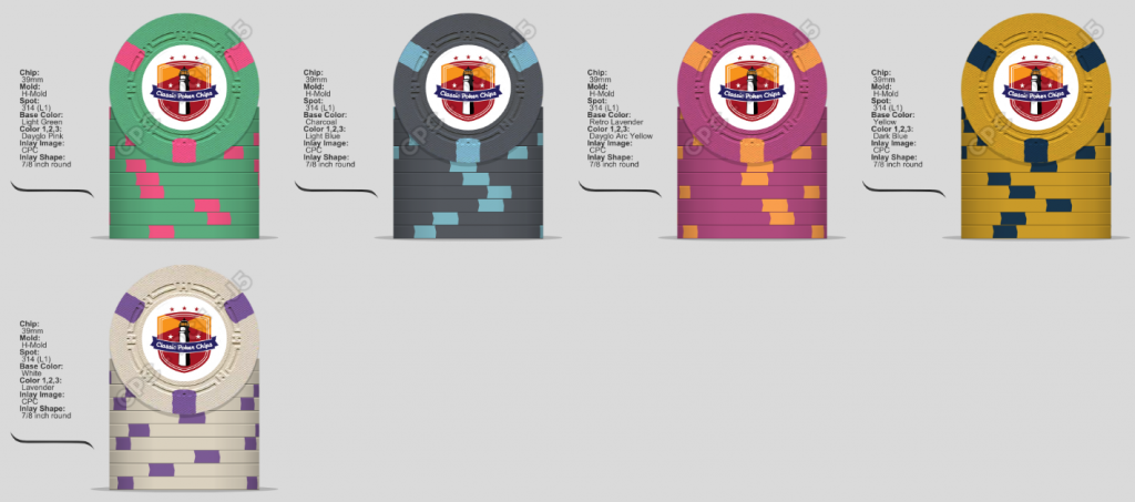
I also like the light blue inverted for the 100
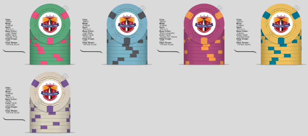
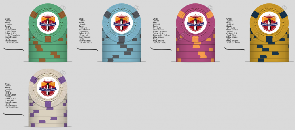
These vintage style sets admittedly aren't in my wheelhouse, so take what I've said with a whole shaker full of salt.
I really like the retro lavender / dg arc yellow combo, I think that's going to look awesome. The only concern I'd have is mixing that with the DG tiger chip, especially if both chips have yellowish spots. You'd probably be OK in good lighting, but these two color shades (bright orange and any of the pinkish purples) are notorious for causing dirty stacks. IMHO the DG tiger (while one of my favorite CPC colors) doesn't seem to mesh with the rest of the set, at least in terms of base colors. Any consideration for moving to a yellow or canary base for the 1k?
I also like the light blue inverted for the 100
These vintage style sets admittedly aren't in my wheelhouse, so take what I've said with a whole shaker full of salt.
Perthmike
Straight Flush
Can't say I'm very good with vintage sets either.Another vote for sticking with 314 and h-mold for these.
I really like the retro lavender / dg arc yellow combo, I think that's going to look awesome. The only concern I'd have is mixing that with the DG tiger chip, especially if both chips have yellowish spots. You'd probably be OK in good lighting, but these two color shades (bright orange and any of the pinkish purples) are notorious for causing dirty stacks. IMHO the DG tiger (while one of my favorite CPC colors) doesn't seem to mesh with the rest of the set, at least in terms of base colors. Any consideration for moving to a yellow or canary base for the 1k?
View attachment 434017
I also like the light blue inverted for the 100
View attachment 434024
View attachment 434021
These vintage style sets admittedly aren't in my wheelhouse, so take what I've said with a whole shaker full of salt.
And I kinda don't want this one to look fully vintage. I'm thinking I want it to look more like a modern take on vintage using the bright DG colours for spots.
I want a yellow chip, but overall CPC yellows bother me, whereas I think CPC arc yellow is a legitimately great colour. So I'm very torn, because it means I can't use arc yellow on the 500, because I really like it too.
@BGinGA does have a point about the tri moon and h-mold thing, although for the reason above, im not too fussed on that fact.
I could still consider plain mold too. I've always been really drawn to the plain molds for some reason.
Who knew a single spot tourney set would be so complicated. I had an easier time with my motswaris.
Last edited:
Big-time boo on losing the retro lav chip. That would be a required chip in any set I'd be making.... even to the point of moving colors around to non-standard positions so they wouldn't clash.
Perthmike
Straight Flush
It doesnt have the same pop as lavender does with a DG pink spot. And I really want an arc yellow or DG peach base for the t1000Big-time boo on losing the retro lav chip. That would be a required chip in any set I'd be making.... even to the point of moving colors around to non-standard positions so they wouldn't clash.
Last edited:
Perthmike
Straight Flush
How dare you use a princess bride meme against meIn case I was not clear earlier:


asian bino
Two Pair
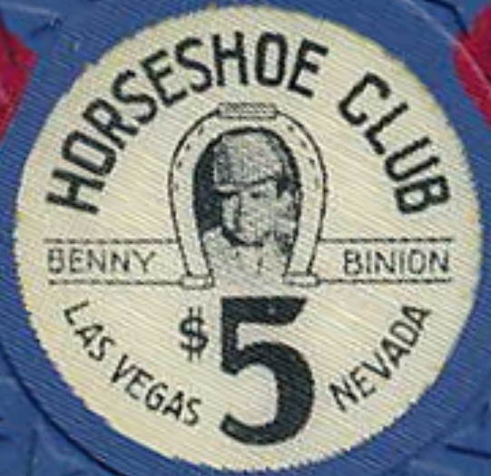
Why not use original Horseshoe chip colors/spot pattern if you are going after the retro look? The 5k Chocolates are my (only) favorite brown chip.
http://chipguide.themogh.org/cg_chip2.php?id=NVLVHL&v=1322251530
And if you REALLY want retro, go with the OUTRAGEOUS old school design!!
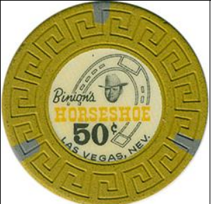
http://chipguide.themogh.org/cg_chip2.php?id=NVLVHL&v=1322251530
And if you REALLY want retro, go with the OUTRAGEOUS old school design!!
detroitdad
Royal Flush
And I kinda don't want this one to look fully vintage. I'm thinking I want it to look more like a modern take on vintage using the bright DG colours for spots.
And if you REALLY want retro
Perthmike
Straight Flush
Pretty sure I'm close to locking in these colours.
I feel like I'm leaning towards tri-moon, but maybe plain mold, as I'm still drawn to that mold.

314 h mold mock up for comparison.

And yes Dave the 500 is retro lav lol
I'm considering a full custom inlay too, rather than copying the horseshoe clubs.
I feel like I'm leaning towards tri-moon, but maybe plain mold, as I'm still drawn to that mold.
314 h mold mock up for comparison.
And yes Dave the 500 is retro lav lol
I'm considering a full custom inlay too, rather than copying the horseshoe clubs.
Only concern I'd have using the Horsehoe Club template for your inlay design is the lack of space for the larger 4-digit denominations.
And retro lav/dg arc yellow rules -- there is not enough contrast with dg pink spots. Same with the gray spotted T5000; try going with charcoal.
And retro lav/dg arc yellow rules -- there is not enough contrast with dg pink spots. Same with the gray spotted T5000; try going with charcoal.
Perthmike
Straight Flush
Slight change of direction. Going to go for more of this style design.
Quick first mockup, for layout purposes. Trying to think of something that can replace the horseshoe, which is probably out of place if I don't use the horseshoe name. Maybe a picture frame. Ideally something safari themed, but I'm fresh out of ideas

Quick first mockup, for layout purposes. Trying to think of something that can replace the horseshoe, which is probably out of place if I don't use the horseshoe name. Maybe a picture frame. Ideally something safari themed, but I'm fresh out of ideas
asian bino
Two Pair
Looks like Baby-Face Nelson..... 
WedgeRock
Royal Flush
Put a cowboy hat on that baby.
Perthmike
Straight Flush
Lol it would be funny, just not sure how possible that would be to do and have look goodPut a cowboy hat on that baby.
cascadiapoker
Two Pair
I love the last horseshoe inlay design!
asian bino
Two Pair
You're getting colder........
- Joined
- Nov 22, 2018
- Messages
- 12,442
- Reaction score
- 26,488
- Location
- 129 West 81st Street, Apartment 5B
Sorry, wrong thread. I switched the comments between threads on accident.
Was supposed to read that idk if you’ve legit gone through 204, but I feel like it just keeps getting better. Love mockups #3 and 4.
Was supposed to read that idk if you’ve legit gone through 204, but I feel like it just keeps getting better. Love mockups #3 and 4.
Last edited:
bsdunbar1
4 of a Kind
That bounty chip is GOLD!
Yeah, you're losing me....You're getting colder........
asian bino
Two Pair
I don't know what your friends are like; Unfortunately for me, only about 2 out of 8 people in *my* poker group care about the chips that are used.
That being said, A baby is not what *I* would want to see on a poker chip. A *CRYING* baby, well.....no.
Please don't take offense; this is just my opinion. If you'd like to make a set to honor your daughter, I think that is awesome. But if you are genuinely here for opinions, show these to your most honest 2 poker playing buddies and try to read them for a tell.
I thought the Horseshoe design was kinda novel and a cute/funny take-off. I'd lean back in that area, sans tears.
It's a laughing baby!
(If you want to see a crying baby, just invite me to your home game.)
(If you want to see a crying baby, just invite me to your home game.)
Similar threads
- Replies
- 8
- Views
- 583
- Replies
- 32
- Views
- 1K
- Replies
- 20
- Views
- 841
- Replies
- 25
- Views
- 977
- Replies
- 10
- Views
- 538
