Greek mold label design questions (2 Viewers)

southsound

Sitting Out
Supporter
Joined
Jan 16, 2024
Messages
22
Reaction score
39
Location
Fox Island, WA
I'm trying to design some labels for a greek mold set and I've run into several questions for anyone who has designed labels for these before.
  • What is the minimum text size that I should use that will look good? I have samples of the Big Top and King's Castle chips and I measured text on those labels that is about 1.5mm tall and looks great. Those both use all caps and I'm hoping to use lower case that might be a little smaller than that.
  • What is the minimum stroke width or distance between elements that I should use? On those sample chips there are some fairly small details in the art that looks great, but I can't quite tell what sizes those translate to in illustrator.
  • How far from the edges should I have elements of the design? The samples I have look very well centered and consistent. Is 1mm from the edge going to be fine on these labels?
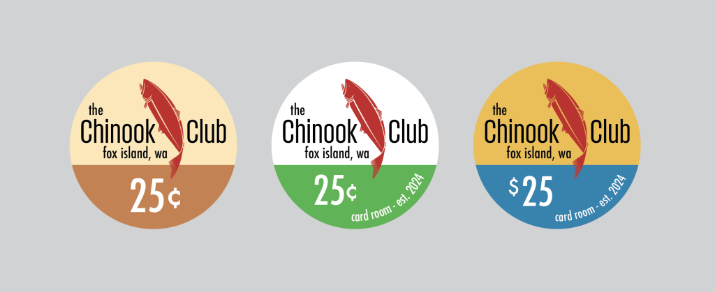
Here are some of the designs I've been trying out, does anyone see any issues with these? I'm worried things might be a bit too small in general. (Also, any general feedback is welcome, this will be my first set of custom chips). The fish has very small details (it's reduced in size from a larger design), so I'm thinking that might need some rework.

labels-wip.png


Thanks!
 
My suggestion is to use a chip designer tool like Chip Lab, and print out the chip in real 39mm size to see how the detail is.
I'm sure anyone with the Greek chips can tell you the size of the label insert
 
I used actual casino chips when I made my set. Things I have learned over numerous designs...
  • Less is more. Nobody goes to a poker game to read.
  • Black "spreads" more than lighter colors. Not much, but a pixel or two of ink absorption will occur.
  • Measure actual casino chips. I figured the smallest text to use would be the text on a chip that reads Las Vegas, NV (or wherever). Do not go smaller than that, unless you are examining then under a jewelers loop.
  • The older you (or your players) get, the "Las Vegas, NV" sized text no longer looks like text, and just looks like a line.
 
My suggestion is to use a chip designer tool like Chip Lab, and print out the chip in real 39mm size to see how the detail is.
I'm sure anyone with the Greek chips can tell you the size of the label insert
I have some Greek mold samples and the labels are 24mm diameter. I've printed these out but my printer isn't capable of getting anywhere near the quality or sharpness of the labels on the sample chips I have. I could probably get some printed out at a similar quality locally though, which is probably a good idea.
 
I used actual casino chips when I made my set. Things I have learned over numerous designs...
  • Less is more. Nobody goes to a poker game to read.
  • Black "spreads" more than lighter colors. Not much, but a pixel or two of ink absorption will occur.
  • Measure actual casino chips. I figured the smallest text to use would be the text on a chip that reads Las Vegas, NV (or wherever). Do not go smaller than that, unless you are examining then under a jewelers loop.
  • The older you (or your players) get, the "Las Vegas, NV" sized text no longer looks like text, and just looks like a line.
This is all great advice! Most of the people I play with don't care about chips at all (yet) so the less is more is totally true here, really these are just for me. :)

I just measured the text on several of the chips I have and the smallest text on most seems to be 1.5mm, with a couple that have 1mm tall text. I'll probably try to keep everything around 1.5mm. I just got to the age where I bought my first reading glasses, so I totally get this one. It doesn't quite look like a line yet, just blurry letter like shapes!
 
I've printed these out but my printer isn't capable of getting anywhere near the quality or sharpness of the labels on the sample chips I have. I could probably get some printed out at a similar quality locally though, which is probably a good idea.
I had the same issue when I tried to print samples.

Next best is to reduce the image on your computer screen to the actual size (24mm in this case). Warning: this will be much smaller than you think! Then leave the room and do something else. The goal here is to make your eyes adjust to something further away than a computer monitor (that means staying off your phone).

When you return to the room, you will see what it looks like with "fresh" eyes.

Here's a chip I've relabeled and what I have found...

1706286195093.gif


  • Enshrined 2024: 1.1mm for the capital "E" and the year. Printed nicely, but is too small to read without taking about 5 seconds of focusing and finding that "sweet spot" with my glasses. Better than going to look up what year a player was inducted, but far from optimal. The red color probably does not help.
  • Hall of Fame/John Burchell: Capitals are 2.2mm, lower case 1.6mm. This is easily readable by picking it up and looking at it, but not readable from your stack on the table. This would be my recommended minimum if you want people to actually read it.
  • Poker Club: 3.2mm tall, 0.2mm spacing between letters. This is readable, but from table distance the letters are too close together. Being the club's name though, everyone knows what it says. However, if I were to change 1/4 of the chips to read "Diner Club" instead, I would be willing to bet $100 that nobody (including the chip nerds) would notice the first night.
  • 25: 4.6mm Legible from your stack. Again, the spacing is too close, but between using standard colors and denominations, your brain can easily fill in the difference.
  • Zombie: 6.9mm tall 0.3mm apart. Readable from the pot.
Your eyes may vary (mine are 20/20 corrected), but I hope this helps.
 
Last edited:
I'm trying to design some labels for a greek mold set and I've run into several questions for anyone who has designed labels for these before.
  • What is the minimum text size that I should use that will look good? I have samples of the Big Top and King's Castle chips and I measured text on those labels that is about 1.5mm tall and looks great. Those both use all caps and I'm hoping to use lower case that might be a little smaller than that.
  • What is the minimum stroke width or distance between elements that I should use? On those sample chips there are some fairly small details in the art that looks great, but I can't quite tell what sizes those translate to in illustrator.
  • How far from the edges should I have elements of the design? The samples I have look very well centered and consistent. Is 1mm from the edge going to be fine on these labels?
Here are some of the designs I've been trying out, does anyone see any issues with these? I'm worried things might be a bit too small in general. (Also, any general feedback is welcome, this will be my first set of custom chips). The fish has very small details (it's reduced in size from a larger design), so I'm thinking that might need some rework.

View attachment 1261925

Thanks!
While ink tends to bleed when printed on paper and especially traditional dye-sub ceramic chips, these new hybrids labels are capable of surprisingly good detail. I think it's due to being printed on vinyl, where the ink doesnt spread or soak in as much.
For comparison, I designed these a few months ago and recently got the finals. On the left is the art file and the right is a photo:
print comp copy.jpg

The "Downtown Las Vegas" text at the bottom is quite small 4.7 point, and the letters stand only .788 mm tall. The printing is great, but you need to ask yourself if you really want it THAT small, when it is hard to read simply because of the size. Going with all caps for the smallest text, and spacing the letters out a bit can also help.

For the fish, the very fine lines in the fins and tail may get lost, simply because they are SO thin...

A great way to get a feel for how large the label will be when printed, you could pinch and zoom the Chinook Club image on your phone down to about that size and see how readable it is at a couple feet away.
 
@Colquhoun wow, that really does look great! Your design is also quite close to the edges and it looks like they printed it perfectly. Thanks for those pics.

I've made some changes in my design so the smallest text I'm using is 8 pt. At that size even the lowercase letters are over 1mm tall. I think I'm going to redo the fish a bit to get rid of those smaller sections in the tail and fins as well.

 
If you're designing for text legibility, the analog way is to print out your inlay/label design at actual size, hold it at arms length, and see if it is reasonably clear.
 

Create an account or login to comment

You must be a member in order to leave a comment

Create account

Create an account and join our community. It's easy!

Log in

Already have an account? Log in here.

Back
Top Bottom