I like this attempt. Would add a black contour to the blue circle inwards and outwards like all chipcos have and make sure it will be printed on chipco blanks.Some mockups below. Tried to lean in a bit on the starburst with the setting sun on the last one. Could work that angle more with an image with a bigger starburst setting sun. (Note 3 of these have watermarks. Those images can be obtained for use without watermarks).
@SemiNumerical and @rjdev7 (and anyone else who is buying the Carribean Adverture sets) - do you have any interest in pursuing a custom frac? This is fun for me, but no need to continue to develop designs if there is no interest.
View attachment 1197112
View attachment 1197113
View attachment 1197114
View attachment 1197116
You are using an out of date browser. It may not display this or other websites correctly.
You should upgrade or use an alternative browser.
You should upgrade or use an alternative browser.
Frac design for Poker Stars Caribbean Adventure Chipco set (1 Viewer)
- Thread starter GreekRedEye
- Start date
Like this? Yeah, a couple people have suggested chipco blanks and that makes sense. But more expensive than Tina route. I'm just the graphics guy. If buyers want to purchase from BRPro on this for chipco blanks or Tina for cost savings (or both) that is cool.I like this attempt. Would add a black contour to the blue circle inwards and outwards like all chipcos have and make sure it will be printed on chipco blanks.
I also fixed the typos below. Why didn't anyone call them out? Y'all are supposed to help me proofread!
And the backside in that color. I think the spiraly things could be white to grey gradient rather than grey to black. The real chips use both.
Edited to add this one, for folks who prefer without any text:
Your chip reverse looks way better than the original version!Like this? Yeah, a couple people have suggested chipco blanks and that makes sense. But more expensive than Tina route. I'm just the graphics guy. If buyers want to purchase from BRPro on this for chipco blanks or Tina for cost savings (or both) that is cool.
I also fixed the typos below. Why didn't anyone call them out? Y'all are supposed to help me proofread!
View attachment 1197392
View attachment 1197393
And the backside in that color. I think the spiraly things could be white to grey gradient rather than grey to black. The real chips use both.
View attachment 1197395
Edited to add this one, for folks who prefer without any text:
View attachment 1197396
The no-text version might look better with just the photo, no rings.
Hope the nitpicking is helping. If not, just let me know and I'll stop heh
It helpsYour chip reverse looks way better than the original version!
The no-text version might look better with just the photo, no rings.
Hope the nitpicking is helping. If not, just let me know and I'll stop heh
Gambleface
Sitting Out
I hope this comes to fruition, I think the original set looks pretty nice and I would love to see a finished frac
I hope this comes to fruition, I think the original set looks pretty nice and I would love to see a finished frac
I need a high res, flat scan or photo to proceed with the design.
I am happy to post the final files in this thread. And the Tina crowd and the BRPro crowd can organize mini group buys, now or later.
For the moment...I am going to try to do a poll to takes folks' temp on colors.
Poll is up.
Any update on the art?
I got a high res photo yesterday. I am busy next couple days but I will work on this over the weekend.
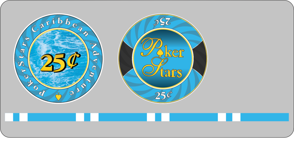
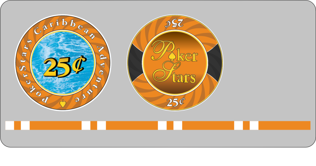
I finished the first version of these. Color poll was all over the place, so I mocked it up in various. No reason why different folks can't order different colors. All of these can easily be made into nickels or non-denoms.
Would appreciate:
BLUE:
ORANGE:
PINK:
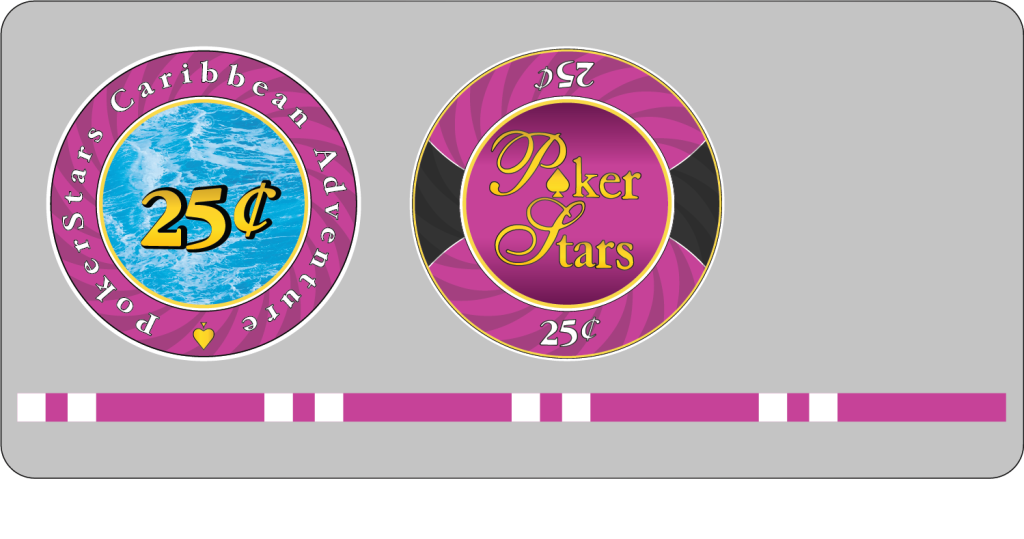
PURPLE:
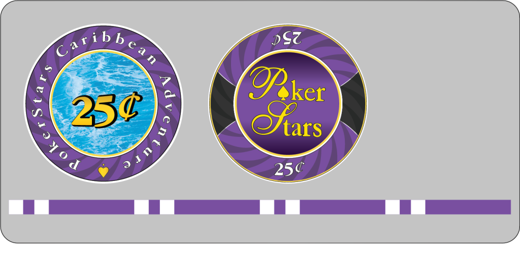
YELLOW (flat):
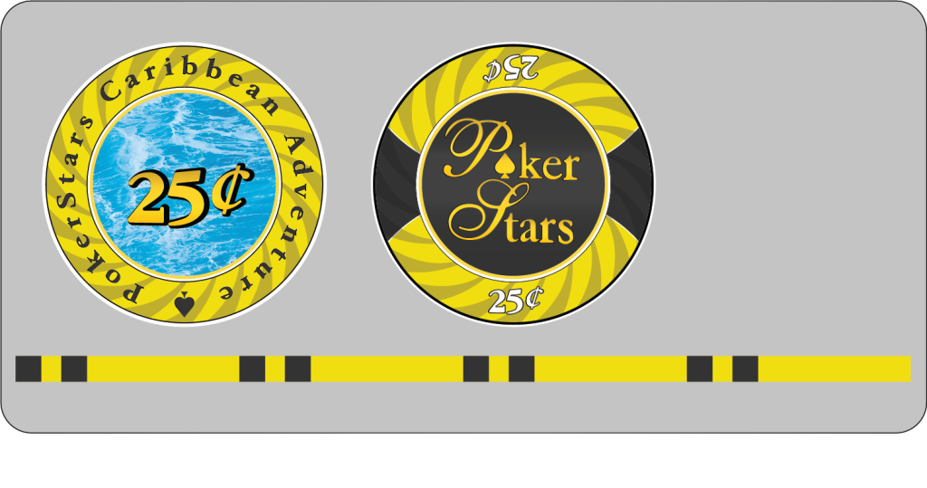
YELLOW (gradient)
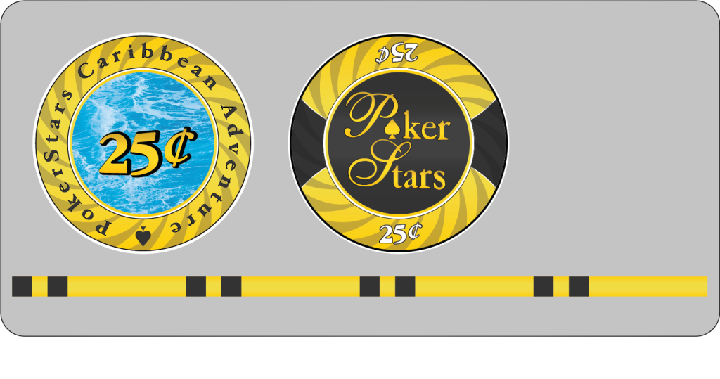
Would appreciate:
- General feedback
- Checks for errors or deviations from the originals.
- Any more suggestions for the "ocean" image? I am still using the watermarked version of this one as a placeholder.
- If there is a pro designer following this who is willing (for free - sorry - I'm doing this volunteer basis) to take a look at the files for any red flags, I would appreciate it. PM me so you don't have to out yourself.
- @SemiNumerical @BigChief @rjdev7 - As I don't have any of the actual chips, I have a couple questions about the edge spots:
- How wide are the edge spots? I've used 3.5mm for spots with 2.5mm space between the pair.
- Do the edge spots have a stroke?
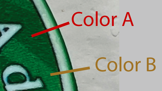
- Is the edge color the lighter or darker version of the face color? For example on the $25, is it color A, color B, or something different?
BLUE:
ORANGE:
PINK:
PURPLE:
YELLOW (flat):
YELLOW (gradient)
Looks like you nailed the kerning for the cent symbol. Nice!
Not sure if this is carried over from the original, but either the ring text or the spade is not centered.
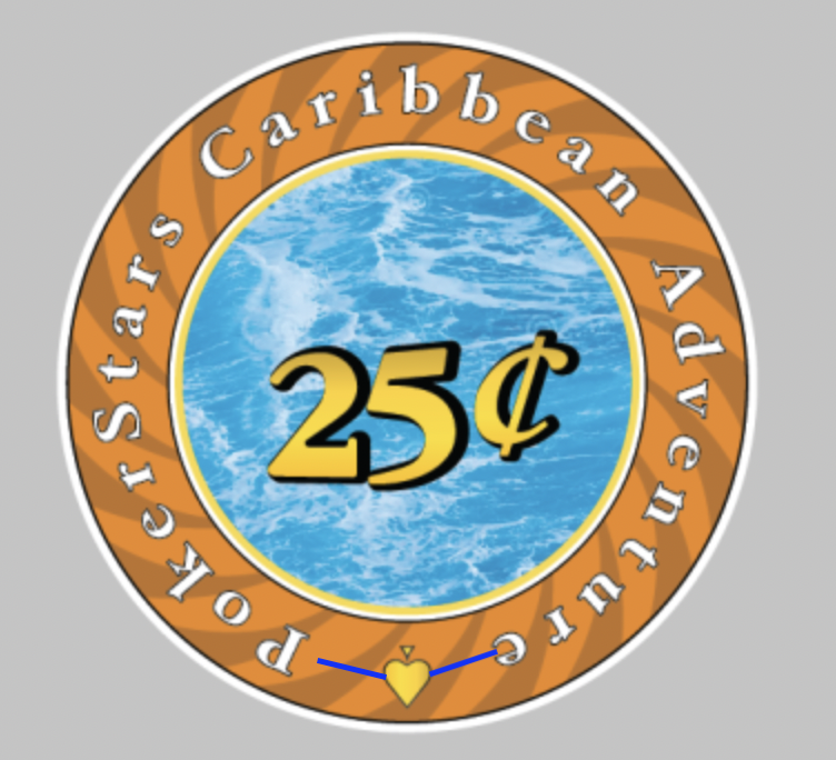
Not sure if this is carried over from the original, but either the ring text or the spade is not centered.
The 25 was interesting. As I played with this, I was reverse engineering what the original designer did. I had to make the 2 and 5 myself since the font did not match close enough for the large size. The designer shrank the 2 height wise, but not width wise, but aligned it to the top of the 5. The black drop shadow is a copy of the numbers with an offset path, set behind, then aligned left with the yellow. Then all space between 2 and 5 removed.Looks like you nailed the kerning for the cent symbol. Nice!
Not sure if this is carried over from the original, but either the ring text or the spade is not centered.
View attachment 1199925
It is the ring of text that is mis-centered and that is from the original design. See below. I was tempted to fix it, but I think matching the originals as much as possible is the goal. I found some other errors in the original. For example, the darker color stripes are not perfectly spaced. Mine are and when you overlay the two, you see in spots they do not line up perfectly. I do not think anyone will really notice, so I left mine perfectly spaced.
Yeah I spent a good amount of time looking for that unique 5 on font search sites... no luck either. I wonder if they started from a different base font and applied their own strokes.The 25 was interesting. As I played with this, I was reverse engineering what the original designer did. I had to make the 2 and 5 myself since the font did not match close enough for the large size. The designer shrank the 2 height wise, but not width wise, but aligned it to the top of the 5. The black drop shadow is a copy of the numbers with an offset path, set behind, then aligned left with the yellow. Then all space between 2 and 5 removed.
Design
Still looking for feedback. @SemiNumerical @BigChief @rjdev7 can you please tell me the edge spot size, space between the edge spots, and the edge band color? If anyone wants to propose a different ocean image, now is the time to speak up. I will finalize the designs tomorrow (Wednesday) and post the files to the top of this thread. If you want a variation (e.g. non-denom blue or purple nickel), let me know in this thread before Wednesday and I will customize it for you.
Orders
The Tina group buy deadline is end of the month. Minimum order is 500 chips. @justincarothers can take individual orders as long as the total for this set adds up to 500 or more.
https://www.pokerchipforum.com/thre...d-diamond-mold-group-buy-october-2023.110225/
You can also take the design to other vendors (e.g. BRProPoker) if you prefer.
Interest in this seems to have fizzled and the original sales thread has been canceled. I went ahead and added a link to the AI file to the top post of this thread in case anyone does want to make these.
Similar threads
- Replies
- 7
- Views
- 3K
- Replies
- 2K
- Views
- 190K
- Replies
- 78
- Views
- 7K
- Replies
- 293
- Views
- 13K
In Progress (ordering closed)
Custom Cut Card Group Buy (Round 11)
- Replies
- 198
- Views
- 15K
