Yeah, that's what I'm thinking. I like the green chip better though. I guess I can use a green $20. I've seen them before.If you play micro stakes a $20 is better. I use the nickel and we use $20 a lot more. Also then you can have 25 for tournaments and $20 for cash games.
Always going to promote big chip or plaques for the big chips $20 & $100.
You are using an out of date browser. It may not display this or other websites correctly.
You should upgrade or use an alternative browser.
You should upgrade or use an alternative browser.
First design (2 Viewers)
- Thread starter RedDirtBo
- Start date
I saw his post in the Introductions section. He's in the opposite corner of the state from me. About 3 1/2 hours drive.@BBQlegend has the Northern Oklahoma Poker League.
You guys should do a meetup/shootout for Oklahoma
Plus they are looking for new chips as well so he’s probably interested in what you come up with.
SeanGecko
4 of a Kind
@RedDirtBo Maybe a 6 spot for the chip after the $5 keep the pattern going. You can also do three colors.


Some of the green can come out a bit dark. Going for a lighter green can help.Yeah, that's what I'm thinking. I like the green chip better though. I guess I can use a green $20. I've seen them before.
This works really well.Good catch, thanks! If I spell out Oklahoma, I think I should abbreviate southwest, or it would be too busy. I'm thinking purple edge spot is better on the 25c, and am looking at light blue on the $1. I'll work on the positioning of the letters tonight. Just did this quick.
View attachment 1202928
twocannons
Two Pair
Love the evolution of the design!
Stay safe down in the Shady five Eighty lol
Stay safe down in the Shady five Eighty lol
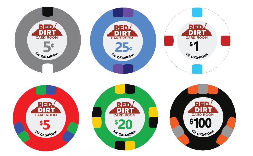
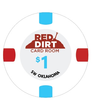
Well, I think this might be it! Words cannot express how ecstatic I am with the help and tips you guys have given me. I was happy with my original design, but with your help, it has been cranked up to an 11! Special shout out to @Colquhoun for making me an amazing logo, without me even asking! I could probably tinker with this forever, but Tuesday is the cut off for the October group buy, so I have to stop somewhere. I left the denom black on the $1 because of the white inlay. Now I'm wondering if I should make it match one of the edge spots, lol!

Nicely done!Well, I think this might be it! Words cannot express how ecstatic I am with the help and tips you guys have given me. I was happy with my original design, but with your help, it has been cranked up to an 11! Special shout out to @Colquhoun for making me an amazing logo, without me even asking! I could probably tinker with this forever, but Tuesday is the cut off for the October group buy, so I have to stop somewhere. I left the denom black on the $1 because of the white inlay. Now I'm wondering if I should make it match one of the edge spots, lol!
View attachment 1203121
You could go pink 25¢ and blue $1 to solve the color matching problem.
SeanGecko
4 of a Kind
Or team black dollar!Nicely done!
You could go pink 25¢ and blue $1 to solve the color matching problem.
I'm mostly kidding
HARDWELL UNDERGROUNDOr team black dollar!
I'm mostly kidding
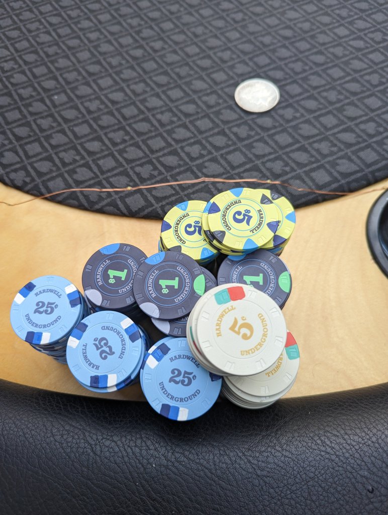
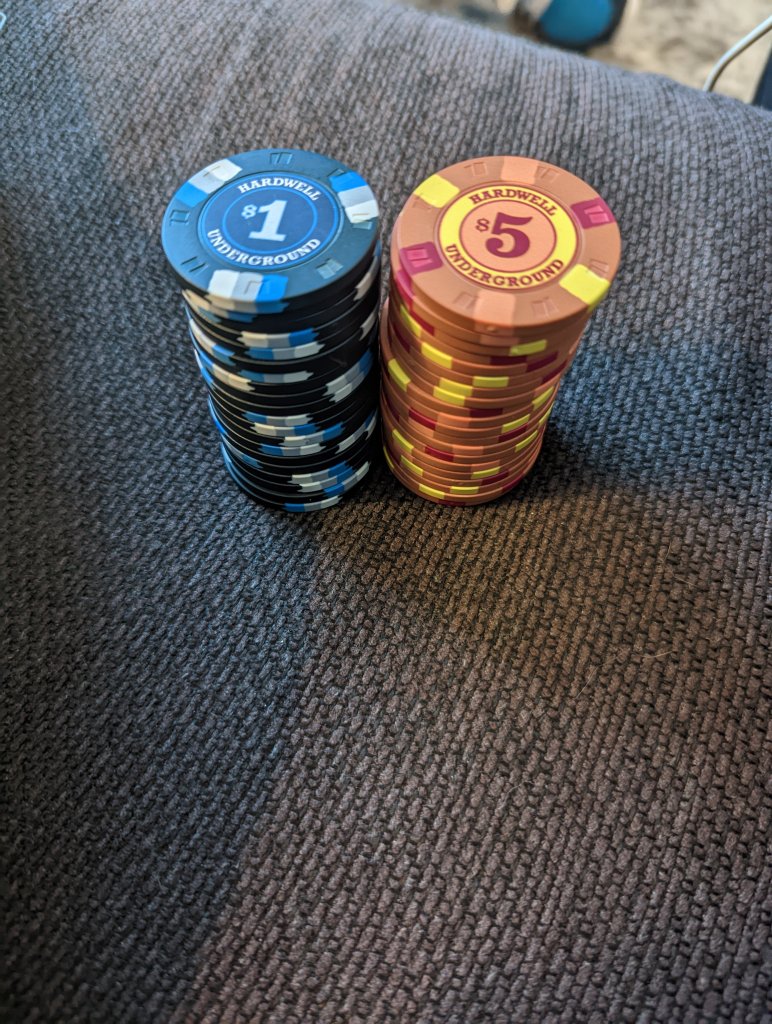
I'm not a big fan of blue $1's, although I like them about 1000X better than yellow $5's, lol! I have seen the pic's of the Hardwell Underground chips. That was a design I wanted to draw inspiration from early on. Nice and clean, and simple! I went ahead and made the $1 match the blue edge spot.

Some of the older members will know more but this is the most succinct summary that I've been able to find:Bosco (not sure on username, nothing comes up when i @bosco)
https://www.pokerchipforum.com/thre...n-gb-tina-or-whoever-order.93996/post-1945534
ngmcs8203
Flush
Wow $.30/chip!Some of the older members will know more but this is the most succinct summary that I've been able to find:
https://www.pokerchipforum.com/thre...n-gb-tina-or-whoever-order.93996/post-1945534
I paid $0.30 for RHCs back in the day... should have grabbed something nicer, but I didn't know any better.Wow $.30/chip!
Personally, I think this lineup would look better without the colour-matched denominations. Just keep them all black. Like where you’ve ended up with the chip design - would definitely try a pink quarter out.Well, I think this might be it! Words cannot express how ecstatic I am with the help and tips you guys have given me. I was happy with my original design, but with your help, it has been cranked up to an 11! Special shout out to @Colquhoun for making me an amazing logo, without me even asking! I could probably tinker with this forever, but Tuesday is the cut off for the October group buy, so I have to stop somewhere. I left the denom black on the $1 because of the white inlay. Now I'm wondering if I should make it match one of the edge spots, lol!
View attachment 1203121
BottomPair7
Straight
This turned out amazing! Great looking design. Good luck with the new set!
Watching the progression on this is way cool. Looks great!
Have you considered making the background of each label the same as the base color?
I love the color on that $5. What color is it?@RedDirtBo Maybe a 6 spot for the chip after the $5 keep the pattern going. You can also do three colors. View attachment 1202938
View attachment 1202941
Some of the green can come out a bit dark. Going for a lighter green can help.
SeanGecko
4 of a Kind
"Tina make it a bright yellow please." - SeanI love the color on that $5. What color is it?
that's bright yellow? wow.... looks more 'copper' to me"Tina make it a bright yellow please." - Sean
SeanGecko
4 of a Kind
that's bright yellow? wow.... looks more 'copper' to me
This one?
yes sirView attachment 1255353
This one?
SeanGecko
4 of a Kind
Butterscotch!yes sir
Aha...... that makes sense. Thanks!!Butterscotch!
Café au lait, with a spoonful of raspberry sorbet.
yumCafé au lait, with a spoonful of raspberry sorbet.
Similar threads
- Replies
- 22
- Views
- 882
- Replies
- 32
- Views
- 1K
- Replies
- 15
- Views
- 516
- Replies
- 17
- Views
- 724
