Thoughts on 1st design? (1 Viewer)

Black or white background

  • Black

    Votes: 30 88.2%
  • White

    Votes: 4 11.8%

  • Total voters
    34

Dub_Dinero

Sitting Out
Joined
Sep 12, 2023
Messages
29
Reaction score
28
Location
Texas
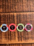
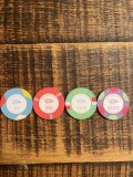
Thoughts on inlay design? It’s my 1st time trying to create something. I quickly learned that I had way too many ideas that it became overwhelming. The design became too busy and this is the simplified version. I made the design in the wife’s cricut design space. Printed out on sticker paper and laminated. Had the cricut cut to the new Greek BTP sample I was able to obtain from @justincarothers. Any feedback is appreciated. The purpose is about the design not really about how it goes with the current chips I’ve over labeled them on. Disregard the 17 and 22 on the close up photo. That was a needed changed to get to save on desktop from design space.
 

Attachments

  • IMG_8897.jpeg
    IMG_8897.jpeg
    281.6 KB · Views: 233
  • IMG_8896.jpeg
    IMG_8896.jpeg
    277.7 KB · Views: 237
  • IMG_8889.png
    IMG_8889.png
    47.9 KB · Views: 244
I prefer the dark label to the light one.

I think the Space City wording needs to come in from the edge a tiny bit.

Are you married to just the Shuttle image or would you consider a different image for each denom? - Shuttle, Satellite, Hubble, ISS maybe. (Just thinking aloud)
 
Great concept! The graphic icon and typefeace are perfect for this.
However, I don't think the curved text at the top is fitting for the theme. It would be better in horizontal, with more "s p a c e". :ROFL: :ROFLMAO:
I also like the idea of pointing the shuttle up.
Space-city.jpg

Not sure if the third one is right. May look like "Spice City". Save for a Dune tribute? ;)

Also, I don't think the Cricut Design Space can do vector output, which you'll need for the printing. If you need any help converting the art to vector, I can help.
 
Last edited:
Great concept! The graphic icon and typefeace are perfect for this.
However, I don't think the curved text at the top is fitting for the theme. It would be better in horizontal, with more "s p a c e". :ROFL: :ROFLMAO:
I also like the idea of pointing the shuttle up.
View attachment 1218273
Not sure if the third one is right. May look like "Spice City". Save for a Dune tribute? ;)

Also, I don't think the Cricut Design Space can do vector output, which you'll need for the printing. If you need any help converting the art to vector, I can help.
I like the middle one with the word spacing of the one on the left
 
Holy fuck I have never seen this community agree on something! Black all the way and it is a nice looking inlay!
 
I was gonna suggest stars on the black field or maybe craters on the white
This was the background on the initial design, but again with so many thoughts it had become too busy. I think I tried to do a 180 and really simply it and it got lost somewhere. Might be worth revisiting.
 

Attachments

  • IMG_8898.jpeg
    IMG_8898.jpeg
    162.6 KB · Views: 37
I prefer the dark label to the light one.

I think the Space City wording needs to come in from the edge a tiny bit.

Are you married to just the Shuttle image or would you consider a different image for each denom? - Shuttle, Satellite, Hubble, ISS maybe. (Just thinking aloud)
At the beginning the shuttle was the 1st thing I found so I ran with it. I did have different accents around the shuttle per denomination like shooting star, orbits, ect. but again I felt too busy and tried to simplify. I also had reservations on the complexity of the design and the actual output. Thank you for your feedback. I think now that I’m pretty sure I won’t have this in time by the November run I’ll revisit that aspect.
 
Great concept! The graphic icon and typefeace are perfect for this.
However, I don't think the curved text at the top is fitting for the theme. It would be better in horizontal, with more "s p a c e". :ROFL: :ROFLMAO:
I also like the idea of pointing the shuttle up.
View attachment 1218273
Not sure if the third one is right. May look like "Spice City". Save for a Dune tribute? ;)

Also, I don't think the Cricut Design Space can do vector output, which you'll need for the printing. If you need any help converting the art to vector, I can help.
WOW! It’s like the same, but different. 100x’s better than what I’ve come up with. Having a hard time deciding on which one I like the most. Those are all great. Thank you
 
The black label with the matching color font is the bee's knees. Also, I prefer the spaceship pointing up, but to each their own.
 
Holy fuck I have never seen this community agree on something! Black all the way and it is a nice looking inlay!

ovt1fs2.png


OQ1TVRD.jpg


Space City - great theme :cool


(For the purposes of general discussion around the theme and not to hijack)
I'd be very tempted to do something related to Space if I went for a second theme, maybe for a dedicated cash set, as you could do a really cool cloth - either Milky Way or Solar System based. Lots of opportunity to be creative, and unique, there.

For chips I'd probably go for a different icon on each chip - picking key moments in our journey so far - so for 4/5 denoms maybe Sputnik, Man on the Moon, Hubble, ISS & Ingenuity (1st flight on another Planet)?. Chip progression of another form.


Looking forward to seeing Space City built.
 
Just make sure any lines/text are thick enough so bleed doesn't obscure them.
This is an important point. The OP said they were planning on the Greek mold chips, which have a label that prints very closely to the intended art.
However, if the choice changes to a standard, dye-sublimated ceramic, the black background could make that art problematic.
 

Create an account or login to comment

You must be a member in order to leave a comment

Create account

Create an account and join our community. It's easy!

Log in

Already have an account? Log in here.

Back
Top Bottom