First design (3 Viewers)

RedDirtBo

Pair
Supporter
Joined
May 30, 2023
Messages
186
Reaction score
357
Location
Oklahoma
I've been toying with a design for a while, but never got too serious about it because I didn't think I had the artistic ability to create an inlay by myself, and I had no clue on how to create the line for the edge spots. I had seen the Aces set by Bosco (not sure on username, nothing comes up when i @bosco), and really liked the simplicity of it.

Today, I found out that design was free to use and the template could be downloaded. It was pretty easy to do, once I figured out how to do anything in Inkscape. After I was finished, I signed up for a free trial of Adobe Illustrator so that I could convert my .svg to an .ai, and convert from RGB to CMYK.

I'm posting this mainly to get some better/fresher eyes on it and see if anything looks off center, or askew. So let me know what you think! Anything obvious that I'm missing, that you folks that have done this before notice? Thanks!
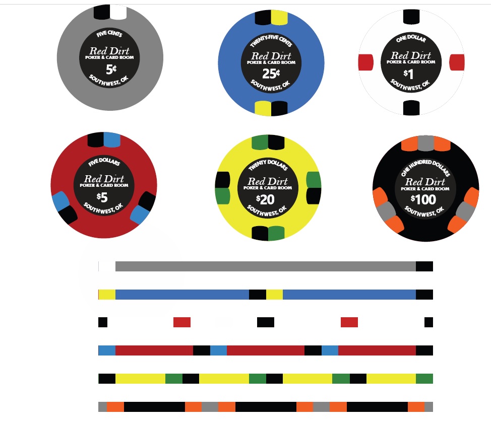
RedDirt Chips2.jpg
 
Last edited:
I like simple inlays too! A few thoughts:
  • There's a lot of black in this set. Have you tried some more colors?
  • The text is very tight. Try increasing the tracking.
  • There's some room for a little more visual interest. Try making "Red Dirt" look more like a logo.
Some simple inlay inspo:

Screen Shot 2023-09-27 at 4.51.15 PM.png
 
Thanks for the input! I wasn't super happy with the font I used for "Red Dirt". I was looking for something a bit fancier. Just did this before work this morning. Trying out a white inlay.

View attachment 1202400
Green. You need some green. That red dirt out there really pops against some green grass, slightly yellow at the edges.
 
Great looking set.

It's nitpicking, but I would probably eliminate the written denom at the top, move the 'Red Dirt Poker Room' up, and make the numerical denom larger.
I would eliminate the denom font as well and maybe put poker and card room up there.

But poker and card is also a bit redundant.

I went w a simple design myself. I like it nonetheless even if u stuck w it!

Try to go with a more fun denom font style. Such as the golden nugget or resorts world. Etc.
 
Love the new inlay. I prefer $25 chips to $20 chips. If you want to keep the yellow, maybe make the 5 cents yellow instead of gray.
 
Also, the cent symbol is too close to the five.
Yeah, I caught that. Noticed it on the quarter, too. They might still be a little too close. Went with the $25, and decided that was too many yellow edge spots, so went to white on the $5.

RedDirtChips.jpg


Also, what about putting “red” in a big, crisp, bold font, and “dirt” in a font like this?
Not sure I have the talent to do a font like that!

And now I see that the $ is too far away on the $25!
 
I'm from Oklahoma, and was a touring "Red Dirt" singer songwriter a long time ago. That term means something. It refers to something earthy.

Have you thought about tapping into something earthy, unique to Oklahoma, rather than just making it pretty?

Not a knock on anything you've done. Just the first thing that came to mind.
 
One of my early ideas was an inlay like the Rounders bear, but with a bison, and maybe a mesquite tree in the background. I don't have near the artistic ability to pull something like that off though.
 
One of my early ideas was an inlay like the Rounders bear, but with a bison, and maybe a mesquite tree in the background. I don't have near the artistic ability to pull something like that off though.
You could hire someone on Fiverr to do the drawing.
 
Latest iterations a vast improvement from the first one. White inlay is the way to go, though personally I feel like the design is a bit unbalanced/dominated by the denomination now.

I echo earlier feedback that there's too many denoms with black edge spots for my liking.
 
I had an idea and ran with it...no offense meant. I love the idea to go with a logo style for the Red Dirt, and this is what came to mind, in a couple different graphics:
red-dirt.jpg


I don't think you need the denom written above, I think it takes away from the art. Matching the color of the numbers to the base color of the chip is something I generally like to see, it gives a sense of continuity.
 
Last edited:
I had an idea and ran with it...no offense meant. I love the idea to go with a logo style for the Red Dirt, and this is what came to mind, in a couple different graphics:

Wow, those look great! I really like the one with the shovel. I started using "Red Dirt" because my metal detecting "group" (there are 3 of us) is called Red Dirt Archaeology. I had considered making the denoms the same color as the base chips, I like the idea of it.

I've been tweaking the edge spots still, I decided that I also had too many yellow. Or basically the quarter and $25 both had yellow and black. Here's where I am currently. I'm not sure if the dark blue on the quarter is any better than black, though.

Also, that looks MUCH better with the card mold overlay!

RedDirtChips2.jpg
 
Last edited:
Some feedback

I like the idea of an more logo version of Red Dirt,
You are using colors more than once for edge spots you don't need to, you have the option to print almost whatever color you want.

I would change the white spot on the 25c to light pink and the black spots on 1$ to purple.

Going with clay like spots I also like the idea of a mold line around the inlay,
 
@RedDirtBo, do you live in a town called Southwest, OK? If not, I'd leave out the comma. It would tilt me. :)

Other than that, I'm digging the set.
I had assumed it was a town...I agree, if youre talking about the southwest region, I would not only remove the comma, but I would spell out Oklahoma.
 
@RedDirtBo, do you live in a town called Southwest, OK? If not, I'd leave out the comma. It would tilt me. :)

Other than that, I'm digging the set.
Good catch, thanks! If I spell out Oklahoma, I think I should abbreviate southwest, or it would be too busy. I'm thinking purple edge spot is better on the 25c, and am looking at light blue on the $1. I'll work on the positioning of the letters tonight. Just did this quick.

25-1.jpg
 
Wow, those look great! I really like the one with the shovel. I started using "Red Dirt" because my metal detecting "group" (there are 3 of us) is called Red Dirt Archaeology. I had considered making the denoms the same color as the base chips, I like the idea of it.

I've been tweaking the edge spots still, I decided that I also had too many yellow. Or basically the quarter and $25 both had yellow and black. Here's where I am currently. I'm not sure if the dark blue on the quarter is any better than black, though.

Also, that looks MUCH better with the card mold overlay!

View attachment 1202847
If you play micro stakes a $20 is better. I use the nickel and we use $20 a lot more. Also then you can have 25 for tournaments and $20 for cash games.

Always going to promote big chip or plaques for the big chips $20 & $100.
 
Good catch, thanks! If I spell out Oklahoma, I think I should abbreviate southwest, or it would be too busy. I'm thinking purple edge spot is better on the 25c, and am looking at light blue on the $1. I'll work on the positioning of the letters tonight. Just did this quick.

View attachment 1202928
@BBQlegend has the Northern Oklahoma Poker League.
You guys should do a meetup/shootout for Oklahoma

Plus they are looking for new chips as well so he’s probably interested in what you come up with.
 

Create an account or login to comment

You must be a member in order to leave a comment

Create account

Create an account and join our community. It's easy!

Log in

Already have an account? Log in here.

Back
Top Bottom