You are using an out of date browser. It may not display this or other websites correctly.
You should upgrade or use an alternative browser.
You should upgrade or use an alternative browser.
First Custom Chip Set - CPC Experience Needed! (2 Viewers)
- Thread starter jackhappy
- Start date
LinkyBabe
Flush
Have you printed your inlays at actual size and held them at arms length to see if they're legible? The white text gets a little washed out on the $100 and $1000. Have you purchased a CPC colour sample? If not then make that the next thing you do as the colours look very different in person.
stevea
Two Pair
I think it looks good! Only thing I see is the spot progression flows good from the 5- 25- then the 100 is different then back to the progression with the 500. Not a big deal though if it’s what you like. It makes me think the 100 is a bigger chip than the 500 a little. Like linky said, get a color sample if you haven't. The colors are a little different in person and the red is kinda dark. The diasq is a great mold btw imo. Good choice! Also is it a tournament set? If so why the $? And no 5,000 chip or bigger? If it’s not tournament set then no $1? I’d also look at posts on completed CPC/custom sets to get an idea of the things you like (although you’ve probably already done that). Gone but not forgotten is a good one. I’ve spent days on there. Good luck and post pics when you’re done!!
Last edited:
@jackhappy I love it so far, though the hundo looks a tad busy. Have you thought about doing this with it instead of 4v12
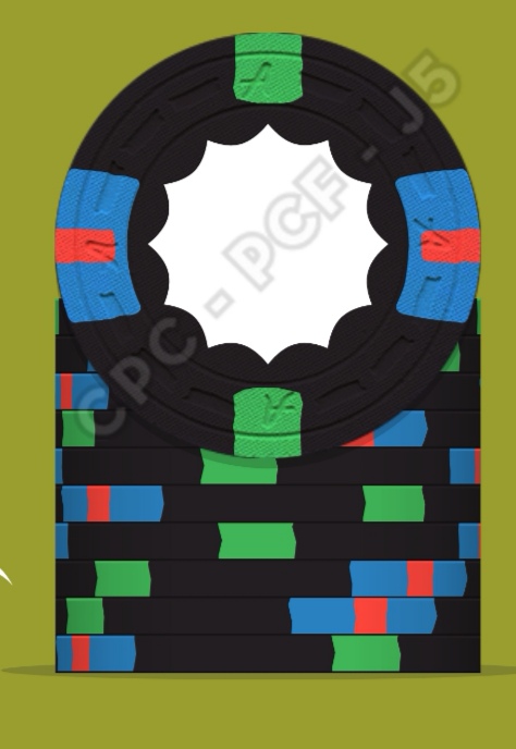
@ruskba did something similar with his $5 and it's bloody awesome
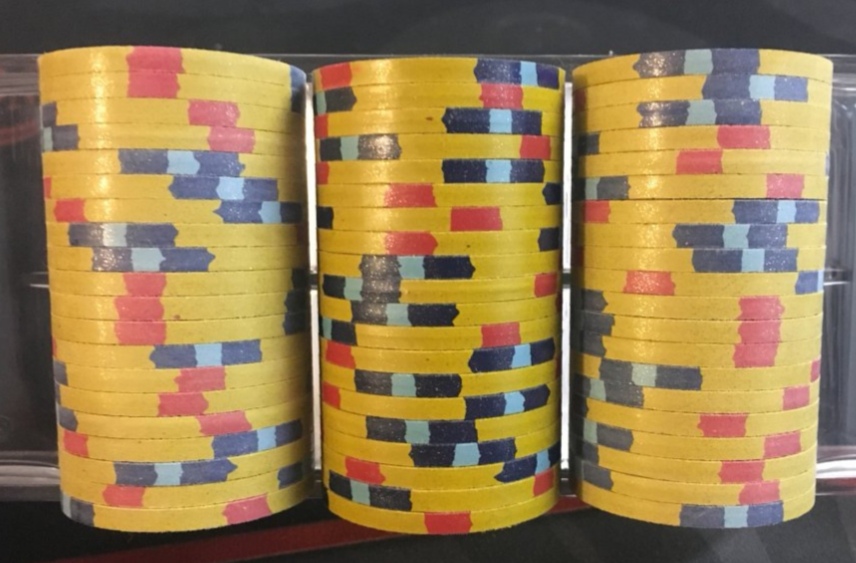
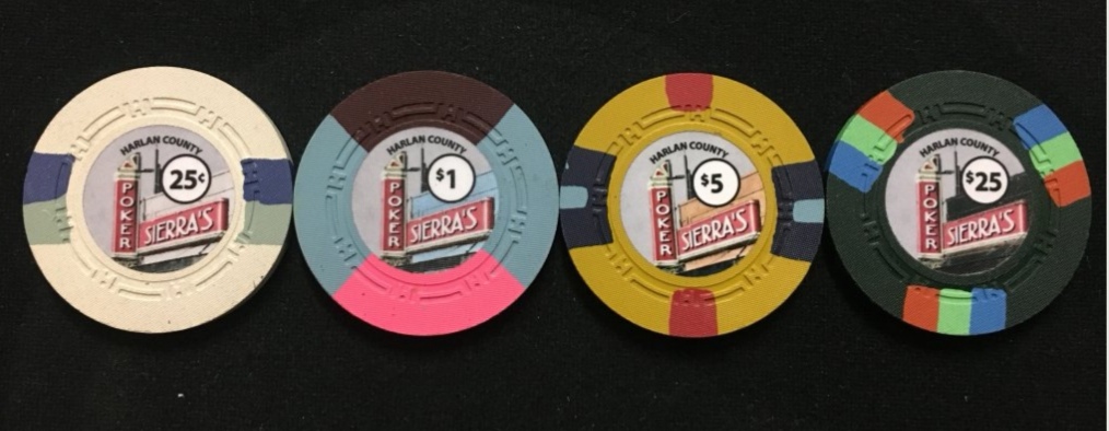
@ruskba did something similar with his $5 and it's bloody awesome
Rhodeman77
Straight Flush
Are you doing real shaped inlays or a circle inlay with a shape design? If it is the latter, make sure your designer is working with CPC so the color matching is as close as possible.
RainmanTrail
Straight Flush
DG Yellow >>>>>>>>>>> Canary unless doing a retro set
Light green >>>> DG Green when using as spots on any of the purples
I highly recommend making these small changes
Light green >>>> DG Green when using as spots on any of the purples
I highly recommend making these small changes
Thanks! I printed it out and I see what you mean about being washed out. I'm in the middle of editing the design, adding a stroke outline to the text/numbers. Will post a new pic after I'm finished with all of the suggested changes.Have you printed your inlays at actual size and held them at arms length to see if they're legible? The white text gets a little washed out on the $100 and $1000. Have you purchased a CPC colour sample? If not then make that the next thing you do as the colours look very different in person.
I just ordered the 38 chip color set, so hopefully that will give me a better idea of the colors and how they match with one another.
You said that the chip base colors are very different in person.... Are the spot colors the same way or are they truer to the color in the images?
I think it looks good! Only thing I see is the spot progression flows good from the 5- 25- then the 100 is different then back to the progression with the 500. Not a big deal though if it’s what you like. It makes me think the 100 is a bigger chip than the 500 a little. Like linky said, get a color sample if you haven't. The colors are a little different in person and the red is kinda dark. The diasq is a great mold btw imo. Good choice! Also is it a tournament set? If so why the $? And no 5,000 chip or bigger? If it’s not tournament set then no $1? I’d also look at posts on completed CPC/custom sets to get an idea of the things you like (although you’ve probably already done that). Gone but not forgotten is a good one. I’ve spent days on there. Good luck and post pics when you’re done!!
Yes, I read a bit about spot progression, but the $500 and $1000s aren't going to see the table that much, so I wanted to make the $100 chip the one with a design pop, and let the $500 and $1000 speak for themselves with the Lavender and Canary colors and a slightly more basic design.
Thanks for the tip on the red color being dark, I went ahead and ordered a color set. Maybe I'll switch to the Mandarin Red or the Retro Red.
This is going to be for a $5/$5 cash game, so $1s won't be needed. I have a $1/$1 game too, but it runs a lot more often and I'd rather not put the extra wear and tear on the chips. I'm trying to make the $5/$5 game an elevated experience, and I want the chips to be as nice as possible for as long as possible.
Can you clarify this part a little bit? I'm not sure I can find what you're referring to here: "Gone but not forgotten is a good one."
Thanks!
Thanks, I like that idea... Just made the change. Still working on the design, will post it when I'm done with the next iteration.@jackhappy I love it so far, though the hundo looks a tad busy. Have you thought about doing this with it instead of 4v12
I'm going to do real shaped inlays, but I do want the center color of the scooter to match the chip base color. Can this be done with reasonable certainty?Are you doing real shaped inlays or a circle inlay with a shape design? If it is the latter, make sure your designer is working with CPC so the color matching is as close as possible.
DG Yellow >>>>>>>>>>> Canary unless doing a retro set
Light green >>>> DG Green when using as spots on any of the purples
I highly recommend making these small changes
Couple of questions on this...
If I use DG Yellow as a base chip color instead of Canary, then it will be the only "Unweighted" color. How severe is the difference between weighted and unweighted chips?
I like the extra little neon pop that the DG Green has over the Light Green. Can you explain a little more why Light Green is the better choice?
Thanks!
Some additional questions:
1. Shaped Inlays: Are they always cut the way they appear in the artwork design? Or is it possible that they could rotate and be out of balance with the artwork design?
2. Inlay & Spot Positioning: Are the inlays always in the same position relative to the spots? Certain shaped inlays look good with certain spot patterns, but they will look odd if the inlay is rotated and they aren't aligned as in the artwork design. I have a feeling I know the answer to this one, but I'm holding out hope...
Another Question:
The Diamond Square mold has a textured finish. From some of the pictures that I've seen, it looks like that textured finish is over the entire face of the chip, including the inlay. Is that correct?
The Diamond Square mold has a textured finish. From some of the pictures that I've seen, it looks like that textured finish is over the entire face of the chip, including the inlay. Is that correct?
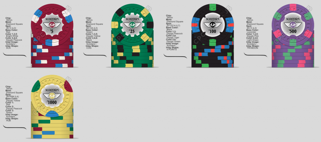
Here's an alternate version, I was trying to have a consistent inlay background gradient that would work for all chips. I don't like it on the Yellow chip though. Still not sold on how to approach the inlay background in terms of consistency, but I like using black the best so far.
stevea
Two Pair
Rhodeman77
Straight Flush
Some additional questions:
1. Shaped Inlays: Are they always cut the way they appear in the artwork design? Or is it possible that they could rotate and be out of balance with the artwork design?
2. Inlay & Spot Positioning: Are the inlays always in the same position relative to the spots? Certain shaped inlays look good with certain spot patterns, but they will look odd if the inlay is rotated and they aren't aligned as in the artwork design. I have a feeling I know the answer to this one, but I'm holding out hope...
Unless you ask otherwise, inlays will be aligned to the edges spots as you submit it.
Color matching the center to the base chip isn’t as crucial to be exact since there is a buffer area of inlay in between.
In the version 2. Having multiple shared colors next to each other is usually not a good idea. The 25 & 100 both having green and black could be trouble.
I was about to post about dirty stacks and I see @Rhodeman77 already noticed it too. I'd probably not put a black spot on that 25.
You've got me in the mockup tool now. I'm an addict and it doesn't take much
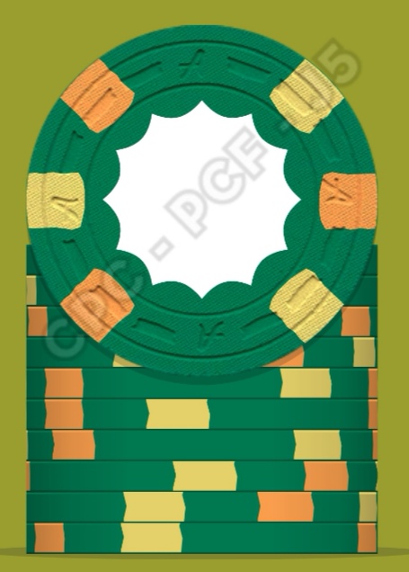
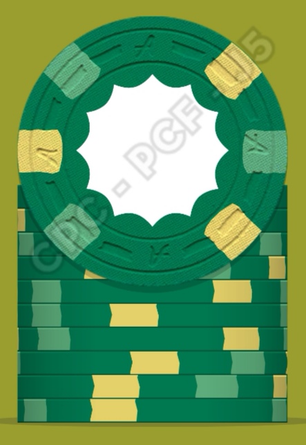
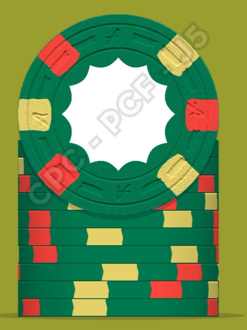
You've got me in the mockup tool now. I'm an addict and it doesn't take much
Last edited:
LinkyBabe
Flush
I didn't specify base vs spot... I just said the colours are different in person meaning all of them.You said that the chip base colors are very different in person.... Are the spot colors the same way or are they truer to the color in the images?
@jackhappy, I like what you got going on so far. Do you have a CPC color sample set?
For these shaped inlays, I do not recommend colour matching the base colour and the inlay gradient. In fact, I do not recommend a gradient at all. Gradients look better on round chips where there is more surface area to cover.
Thanks, I hadn't seen this thread yet.
BCC is gone now right? And ASM was bought by CPC, correct? So CPC is my only option for purchasing?
Does anyone have this mold? I don't see that CPC offers it...
Unless you ask otherwise, inlays will be aligned to the edges spots as you submit it.
Color matching the center to the base chip isn’t as crucial to be exact since there is a buffer area of inlay in between.
In the version 2. Having multiple shared colors next to each other is usually not a good idea. The 25 & 100 both having green and black could be trouble.
Thanks! I honestly didn't expect the inlays to line up with the spots exactly as on the design, so that's pretty cool.
@Rhodeman77 & @Perthmike: As for using the black spots on the $25 chip, I couldn't find another color that I liked... I'm not a fan of using orange/tan on the Green base. Light Gray seemed to be the next best, but I liked the black better. Green was by far the hardest chip to find something that I liked... still working on it.
Yes! I ordered on Friday, hopefully I get it sometime this week =)@jackhappy, I like what you got going on so far. Do you have a CPC color sample set?
Good idea, but I'd like to see an example of a gradient on a shaped inlay first before abandoning the idea. I'll start looking for a picture on here, let me know if you know where one is. Thanks =)For these shaped inlays, I do not recommend colour matching the base colour and the inlay gradient. In fact, I do not recommend a gradient at all. Gradients look better on round chips where there is more surface area to cover.
Last edited:
The chip design tool lets you pick from the same color pallette for base chip color and for spot colors. Do the spot colors match the chip base colors in real life? In other words, when I get these base chip colors, can I assume that a spot of that color will look exactly the same?
The chip design tool lets you pick from the same color pallette for base chip color and for spot colors. Do the spot colors match the chip base colors in real life? In other words, when I get these base chip colors, can I assume that a spot of that color will look exactly the same?
Yes, the same colours used for the base are also available for the spots. I would recommend ordering a colour sample from CPC so you can see the colours in your hand rather than on a screen, because they can look very different.
@jackhappy, The Blind Pig is a BCC mold.
This is going to be for a $5/$5 cash game, so $1s won't be needed. I have a $1/$1 game too, but it runs a lot more often and I'd rather not put the extra wear and tear on the chips. I'm trying to make the $5/$5 game an elevated experience, and I want the chips to be as nice as possible for as long as possible.
Wait? You host a 1/1 game more often and dont want these chips to get used too much? Wear and tear? Man.. order a set that covers your 1/1 game AND your 5/5 game.. let the set see use, lots of use. You won’t host enough to wear these chips out. CPC chips are often a tad more durable than Paulson chips (for wear), and Paulson chips take years to show significant wear, being used 24/7 365 days a year.
stevea
Two Pair
Yeah the link was just for ideas on colors and spot patterns really. Some of those molds are gone as far as I know.
let the set see use, lots of use. You won’t host enough to wear these chips out.
+500
A set unused, is a useless set. I ALWAYS look forward to my CPC's hitting the table. This can't happen often enough IMO.
@jackhappy, The Blind Pig is a BCC mold.
So just to confirm, CPC is the only company available right now for custom clay chips. Correct?
I did see a couple of pictures in there of gradients, and I didn't like them that much. My biggest fear is getting the chips and the color I chose in the design doesn't match the base chip color. Wavering on whether to do that or not.Yeah the link was just for ideas on colors and spot patterns really. Some of those molds are gone as far as I know.
Has anyone ever requested to have a sample inlay mailed to them for visual approval before the chips are made?
I had no idea that they would be so durable... Yes, it makes sense to get some $1s then I guess.Wait? You host a 1/1 game more often and dont want these chips to get used too much? Wear and tear? Man.. order a set that covers your 1/1 game AND your 5/5 game.. let the set see use, lots of use. You won’t host enough to wear these chips out. CPC chips are often a tad more durable than Paulson chips (for wear), and Paulson chips take years to show significant wear, being used 24/7 365 days a year.
I saw a picture of white based chip with chocolate spots and over time the chocolate spots had "rubbed" off onto the white, making it look dirty. Is this common?
LinkyBabe
Flush
Unless you are willing to spend an exorbitant amount of money for this service the answer is CPC will not do this. They will send you a scanned image but that's about it... not very helpful as looking at the image on your screen in RGB differs from printed materials in CMYK. Even if you print the image, your ink and paper differs from CPC's. The other thing you need to consider is that the colours in your inlay will darken once they are heat pressed into the chip, so precise colour matching with CPC is very difficult.I did see a couple of pictures in there of gradients, and I didn't like them that much. My biggest fear is getting the chips and the color I chose in the design doesn't match the base chip color. Wavering on whether to do that or not.
Has anyone ever requested to have a sample inlay mailed to them for visual approval before the chips are made?
Last edited:
Similar threads
- Replies
- 15
- Views
- 347
- Replies
- 46
- Views
- 2K
- Replies
- 8
- Views
- 625
