Feedback on custom CSQ cash set "The Paradox" (1 Viewer)

paraDoxl

Sitting Out
Joined
Aug 6, 2023
Messages
36
Reaction score
27
Location
Graz, Austria
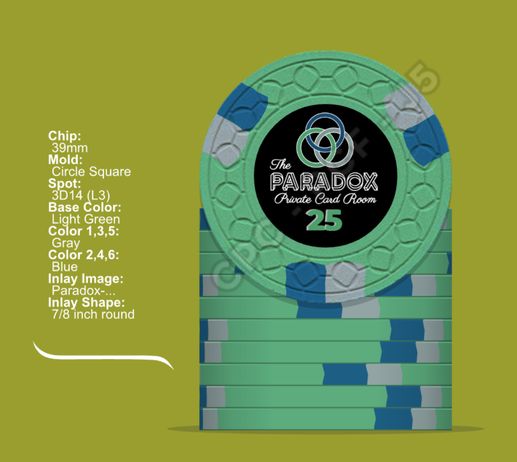
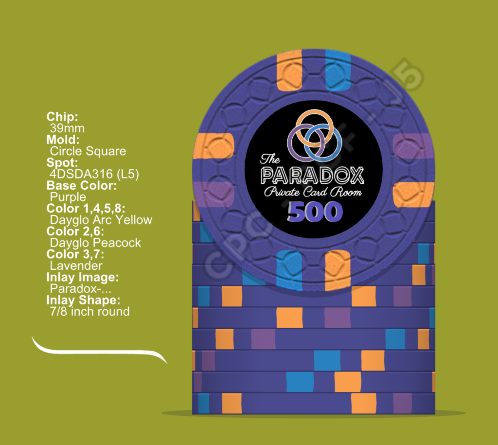
Hi everybody, I've recently just finished what I would consider version "1.0" of my hopefully soon-to-be first custom set from CPC:

TheParadoxChipset.png


First of all thanks to everybody here on PCF for contributing to this awesome community, I've gotten a lot of inspiration and knowledge from many posts and threads.

I'm quite happy with how the designs have turned out, however, there are some details and ideas where I'd like to have some feedback and opinions. Also, I'd like to avoid potential gotchas (and yes I did get samples from CPC ;) )

What I'm happy about:
  • Theme: I like paradoxes :) (especially in the works of Escher and works related to Eschers, like the Penrose Triangle used here)
  • CSQ mold: Great fit for the theme, also enjoyed the feel of it, moderate cost compared to other molds
What I think I'm happy about (but I might not have thought of everything)
  • Chip values: Typically, I host microstakes cash games with .05/.10 blinds, so all the chip values whould be interpreted in (Euro) cents. We're still a quite unexperienced and young group, so I can imagine that we would like to raise the stakes at some point in the future, that's why there's a 500 denom included.
  • Chip count and budget: I think I'll go 5 - 100 or 120; 25: 140, 100: 160, 500: 100 or 120 which will get me around 1.5k net. This is a budget I am willing to spend and in my current experience, this seems sufficient.
  • Similarity of logo and edge spot colors, especially in the 5
  • Coloring in general (somewhat "standard" colors for each denomination) and edge spot colors
What I'm unsure about
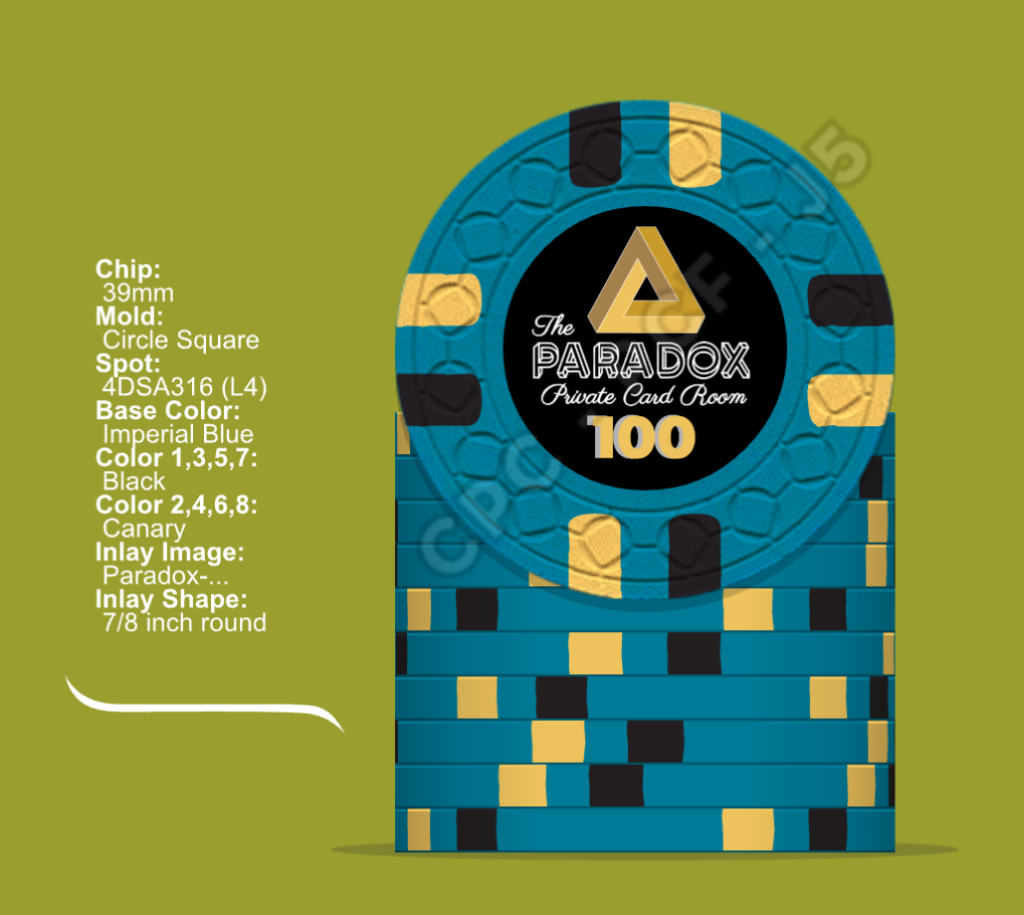
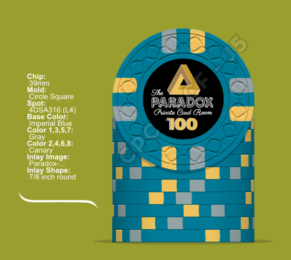
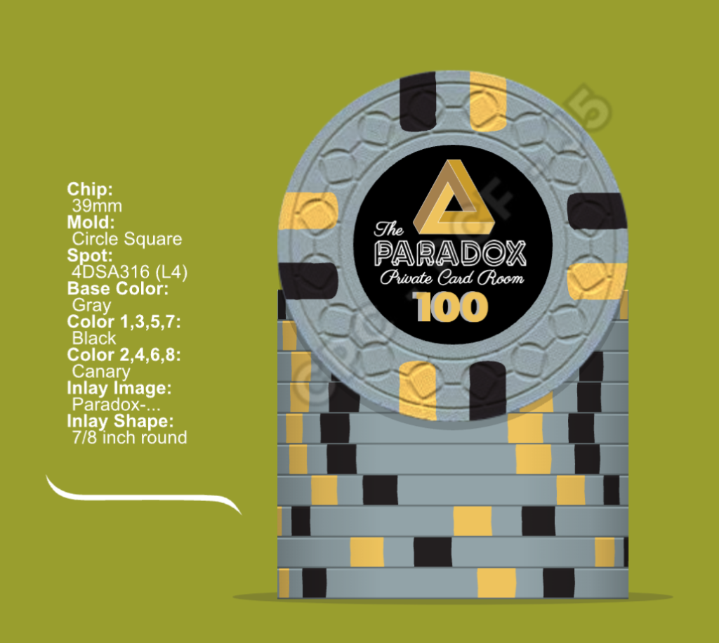
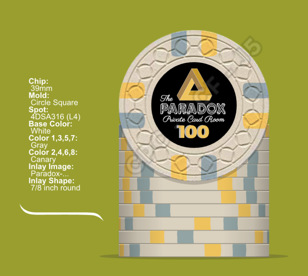
  • Coloring on the 500. I find the idea of going for blurple as body color on this chip really intriguing. However, I'm unsure if there might be too little contrast to the 100 if the light is low. So the options I see are basically: 1) Taking the safe option and going for 500 purple and 100 black; 2) Going for the 500 blurple chip and switching the 100 to a grey, white or even imperial blue body, with the cost of losing the more standard black for the 100; 3) Ordering a complete color sample set from CPC for the small chance that black 100s and blurple 500s work well together, then more probably resort to 1) or 2). Any opinions here?
100alt4.png
100alt3.png
100alt.png
100alt2.png

  • Diversity of the inlays/logos: While like the penrose triangle very much, I have the feeling a bit more diversity might be nice. I've created alternate inlays for the 25 and the 500 using the borromean rings (see below), but I'm not really sure I like them over the triangle. There are also some other impossible figures that I might use, however, if I were to have four different figures, I'd probably be unsure about the appropriate match for each denom. So any idea or inspiration is quite welcome here.
25alt.png
500alt.png


I'm also happy about any further feedback or opinions, so feel free to go ahead ;)
 
What I like:

- Your theme and how you've implemented it so far, esp. the penrose triangle.
- CSQ selection fits well.
- Looks like your bank is pretty extensive.

What I recommend:

- Definitely order the color sample.
- There's room for some geometric, maybe Escheresque, texture for the inlay.
- If you're going with different logos, have a different one per chip.
- It's worth considering a barrel of 1000 or 2000 for a little additional bank capacity.
- Consider changing the spot pattern of 100 or 500, since all your other ones are different.

The color scheme is always the hardest for me to make recommendations for. I'll think a bit more and see if there's anything specific that comes to mind.
 
Wow, thanks for the lightning fast feedback and especially the idea with the additional inlay texture :tup:

Do you have, by any chance, an example of a nicely designed inlay texture in mind? Pretty anything would do, just would like to get some inspiration on that.
 
I have tried a white inlay background, during earlier stages of the design:

bright100.png


Really just didn't feel it with white background on black chip.

Of course, I hadn't added colors to the logo then, so it might be worth a try...
 
Wow, thanks for the lightning fast feedback and especially the idea with the additional inlay texture :tup:

Do you have, by any chance, an example of a nicely designed inlay texture in mind? Pretty anything would do, just would like to get some inspiration on that.
@improviseallday Just realized I've had a thread with the "Arizona Club" set open. What a coincidence: There is a lizard tessellation by Escher used as background texture :wow: So I've gotten at least one source of inspiration ^^
 
@improviseallday Just realized I've had a thread with the "Arizona Club" set open. What a coincidence: There is a lizard tessellation by Escher used as background texture :wow: So I've gotten at least one source of inspiration ^^
Posting inline for those following along (from @toad94 's post):

1691541960092.png


This is a great one. A bonus that the full color lizard fits neatly into the background tessellation. I think this is the right approach- a very light background.

Do you have, by any chance, an example of a nicely designed inlay texture in mind? Pretty anything would do, just would like to get some inspiration on that.

Ultimately I think I will go with a less abstract approach, but I had some waves for my beach chips originally:

Screen Shot 2023-08-08 at 2.36.20 PM.png


I still want to do a textured inlay at some point.
 
Blurple is probably my favourite base colour. I don’t think it clashes with black as long as your edge spots are different. I think that yours are too similar so I can see you having dirty stack issues.

My suggestion would be to change one of the denom’s edge spots or go with a different base colour.

I’ve got both blurple and black in one of my CPC sets and they don’t clash because the edge spots are so different.

IMG_8083.jpeg
IMG_8084.jpeg
 
My 2 on denoms. Having lived the hassle of conversion, my advice: make the 5 a 5¢, you’ll thank me later when there’s less confusion and you aren’t making errors when cashing out.

If you get 5¢ through €5, it may be a while before you need to buy a €20. You really have to step it up before you need a €20/25. SteveEH has a great 25¢-$5 set- no $20 needed. Sure, inflation… but you can always add on. Or just build a set that covers a 50¢/€1 game now, buy some €20s, skip the €100s (if you’re playing big stack €1/€2 regularly, you’ll be able to afford a new set). It may cost a few more dollars, but you’ll be set for a verrrrry long time unless there’s runaway inflation, in which case we’ll all be adding on.
 
I have tried a white inlay background, during earlier stages of the design:

View attachment 1177125

Really just didn't feel it with white background on black chip.

Of course, I hadn't added colors to the logo then, so it might be worth a try...
What if you added a white ring around the inlay? (There are some minor issues with that, but curious if that gives a good pop.)
 
my initial thoughts:

1) i would avoid using gray spots on 2 chips in a row. since the 100 is pretty awesome as is and gray can look washed out against light green, i would swap out the gray on the 25 for white or bright white.
2) lavender on purple doesn't have enough contrast IMO. DG pink maybe?
 
My 2 on denoms. Having lived the hassle of conversion, my advice: make the 5 a 5¢, you’ll thank me later when there’s less confusion and you aren’t making errors when cashing out.

I initially thought the same... but then the "500" has to be "500¢" or "€5". 500 cents is just awkward, 5 euros doesn't match the chip color. Might be worth it just for the aesthetics.
 
I initially thought the same... but then the "500" has to be "500¢" or "€5". 500 cents is just awkward, 5 euros doesn't match the chip color. Might be worth it just for the aesthetics.
Correct- 5¢ and €5.

Looking at Austrian chips, it doesn’t seem like there’s much of a standard or a huge poker influence, so I think OP can go with any colors they want.
 
I love the blurple $1 @BonScot made, and there's a blurple 212 DG pink light blue frac I really like from @krafticus too.

For more contrast have you considered charcoal for the 100 or lavender for the 500?
 
Posting inline for those following along (from @toad94 's post):

View attachment 1177132

This is a great one. A bonus that the full color lizard fits neatly into the background tessellation. I think this is the right approach- a very light background.


Ultimately I think I will go with a less abstract approach, but I had some waves for my beach chips originally:

View attachment 1177133

I still want to do a textured inlay at some point.
Thx for inlining and the example, I sure will toy around with some texture options in the following weeks. I think I'll spend quite some time on this one ^^
 
Blurple is probably my favourite base colour. I don’t think it clashes with black as long as your edge spots are different. I think that yours are too similar so I can see you having dirty stack issues.

My suggestion would be to change one of the denom’s edge spots or go with a different base colour.

I’ve got both blurple and black in one of my CPC sets and they don’t clash because the edge spots are so different.

View attachment 1177240View attachment 1177241
Yeah, I'm pretty sure I've stumbled across that beautiful blurples when doing research for the current design. Very nice job :tup:
 
Thank you for all the feedback and input, I'll have a thing or two to think and work upon.
What if you added a white ring around the inlay? (There are some minor issues with that, but curious if that gives a good pop.)
I might just as well give it a try - I liked the inlays on the Club 72 set by @SteveEH. I'll see how that turns out
 
I love the blurple $1 @BonScot made, and there's a blurple 212 DG pink light blue frac I really like from @krafticus too.

For more contrast have you considered charcoal for the 100 or lavender for the 500?
Unfortunately, I couldn't find the blurble chip from @krafticus - could I be missing something?

I've considered lavender, but the Atlantic club 500 sample from CPC wasn't really to my taste, so no lavender for my chip bodies... I might look a little more into charcoal, but I fear it will just feel way worse than the black 100 :( - maybe better to change completely and go with grey/white/blue bodies
 
my initial thoughts:

1) i would avoid using gray spots on 2 chips in a row. since the 100 is pretty awesome as is and gray can look washed out against light green, i would swap out the gray on the 25 for white or bright white.
2) lavender on purple doesn't have enough contrast IMO. DG pink maybe?
1) That's nice input there, thx
2) I fear DG pink is a bit too bright for my liking
 
Regarding denoms: Don't know where it comes from, but it seems I have an aversion to currencies on chips ¯\_(ツ)_/¯ Maybe because I feel like I'm more flexible if there are no currencies included :unsure: Also, it kind of feels nice to play for "greater" amounts - even if its just a placebo ^^ And with the games I've hosted and have been invited to (all in the microstakes range), conversions or cashing out never have been an issue.

I haven't thought of inflation though, and since I have the "vision" (don't know what else to call it) that someday I'll pass the set to one of my three kids as an heirloom, getting a barrel of 2000s doesn't seem that far fetched... Would require some more thinking and designing though... Well, "Der Weg ist das Ziel" or so they say :) (I might one day design a set with that theme ^^)

Anyway, thanks for all the input @all, seems I have some more time to spend - probably will take me a few months to find the time and make progress towards a V2.0. If there is some more feedback in the meantime, I'm always happy about new perspectives :)
 
Hi,

My 2 cents…

Love the name. Really. The Paradox sounds really nice, like a real place that sparks mysterious and wild stories. Congrats!

I do not like black chips, so I may be biased, but I think your second Imperial Blue 100 could be gorgeous. Maybe pimp the grey on the 25 to something a bit more flashy?

I quite like where you are going with your inlay… but I think it is perhaps a bit "cluttered".
I am not so sure about the "paradox" font (Escher Grotesk?) in addition to the triangle plus the script font. Too much imho. I wonder if you could make it two different sides, one with only a symbol (either the triangle or whatever shape) and the name, and the other with the denom' in the paradox font ? I'll try to mockup something tonight to visualize what I mean.
 
I typically prefer a grey or charcoal base 100 chip if a dark-ish purple hue is used for the 500.

Regardless of the colors you end up selecting, if repeating the spot pattern on the 100 and 500, rotate of them 45° (so one chip is a + pattern while the other chip is an x pattern). Doing so will do wonders for distinguishing them visually.
 
I really hope you do not mind @paraDoxl, but I have taken the liberty to continue to play with your idea and your layout.

First one is the same posted this morning, second one is a test with the initial P instead of the generic triangle (that I would keep to make a killer dealer button), and 3+4 are a riff on a retro but modern hot stamp that could be nice imho. I could imagine a whole stamped set, or only for perhaps a non-denom frac'?

You really need to make custom cards with a cool Penrose tessellation pattern as back ;)

Again, I hope I do not overstep, just food for thoughts for a great concept.

paradox-mockup-2.png
 
Hi,

My 2 cents…

Love the name. Really. The Paradox sounds really nice, like a real place that sparks mysterious and wild stories. Congrats!

I do not like black chips, so I may be biased, but I think your second Imperial Blue 100 could be gorgeous. Maybe pimp the grey on the 25 to something a bit more flashy?

I quite like where you are going with your inlay… but I think it is perhaps a bit "cluttered".
I am not so sure about the "paradox" font (Escher Grotesk?) in addition to the triangle plus the script font. Too much imho. I wonder if you could make it two different sides, one with only a symbol (either the triangle or whatever shape) and the name, and the other with the denom' in the paradox font ? I'll try to mockup something tonight to visualize what I mean.
Hi, very glad you like the theme and thanks for the feedback :) You might be right about the cluttered inlay, I think I'd rather try cleaning that up first before giving it a complete overhaul. The penrose triangle might also look ok if made it a little bit smaller and the "Private Card Room" subtitle might not really be necessary. Maybe "The Paradox Club" would also be a fitting title. "You're never really in, you're never really out" is kind of the organization for my first couple of games went, but hey, that's a different story :ROFL: :ROFLMAO:

That Mobius Zero is top notch. Is this an off-the-shelf font?
As @binoclard has already correctly stated, the font I am using is Escher Grotesk and you can download it when giving the creators your mail address.

I really hope you do not mind @paraDoxl, but I have taken the liberty to continue to play with your idea and your layout.

First one is the same posted this morning, second one is a test with the initial P instead of the generic triangle (that I would keep to make a killer dealer button), and 3+4 are a riff on a retro but modern hot stamp that could be nice imho. I could imagine a whole stamped set, or only for perhaps a non-denom frac'?

You really need to make custom cards with a cool Penrose tessellation pattern as back ;)

Again, I hope I do not overstep, just food for thoughts for a great concept.

View attachment 1178272
Wow, thank you for putting in the work, I especially love the idea with the hotstamps. I think I'd prefer having the denom on both sides of the chip to avoid questions. Also thanks for bringing up the idea with the custom cards and the dealer button - I'll have to research where to get those made and if Fournier does custom plastic cards in smaller quantities for the consumer market. Im very fond of the Fournier decks I possess.

No need to be concerned that you might overstep, I'm really happy you build upon the idea :) As long as David will make me a custom set and nobody else is getting rich of the idea (which I both seriously doubt btw.) I don't think overstepping will be an issue here ;)


I typically prefer a grey or charcoal base 100 chip if a dark-ish purple hue is used for the 500.

Regardless of the colors you end up selecting, if repeating the spot pattern on the 100 and 500, rotate of them 45° (so one chip is a + pattern while the other chip is an x pattern). Doing so will do wonders for distinguishing them visually.
Since charcoal has come up the second time now, I did some research and I have to admit, those "Pieces of 8" from the Pillage and Plunder set look really nice. Also, great tip regarding the edge spot rotation :tup:

8f7a6f2c-de9d-43f0-a486-75243d75f0ce-jpeg.627174


Need to be careful when doing an outer ring- can’t be too thin. David will walk you through it, but it helps to design correctly from the start. See this and the following posts:

https://www.pokerchipforum.com/threads/sands-inspired-tribute-set-cpc-small-crown.99606/post-2062798
Man, this place is just so helpful and great, thank you for the tip :) Just for clarification: What do you mean by "can't be too thin"? Because what I took from the quoted email text was kind of "Don't make the circle too thin, or else a slightly off-center cut may lead to it looking weird. (might be the language barrier, not a native speaker to state the obvious ;) )
 
Last edited:
Man, this place is just so helpful and great, thank you for the tip :) Just for clarification: What do you mean by "can't be too thin"? Because what I took from the quoted email text was kind of "Don't make the circle too thin, or else a slightly off-center cut may lead to it looking weird. (might be the language barrier, not a native speaker to state the obvious ;) )
Inlays are hand punched by CPC, so there’s some variation. If you make the ring too thin, and off-center punch could cut the ring. So you need to make them a bit thicker. Looks like your ring is really thin. I can pull up my outer ring design and let you know who thick the ring is and where it starts. You can also ask the others that have done an outer ring, including @chipinla.
 
Ok, so I got that correctly :) Nevertheless, thank you for explaining :tup:

In my design, the denom and the logo are getting very close to the red line in the template, so a circle might look weird in case I don't create some space by making some elements smaller or even removing them
 

Create an account or login to comment

You must be a member in order to leave a comment

Create account

Create an account and join our community. It's easy!

Log in

Already have an account? Log in here.

Back
Top Bottom