Designs Inspired by Santa Monica, California (1 Viewer)

TheOffalo

Full House
Tourney Director
Joined
Sep 26, 2021
Messages
4,350
Reaction score
7,599
Location
Los Angeles, CA
My regular home game is in Santa Monica, so I've been tossing some ideas around, and I'll be posting the results in this thread. Ironically, the first design that I've gotten to a point where I'm ready to post is actually based on a casino in Las Vegas, but the casino's name was based on a gambling ship that ran off the coast of Santa Monica, CA called the S.S. Rex. For more history on both the ship and the Vegas casino that named itself after it, check out this L.A. Times article.
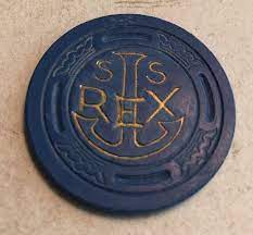
1635118995521.jpeg

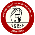
The inspiration for my design came from the above chip. I recreated the anchor and found a font close to what was being used and manipulated the letters to match the original chip design. I added "Club" since that was the name of the casino in Vegas, to distinguish it from the ship.

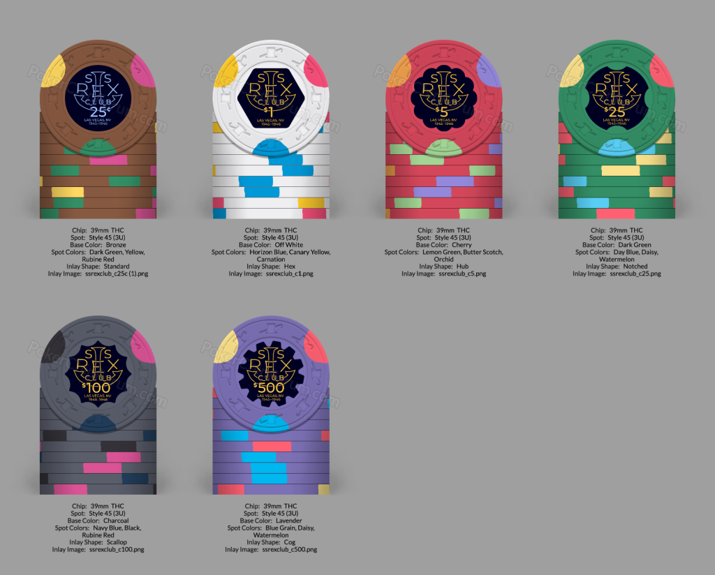
First is the Cali colors version. Are there standard frac colors in California? Was gonna go with brown, but went with melon instead...
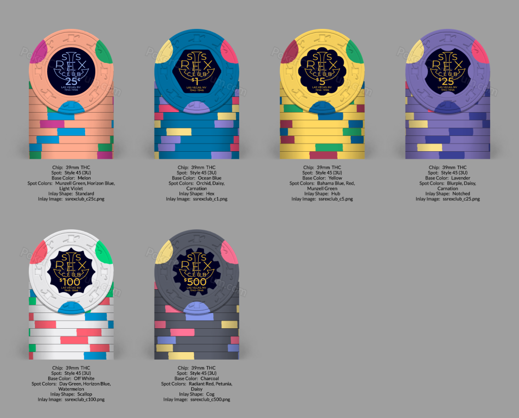
ssrexclubcalicolors.png


Next is the non-Cali colors version:

ssrexclubvegascolors.png


I like the half moons but not sure if I want to use them on all the chips or change them up. Any suggestions?

Preview of tribute designs I'm still tweaking on based on the chips on the ship itself:
ssrexship_t5text.pngssrexship_t5.pngssrexship_t25text.pngssrexship_t25.png

Started with non-Cali colors but may switch them back. I like the original plain look, but I also want to incorporate mention that this was an illegal gambling ship off the coast of California, but I'm not sure how best to do it. The additional text is probably too much, though.

Obligatory WSOP-inspired design below. Took forever (as a non-artist) to create that swoosh with the S...
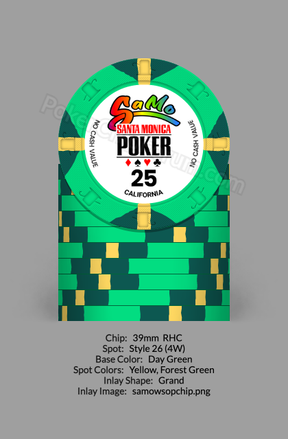
samowsop25.png
 
Last edited:
@RainmanTrail this seems right up your alley if you have a chance for some input.

Edit: My personal input would be to maybe try to incorporate a little more color matching on the inlays. I really love tri moon sets, they look great
 
@RainmanTrail this seems right up your alley if you have a chance for some input.

Edit: My personal input would be to maybe try to incorporate a little more color matching on the inlays. I really love tri moon sets, they look great
Thanks! Like match the background color of the inlays to the chips? I can give that a shot. Wasn't sure yet what the colors were when designing the inlay, but now that I've picked some out I can try to match, or do a darker version of each color to allow the inlay progression to still show.
 
That makes more sense! The bg is actually slightly blue but wanted it close to black, but maybe I'll try switching it to full black and your idea, thanks again!
Sure no problem! I didn't differentiate the dark blue from black at first glance. But the dark background really makes the text pop.
I think I would also pick one color for all the denoms, so they are the same across all the chips. I adore red denominations but it may be hard to incorporate red with the other colors. Perhaps keeping the denoms yellow would help them stand out a bit

I like the yellow denoms because it reminds me of the original hotstamp but may clash when matching the rest of the inlay with the chip color. I agree on red denoms too but yeah would be tough on the black background at the font size with other colors involved.

If you check this thread out @Eriks did some color matching detail on his inlays as well which really made each chip unique imo

Thread 'Carmel Casino CPC customs (with pr0n)' https://www.pokerchipforum.com/threads/carmel-casino-cpc-customs-with-pr0n.75051/

Thanks, will check that out! I did a quick mockup with just the 25¢ and also experimented w/filling in the anchor. Let me know which you prefer:

ssrexclubmatchtest.png


I don't actually mind the denom color matching the rest, but the white will definitely make them pop. I like the idea of filling in the anchor a lot, and if I hadn't added the "Club" into the design then I think that'd really work, but it makes the "Club" too hard to read.

I could take the "Club" out and then I could bump up the size of the denom (and increase the border around it to set it apart from the filled in anchor.

Too many variations to try, but glad I posted to get this feedback. :)
 
I like the filled anchor alot too but agree that it takes away from the text a bit. I also like the white for the denomination. I think the non filled anchor keeps the original style of the font more oldschool though
 
I like the filled anchor alot too but agree that it takes away from the text a bit. I also like the white for the denomination. I think the non filled anchor keeps the original style of the font more oldschool though
Another thing I like about the outline was the nautical knot-like interplay with the letters in "CLUB" (particularly the "L" and the "B" [Edit: I mean the “U”]) though that's much easier to see when zoomed in and editing the design and not that apparent in the mockup.

I'll probably stick with the outline rather than the fill and keep it closer to the original style!
 
Last edited:
Another thing I like about the outline was the nautical knot-like interplay with the letters in "CLUB" (particularly the "L" and the "B") though that's much easier to see when zoomed in and editing the design and not that apparent in the mockup.

I'll probably stick with the outline rather than the fill and keep it closer to the original style!
I agree with that. It's fine details like what you have included that make customs so special, not everyone notices at first glance but incorporating small things like that really make a big picture intricate in a clean way
 
BA4122FB-0295-42BA-92CB-27F149C20785.jpeg
SoCal here. I would take LV off if you’re doing a tribute. Maybe consider making it more Santa Monica. I’m just not a fan of “copying” chips. No right or wrong, just my opinion. Saw this online. Could make for some fun inspiration to make the inlay more unique while still honoring the original concept.
 
@RainmanTrail this seems right up your alley if you have a chance for some input.

Edit: My personal input would be to maybe try to incorporate a little more color matching on the inlays. I really love tri moon sets, they look great
Time for another are those “half circle or tri-moons” debate?
 

Create an account or login to comment

You must be a member in order to leave a comment

Create account

Create an account and join our community. It's easy!

Log in

Already have an account? Log in here.

Back
Top Bottom