Bay Pony Cantina (1 Viewer)

Can't wait to get my new dealer buttons from BRPro. Started working on design for new labels for my Lucky Bee set. Here is a mockup printing on copy paper for the 5. I have a ton of blank labels, so I can relabel for just my time. (The labels are glossy and the printing looks better on the labels.)
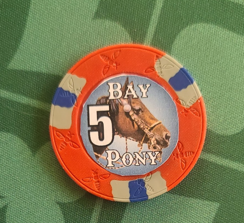
1664993447800.png
 
So the dealer buttons came in (along with a DIA DE LOS MUERTOS I added to the order). I love them.

1665697572729.png


Still working on getting all the Lucky Bees relabeled. Although I think doing so is giving me the bug to do customs even more. I like the feel of the DIA DE LOS MUERTOS from BRPro still seems like a lot of money though.

1665697771408.png
 
So the dealer buttons came in (along with a DIA DE LOS MUERTOS I added to the order). I love them.

View attachment 1005548

Still working on getting all the Lucky Bees relabeled. Although I think doing so is giving me the bug to do customs even more. I like the feel of the DIA DE LOS MUERTOS from BRPro still seems like a lot of money though.

View attachment 1005549
Those turned out great!!
 
So I have most all of the Lucky Bees relabeled, but I keep obsessing over getting some full customs from BRPRO. Here is a mock up of a heads and tails design inspired by the DIA DE LOS MUERTOS. Same horse in both pictures (mine) and that is me dropping a loop on that steer. Need to work out the edge design still. But what do you all think of the direction?

1666147817625.png
 
Ok, I know this is not a CPC horse head mold. That would be nice but just not in the budget for me. Playing with designs is addictive though. Leaning hard to if I do this it will be BrPro. I could use a little feedback on the designs. Not sure what I like best for the green edges. Leaning to the solid green with card suites.
1666461598578.png
 
Ok, I know this is not a CPC horse head mold. That would be nice but just not in the budget for me. Playing with designs is addictive though. Leaning hard to if I do this it will be BrPro. I could use a little feedback on the designs. Not sure what I like best for the green edges. Leaning to the solid green with card suites.
View attachment 1011415

I see the edge spots on the 5 have no suits where the others have suits......what about horse shoes instead of suits? Or add suits to the edge on the 5....
Also your 25 lacks a background image while the other chips have suits or a starburst behind the centre image, would it be more consistent to add these things? The overall design looks great!

Also gives me a good perspective on what lucky bees can look like labeled well.
 
Horse shoes on the edges I like it. That is a good idea I'll play with that some. The 25 had stars but they are subtle, I'll mess with that some too. Trick is to make it be there without overtaking the foreground. On the 5 I thought I'd try out bringing the starburst from the face to the edge. I think the horse shoes is a good idea. Thank you for the feedback.

Mike
 
Philhut, I worked on them some more using your input. The horse shoes brought me back to horses and that made me realize I didn't have my brand in there, so added it to each one. Newest edge designs on top and I like them better than any of the earlier ones. What do you think?

1666551376222.png
 
Philhut, I worked on them some more using your input. The horse shoes brought me back to horses and that made me realize I didn't have my brand in there, so added it to each one. Newest edge designs on top and I like them better than any of the earlier ones. What do you think?

View attachment 1011992
Great updates on the faces. New edge design looks good, now just to finalize the colors. Looking forward to seeing the final product.
 
Thank you phihut. Oh, and a note on how I did the horse shoes. My mare steps on or almost steps on her front track most of the time leaving tracks that look like the ones on the edges. :)
 
Thank you phihut. Oh, and a note on how I did the horse shoes. My mare steps on or almost steps on her front track most of the time leaving tracks that look like the ones on the edges. :)

Interesting, that is a gate pattern you dont see everyday. She must have stepped out of a fair number of shoes travelling like that. Personalized is better, each piece a story.

From what I have read BR Pro may give final advice on colors for best resolution, others could speak with this regarding resolution of the rim fonts to get the best effect. (I have never ordered from them personally other than in group buys but they sound good in reviews and others sets look great).
 
Just a note on the horse head...is there a reason the neck doesn't go all the way to the border you've added? Made sense when it was an element in the middle of the label but on the full custom it seems kinda weird to have that gap. FYI I love the different designs on different sides...especially the hound.
 
Just a note on the horse head...is there a reason the neck doesn't go all the way to the border you've added? Made sense when it was an element in the middle of the label but on the full custom it seems kinda weird to have that gap. FYI I love the different designs on different sides...especially the hound.
That is how it got cropped, I'll have to go back and see if I can crop it a little better.

Hound? Did you mean hundred?
 
Just a note on the horse head...is there a reason the neck doesn't go all the way to the border you've added? Made sense when it was an element in the middle of the label but on the full custom it seems kinda weird to have that gap. FYI I love the different designs on different sides...especially the hound.
Well after I dug into the file again I realized it was mostly just bad placement on the 5 and 25. Does this look better?

1666736705689.png
 
Well after I dug into the file again I realized it was mostly just bad placement on the 5 and 25. Does this look better?

View attachment 1013071
I do think it looks better on the 25 and 5, still see it a bit in the 1 and 100. The other thing I see is negative space at the bottom of the circle in the red and green chips. I'm working on battling this in my designs too. I don't have a perfect solution for that but maybe putting the horse head a bit lower in the chip and increasing the size could help? I would definitely take others' word for it more than me, just trying to help with what I see.
 
Kind of let this project slip away, but picked it up a bit to play with the 25. Which one looks better?

1676078223612.png
 
Love it. As someone who used to convert their chips $1 = 10¢, I would encourage you to NOT do that. Mental math is hard, especially if you’re playing in that awesome cantina.

Unless you seriously up your game, you could play forever and not use the $100s. So could do 25¢/25¢ and go quarters, go with what SteveEH recommended, or go crazy and go 10¢/50¢/$2.50/$10 - which is your $1/$5/$25/$100 divided by 10.
We have been playing that way over a year and it hasn't been a problem. When I put together my Lucky Bees the people I played with we played the full value. That was in town, I am out in the sticks now don't think I could get a game at $1/$2 with a $200 buy in up here. I do hope to at some point get a game at those stakes going again. That and people seem to like having it look like they have $1,000 in front of them even if it is really only $100. :)
 
I decided that it might be good to add a 500 to the set. We play for dimes so 500 is $50 and we actually got one in play last week.

1678568445254.png
 

Create an account or login to comment

You must be a member in order to leave a comment

Create account

Create an account and join our community. It's easy!

Log in

Already have an account? Log in here.

Back
Top Bottom