Bay Pony Cantina (1 Viewer)

On the horse head sides, only the $1 looks right because it goes to the circle...looks clean. The others have the horse head looking severed if you will.

The circle on the horse head $500 disappears on the right side by the suits. I guess your inlay is not centered
 
On the horse head sides, only the $1 looks right because it goes to the circle...looks clean. The others have the horse head looking severed if you will.

The circle on the horse head $500 disappears on the right side by the suits. I guess your inlay is not centered
It is more the arch of the crop on the horse head that is the problem. Maybe I can try making a new bitmap with a better crop but getting rid of the background is a huge pain. :)
 
Any better?
1683421875002.png
 
As I worked on this it occurred to me that I have been trying to get things to fit perfect inside of things. It is easier to get them to fit ok and put a mask over the top. Is this one a move in a good direction?
1683424873173.png
 
Is this gap intentional? The gray line isn’t flush with the darker inner circle?
IMG_5796.jpeg
 
I feel like I’m a glutton for punishment also by continuing to even come back here ha.
You should have someone clean up your editing around the horse.
View attachment 1131249
It took a good amount of editing almost pixel by pixel but I think I have it cleaned up. Then I noticed I had lots of the same on the log jump pic. I added a mask over the inlay to make getting things to the edges easier too.

1683551319056.png
 
Just noticed on the 25 the neck is sticking out from under the mask a little. Fixed it already.
 
Recommendation: build one outer ring group, get it perfect and then copy it to the other chip (changing just the colors in the process).

The spacing between words is off (see yellow circles). And cleaning it up once is easier.

I’d also consider @chipinla’s thought of having Warner Springs CA face up.
IMG_5804.jpeg
 
You just described pretty much exactly what I did. Remember that you are looking at a screen shot not the actual art work.

1683565089501.png
 
Hmmm… shouldn’t look that different…
IMG_5805.jpeg
 
Oh I thought you were talking about the 2 color ring. I thought I had swapped all of the word rings out for the same one too thought. Inkscape sucks at put text on a path. Another thing to dig into.
 
Before:
1683568207622.png


After:
1683568324571.png


What is really fun is sometimes when you cut n past or ungroup things that include text on path it undoes the text on path. I guess you get what you pay for (inkscape).
 
That’s it. While they’re all the same… it still looks a bit wide to my non-paying, non-owning eye.
 
Warma, ok I looked closer at this and now I see what you meant. There were two spaces vs one space between Warner and Springs. I thought you just meant they should all line up. I changed the 5 when I should have really changed everything but the 5.

I figured out I didn't have to ungroup and move things around to edit the text. That helped a lot on fixing it. So they all have one space not two now.

I ordered prototype/samples from BRPro today. It was before I made the change but should give me a good idea if these are going to turn out like I hope or not.


1683673333578.png
 
Excited for you! Sweet service from BRPro. Hope you love ‘em.
 
Did you look at the latest proof? They all have a double ring as a mask over the inlay.
 
Nice. Very nice.

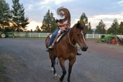
Trying not to threadcrap, but I have a special fondness for bays. Raised this guy from a foal, broke/trained him, and he was the one to help teach my girls to ride when they were young. LOL, he didn't care for my ex, he had a lot of 'horse sense" :p . I was also the one that helped him "cross over" when it was time (he was well into his twenties).


DSC_0080b.jpg
 
I got my prototypes today. Over all they look pretty good. I have some work to do, mostly on the tails sides. Make some of the backgrounds lighter. Maybe tweak a couple of the bitmap images I am using. Take the outline off the words for the most part. Been a long slow process but it is getting close now.

1684184091512.png


1684184144852.png
 
Ok, based on how the prototypes came out I made some tweaks. Included a bunch of pixel by pixel edits on the bitmaps. Do you guys thing these will print on the chips better?


1684194915725.png


1684195092376.png
 

Create an account or login to comment

You must be a member in order to leave a comment

Create account

Create an account and join our community. It's easy!

Log in

Already have an account? Log in here.

Back
Top Bottom