megabit
Pair
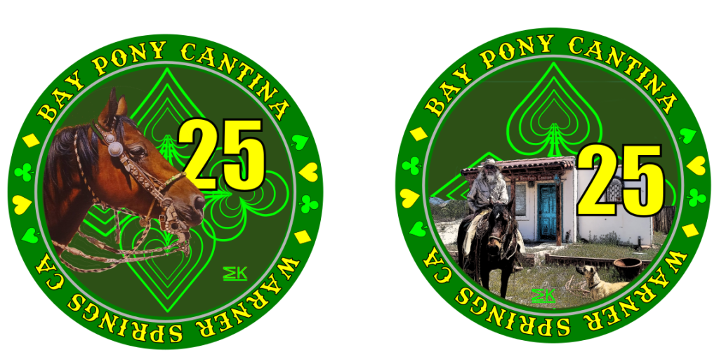
I think I like this one even better:

I was actually thinking black instead of adding yellow to give some contrast thereNope to B. Keep denom black. I think what other member meant was its entirely green. Maybe you need to add some yellow to that SPADES/HEARTS/CLUBS/DIAMONDS
background pattern maybe just one of the rings? The inner shape?
I tried to go with denom color that gave best contrast on each chip.I guess yellow denom is ok cuz you got white on $100 & $500 and black on $1 & $5
Funny, I was kind of playing with that idea this morning as I was making a couple small tweaks before I posted. What would be the most consistent would be to use the color from the words on the edges. Not sure that will work for the 500 though. Had to make a small tweak for it to work on the 100.I feel like I'm nit-picking especially since this is YOUR set lol. But...denomination colors:
$1 = Blue
$5 = Black
$25 = Yellow
$100 = White
$500 = White
I feel they should either all be the same or all be different. Not sure if that means using Teal for the $100? You've used the color from outer text except on the $100
I would say that one was more of an oversight than a decission.Also on the Action side of the $1 you should have some of the suits that are on the Horsehead side in the sky area as you've done on all the others
To tell the truth the first version of this had the same image for both sides. Then I decided it should have heads and tails if it was a Challenge "Coin".That’s the nicest image of the cantina yet. Not sure why you haven’t used it until now. Solid cropping and adding, btw
Hmmm... you may have a point. I guess I got lazy. Maybe I can come up with something like the Dia De Los Muertos 1,000. That set was a big inspiration for this set.I would not duplicate the background image from the $25 chip
Look how close the
How are you doing it? Happy to help.
Looks 1000% better now. BUT (you’re gonna hate me)… Your spacing is off with your words now. Less space between “Bay and Pony” than there is between “Pony and Cantina.” Same with “Warner and Springs” and “Springs and CA”. To me, the outer part of a chip needs to show some type of symmetry that will hold the rest of the chip together.
We figured out the alignment issues, so all paths and circles can be set appropriately.Looks 1000% better now. BUT (you’re gonna hate me)… Your spacing is off with your words now. Less space between “Bay and Pony” than there is between “Pony and Cantina.” Same with “Warner and Springs” and “Springs and CA”. To me, the outer part of a chip needs to show some type of symmetry that will hold the rest of the chip together.
Think of it like a movie and each part of the chip needs to have its own little story arc that makes the full chip make sense and come together. When that’s out of balance the rest of the chip will look awful. Just my opinion.
Also, since I’m here, speaking to symmetry. Have you considered something like this? I think it could work better than just going all the same direction around the chip.
View attachment 1130732
I need to check out Inkscape and see what all the fuss is about. I just use an app on my phone for everything haWe figured out the alignment issues, so all paths and circles can be set appropriately.
I do like the everything reads up approach- but that creates more pesky alignment issues.
Inkscape works, but I found it frustrating and ditched it a while ago (might just be the Mac version, but it always crashes on me). I find Vectornator to be a great option for the Apple ecosystem- works across phone/iPad/Mac. They also have a robust set of tutorials, which have been key to me becoming a lot more proficient with it.I need to check out Inkscape and see what all the fuss is about. I just use an app on my phone for everything ha
