OP
OP
dew4au
Flush
Ahh, thanks. Oh on the sample set, I may have one more. I'll double check when I get home. I definitely have an extra $1 I could send you.
Ahh, thanks. Oh on the sample set, I may have one more. I'll double check when I get home. I definitely have an extra $1 I could send you.
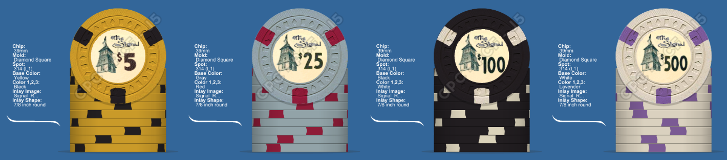
I think I'm leaning towards the White / Lavender 314 for the 500. Time to move on to settling the issue of the T25 base color. We don't really have access to a color that has as much blue in the gray as the El Rancho $25 does, but while holding the gray sample I really got a feeling for how much blue is in it. It seems like a decent amount. Going purple almost seems like getting further away from the mark. What do you think, @pltrgyst ?
....
Right now Lineup #1 is winning the chip race in my mind.
 :
:Like some others, I love the $25 in #3, too. But I agree that the color combos in #1 are more true to the time period.
In the end, go with what *you* want to be playing with! The rest of us will still be squabbling over them if you ever put them up for sale.
Defo go retro!
Best fit for the set.
WOW...I have never seen the original chips before. They are AMAZING!!
New design is AWESOME too, but the original took my breath away!!
I think I'm leaning towards the White / Lavender 314 for the 500. Time to move on to settling the issue of the T25 base color. We don't really have access to a color that has as much blue in the gray as the El Rancho $25 does, but while holding the gray sample I really got a feeling for how much blue is in it. It seems like a decent amount. Going purple almost seems like getting further away from the mark. What do you think, @pltrgyst ?
Lineup #1: Gray $25
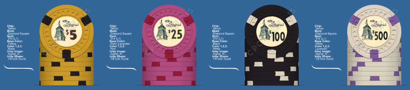
Lineup #2: Retro Lavender $25
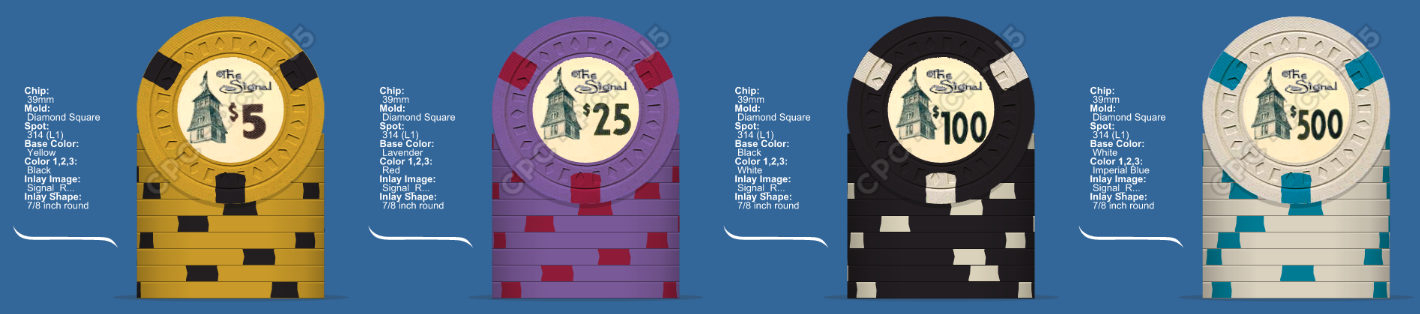
Lineup #3: Lavender $25
Right now Lineup #1 is winning the chip race in my mind.
Now about getting an artist. Obviously, J5. I've seen p5woody's name thrown around. Who else is doing chip work these days?
Lineup #1 is ly clear favorite. If you've got a color sample, you should oil one face of the chip before deciding, colors before and after oiling are very different...
Speaking of design, are you considering going 100% 1940s Rancho style with your tower / typo design, or are you sticking to the old-school look?
That's a good point about oiling my sample. I've had it for 6 years and I've never thought about oiling it!
I would highly recommend ordering an updated full sample set. With all the changes in recent years and the subsequent clay formula changes, I would be hesitant to use anything older than a couple of years.
I've already updated the OP, but I'm happy to announce @machinelf will be taking the reigns for this one. This project brought him on over to PCF. Welcome aboard!

Thank you Sir! I hope to do your set justice. (y) :thumbsup:


I think I'd be going 20. So hard to deny that black background with the blue script.