Advice with custom CPC tourney set (Paulson Pharaoh tribute - Armenia theme) (6 Viewers)

pipdenny

3 of a Kind
Supporter
Joined
May 17, 2020
Messages
675
Reaction score
1,642
Location
Los Angeles, CA
Hi all,

I'm thinking for my custom CPC tourny set I would like to go with the A-mold and level 3 edge spots, as this would really be pushing the top limit of my budget.

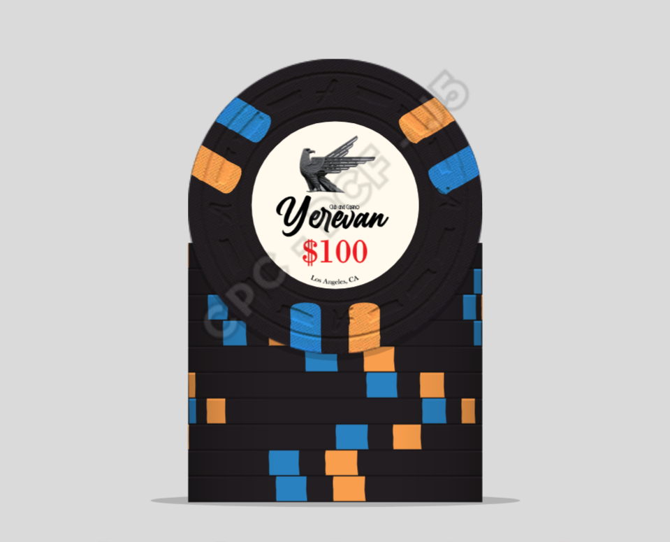
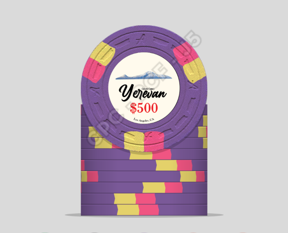
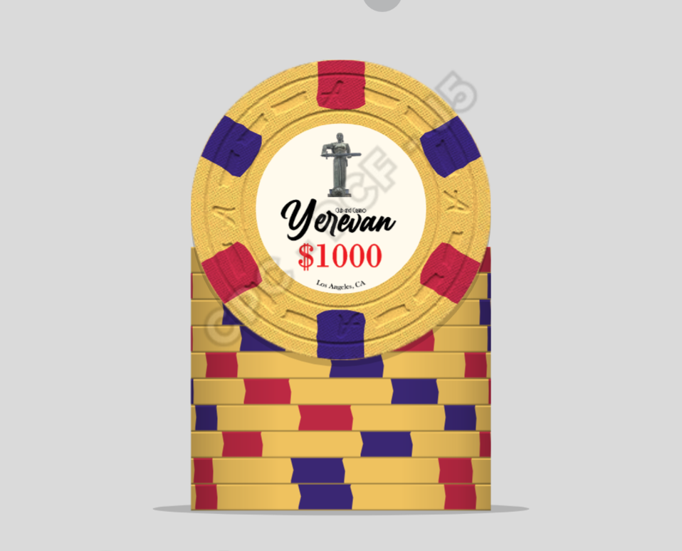
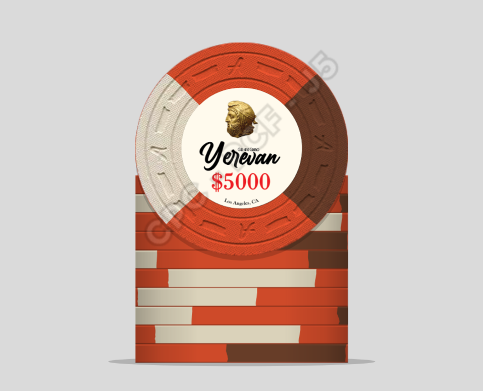
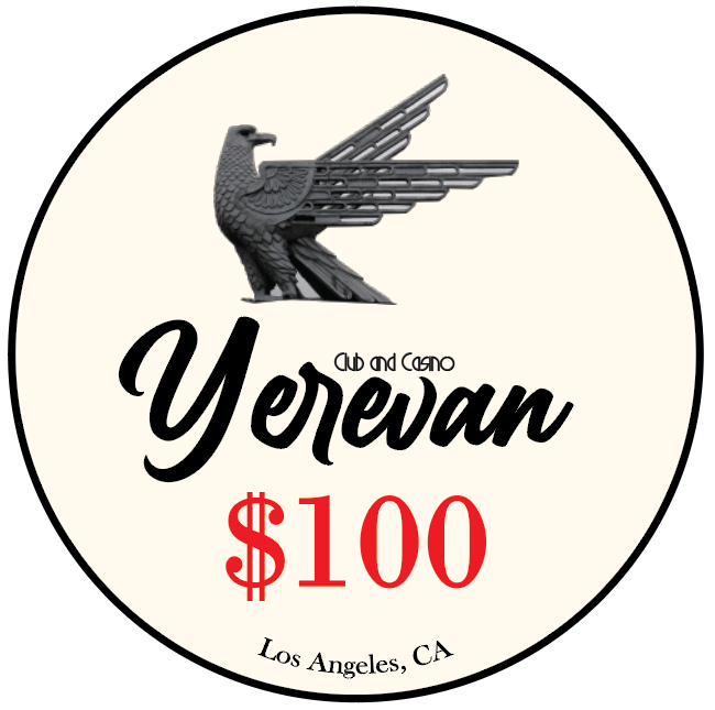
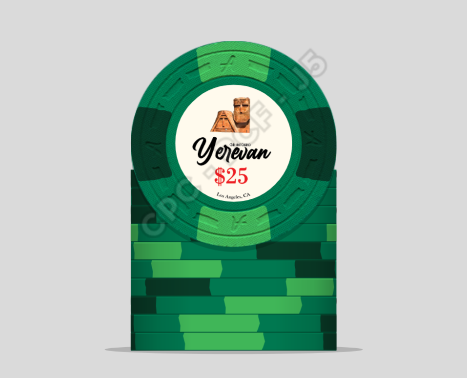
This is just a quick mock-up I made in the style of the Paulson Pharaoh's design. Fonts, lettering sizes, images, etc will be adjusted and refined (font too small in some places, some images look awkward, and ideal main font still yet to be found). Again, I just threw this together just to see how the inlay might look.

I wanted my CPC set to be a tribute to my Armenian heritage. Here the images depict famous Armenian monuments/statues/iconography. Yerevan is the capitol city of Armenia.

I am just looking for advice about what I've got so far. I am pretty satisfied with the 25, 100, 500, and 1000 colors and edge spots.
I was struggling with the 5000. Here I have a level 4 spot, but I still cannot really settle on a edge and color combo that speaks to me.

I am also open to all suggestions about different colors and spot patterns, as well as overall design suggestions.

This is just the very rough first draft.
yerevan1.PNG
yerevan2.PNG
yerevan3.PNG
yerevan4.PNG
yerevan5.PNG
yerevan2.PNG
 
Last edited:
When it comes to testing legibility, simply print your inlay designs at 7/8" diameter, and then hold the printed sheet about arm's length away. If it's clear enough to be read at that distance (the denomination being the most important part), then you're probably good to go.

Remember, there's no law stating that both sides of your chips must have the same inlay. But right now, if you're meaning to keep just these few basic elements of graphics and text, you should be okay with matching sides without looking like the inlay will be cluttered up.
 
Side note: how do i export from the chip design tool to look like
1598231544383.png

When I click "save as png", nothing happens?
 
Nice colors. The $25 chip has considerably less contrast between base color and spot colors than all the other chips, so this could be reviewed. The $5000 seems a little unbalanced with a very light color on one side and a relatively dark color on the other. Consider white on top, chocolate(?) on the bottom and tiger(?) on the sides.

I suggest making club and casino and Los Angeles, CA larger. With the print resolution it would probably come out as hardly readable. I would try increasing the height of club and casino so that it flushed with the top of the Y. The font used for club and casino needs more spacing I think to avoid being cluttered.Have you considered using a font or creating a "logo" for Yerevan that looks like the Armenian script? Or would it be too square?

Consider reducing the size of the dollar sign and raise it above the line (superscript-like) to make the denomination more readable. Many omit it altogether on tournament chips - if this is a tournament chip...

I hadn't considered using Armenian script! Armenian fonts are usually pretty square, but i found this one that resembles the Pharaoh font on the Paulson chips.
Here it does not say "Yerevan", but rather my last name.
I also played around with getting rid of "club and" because finding the space for the whole phrase was difficult while also trying to make it large enough to read.

1598249334601.png
gezalyan100.PNG


As for the green chip, I wanted to do dayglo green and pink edge spots to resemble the CC Pharaohs, but was concerned with possible dirty stacks with the pink on the 500 chip. I was trying to have edge spots with no repeating colors whatsoever, which was proving to be difficult. I will play round with this more. Any color suggestions for the green chip would be greatly appreciated :)

Thanks everyone for the help so far!
 
I also like the idea of the two faces being different as @allforcharity mentions. This may allow me to have one face with the denomination and other more focused on the imagery.

There is something about this inlay that is lacking in my opinion, like something is missing. It seems maybe too simple? It needs some "texture" so-to-speak, if that makes sense. The Pharaohs seem to have some sort of light watermark in the background of what seems to be a scarab, so maybe something like that. Again, something I'll play around with as I get better with illustrator
 
Just eyeballing the inlay, which is gorgeous.., everything looks good except:
1. The denom is sitting at about the max for the textual limit allowed by CPC.
2. The Bottom rounded text is absolutely outside what CPC allows.

The limit is .750 for text. So add a circle to the center and all text must be inside that. The only way around it is to go up in size for the inlay. Although, it will only increase legibility. The scale remains the same.

links to the PDF from Classic.
http://www.classicpokerchips.com/pokerchips/realclay/artworktemplate.pdf
 
Really like your inlays, very classy looking! Made a go on the design tool. I really like this 25 although I know it’s a L4. Not a fan of making the biggest denom a 1/4 pie but maybe it’s hard to make a good one otherwise if we’re not going bigger than L4.

860E8101-4D04-42D1-BDBF-09E21597F00A.png
 
Just eyeballing the inlay, which is gorgeous.., everything looks good except:
1. The denom is sitting at about the max for the textual limit allowed by CPC.
2. The Bottom rounded text is absolutely outside what CPC allows.

The limit is .750 for text. So add a circle to the center and all text must be inside that. The only way around it is to go up in size for the inlay. Although, it will only increase legibility. The scale remains the same.

links to the PDF from Classic.
http://www.classicpokerchips.com/pokerchips/realclay/artworktemplate.pdf
I'm not sure what you mean by the textual limit allowance. Then again, I just roughly threw this together before getting into the requirements of CPC, which I should absolutely do now that my ideas are starting to come together. I assume you mean the limit of the area that can be occupied with text.
Learning about the design requirements before starting would have been a very good idea. I was just messing with illustrator, but now I'm going to start digging in a bit more.

Increasing the inlay to 1" may be a very good option for this design indeed.
I just found the illustrator template on their website, so I'll definitely start using that now.
 
Really like your inlays, very classy looking! Made a go on the design tool. I really like this 25 although I know it’s a L4. Not a fan of making the biggest denom a 1/4 pie but maybe it’s hard to make a good one otherwise if we’re not going bigger than L4.

View attachment 518827

Yes I could be a bit more lenient with the 5k chip as I will only be needing around 60 of them. I hadn't yet looked into the L6+ spots, so maybe I could find a L6 or L7 for the 5k that would work nicely. Thanks for opening up that door, I hadn't considered that! :D
 
Pomegranate (important Armenian symbol) watermark + Dealer button.
I will find a better image for the pomegranate, or make one myself. I just wanted to see how this might look

gez100POM.PNG
gez100POMsmall.PNG

1598257919491.png

1598258395535.png
 
Last edited:
Do you have a mold sample? Personally, I much prefer the horsehead mold over the A-mold and the B-mold over both (though the latter is one step up in price).
 
A-mold for Armenia is perfect. The A mold is very decent in all respects (and, above all, it is always available).
You could even name the set Ararat, after the biblical mountain.

Make sure you have the CPC color sample in your hands before you make any decisions about chip and edge-spot colors.
The 3TA316-spotted 5K is great. That edge spot is not offered in 43mm (oversize) chips by the way @Eriks

Edit: Make sure to have the denomination on both sides; it's a lot more practical. One side could be in English and the other in Armenian, preferably saying the same thing.
You’re right that the A-mold makes sense. I just don’t like it. The oversize thing wasn’t really a serious suggestion, but one can dream :)
 
My 2c
Armenian.png


Considering that the Armenian flag top chip is your inevitable starting point and anchor.

Edit: Marginally cheaper version, more Pharaoh-loyal, without spot progression other than for the top chip
Armenian II.png
 
Last edited:
Do you have a mold sample? Personally, I much prefer the horsehead mold over the A-mold and the B-mold over both (though the latter is one step up in price).
I do not have a mold sample yet, but I do have the full color samples as @Coyote suggests, which is definitely a huge help. TBH I went with a-mold because it would allow me the budget to get more complex spot patterns. I have a 10-piece "random" sample set from CPC as well which has the csq, elephant, FLD, small crown, and jokey molds with random spots and colors, but I will order a mold sample today! I just realized that horsehead is the same price as a-mold. Did this change in the last few days? haha

I really like @Coyote and @Eriks color suggestions, and makes me feel like I'll never be able to settle on a final scheme! This set is meant to be my holy grail that will last a lifetime, sort of an heirloom piece, and I just need to be absolutely sure I am satisfied with everything. In that sense, getting the mold samples and perhaps spending more on a 'better' mold may be justified.

I'm going to be working on this and will be updating this thread as I progress.
I really appreciate your feedback and suggestions, it is profoundly helpful! I hope to hear some more ideas thrown at me as I chug along :D

edit: i think I will be going for a 1" inlay. Looking at these CPC samples with 7/8" makes me feel like my design wouldn't work too well on the smaller inlay.

Sounds good, make sure to take your time. I ended up with a very different set than the one I first posted for comments and suggestions. Mold sample is definitely the right choice so you’ll be able to feel them all. To paraphrase mr. @Coyote, you don’t want to be too economical with a custom set, but rather be 100 % happy with it. If it lasts a lifetime what is an extra 100 or so bucks?
 
slight progress + 1" inlay printout.
Looks like I need to work on the inlay a lot more (text sizing and placement, not happy with image choices for the 500, 1k, and 5k)

1598297307900.png


1598297265981.png
 
Pomegranate (important Armenian symbol) watermark + Dealer button.
I will find a better image for the pomegranate, or make one myself. I just wanted to see how this might look

View attachment 518830

View attachment 518840

I LOVE that large pomegranate watermark at the top of #14. That added a really nice bit of color to it.

The multi-color dealer has a bit of 50s/60s color-forward vibe. Is that what you were aiming for?

Don’t forget, the A mold chips have a bit of texture to the inlay. Might impact the legibility of the small font casino.
The colors on the dealer button are the tricolors of the Armenian flag, but yeah it does have a nice vibe that I am digging :cool

I assumed that I would have a choice on the texture of the inlay. I didn't know that it was based on the mold :eek:
 
I assumed that I would have a choice on the texture of the inlay. I didn't know that it was based on the mold :eek:
The texture (whether relatively rough or relatively smooth) is part of the individual mold. In the compression process, the texture is pressed into the chip and inlay at the same time.
 
The texture (whether relatively rough or relatively smooth) is part of the individual mold. In the compression process, the texture is pressed into the chip and inlay at the same time.
That makes sense. From the 'random' CPC sample set that I have, I can see that the FDL mold inlay is totally smooth, but the clay does indeed have texture. Could it be that the inlay texture wears down?

It seems like the HHR, small crown, and diamond/square molds all have a relatively smooth finish on the inlay. The b-mold seems to have the most textured inlay. Can I assume that the B-mold inlay will be similar in texture to the a-mold? I wish I had an inlaid a-mold in this set.
 
Last edited:
That makes sense. From the 'random' CPC sample set that I have, I can see that the FDL mold inlay is totally smooth, but the clay does indeed have texture. Could it be that the inlay texture wears down?

It seems like the HHR, small crown, and diamond/square molds all have a relatively smooth finish on the inlay. The b-mold seems to have the most textured inlay. Can I assume that the B-mold inlay will be similar in texture to the a-mold? I wish I had an inlaid a-mold in this set.
For most of the CPC molds, the inlay has the same texture as the rest of the chip, so smoother chips have smoother inlays, and vice versa. The only chips that are different are the 44mm A-mold and the HHR mold, but the HHR still has a little texture. So yes, the B-mold and A-mold chips will have similarly textured inlays.
 
How do you feel about the quality of the bird logo on the label you printed?

Personally, I'm not a fan of photographs on chips. I'd strongly recommend having a designer (we have several on the forum) take the photos you want to use, like the bird thing and the statue face image, and and turn them into simpler drawings of those same things. This allows the same idea to get across without trying to have a highly-detailed image shrunk down to chip size where it loses its detail and ends up looking like a blurry mess.

Again, just my opinion, but hopefully something worth considering. I love the idea and the mockups so far!
 

Create an account or login to comment

You must be a member in order to leave a comment

Create account

Create an account and join our community. It's easy!

Log in

Already have an account? Log in here.

Back
Top Bottom