Warning, this might be dumb and not make sense.
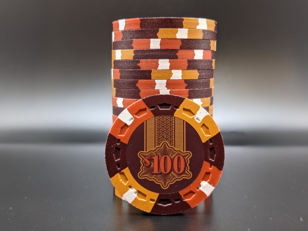
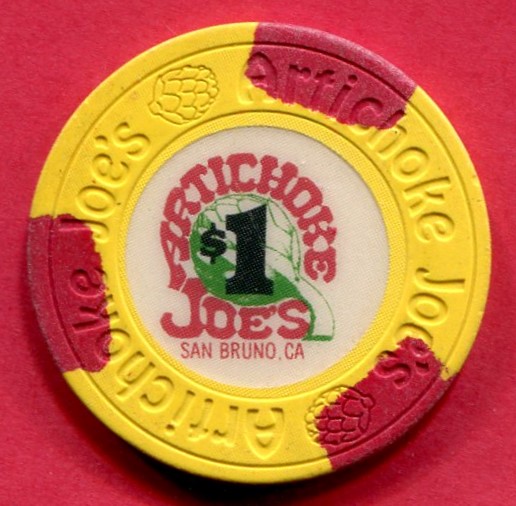
There's a few inlays out there where it feels like the whole inlay is super cohesive and the graphics combine with the text to sort of, really stand out and make them look awesome. The first two that come to mind are the circus circus inlay with the prize units, and the cactus petes, where the denom and graphics are involved.
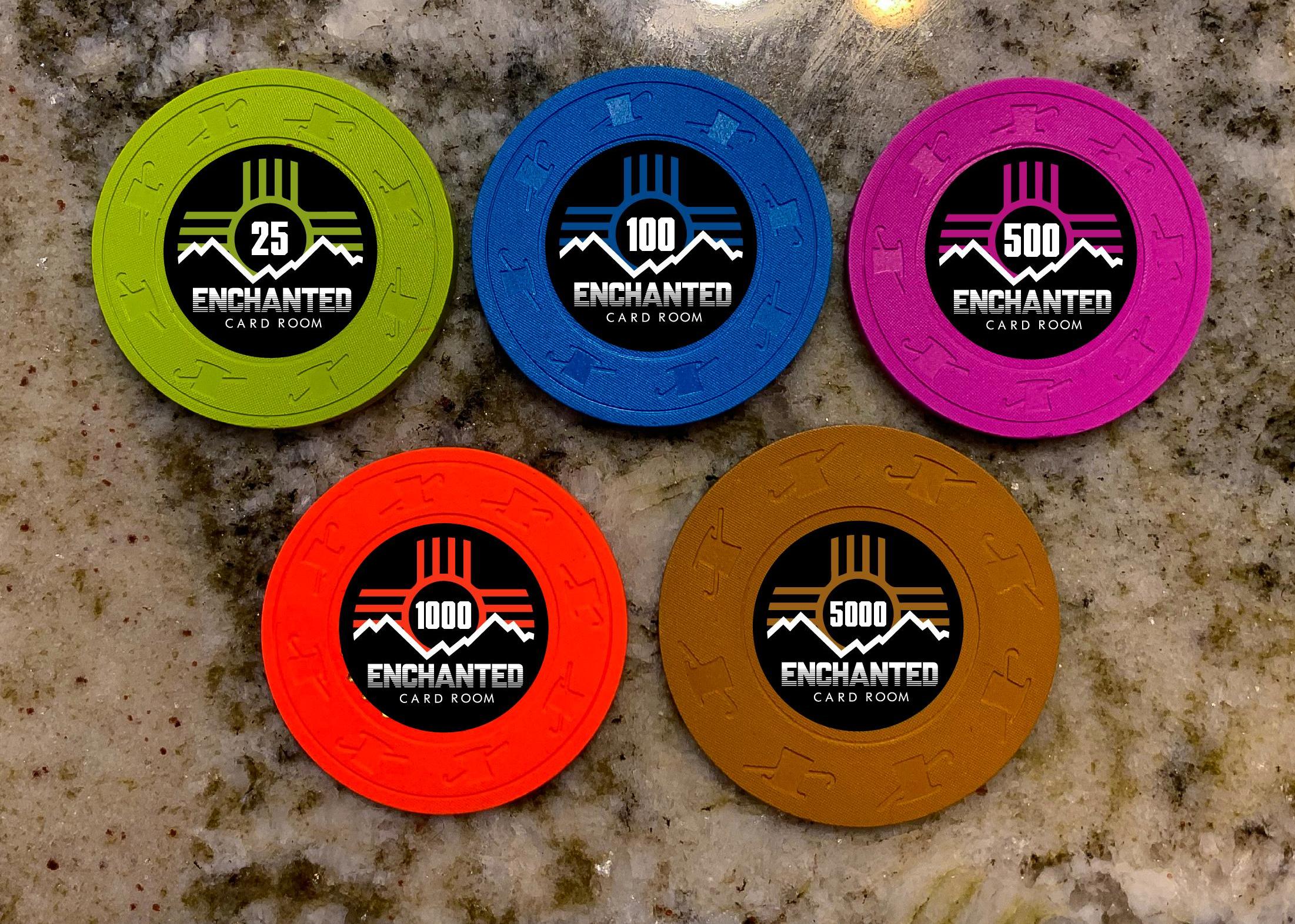
I'm just curious to know if there are any more examples of inlays like this. Doesn't have to be just the denom in the graphic, can be the text itself or just really clever ideas in general.


There's a few inlays out there where it feels like the whole inlay is super cohesive and the graphics combine with the text to sort of, really stand out and make them look awesome. The first two that come to mind are the circus circus inlay with the prize units, and the cactus petes, where the denom and graphics are involved.
I'm just curious to know if there are any more examples of inlays like this. Doesn't have to be just the denom in the graphic, can be the text itself or just really clever ideas in general.
Last edited:
") Or were you only talking about casino chips and not customs?
Or were you only talking about casino chips and not customs?