Help! My font changed. (1 Viewer)

digirati

3 of a Kind
Supporter
Joined
Nov 9, 2023
Messages
730
Reaction score
513
Location
Colorado
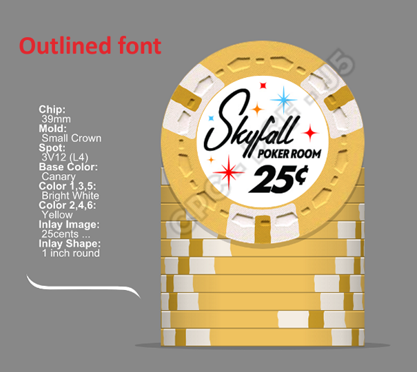
My designer has my inlays completed and they look great. However, before sending the Illustrator files (.ai) to the printer, she "outlined" the fonts which I understand is normal since it turns the font (which a printer may not have) into a graphic. This is supposed to help avoid issues. But, after that was done and I test printed the inlays, now the small font text appears bold and some characters are harder to read. Everything is great except the small POKER ROOM text. It's much more noticeable when printed at the scale of an actual inlay.

Has anyone had this issue, and how did you fix it?

25 cent v8.png
25 cent v11.png
 
I’ve found outlining during the final stages can make the type look bolder at a distance, but when close up, it’s the same. I always figured it was a screen representation more than anything…the letterforms aren’t actually changing.

If you think the letters are running into each other, they could be tracked apart slightly. A less desirable solution is to make the type less bold by using a very thin stroke on each letter, expanding the appearance then using the pathfinder to clip that thin amount from each letter. Not the best, because that does alter the typeface slightly, and may not be exactly what you want.
 
The text in the screen image looks good. Could be your printer and your paper aren't good enough to print small detail clearly.

Communicate your concern to CPC, maybe they can send you a test print using their materials. Or maybe they can give you their experienced opinion.

Nice label, looking forward to seeing the final product!
 

Create an account or login to comment

You must be a member in order to leave a comment

Create account

Create an account and join our community. It's easy!

Log in

Already have an account? Log in here.

Back
Top Bottom