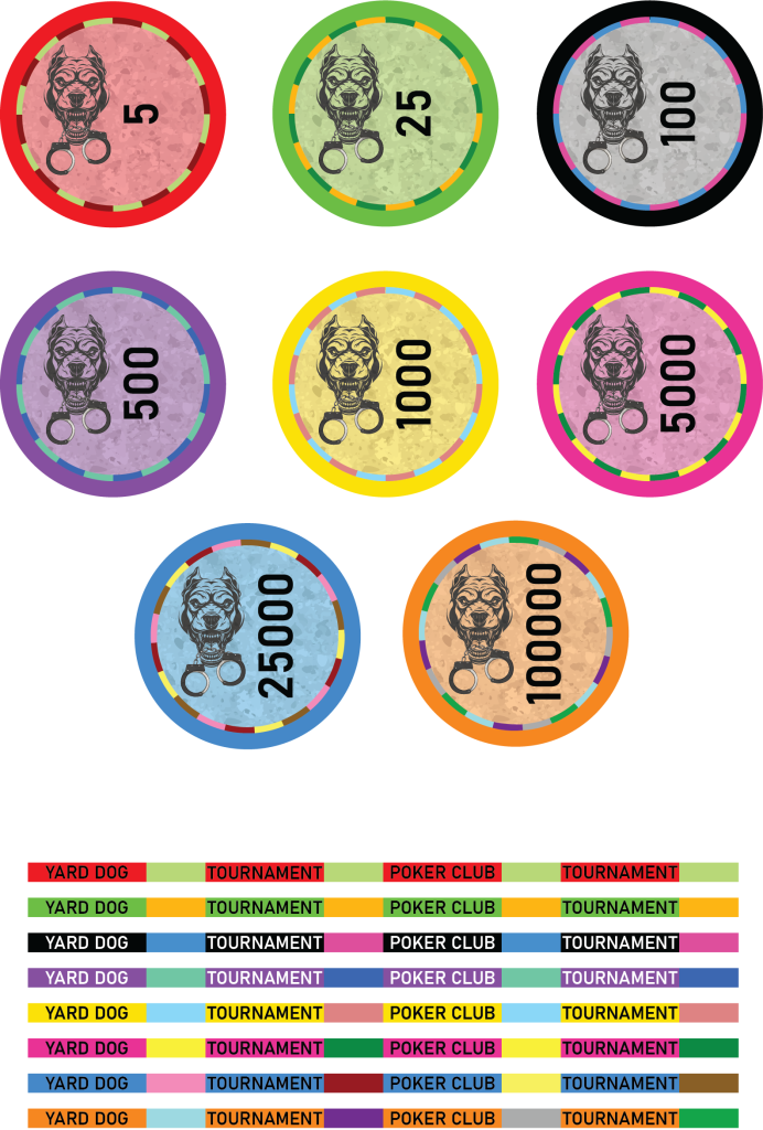
Here are my mockups for my custom ceramics. I'm not exactly a pro at design and definitely not an artist, so any constructive feedback will be very welcome.
You are using an out of date browser. It may not display this or other websites correctly.
You should upgrade or use an alternative browser.
You should upgrade or use an alternative browser.
Tournament set for my home game (1 Viewer)
- Thread starter Danny_Banana
- Start date
RocAFella1
Royal Flush
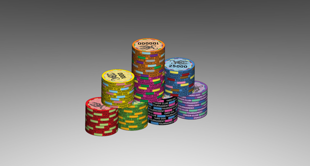
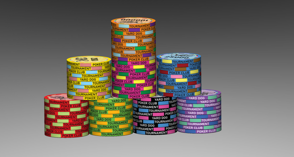
The multitude of colors on the edges may be a bit confusing when stacked together. I would try to see how they look with one color per rolling edge as opposed to two.
ekricket
Royal Flush
What’s your starting stack with those denominations? T5 with millions, has to be a multi day tourney?
Nymor
Two Pair
Yard Dog Poker is quite snappy and has great potential but I'm not overly keen on those chips as they are currently. I hope the following doesn't sound too negative but getting different view points can only help and is what you wanted after all.
Personally I wouldn't have any text on the edges at all and put Yard Dog (with/without Poker) on the faces. I'd lose the word Tournament completely.
While the base colours are fine the edges and inner ring need work - they're a bit confused (... again imo)
Depending on how things then looked I'd have to think about whether I'd want the logo and denom text in the same orientation or at 90deg as you've got it now - the latter being more difficult to pull off well I think.
What's the significance of the handcuffs?
... and in an ideal world I'd give that dog his ears back (ducks)
Whatever you do take your time.
Personally I wouldn't have any text on the edges at all and put Yard Dog (with/without Poker) on the faces. I'd lose the word Tournament completely.
While the base colours are fine the edges and inner ring need work - they're a bit confused (... again imo)
Depending on how things then looked I'd have to think about whether I'd want the logo and denom text in the same orientation or at 90deg as you've got it now - the latter being more difficult to pull off well I think.
What's the significance of the handcuffs?
... and in an ideal world I'd give that dog his ears back
Whatever you do take your time.
The multitude of colors on the edges may be a bit confusing when stacked together. I would try to see how they look with one color per rolling edge as opposed to two.
Ya, I wasn't sold on having a ton of different colors, but I wanted some sort of spot progression. I'll see how I like it with one color, though I think I'd probably prefer it with two on most.
What’s your starting stack with those denominations? T5 with millions, has to be a multi day tourney?
My group likes to play around with a wide variance of starting stacks just to mix things up and play with different denoms. We do anything from 1k up to 150k. and those are 100k's, I know I'd never make use of millions lol.
Yard Dog Poker is quite snappy and has great potential but I'm not overly keen on those chips as they are currently. I hope the following doesn't sound too negative but getting different view points can only help and is what you wanted after all.
Personally I wouldn't have any text on the edges at all and put Yard Dog (with/without Poker) on the faces. I'd lose the word Tournament completely.
While the base colours are fine the edges and inner ring need work - they're a bit confused (... again imo)
Depending on how things then looked I'd have to think about whether I'd want the logo and denom text in the same orientation or at 90deg as you've got it now - the latter being more difficult to pull off well I think.
What's the significance of the handcuffs?
... and in an ideal world I'd give that dog his ears back(ducks)
Whatever you do take your time.
Doesn't sound too negative at all, this is why I wanted the opinions of those with more experience. I went with the text on the edges because I was worried about not having enough room on the the faces while still keeping everything large enough to read. Perhaps if I lose the the word Tournament and just put one word of the club name in each section?
As for the colors, I'm really bad with synergizing colors, so ANY suggestions on that front would be appreciated. And the logo/text orientation was just done for room, since the logo is pretty tall but there are any suggestions for better arrangement, suggest away. And that was the best looking stock vector of a snarling pitbull I could find since can barely draw stick figures, much less something like that. I'm trying work around my lack of artistic talent.
Finally, the cuffs as well as the name of the club, "Yard Dog Poker Club", are because myself and all my players all work in corrections, and I spent the majority of my career as a yard officer, colloquially known as a "yard Dog" (at least where I work, lol).
P.S. Here is one the clay cash set inlays I designed, in case you see something with that which might work well.
I think the denoms being sideways to the logo looks awkward. I would also try to find a font that stands out a bit more. Text on the sides might not print great either. Maybe try to find a way to fit Yard Dog onto the face.
Move the image to the middle center more and just put the denominations under so they're the same direction as the image. Not a fan of the side ways denominations. Remove tournament from the edge work, it's too busy.Here are my mockups for my custom ceramics. I'm not exactly a pro at design and definitely not an artist, so any constructive feedback will be very welcome.
View attachment 1256081
View attachment 1256082
View attachment 1256084
Sweet color selection though. Great start.
buzzmonkey
Flush
Maybe add a 1 or 2 point stroke around the text. Try white or a very light color, or maybe white text with a black outline.
Way too many denominations. Value at right angles to the graphic on chip face is disorienting. Text better on face than on edge, but could live with both. You mention spot progression, yet have none. Multi-coloured ring on the faces ok as it delineates a faux inlay space.
DeeVee8
Straight
Nit picky OCD stuff, but I don't put $ on my tourney sets. I did a set with edge printing, won't do that again. You'll usually get 1-2% that print wonky.
I think I'm probably gonna try and find someone who can actually draw to come up with a new logo for me that will work a bit better for this so I can more easily work text around it..
Fixing this will also be included after I get a new logo.
The one with the $ is an inlay for my planned cash set that I included in case anyone saw something from there that they thought could work on the tournament set. I too would never use a $ on a tournament set. I'm gonna try to lose the edge text all together with the next iteration. Also gonna try playing around with the majority of the ideas presented thus far.
Anyone have suggestions for better spot colors?
I think the denoms being sideways to the logo looks awkward.
Value at right angles to the graphic on chip face is disorienting.
Fixing this will also be included after I get a new logo.
The number of denominations is to cover the wide range of starting stacks and tbh, I just like making lots different denoms and have no issue with paying for the number of chips to cover it. And what I meant with bit about spot progression was that I substituted actual spot progression with increasing the number of spot colors with higher denoms. Apologies for any confusion.Way too many denominations. ........ You mention spot progression, yet have none. Multi-coloured ring on the faces ok as it delineates a faux inlay space.
Nit picky OCD stuff, but I don't put $ on my tourney sets. I did a set with edge printing, won't do that again. You'll usually get 1-2% that print wonky.
The one with the $ is an inlay for my planned cash set that I included in case anyone saw something from there that they thought could work on the tournament set. I too would never use a $ on a tournament set. I'm gonna try to lose the edge text all together with the next iteration. Also gonna try playing around with the majority of the ideas presented thus far.
Anyone have suggestions for better spot colors?
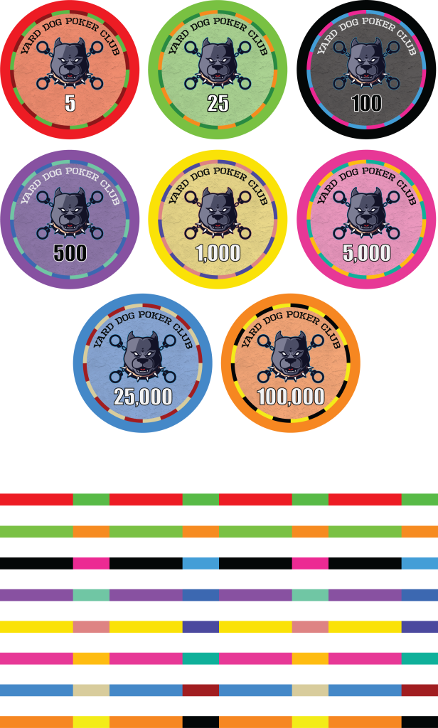
Ok, here are the updated versions, let me know what you guys think of version 2.0
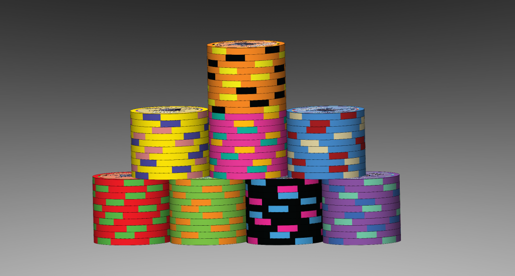
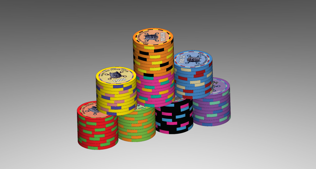
Natskule
3 of a Kind
I like the first logo much better.Ok, here are the updated versions, let me know what you guys think of version 2.0
View attachment 1258150
View attachment 1258152
View attachment 1258153
I see some steps forward here, but I’m in agreement with some of the other notes as well.Ok, here are the updated versions, let me know what you guys think of version 2.0
View attachment 1258150
View attachment 1258152
View attachment 1258153
I think you’re going to have some dirty stack issues with all the edge spots. Have you considered going without edge spots? Your ring on the chip face already suggests an edge spot, and I kinda like the effect
I’d stay consistent with your text colors, changing the 100 and 500 to a white with black outline.
Personally, I’d ditch the commas in the denoms
Chip face layout is much improved.
I think you took a step backwards from the original artwork, unless that is a design choice. I feel like the first artwork is gritty, and the second feels more like a sports team logo. There’s intensity there, but the tone is very different. Again, that’s a totally fine choice to make if that’s the intention.
I would say if you’re going to keep the new logo style, I’d talk to your artist about adding some highlights. Right now it feels dark and could use some more definition.
In general, I think you’re moving in the right direction though
Ok, so I went ahead and did some testing with my solidworks models, and there was definitely some dirty stack issues between the T5 and T25. I rectified it by changing the T5 spot color to gray.
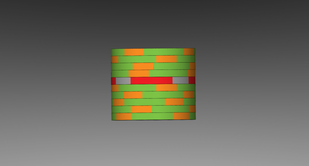
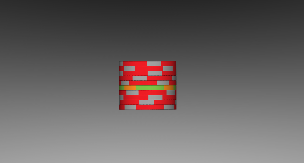
The only other ones that really had issues with it were T5/T5k and T25/T100k, but those will never be in play at the same time, so I'm not super worried about it. I was little worried about T100/T5k, but there was enough contrast that I felt it was ok. I may try edge dots (like the Aria T chips), but that'll be when I'm less sleepy.
I'm on the fence about the commas tbh. I'm not a huge fan of them, but I put them in due to someone earlier in the thread mistaking the T100k for T1M. That had me worried about such confusion in the future.
As for the logo, I agree that I like the concept of the original better, but it being more tall than wide, is what lead me to get another one made, and the shape of the new one is what allowed me to make a better face layout. Unfortunately, I don't currently have the money to pay another random artist on fiver for a new one, and I my artistic ability is pretty much -100. So I'm pretty much stuck with the new one for now
Nymor
Two Pair
I think Yard Dog should be big, and in a standout font, and Poker Club small, and somewhere else on the chip.
I prefer a more traditional outer face/edge myself rather than the inner ring as it is now but that's obv just opinion.
I prefer a more traditional outer face/edge myself rather than the inner ring as it is now but that's obv just opinion.
buzzmonkey
Flush
Ok, here are the updated versions, let me know what you guys think of version 2.0
View attachment 1258150
View attachment 1258152
Good job with the outline on the numbers. I would increase the stroke by 1 pt, and reverse the colors on the numbers for some of the chips.
The darker faces should have white with black outline, and the lighter faces the opposite. Try this:
$100: white with black outline
$500: white with black outline
$1000: black with white outline
So I tried my hand at making a new logo more similar to the original. Let me know what you all think, and I'll be working on the other suggestions a bit later after lunch.
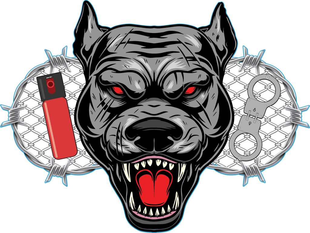
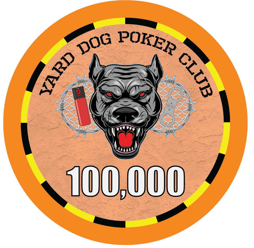
So I tried my hand at making a new logo more similar to the original. Let me know what you all think, and I'll be working on the other suggestions a bit later after lunch.
View attachment 1258386
View attachment 1258388
I’d love to see what you could do if you had artistic abilityI'm not exactly a pro at design and definitely not an artist
I think this is a really nice blend of the two options. Gritty but much more readable, and the orientation of the design is much more friendly to a chip face
To be fair, those are all just stock images that I arranged together. And it's a good thing it turned out ok, cause I'm out of shutterstock credits lol.
Just my $0.02:
It's a Trap! (By that I mean your wonderful big monitor)
All the shading and detail you have put into this design is great when zoomed to 1600%.
Print it out at 100% and hold it at arm's length.
All that shading and detail will be lost and make the image muddy. (marked up some of what you won't see when printed at 100%)
Then think about the texture that will be on the chip, that will make all the finer details look even more fuzzy/blurry.
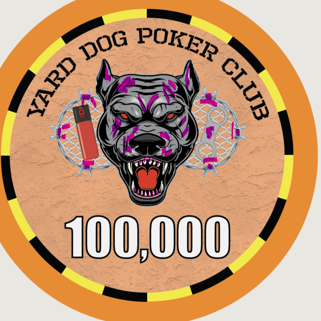
You are 100% correct in that assessment, but, as I said before, it's all stock images (on account of my lack of drawing ability). So I'm pretty much just gonna have to deal with it and hope it ends up ok 
Like the handcuffs -- but the Pepper Spray seems a bit corny and out of place looking to me. 100% just my opinion though!So I tried my hand at making a new logo more similar to the original. Let me know what you all think, and I'll be working on the other suggestions a bit later after lunch.
View attachment 1258386
View attachment 1258388
I like the idea of edge spots. But I agree with others that say your implementation is confusing. One of the great things about ceramics is the almost infinite color shades and unique patterns. When you make real clay, you are limited to a few dozen stock colors and patterns, so avoiding overlap while still making the set cohesive is a challenge.
So embrace your pallet!
For example...you use the same green on your purple and red edge spots as you do in your base 25. Same orange color in 25 edge as 100k. Use different shades of colors. You also can do different patterns. You can angle edgespots. You can do funky things...check out Dia de los Muertos edge spots from BR Pro. I even remember seeing someone who did edge spots so when you rotated them the right way you got an image of his state, I believe. Could have the chips spell out "DOG" for example or something else.
I think you have a great thing going! I am excited to see the final product.
buzzmonkey
Flush
If you order with BR Pro, you can purchase samples before they do the full run. They won't print the edge spots, but you can see how the full face will look.You are 100% correct in that assessment, but, as I said before, it's all stock images (on account of my lack of drawing ability). So I'm pretty much just gonna have to deal with it and hope it ends up ok
So here's a more simple logo. there's a little less to it than I'd like, but I can live with it. If I left it with just the dog, all it would be is a random stock image from shutterstock. And I want at least SOME reference to corrections in it.

For the colors, I've already changed the spots on T5 to gray, as for the others, I'd LOVE some suggestions from someone who has an eye for colors, cause as you've all noticed, I'm not great at it. Seriously, I could really use some help on that front.
And I am planning to order from BRPro. I forgot they do samples, so thanks for the reminder on that.
Just print tested the chips, and both of the most recent versions of the logo on the chip actually turned out more than acceptable. Even on the fence version, it didn't lose nearly as much detail as I anticipated. Turns out the most important part is that I remember to rasterize the logo first.
Similar threads
- Replies
- 32
- Views
- 1K
- Replies
- 18
- Views
- 599
- Replies
- 51
- Views
- 2K
- Replies
- 4
- Views
- 281
- Replies
- 46
- Views
- 2K
