RudysNYC
Flush
Didn’t see a thread for this so figured I’d start it... random sh!t you learned today
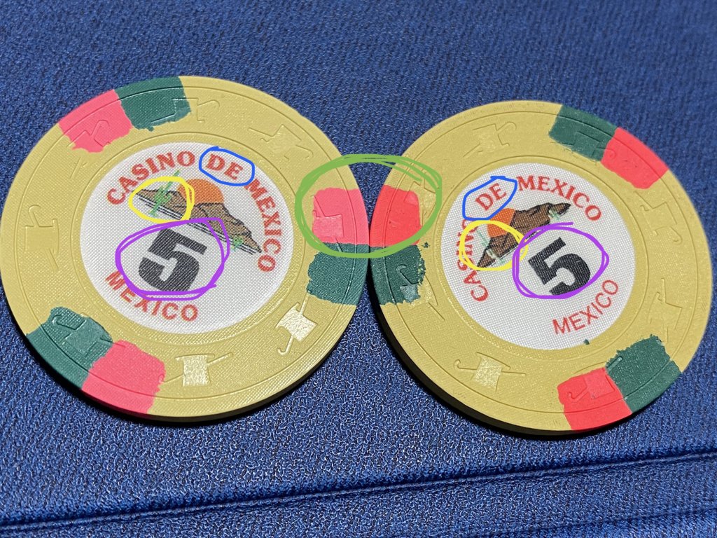
Today I learned that there were (at least) two versions of the CDM set (or at least the 5s) made.
I had one existing rack and got another couple barrels to round out that part of my set; the edge spots were different colors. I’ve worked in forensic document examination on and off for a while now so it was obvious the second I saw them, before I even put them together. At first I thought maybe the newly received barrels had been oiled, but a quick glance at the inlay made it even more obvious
attached is the difference between the two.

BLUE: Text on the left is bolded, text on the right isn’t. Left text seems a darker red too, but that could be my eyes playing tricks on me due to the bold text
YELLOW: Couple things here. First, the sun and mountains on the left are lighter than on the right. Second, the cactus is much more pronounced. Third, there are a few pronounced horizon lines under the mountains on the left, but only one fuzzy one on the right.
PURPLE: The 5 denom is a different font. It *could* be that the denom on left, is just bolded, but I really don’t believe that’s the case. I’m reasonably positive they found a very similar but different font—given the size difference between the two denoms, I reckon if you took the 5 on right and bolded it the proportions would be different than on the left. Low confidence assessment though
GREEN: The obvious pink/reddish edge spot difference
This may be obvious information to all of you, but I was kind of blown away at how many differences there were. I would expect some color variation, so I’m willing to give Paulson a pass on the edge spots, but I really don’t get how the inlays could be so noticeably different. I would’ve expected them to crank out facsimiles of the same original print, not do it all over.
Today I learned that there were (at least) two versions of the CDM set (or at least the 5s) made.
I had one existing rack and got another couple barrels to round out that part of my set; the edge spots were different colors. I’ve worked in forensic document examination on and off for a while now so it was obvious the second I saw them, before I even put them together. At first I thought maybe the newly received barrels had been oiled, but a quick glance at the inlay made it even more obvious
attached is the difference between the two.
BLUE: Text on the left is bolded, text on the right isn’t. Left text seems a darker red too, but that could be my eyes playing tricks on me due to the bold text
YELLOW: Couple things here. First, the sun and mountains on the left are lighter than on the right. Second, the cactus is much more pronounced. Third, there are a few pronounced horizon lines under the mountains on the left, but only one fuzzy one on the right.
PURPLE: The 5 denom is a different font. It *could* be that the denom on left, is just bolded, but I really don’t believe that’s the case. I’m reasonably positive they found a very similar but different font—given the size difference between the two denoms, I reckon if you took the 5 on right and bolded it the proportions would be different than on the left. Low confidence assessment though
GREEN: The obvious pink/reddish edge spot difference
This may be obvious information to all of you, but I was kind of blown away at how many differences there were. I would expect some color variation, so I’m willing to give Paulson a pass on the edge spots, but I really don’t get how the inlays could be so noticeably different. I would’ve expected them to crank out facsimiles of the same original print, not do it all over.
