The Icon Set - Feedback Requested (1 Viewer)

TheLemursReturn

3 of a Kind
Supporter Plus
Joined
Sep 16, 2022
Messages
555
Reaction score
713
Location
AZ
Edit - the latest:

1667700374736.png


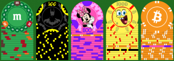
I've not totally solved the "inconsistent theme" challenge and I'm not sure that will ever be 100% possible given what I'm really wanting. But I'm pretty sure the actual artwork has made some major progress.

We ended up with a cross between the original super clean chips and the inlaid but busy second draft.

Possible challenges/questions:

- Is the new 25 too busy for a 25? Obviously there's an important reason for all the colors and it became of on my favorite chips. Just not sure if the 25 has to be simpler.

- Speaking of the 25.... Would it be crazy to plan on reusing the Monopoly theme with a 25k plaque? It could be even cooler there since it could look a lot like the game board and of course... if you get a 25k.... you pretty much have a monopoly on all the chips. The only reason I may want BOTH is because I love the chip and I wouldn't want it to appear as rarely as a 25k would.

- Pink and orange too similar?

--------

Edit:

1667315004697.png


I recognize it will still need work but I'd like to think it's better.

Introduced the inlay ring and the circles of silhouettes to get something slightly consistent across them all. Still need to handle some sort of silhouettes and the denom for orange. No more edge denoms. I think the stacks should be pretty clean now but happy to hear thoughts.

--------

I've posted threads for a few of these individual chips. But now I have the mains ones somewhat built out and I want to start looking for feedback on the set as a whole.

The idea is to have a super recognizable character/icon for each chip. I want people of all ages to immediately know what they're seeing for each one.

Special thanks to @Machine for suggesting the edge numbers - it really saved me from defacing the main art.

Current thoughts/concerns:

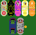
- I used my chip stacker tool to preview possible dirty stacks. The pink+white and orange+white seem like they could cause trouble. Ideas to fix?
- Could Batman and Spongebob get dirty?
- Are any of the numbers hard to read? I actually prefer them to be subtle, but they still have to be readable.

1665681492403.png
 

Attachments

  • 1667313080530.png
    1667313080530.png
    227.9 KB · Views: 46
  • 1667671594581.png
    1667671594581.png
    603.6 KB · Views: 61
Last edited:
You should change white on one of the chips, I would think pink blue or purple would work for you

Also, if you populate proximately 10% of a given chip with a different image, you could use Knightwing in place of Batman
 
You should change white on one of the chips, I would think pink blue or purple would work for you
Ooooh pink+purple could be great. Especially since purple is a common 500 color anyway. Will give it a shot.
 
While these are all very recognisable, I would try to somehow give the set more of a theme. Like to only have characters from children's movies/shows. Or only have different types of candy. Or a superhero set. Or a crypto set with different cryptos. The mix or them all in a set just seem extremely random to me.
 
The denominations on the edges will be impossible to read for most people over 40. And probably only chippers would even think to look on the edge.
This is fine if it's the design you like. Plenty of people use nondenominated chips and honestly even though my casino chips are clearly denominated, I still get people asking "how much are these worth?" So chip denominations are never perfect for everybody. But I'd guess yours would be effective like 10% for the time, fwiw.
 
While these are all very recognisable, I would try to somehow give the set more of a theme. Like to only have characters from children's movies/shows. Or only have different types of candy. Or a superhero set. Or a crypto set with different cryptos. The mix or them all in a set just seem extremely random to me.
Totally reasonable. This has been a concern since before I even started designing.

One challenge is that most of those categories don't have 5+ icons that span all ages. And this problem gets even worse when limited to things I personally like.

For example, everyone knows Bitcoin but most people still would not recognize any other cryptos. There might be 3-4 superheros that span all ages but I only like one of them.

Candy could probably work. And I might see hope for older TV... Mickey/Mini, Snoopy, Bugs Bunny, Kermit, Big Bird, probably still Batman, and I'm sure a few others.

Anyway, I completely understand your concerns and I do not want to claim that I have this all perfect. I suppose I need to keep thinking, iterating, and/or planning to live with a somewhat random set that people recognize but don't really understand together.
Yeah, and keep in mind I'm just a guy on the Internet, so take my thoughts with a grain of salt, but that was my initial thought. The most important thing is obviously that you end up happy with what you get. I understand and agree that it might be hard to fit your criteria in crypto. I think finding 5 superheros should be easy, but if you don't like them all it wouldn't make sense of course..

Good luck anyways!
 
The denominations on the edges will be impossible to read for most people over 40. And probably only chippers would even think to look on the edge.
This is fine if it's the design you like. Plenty of people use nondenominated chips and honestly even though my casino chips are clearly denominated, I still get people asking "how much are these worth?" So chip denominations are never perfect for everybody. But I'd guess yours would be effective like 10% for the time, fwiw.
Makes sense. Will give that all some thought.

If I do decide that edge denoms are a no-go, I'd probably end up skipping them altogether rather than deface the main art. My group has never really had any trouble with non-denoms. And I've played with a whole table of senior citizens who had no trouble either.
 
While these are all very recognisable, I would try to somehow give the set more of a theme. Like to only have characters from children's movies/shows. Or only have different types of candy. Or a superhero set. Or a crypto set with different cryptos. The mix or them all in a set just seem extremely random to me.
Completely agreed.

I’m assuming you’re going to get these on no mold ceramics like chipcos?

I also think there’s an aesthetic variation between the more busy SpongeBob/Batman and the M&M and BTC which are just logos
 
There's really nothing that ties this together as a "set", from the graphics to the colours and spot choices. As is, they are a bunch of individual chips that happen to be next to each other. Don't want to sound totally harsh, but that's what I see.
 
Interesting concept.

I think if each chip is going to be different in terms of theme, you will need a common design element to tie them together to a make a cohesive set.
 
For example, see the amazing 'on the strip' cash set below. Using a clever label design, the designer was able to connect molds from several different casinos in a unique and cohesive manner. Normally people would say mixing casino molds would never work, but the designer made it work. And it works very well.

https://www.pokerchipforum.com/thre...nevale-v-on-the-strip-cash.74030/post-1500499

You just need to find some kind of common design element for all the chips.
 
Completely agreed.

I’m assuming you’re going to get these on no mold ceramics like chipcos?

I also think there’s an aesthetic variation between the more busy SpongeBob/Batman and the M&M and BTC which are just logos
Leaning towards cards molds. I worried for a bit that the molding would ruin the graphics, but the recent PNY chips showed me it could work fine. I'm pretty sure Tina has a flat mold too, but since these are very non-traditional, I'd like to have a least something subtle that makes it clear that these are poker chips. And the cards mold might do that.

There's really nothing that ties this together as a "set", from the graphics to the colours and spot choices. As is, they are a bunch of individual chips that happen to be next to each other. Don't want to sound totally harsh, but that's what I see.
Thanks for the thoughts - not harsh at all. I 100% agree, really. Will see if I can minimize that feeling and very open to ideas. But I'm also open to a wonky set if it makes my players smile.

Interesting concept.

I think if each chip is going to be different in terms of theme, you will need a common design element to tie them together to a make a cohesive set.

For example, see the amazing 'on the strip' cash set below. Using a clever label design, the designer was able to connect molds from several different casinos in a unique and cohesive manner. Normally people would say mixing casino molds would never work, but the designer made it work. And it works very well.

https://www.pokerchipforum.com/thre...nevale-v-on-the-strip-cash.74030/post-1500499

You just need to find some kind of common design element for all the chips.
Love this idea. I suppose that white background with the edge gradient is mostly what you're refering to there?

Will be tough but I bet we can come up with a design element for this. I think the chip mold itself will help a bit too.
 
Here's a version with purple spots for Mini and some bolder edge text on a few chips. I'm not sure I actually love the purple+black text on Mini (tried white text too), but it does significantly help with the dirty stack concerns.

1665704824133.png


I had the idea that I could replace Spongebob with Pacman since he seems more iconic and would introduce a video game theme while easing up on our TV character count (currently 3 with Spongebob). But the biggest challenge there is that yellow+black is already taken by Batman.

Anyway, thanks everyone for your thoughts today. I'm taking a break for at least a few days now to mull over if/how I should overhaul anything. Really appreciate the input.
 
The latest:

1667315265066.png


I recognize it will still need work but I'd like to think it's better.

Introduced the inlay ring and the circles of silhouettes to get something slightly consistent across them all. Still need to handle some sort of silhouettes and the denom for orange. No more edge denoms. I think the stacks should be pretty clean now but happy to hear thoughts.
 
If you’re interested in opinion/taste sort of feedback, I hate the bitcoin chip for every reason. It just doesn’t belong. It’s not particularly recognizable. Everything else is like a childhood thing and bitcoin is the polar opposite. It’s real-world presence in this lineup bothers me.
If you’re not looking for that kind of feedback, sorry, disregard.
Edit - if that was overly harsh I apologize. I like the other chips and they make me feel like a kid. Which is good. It's just that the bitcoin chip pulls me right out of that.
 
Last edited:
You're not going to make everyone happy, but I don't think the changes to the Sponge Bob chip makes anyone happy ;) I liked the flat art you previously had 10000x better.

The batman and minimouse is an improvement.

The M&M chip needs help, a lot of help.

I see you're trying to keep it standard, but while I like the changes to 100 / 500, you don't have to keep the outside boarder, that's not what is holding the set together. And I don't think you really need it to work your theme.

I think @upNdown is right about Bitcoin, it doesn't fit, you could also make an argument M&M doesn't fit. 3 of the chips are characters from childhood, could you come up with 2 others?

To replace bitcoin?
1667317515739.png
 
Last edited:
You're not going to make everyone happy, but I don't think the changes to the Sponge Bob chip makes anyone happy ;) I liked the flat art you previously had 10000x better.

The batman and minimouse is an improvement.

The M&M chip needs help, a lot of help.

I see you're trying to keep it standard, but while I like the changes to 100 / 500, you don't have to keep the outside boarder, that's not what is holding the set together. And I don't think you really need it to work your theme.

I think @upNdown is right about Bitcoin, it doesn't fit, you could also make an argument M&M doesn't fit. 3 of the chips are characters from childhood, could you come up with 2 others?

Green could be Hulk
Bitcoin could become Jake From State Farm
 
I actually like the insanity progression here where it culminates with the 1K and then the 5K is surprisingly gentle, like the wake-up phase of a colonoscopy.

Did an actual human design these or was it something that was fed into AI?
 
If you’re interested in opinion/taste sort of feedback, I hate the bitcoin chip for every reason. It just doesn’t belong. It’s not particularly recognizable. Everything else is like a childhood thing and bitcoin is the polar opposite. It’s real-world presence in this lineup bothers me.
If you’re not looking for that kind of feedback, sorry, disregard.
Hah - totally reasonable. I can't say I'll follow everyone's feedback but I still want all I can get. So thanks.

In this case, I might have to defer to my players and I'm pretty sure they'll think it's hilarious. I should definitely think it through some though.

You're not going to make everyone happy, but I don't think the changes to the Sponge Bob chip makes anyone happy ;) I liked the flat art you previously had 10000x better.
Spongebob has also been my least favorite. I probably did like 10 revisions in the past few weeks and still am not really loving it.

I see you're trying to keep it standard, but while I like the changes to 100 / 500, you don't have to keep the outside boarder, that's not what is holding the set together. And I don't think you really need it to work your theme.
This is one where I might disagree. If I nixed the outer ring from just one chip and had Spongebob living edge-to-edge, I think it'd stand out as a bit odd.

Only if they post in my thread. Otherwise it's just mean.
No seriously, I can handle it.

I actually like the insanity progression here where it culminates with the 1K and then the 5K is surprisingly gentle, like the wake-up phase of a colonoscopy.

Did an actual human design these or was it something that was fed into AI?
That depends if I'm human or AI. Not sure I have a definitive answer available.
 

Create an account or login to comment

You must be a member in order to leave a comment

Create account

Create an account and join our community. It's easy!

Log in

Already have an account? Log in here.

Back
Top Bottom