The Colosseum Card Room (1 Viewer)

Pokerdweebz

Straight
Supporter
Joined
Nov 2, 2015
Messages
999
Reaction score
974
Location
Lancaster, PA
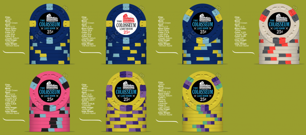
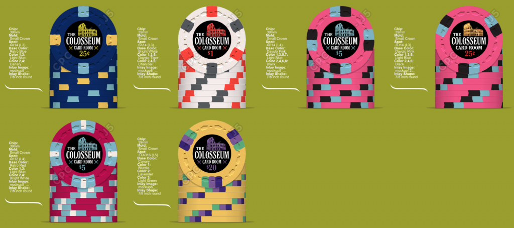
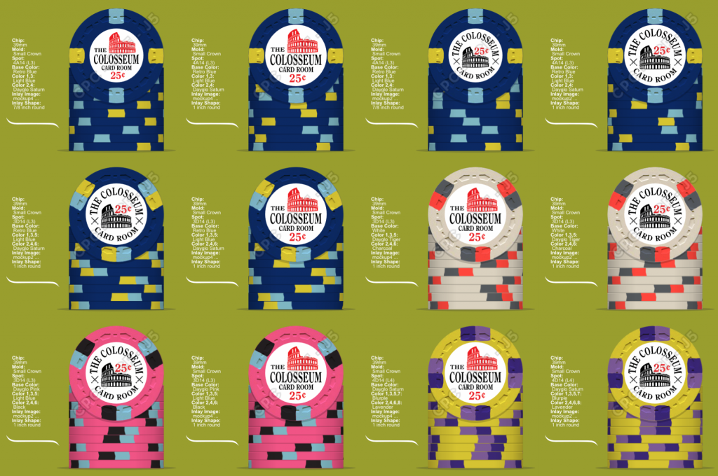
I was planning on getting customs sets sometime in the future, but the Scrown mold is really pushing me to get a design in place. This is where I'm at right now(newest on top):
trk12_2.png


trk.png
trk6.png
trk11.png


Comments/Opinions

1) I'm liking the dark inlay over the light inlay
2) I feel like I prefer the same font color for every chip(not this blue) over color matched but I'm going to see what it looks like at some point
3) Real picture of the Colosseum vs art?
4) Edge spot pattern/progression. I want to stay away from XD14+ because my eventual tournament set will use it, but it's one of my favorites so it's hard and I like the mocks with it.
5) 7/8th vs 1 inch. I'm liking 7/8th more.
6) Label progression: for example Helm, Shield, Sword, Colosseum. Preference is currently Colosseum on all.
7) Yes the $5 is based on the Pick Hobson $5
8) If there is a hundo it will probably be black 3TA316 with light blue/pink(or dg pink)/charcoal which will probably make me have to go lighter on the quarter.
 
Last edited:
Love the theme! I like the black inlays better as well.
 
Man I can't wait until these SCROWN chips start rolling off the presses!
 
I always prefer black inlays as well - make sure the blue is bright enough in the lettering to show, maybe a blue collesium and white lettering?
 
Do you have a CPC color sample set? Just noticed the yellow in your mockups were DG saturn - if you don't have a sample set make sure you get one, DG saturn is a really weird color, IMHO it's impossible to replicate the actual look on screen. I think people either really like it or really don't.
 
Do you have a CPC color sample set? Just noticed the yellow in your mockups were DG saturn - if you don't have a sample set make sure you get one, DG saturn is a really weird color, IMHO it's impossible to replicate the actual look on screen. I think people either really like it or really don't.

I actually don't have one yet. I put an ad in the classifieds to borrow one, but I will probably get impatient and just buy one soon. I wasn't going to put an order in until I see them. Thanks for the heads up.
 
I like the dark inlay with the art!
Actual picture not needed for my eye.

Switch out DG Saturn to Canary or DG Yellow?
Get Samples
 
I think dark inlays lend themselves to a more classy theme/style. If you have an upscale theme something like "Colosseum" then dark inlays work well.

Thoughts:

-I would prefer to see some standardization of edge spots. You have several different edge spot patterns. I prefer edge spot progression using a similar pattern.

- I like the colors of the 5 and spots but prefer a different spot pattern.

-I would like to see a brighter yellow used on the 20 base chip.

-I favour the pink franc and actually don't like the look of the navy frac.

-Consider changing the inlay to curve the word "Colosseum" along the circular perimeter of the chip rather than write it straight across the chip.

All just my 2c.
 
I think dark inlays lend themselves to a more classy theme/style. If you have an upscale theme something like "Colosseum" then dark inlays work well.

Thoughts:

-I would prefer to see some standardization of edge spots. You have several different edge spot patterns. I prefer edge spot progression using a similar pattern.

It's not that I don't like progressions, but I certainly don't feel they are necessary. I have mocked up exact progressions using 14 and D14+ progressions and do not think they look remotely as good as these.

- I like the colors of the 5 and spots but prefer a different spot pattern.

Which fiver? Both dayglow pinks and the retro red chip are all possible fives. The only reason one of them has a quarter inlay is because that's the only mockup I have of that inlay style and I wanted to see it.

-I would like to see a brighter yellow used on the 20 base chip.

After looking at samples Dayglow Saturn is too neon lime and Dayglow Yellow is too washed out for what I'm trying to have the chip look like.

-I favour the pink franc and actually don't like the look of the navy frac.

That's the only frac

-Consider changing the inlay to curve the word "Colosseum" along the circular perimeter of the chip rather than write it straight across the chip.

I have inlay mockups that have this(in white though) and prefer this style. I will see what a dark inlay looks like in that style but I don't expect to like it.

All just my 2c.
 
I'd offer one suggestion on the $20, since the colors are now very similar to the T25ks I have planned for a custom tourney set. Take a look at swapping out the lavender for retro lavender, the slightly pinker hue of the retro version may help to compliment the pink $5.

My other comment was going to be the repeated light blue spot on the quarter and five, but I really like both chips the way they are. I was thinking maybe swapping out the light blue on the quarter for DG green, DG peach or even butterscotch, but I couldn't tell if I like it or if it went as well with the rest of the set.

I like the inlays with the color matched Colosseum. (y) :thumbsup:

We actually tried all the purples next to each other. Devin and I both thought blurple/lavender/light green looked the best as a standalone chip. I do see what you mean about complimenting the dayglow pink though.

I had that thought as well. I know some people don't like reusing edge spot colors, but light blue and pink are my two favorite colors. I could really find anything I liked more and I think both chips work fine together.

Devin feels that was as well and I'm definitely leaning that way.
 

Create an account or login to comment

You must be a member in order to leave a comment

Create account

Create an account and join our community. It's easy!

Log in

Already have an account? Log in here.

Back
Top Bottom