Redwood Loop (Ceramics) - Feedback welcome (1 Viewer)

NachoGame

Waiting List
Joined
May 13, 2021
Messages
9
Reaction score
4
Location
California
Still working on sides.

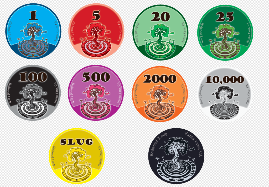
Main use will probably be board game, but they could see some poker use. 20/25s shouldn't be simultaneously at play.

1705651723382.png
 
My $0.02:
The words Redwood Loop and Santa Cruz CA are not big enough and not clear enough. Much squinting will occur at the table.
Choose a more solid font, and make the minimum font size the same as the Non Denom, if not bigger.
 
That text is so small I didn't even notice it, let alone read it. I think color matching the denom might be a nice touch too.
 
Can you explain the theme, it feels too flat.
 
Suggestions:

Yes, you will need to increase the font size somehow. Doesn't have to be huge, but print bleed might obscure or obliterate some letters.

Change 20 to Yellow. Change SLUG (?!) to Pink or White.

Instead of a solid background colour, use a gradient that radiates out from the center, like a glow or halo effect around the tree.

For rolling edge, consider taking the tree graphic by itself and separating in 4 or 5 equal height sections. Print these in 1/4 or 1/5 intervals. If you align them from the side, you will see two complete trees on top of each other in a stack of 8 or 10. If you have room, you can repeat the denomination in between each graphic segment.
 
All good feedback.

Side text:
This is purposely a bit vague because I didn't want it to be that important. Most of the time, these are used as currency for a game and I'm not interested in highlighting this a lot. But since I did want to be a "little bit" like a poker chip I ended up adding it as is. The size is not as small as it looks since this is the whole chip and not a label, it's bigger than most small text in labels. In some of Tina's files 6pt is not the smallest, but I can see how the font+size will be problematic. This is the same size as the small text in the Aces design. -- I guess it's not working, I'll think about it.

Theme:
The tree in the center is the group's logo.


Yellow - SLUG
Santa Cruz is know for banana slugs, which are yellow. I wanted to keep that a special separate color, and instead of calling it NCV I just called it slug.

Solid color:
I tried but wasn't totally satisfied. I'm battling having some pattern vs flat. It currently has an inner glow from the edge, but it's not evident on all colors.


I'll iterate, I appreciate the comments.
 

Create an account or login to comment

You must be a member in order to leave a comment

Create account

Create an account and join our community. It's easy!

Log in

Already have an account? Log in here.

Back
Top Bottom