superchromix
Full House
Hotel
Club
Card room
Hotel and casino
Club
Card room
Hotel and casino
You'd have to consider the effect on your overall design and it may just not work with the retro feel because of the larger inlay, but the fleur-de-lis seems decidedly consistent with the New Orleans theme. I think inlays that large and untextured were relatively uncommon in the time period you're looking to emulate, so FDL may be a no-go.Now I have to decide if this design will be on the scrown mold... Hmmm...
I love diamond square too. Sounds like the scrown will probably be the same price as Diasqr, so it'll be whichever you prefer between those two. At least on my sample mold set, the texture on Diasqr is a little more subtle than some of the other molds, so it may be better for printing your detailed inlay than H-mold or others would be anyway. But scrown may be better still.I absolutely hate the FDL mold. I think the DiaSquare mold is nearly perfect. There are many examples of that or similar during that timeframe. The H-mold is good too, but I prefer the DiSq. The scrown is interesting because it is appropriate for the time too. I think I like the DiSq better though due to more detail. I'll have to see how it looks once the scrown gets added to the chip tool.
It would probably work well on the Lcrown, but I'd also keep it on the MD50.. I hope to one day add a custom MD-50 set . Classic.Now I have to decide if this design will be on the scrown mold... Hmmm...
")
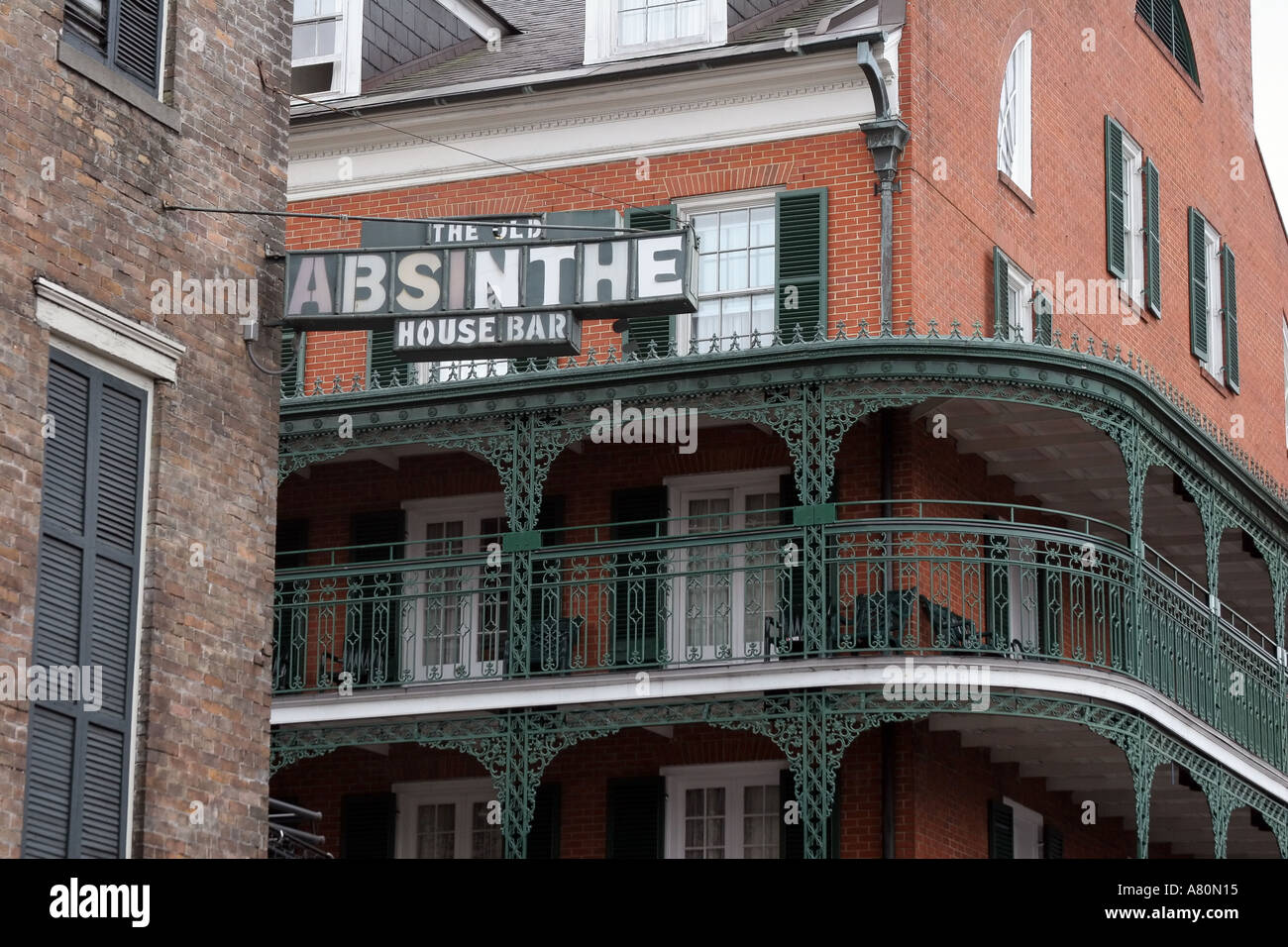
Sounds too modern to me. Here is an image of the actual place that is depicted in the NCV chip. Note the name is Old Absinthe House Bar.
But it’s the song, man!! “There is a house in New Orleans they call the Rising Sun.”well.. “Club” is certainly not modern ... you find it on chips from the 40s anyway. Might want to keep looking past “Public house” because somehow it’s not quite conjuring the right image ...
Something simple like “Hotel” would also work.. also because a building that size is probably also going to be a hotel...
well.. “Club” is certainly not modern ... you find it on chips from the 40s anyway. Might want to keep looking past “Public house” because somehow it’s not quite conjuring the right image ...
Something simple like “Hotel” would also work.. also because a building that size is probably also going to be a hotel...
3 definitelySo working with @chipjoker on the "HOUSE" vs "PUBLIC HOUSE" thing... I am now looking for feedback on the four images below.
View attachment 207865