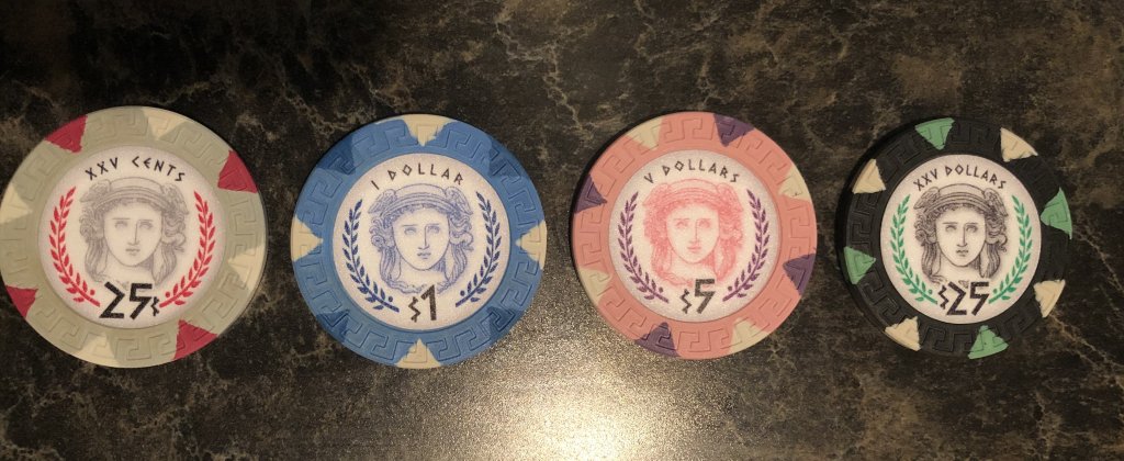
For a poker chip, I'd consider an image of Nike/Victoria (goddess of luck) or Athena/Minerva (goddess of strategy)
You are using an out of date browser. It may not display this or other websites correctly.
You should upgrade or use an alternative browser.
You should upgrade or use an alternative browser.
Post your 8V semi custom thread (8 Viewers)
- Thread starter JoeBGo
- Start date
Are you planning on printing your own or having someone else print them?
I'll use at @Gear. This will be project #6 using him (+ two previous add-on orders). I've been happy with the result every. single. time.
If I were to print them myself I fear I would let myself down, run out of ink half way through, and likely smash my printer

SeanGecko
4 of a Kind
Gear is awesome.
Jonesey07
Full House
I'll use at @Gear. This will be project #6 using him (+ two previous add-on orders). I've been happy with the result every. single. time.
If I were to print them myself I fear I would let myself down, run out of ink half way through, and likely smash my printer
If you stick with a similar design I’d possibly be interested in buying some!
If you stick with a similar design I’d possibly be interested in buying some!
Whether or not I stick with a similar design, if you're interested, I'd be happy to share (y) :thumbsup: I'll PM you toward the end of the weekend.
Jonesey07
Full House
Awesome! I’m a big fan of the Greek theme! I am ordering chips and labels from ABC just have to find some artwork!Whether or not I stick with a similar design, if you're interested, I'd be happy to share (y) :thumbsup: I'll PM you toward the end of the weekend.
I’m going with the following:
Grey .25
Blue - $1
Pink - $5
Green - $25
Getting close!

SeanGecko
4 of a Kind
Getting close!
View attachment 221344
That’s the one.
And you’re about 4 hours away from me. So future game!
Right on! I'd love to connect with the Omaha crowd sometime! Maybe get some Des Moines folks in on it, too.That’s the one.
And you’re about 4 hours away from me. So future game!
SeanGecko
4 of a Kind
Right on! I'd love to connect with the Omaha crowd sometime! Maybe get some Des Moines folks in on it, too.
I’m a micro stakes player. There’s a reason we have nickels in our games. The games are fun though and we’ve worked hard to make them good. You’ve seen the cash sets I made! We put work into our little cash game. Next one is the 22.
Jonesey07
Full House
Just labeled one of each...

SeanGecko
4 of a Kind
25!!! must be GREEN!!!!
SeanGecko
4 of a Kind
I'm kidding they look great.
Jonesey07
Full House
Yeah really wish I would have gone 20 on the black. They look great though!!
SeanGecko
4 of a Kind
If you get the desire to in the future you can always change it. All it takes is money and time...…. two things that are..... not really easy to come by.Yeah really wish I would have gone 20 on the black. They look great though!!
Just labeled one of each...
Seems like you got these really quickly, or I've lost track of time. What was your turnaround on these, invoice to delivery?
Jonesey07
Full House
Ordered on Black Friday, paid my invoice last Monday so about a week and a half?
That's pretty quick. They look good! (y) :thumbsup:
I paid Thanksgiving weekend, but didn’t get him my design till Sunday evening. They shipped out today!
I paid Thanksgiving weekend, but didn’t get him my design till Sunday evening. They shipped out today!
Time well spent. Your label looks good!
Thanks!Time well spent. Your label looks good!
Jordan Downs
3 of a Kind
Man those chips are F’n awesome! I really like how the $100 looks. Also the way the inlay colors match the $20 8v spot colors. Great job (y) :thumbsup:
SeanGecko
4 of a Kind
I like the crown with the circle bestEarly on in trying to figure out what to do. Intending to do a black laser print on silver polyester. Waffling on which of the following three concepts to try and improve. Welcome any comments (including "keep your day job, you suck at graphic design!").
View attachment 225419
I like the crown with the circle best
Ditto. You might grow out of your Anarchy phase, or move out of New Orleans. The crown is clean and simple and will stand the test of time.
SeanGecko
4 of a Kind
Maybe add your initials into the crown in a subtle way.Early on in trying to figure out what to do. Intending to do a black laser print on silver polyester. Waffling on which of the following three concepts to try and improve. Welcome any comments (including "keep your day job, you suck at graphic design!").
View attachment 225419
Ditto. You might grow out of your Anarchy phase, or move out of New Orleans. The crown is clean and simple and will stand the test of time.
Heh, heh ... never really had an anarchy phase, am WAY too old to grow out of anything and don't live in New Orleans. "Rising Sun" is referring to the song and to my old nickname ("Mr. Sunshine" ... irony is fun). The "Anarchy" thing just came out of trying to think of an iconic graphic, my enjoyment of punk, and mocking my players for being a bunch of random goofs. Suggested it as a possibility for a hot stamped A-mold buy that ended up going another direction. I've got a "chaos" set idea too, but that one requires color.
I certainly think you're right in that the crown is the closest to "ready".
Maybe add your initials into the crown in a subtle way.
How dare you suggest defacing the logo of the grand and proud "LA Kings" franchise?! (Current residents of the basement in the NHL standings ...)
Thanks for your thoughts, guys.
Similar threads
- Replies
- 10
- Views
- 586
- Replies
- 13
- Views
- 529
- Replies
- 14
- Views
- 400

