- Joined
- Dec 29, 2017
- Messages
- 25,940
- Reaction score
- 35,097
- Rewards
- 0
- Location
- Burnaby (Greater Vancouver), BC
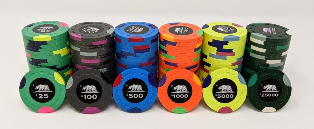
Is this as close as you can get with CPC colors?
alternate 5k as a bounty...I wish CPC had a correct Yellow, Indian Blue, Radiant Red and a Tan...
View attachment 487679
Get an updated colour sample set to make sure.