Which usefully demonstrates how wrong is to take into account the weighed/unweighed criterion (as a hard-and-fast rule) when designing CPC chips")
I’m not sure what you mean. Both look great. It’s just that one set would be about $150 less expensive than the other.Which usefully demonstrates how wrong is to take into account the weighed/unweighed criterion (as a hard-and-fast rule) when designing CPC chips
How do I get in on this 4moon NAGB?$1 would be 4moon.
Lol. I’ve been told it is now an option. Sets have been made with that spot pattern. But not in the tool yet.How do I get in on this 4moon NAGB?
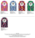
Update on the $1. I'm about ready to order a huge set. Just need to sell some stuff first.


 Especially with this label.
The $1, $5, and $20 are fire!Update on the $1. I'm about ready to order a huge set. Just need to sell some stuff first.
View attachment 570874


Huge AS Cali set. Took a year to put it together...but the heart wants what the heart wants.The $1, $5, and $20 are fire!
Whatcha selling??
Not a fan of DG yellow as a base color. But I have thought about bright white for the $20.Scott, you need more contrast (IMHO) on the following chips:
-DG Arc Yellow spots instead of DG Peach spots on the Retro Red ($5)
-Green, or even Retro Green spots on the DG Arc Yellow chip ($20). Even better if you made the base color DG Yellow (IMHO, and excuse me for the nuisance)
The dime chip is the cold nutz.
The $20 is perfectly fine as it is. Certainly don't swap out the Arc Yellow (you'll bite your ass if you ever see a Paradise LA $5 in person) and even the DG Green doesn't have to.Scott, you need more contrast (IMHO) on the following chips:
-DG Arc Yellow spots instead of DG Peach spots on the Retro Red ($5)
-Green, or even Retro Green spots on the DG Arc Yellow chip ($20). Even better if you made the base color DG Yellow (IMHO, and excuse me for the nuisance)
The dime chip is the cold nutz.
dibs on a sample setUpdate on the $1. I'm about ready to order a huge set. Just need to sell some stuff first.
View attachment 570874
You found it! Not sure when the order will go in. I missed the cutoff.dibs on a sample set
seems like a lot of pinkDoes this count?
I’m assuming if anyone bets with the MTA chip the Roulette wheel skips a round and takes ten minutes longer than expected, right?
Great idea on the apple motif that will certainly replace the fugazi Brooklyn Bridge. Thanks!!Looking good!
NYNY in Vegas makes the heart-suit on their cards an apple instead of a heart. Just throwing it out there as a potential idea on that pink chip, although I realize the historic use of that specific logo though.
Example:
View attachment 572645
Lefty: I don't know how the fuck you knew that ring was a fugazi.Great idea on the apple motif that will certainly replace the fugazi Brooklyn Bridge. Thanks!!
One of my favorites. I practically grew up around the vestiges of the old Motion Lounge, my uncle grew up in the neighborhood with half the guys the movie is about (he became a detective though lol)Lefty: I don't know how the fuck you knew that ring was a fugazi.