QueensFool
Sitting Out
Hey everyone, I’m looking for some feedback on a custom set I’ve been working on. I’ve been playing around with the colors and spot patterns in ChipMatic and would love to get some opinions before moving forward.
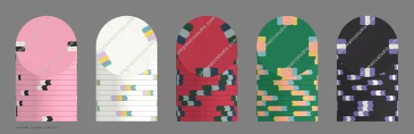
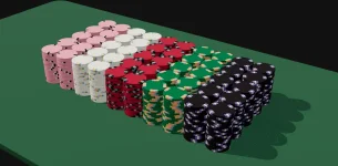
I attached the chip mockups with blank inlays since the artwork is still being finalized. Right now I’m mainly looking for feedback on the spot patterns and how the set flows together as a whole.
The inspiration for this set comes from the look of Harrah’s Cherokee chips. I really like the clean casino feel of their chips and wanted to create something with a similar aesthetic while still making it my own.
For reference, the breakdown is:
Pink = $0.25
White = $1
Red = $5
Green = $25
Black = $100
A few things I’d love opinions on:
Do the spot patterns feel balanced across the set?
Does the progression from the lower to higher denominations feel natural?
Are there any spots that you think work well (or don’t work)?
Is there anything you would tweak before production?
Would love to hear what you guys think!
I attached the chip mockups with blank inlays since the artwork is still being finalized. Right now I’m mainly looking for feedback on the spot patterns and how the set flows together as a whole.
The inspiration for this set comes from the look of Harrah’s Cherokee chips. I really like the clean casino feel of their chips and wanted to create something with a similar aesthetic while still making it my own.
For reference, the breakdown is:
Pink = $0.25
White = $1
Red = $5
Green = $25
Black = $100
A few things I’d love opinions on:
Do the spot patterns feel balanced across the set?
Does the progression from the lower to higher denominations feel natural?
Are there any spots that you think work well (or don’t work)?
Is there anything you would tweak before production?
Would love to hear what you guys think!