-
PCF is an eBay Partner. If you make a purchase through one of our links, we may earn a commission at no extra cost to you. Thank you for your support!
You are using an out of date browser. It may not display this or other websites correctly.
You should upgrade or use an alternative browser.
You should upgrade or use an alternative browser.
Post mockups for fun/science? (5 Viewers)
- Thread starter lherron
- Start date
realcdn
Flush
Avengers inspired cash set, on the 'A-Crest' mold obviously!
#1 - Captain America ($1)
#2 - Iron Man ($5)
#3 - Hulk ($25)
#4 - Thor ($100) -having troubles getting this one to "match" the character.
Need a frac ($0.25).... and some inlays! But fun first time playing with the Chip Tool!

#1 - Captain America ($1)
#2 - Iron Man ($5)
#3 - Hulk ($25)
#4 - Thor ($100) -having troubles getting this one to "match" the character.
Need a frac ($0.25).... and some inlays! But fun first time playing with the Chip Tool!
Nex
Flush
- Joined
- Jan 25, 2017
- Messages
- 2,193
- Reaction score
- 3,417
- Rewards
- 193
- Location
- Club Hel, Downtown Megacity
Thor: Gray, Red, Canary (HAIR!!)
Iron Man: Retro Red, Saturn (never seen an orange metal suit)
Iron Man: Retro Red, Saturn (never seen an orange metal suit)
realcdn
Flush
Thor: Gray, Red, Canary (HAIR!!)
Iron Man: Retro Red, Saturn (never seen an orange metal suit)
Thanks for the suggestions! Good catch on the Iron Man... but still not sure about the Thor.
Nex
Flush
- Joined
- Jan 25, 2017
- Messages
- 2,193
- Reaction score
- 3,417
- Rewards
- 193
- Location
- Club Hel, Downtown Megacity
Gray instead of Charcoal will sure brighten the chip up. Could also experiment with DG Yellow instead of Canary.
- Joined
- Dec 29, 2017
- Messages
- 25,940
- Reaction score
- 35,097
- Rewards
- 0
- Location
- Burnaby (Greater Vancouver), BC
What about Phase 2 Avengers?
$1 - War Machine (?)
$5 - Scarlet Witch
$25 - Vision
$100 - Black Panther
$1 - War Machine (?)
$5 - Scarlet Witch
$25 - Vision
$100 - Black Panther
- Joined
- Dec 29, 2017
- Messages
- 25,940
- Reaction score
- 35,097
- Rewards
- 0
- Location
- Burnaby (Greater Vancouver), BC
I think Cap should be a base Blue chip with Red/White stripes, and a faux-star-shaped inlay
Jonesey07
4 of a Kind
Made a mock tourney set.
25 chip was no inspiration
100 chip inspired by the MTSU Blue Raiders (closest college to our group)
500 chip inspired by the LSU Tigers (founding member is an LSU fan)
1000 chip inspired by the Tennessee Volunteers (Duh, Go Vols!)
5000 chip inspired by the Nashville Predators (Go Preds!)
andy699669
3 of a Kind
Remember the infamous "WSOP House Mold" chips? I made additional iterations with 2V6TA18A and 2HC6TA18A spots. 43mm Hybrids with AC Oversize 1-inch label.

Last edited:
realcdn
Flush
Being a Canadian, naturally my favorite sport is hockey, and being a Vancoverite, my team is the Canucks (sorry guys) - despite not having much to cheer about lately. lol
The Canucks have had a lot of logos over the years and various colours, which lends itself well to making multiple chips denominations. Speaking of denominations, if I were to go ahead with this set, I think it would be a cash set ($0.25, $1, $5, $25 & $100) with denom's on the reverse side of the chips... don't think it would make sense to try and incorporate into the logos.
I know this set isn't going to appeal to many others but any constructive suggestions would be welcomed. I'm also well aware how gaudy the "skate" logo is, and the related chip designs, but its an iconic bit of Canuck history and truly one of my favorite chips in the set... if I could only decide which one I like best! It grows on you, trust me. lol
What ya think?
Nex
Flush
- Joined
- Jan 25, 2017
- Messages
- 2,193
- Reaction score
- 3,417
- Rewards
- 193
- Location
- Club Hel, Downtown Megacity
Í am not into sports stuff at all, but the black-orange mockups do look good. Even the logo style on that one. (Would sure be a great template for a graphics artist to make a custom text logo for a poker club)
All around best one is probably the 1/4 Pie 414 with the Saturn spots, followed by the 4DSA316, followed by the 6A18.
All around best one is probably the 1/4 Pie 414 with the Saturn spots, followed by the 4DSA316, followed by the 6A18.
- Joined
- Dec 29, 2017
- Messages
- 25,940
- Reaction score
- 35,097
- Rewards
- 0
- Location
- Burnaby (Greater Vancouver), BC
Go Canucks!
Pete
Two Pair
Being a Canadian, naturally my favorite sport is hockey, and being a Vancoverite, my team is the Canucks (sorry guys) - despite not having much to cheer about lately. lol
The Canucks have had a lot of logos over the years and various colours, which lends itself well to making multiple chips denominations. Speaking of denominations, if I were to go ahead with this set, I think it would be a cash set ($0.25, $1, $5, $25 & $100) with denom's on the reverse side of the chips... don't think it would make sense to try and incorporate into the logos.
I know this set isn't going to appeal to many others but any constructive suggestions would be welcomed. I'm also well aware how gaudy the "skate" logo is, and the related chip designs, but its an iconic bit of Canuck history and truly one of my favorite chips in the set... if I could only decide which one I like best! It grows on you, trust me. lol
What ya think?
View attachment 198475
View attachment 198476
The skate logo is iconic! Loved those 80’s era Canucks teams of my youth bringing the likes of Harold Snepts, Garth Butcher and Craig Coxe to town to play the Flyers @ The Spectrum!
Great mock and yes, love the idea of one side of the chip being just the logo and the other for the denom. (y) :thumbsup:
andy699669
3 of a Kind
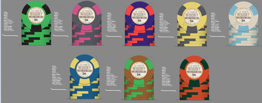
I know this has done multiple times over, but I just want to know if the colors are correct, or some adjustments needs to be made. Here it is the 818 43mm WSOP/WPS 2008 Secondary set.

Do you happen to know if CPC no-mold (plain/textured) has an equally sweet low-pitch rumble as e.g. the PAULSON house mold?Toss-up between diamond-square and jockey. Sound/feel is probably closer with diamond-square, but jockey has the edge with visual appearance similarity.
Other CPC molds with concentric ring (which helps define the similar THC look and feel characteristics) are B-mold, horsehead, A-mold, and circle-square.
I love the no-mold minimalism, but if it makes no sweet sound, one may as well opt for CPC ceramics (for the same looks).
andy699669
3 of a Kind
Based on Horseshoe Cleveland Primaries. 43mm Hybrid or Full Ceramic possible.

Can I ask what program you’re using for the mockups? I’d love to design a tournament set of hybrids.Based on Horseshoe Cleveland Primaries. 43mm Hybrid or Full Ceramic possible.View attachment 199564
andy699669
3 of a Kind
Inkscape.Can I ask what program you’re using for the mockups? I’d love to design a tournament set of hybrids.
Jonesey07
4 of a Kind
Big fan of the Andy699669 house mold.Based on Horseshoe Cleveland Primaries. 43mm Hybrid or Full Ceramic possible.View attachment 199564

Pinball
Full House
5000 chip inspired by the Nashville Predators (Go Preds!)
I like the Preds, msinly because of the Swiss players. Josi, Weber and Fiala
Being a Canadian, naturally my favorite sport is hockey, and being a Vancoverite, my team is the Canucks (sorry guys) - despite not having much to cheer about lately. lol
The Canucks have had a lot of logos over the years and various colours, which lends itself well to making multiple chips denominations. Speaking of denominations, if I were to go ahead with this set, I think it would be a cash set ($0.25, $1, $5, $25 & $100) with denom's on the reverse side of the chips... don't think it would make sense to try and incorporate into the logos.
I know this set isn't going to appeal to many others but any constructive suggestions would be welcomed. I'm also well aware how gaudy the "skate" logo is, and the related chip designs, but its an iconic bit of Canuck history and truly one of my favorite chips in the set... if I could only decide which one I like best! It grows on you, trust me. lol
What ya think?
View attachment 198475
View attachment 198476
While I find the thought of watching the 'Nucks play hockey about as appealing as getting a root canal, I have to admit, you really nailed the design of these chips - really sharp and a great tribute the history of the franchise. As for the $100 chip, my pick would be either the 1/4 PIE, or the 6A18 versions, as I feel they best fit with the design of the other chips. Also, IMO, the "Flying Skate" Logo is one the best logos in NHL history.
- Joined
- Dec 29, 2017
- Messages
- 25,940
- Reaction score
- 35,097
- Rewards
- 0
- Location
- Burnaby (Greater Vancouver), BC
While I find the thought of watching the 'Nucks play hockey about as appealing as getting a root canal,/QUOTE]
BLASPHEMER!
Okay, okay, I get your point.
andy699669
3 of a Kind
Horseshoe Cleveland Secondaries reference, except for the 5 which is from Horseshoe Cincinnati. 43mm possible Full Ceramic or Hybrid Ceramic. Made with Inkscape.

Last edited:
Been seeing a bunch of mock-ups with monotone colors lately. Thought I'd try my hand at it.

Just playing around tonight.
25¢, $1, $5, $20

25¢, $1, $5, $20
andy699669
3 of a Kind
Questions:
1. Are the colours correct?
2. Are there any changes needed regarding the edgespots, are all of them must be hourglass-shaped?
Bobb59
Full House
saleen121212
Full House
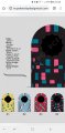
Thoughts? From first to last = quarter, $1, $5, $20. Haven't figure out how to add text or images if anyone has tips. No idea.
Attachments
BSteck
Full House
Thoughts? From first to last = quarter, $1, $5, $20. Haven't figure out how to add text or images if anyone has tips. No idea.
Try out the the ‘Save as PNG’ link.
")
Text and images are added by creating an ‘Inlay’ image.
Last edited:
Each individual chip is nothing short of beautiful. There may be some room for improvement for them to work as a team, however.Thoughts? From first to last = quarter, $1, $5, $20. Haven't figure out how to add text or images if anyone has tips. No idea.
Blue, either as Imperial or Light is omni-present. What's more, the combination of Light Blue with Mandarin Red is used on two consecutive chips.
Progression-wise, in my "book" (which is just me) the hierarchy would be 414 (or 418) - 4D18 - 4DSA316 - 6D18 (or 8D18).
My 2c
Attachments
Similar threads
- Replies
- 15
- Views
- 323
- Replies
- 6
- Views
- 791
- Replies
- 17
- Views
- 1K