Post mockups for fun/science? (12 Viewers)

What do you think?
Unknown.png
 
What do you all think?

In my opinion...
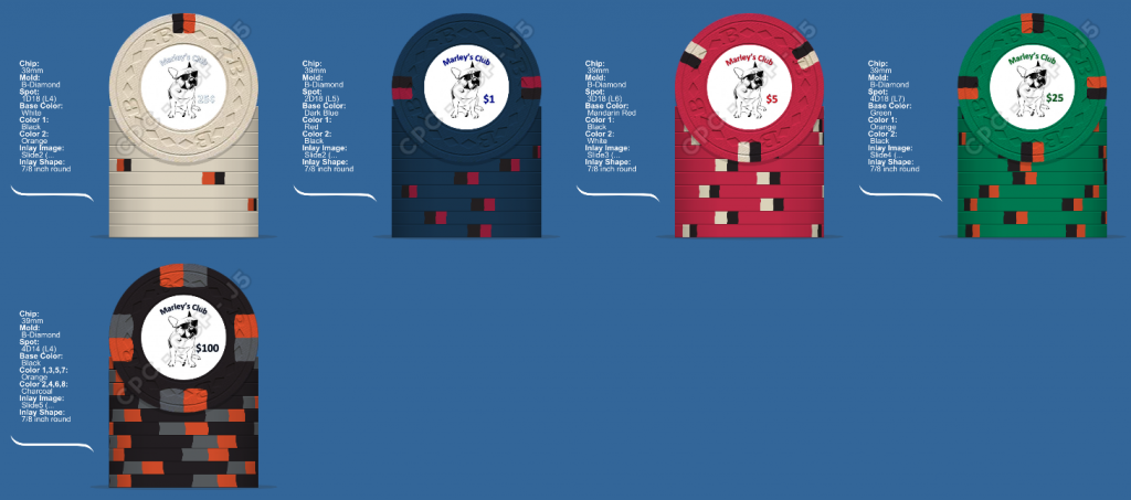
- Font needs rework: Club name bigger, maybe a different font, and correctly curved along the round border of the inlay. Maybe position to the left of the dog. Denom font also needs to be a bit bigger, potentially different font, maybe also make the currency symbol smaller than the number.
- Base&spots on the $1 are quite dark, might not look good. Especially doesn't fit in with the other, brighter denoms.
- I'd not reuse black and orange that often.
 

I like the theme and base colors, spot progression is good, but I would venture out to more colors.
Larger club name, move the dog to the left and increase the denom size, also keep the denoms the same color (black or red work well).

Maybe the name would be black and the dogs sunglasses change color according to and edge spot..


Just my opinion...
 
The handwriting-style font for the club name becomes badly legible when bent around.
Changing color of the dog shades don't look good to me.

Colors look better, and I'm indifferent about the edge spot type changes.
You might want to change the $1's dark blue to normal blue though. Dark Blue is near black in person while the normal Blue is still quite dark (much darker as shown in the design tool).
Also maybe consider DG Peach as an alternative to your Orange spot (Orange is quite dark too, and DG Peach is very orange in person).

Really, do get color samples.
 
Definitely an improvement. Font is still bent just a little bit too much for my taste, but legible now. Maybe do an experiment and reduce only the font height (i.e. not the font size, but actually squeezing it) to maybe 90-95%.

Also maybe bend the "Est. 2007" around the border of the chip too?

As for color matching, if you use Adobe Illustrator, I have made a color swatch file with the exact color codes from the chip design tool (if those are accurate is a different story though). It seems like it's not possible to save names with each swatch, but the order is unchanged and exactly the same as in the chip design tool. Unfortunately I can't upload it here as the forum doesn't like the file extension, but here: http://www69.zippyshare.com/v/fMmB8CKP/file.html
What do you use for mock ups? I'm currently just using PowerPoint and saving it as a jpeg.
 
As for color matching, if you use Adobe Illustrator, I have made a color swatch file with the exact color codes from the chip design tool (if those are accurate is a different story though). It seems like it's not possible to save names with each swatch, but the order is unchanged and exactly the same as in the chip design tool. Unfortunately I can't upload it here as the forum doesn't like the file extension, but here: http://www69.zippyshare.com/v/fMmB8CKP/file.html

FYI - I think if you zip the file you can then upload it
 
There are a bunch of resident designers around here. The name I've read most often so far is @Johnny5 but there's also @p5woody and a few more.

Both have done designs for me. Check out my Sunsets and Bourbon Basement poker chips. You'll see that both of these guys are fantastic at designing inlays for chips.
 
Not sure if this is the right place to share. I'd eventually like to put together a Tragically Hip themed custom chip set (both my wife and I are fans, so it will help a bit to get the purchase through).

I have based the colours of each chip on different album art. My wife was able to name each album so I think I got them right. The inlay's are based on t-shirt designs (rough mock ups as I don't have excellent photo editing skills). My thought would be to have this inlay on one side and then the denom over a ghosted inlay on the other side.

Looking at each of the levels I think this may currently be outside my budget. I have done more denoms than I would use but just playing around for now.

HipChips2.png


This will be a tournament set starting at T25. I would likely drop the last few chips, so from the top left it would be T25, T100, T500, T1000, T5000, T25K.
 
Last edited:
  • Like
Reactions: Nex

Create an account or login to comment

You must be a member in order to leave a comment

Create account

Create an account and join our community. It's easy!

Log in

Already have an account? Log in here.

Back
Top Bottom