Nex
Flush
- Joined
- Jan 25, 2017
- Messages
- 2,191
- Reaction score
- 3,411
- Rewards
- 81
- Location
- Club Hel, Downtown Megacity
You definitely should reduce the denoms down. Even 7 denoms (5c, 25c, $1, $5, $20/$25, $100, $500) is already covering a broad range of stakes, and would require a large number of chips in total to be useful. If you're on a budget and can't get too many chips, I'd probably aim for 5 denoms (25c-$100) that cover a narrower range of stakes.
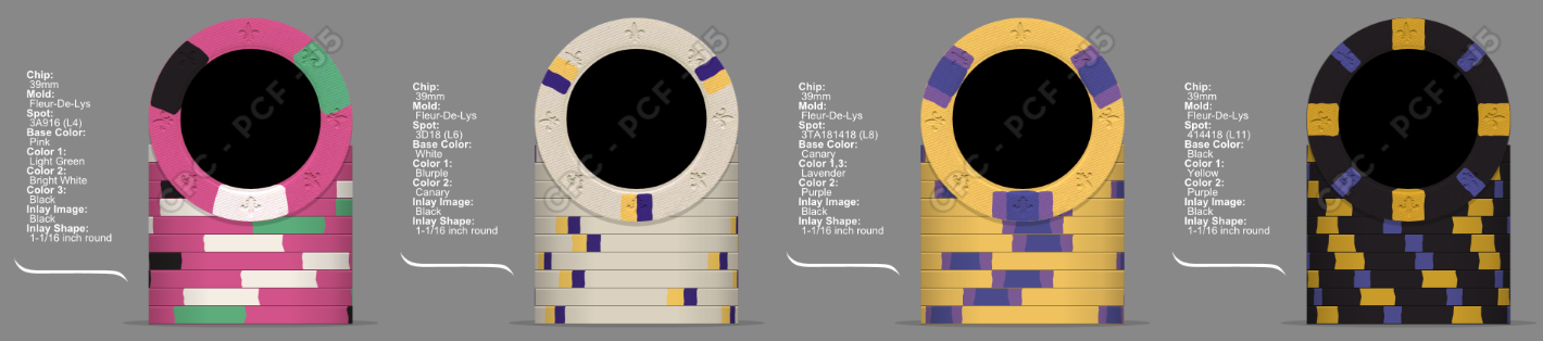
While reducing designs, primarily think about contrast: You want all the denoms to be easily distinguishable from each other, not just looking at the chips' faces, but also when they are stacked. Specifically you want to avoid multiple dark body colors with nothing to brighten them up. Retro Blue and Charcoal for example might already be hard to tell apart from each other under bad lighting conditions, and the same might apply for the broad black spots on your 1/2 pie 214 and 1/4 pie 3c chips when these are stacked.
Do get CPC color samples because the chip design tool can be VERY misleading regarding specific chip colors. Some are way off.
Last edited:

")
 :
: