links_slayer
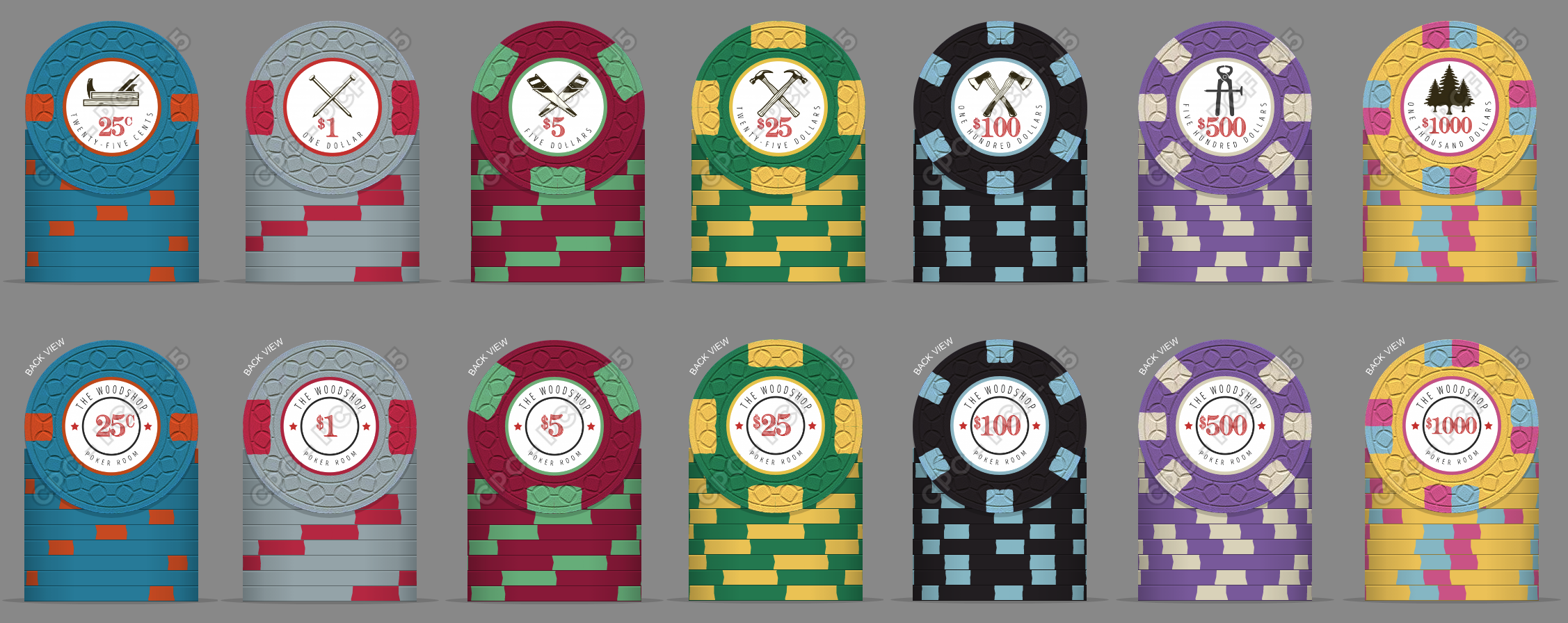
4 of a Kind
Hope to move forward with this sometime in 2018 ")

Thanks, I think you're right. What do you think about repeating the yellow on the 5s/25s?
Bi-colored q-pies? You have my attention.Hope to move forward with this sometime in 2018
They all say 1 dollar. Of course, I assume they are going to be all different denominations, with appropriate lettering difference on the label.
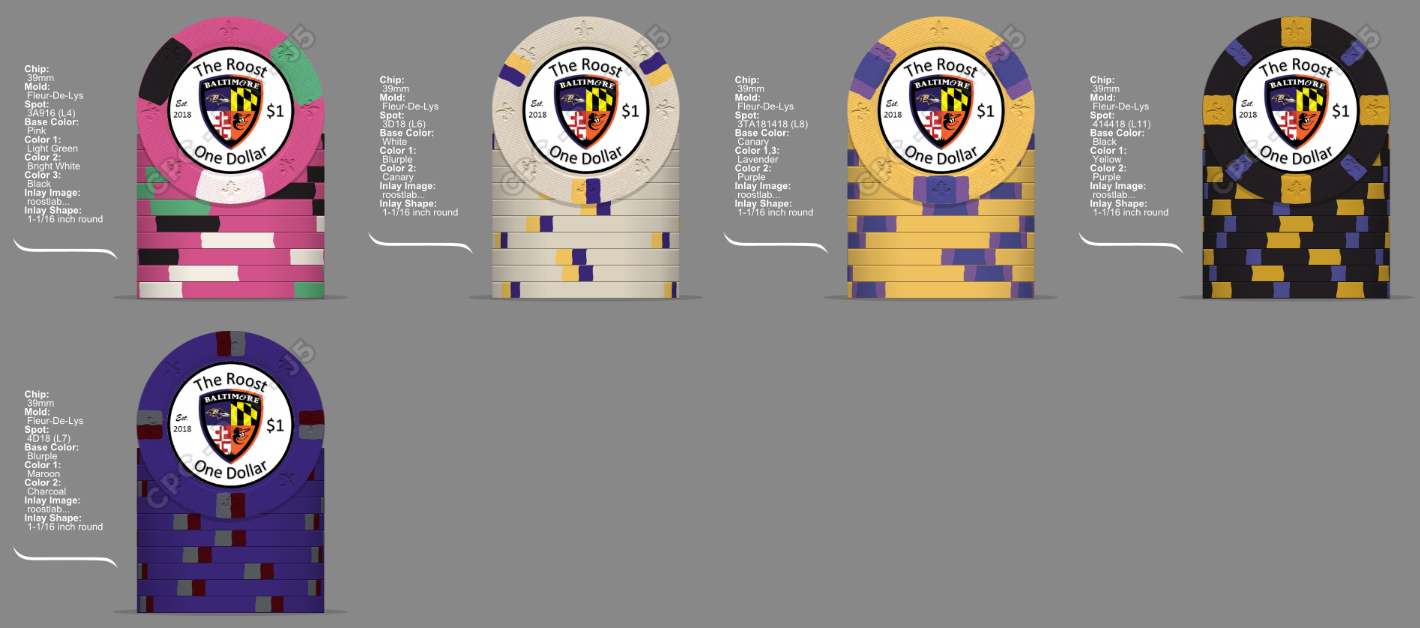
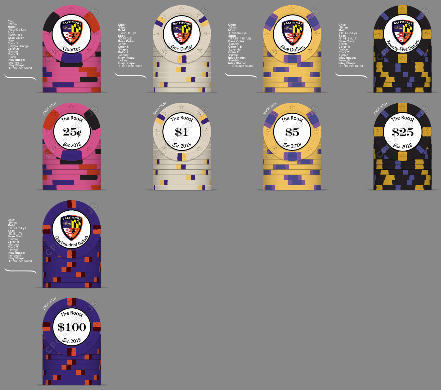
This is actually one of the most complicated labels I've seen (not that this is a bad thing). We're talking about 1" diameter - will the graphics and text be easy to read? The shield alone has 4 quarters AND a header! Might I suggest Side 1: Shield graphic and "X Dollar" text denom, while Side 2: "The Roost", "est. 2018", and large numerical denom?
The edgespot colours of your grey and black chips almost exactly match the base chip and edgespot colour of your gold chip. I would consider changing at least one (or both) of the edgespot colours so they don't match that chip (or each other).
But I totally love the shield design and the FDL. What would make it even more amazing is if you can use a gear-shaped inlay to mimic the crenellation pattern on a castle wall!
Took those changes, it does look better IMHO...
Evolution of my colorful best of. Hope you enjoy. - Think I should really stop, before I simply have to buy more chips.
Edit: Also like the Maps 5$ chip, some changes made on the orange chip
]
nevermind... ignore this comment....

Top left was nice
Does anyone know about someone who have chips with this spot pattern? View attachment 148320
You'r probably right, ill try another place.This might not be the best thread for you to post your question... but here are the closest available chips that I can think of...
View attachment 148321 View attachment 148322