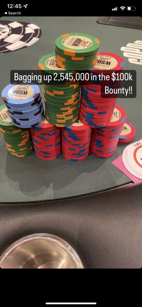
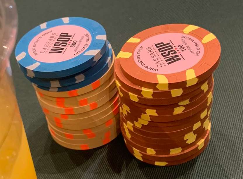
Yeah a single color 5v would actually be cool. But they way they did it is just bad. The T100 could’ve been awesome, but nope they managed to mess it up lol.Why the hell is red the new standard color for the T5ks, I just don’t get it.
And I feel like the 5v would look infinitely better in a single color, would actually be pretty cool.
You are using an out of date browser. It may not display this or other websites correctly.
You should upgrade or use an alternative browser.
You should upgrade or use an alternative browser.
Official WSOP 2022 Chips Thread (4 Viewers)
- Thread starter kmccormick100
- Start date
Pfft, ya'll too OCD. That V5 is a little weird, but overall it's fine.
I suspect the same crowd that goes on and on about "edgespot progression" nonsense are the ones tilted by the lopsided color V5 spots.
Also, the fact that color/spot combos are reserved forever by GPI (i.e., never re-used) suggests there are more of these weirdo spot and color combos coming in the future.
Ali building stacks. These sets are just too many primary saturated colors, mehhh.

these spots are comically bad
bsdunbar1
4 of a Kind
Most importantly, that man is in need of a drink!
That's the coolest lammer I've ever seen.
GROUP BUY
Mandos
3 of a Kind
You don't have to have OCD to be bothered by the 2 tone 5V. 1 color would have been great, or 5 different colors would be fun too (especially on a white base) but 2 just doesn't work.
gopherblue
Straight Flush
Zmasterben
Flush
Buy-in chip for this year

AnteAndy
Straight
You make it sound like that's a bad thing.Ali building stacks. These sets are just too many primary saturated colors, mehhh. View attachment 921356
Zmasterben
Flush
First good look I have found on the fourth set. Looks like they are using them in satellites right now.
The 25s have 4 edgespots but the middle denominations have 6 edgespots. I wonder if the higher denoms have 8?

The 25s have 4 edgespots but the middle denominations have 6 edgespots. I wonder if the higher denoms have 8?
When Paulson has a beautiful nuanced color palette it is.You make it sound like that's a bad thing.
Can't wait to see what crazy things they've done with 43mm+ chips.
Zmasterben
Flush
Do those half moons look real thin or is it just me?
They're super thin. I think they're almost more like a 5/16" spot that happen to be round on some of the sides of the chips. Thought they might be the RFID inserts initially because they're so shallow, but I don't think so.Do those half moons look real thin or is it just me?
Zmasterben
Flush
Do those half moons look real thin or is it just me?
The other thing I am realizing now is all of the edgespots on every set are very small in comparison of the entire chip. Straight lines, mini triangles, and undersized half moons.
Players are also commenting early on Twitter that they are having a really easy time differentiating between denoms as compared to at the Rio. I would bet a WSOP buy-in* that this was completely intentional on their part after years of complaining. As much as we the chip nerds/snobs don't like them, they clearly went with functionality over artistic license.
Just some added perspective for people saying "WHY?"
I'd also bet a WSOP buy-in* that they probably have some kind of exclusive agreement with Paulson that the company cannot use these edgespot styles on any other chips either ever or for an agreed upon period of time (not that these forums would have any idea why they would need that....)
*offer not valid on planet Earth
Mandos
3 of a Kind
That would explain why they chose to use a funky two tone 5v - don't want to waste a good onethey probably have some kind of exclusive agreement with Paulson that the company cannot use these edgespot styles on any other chips either ever
Mandos
3 of a Kind
Fully agree and i can't blame them.As much as we the chip nerds/snobs don't like them, they clearly went with functionality over artistic license
I like that the bold colors make the chips easily distinguishable. I hate watching triton tournaments and not being able to tell what color they just bet.
AnteAndy
Straight
I'm a sucker for vibrant primary colors.Fully agree and i can't blame them.
I like that the bold colors make the chips easily distinguishable. I hate watching triton tournaments and not being able to tell what color they just bet.
I'd also bet a WSOP buy-in* that they probably have some kind of exclusive agreement with Paulson that the company cannot use these edgespot styles on any other chips either ever or for an agreed upon period of time
I’ll take that bet
chicubs1988
Flush
The only ones that really standout to me in any way are the 5Vs, and they remind me of when a sports fan doesn't leave themselves enough space on their sign and has to cram in the last few letters. I have a hard time wrapping my brain around the idea that those edgespots were intentional.
Thisfiendis138
Full House
Mandos
3 of a Kind
Not a fan of the brown T100s
I wonder if the main event will have it's own chip set.
Legend5555
Full House
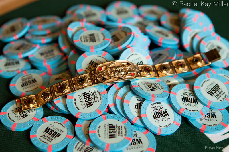
Good pic of the 100ks.

jpietrella
4 of a Kind
Well I don't hate that one.
All these photos.... I like their colors and spots in general but, as was already said, the denom on them is just too small.
I think the size of "WSOP" and the denom font size should be reversed.
I think the size of "WSOP" and the denom font size should be reversed.
I really like this set. Today’s $500 is one of the gigantic field event that typically used BJ…wonder what they use today
Similar threads
- Replies
- 4
- Views
- 2K
- Replies
- 2
- Views
- 2K
- Replies
- 9
- Views
- 2K


