Go easy, Squirrely Dan.If Letterkenny isn't at least considered for one inlay I suggest you let that one marinate!
You are using an out of date browser. It may not display this or other websites correctly.
You should upgrade or use an alternative browser.
You should upgrade or use an alternative browser.
New Theme: Canadiana, or something, eh? (2 Viewers)
- Thread starter cpac54
- Start date
HebrewChuckNorris
Two Pair
How about this?
Trying a few different colour combos out. The more I play, the more I realize how difficult it is to find a colour combo for a base white $100 that I like. Starting to feel like Charcoal is the way to go...
Looking at the sample colours, I realize that Dayglow Orange looks vastly different in real life vs. online.
Mocked up a green $25 as well just to see... I've always liked that colour combo from the ESPT T25.
View attachment 500625
View attachment 500627
Trying some different things out with the frac and $1, as well as some tweaks to the spot progression. How's this vs. the previous two iterations? What are the thoughts on the darker $25 (purple vs. lavender)?
Pinball
Full House
GenghisKhan
Full House
- Joined
- Nov 7, 2014
- Messages
- 2,897
- Reaction score
- 4,696
Wynona's got a great big beaver lodge.
Can't wait to see final designs.
Different Canadian animal for each inlay would be pretty neat. You also have some pretty good chip designs.
Pretty hard choosing between last 3 lineups.
All 3 are good in my opinion.
I'd say 3/4 of my coworkers are so young they wouldn't get most references made in this thread. The Mackenzie brothers, the log driver's waltz. Ah the memories....
In light of the spot progression for the frac, $5, $25 and $100, I've been playing with a few different options for the $1.
Ignoring the colours for the moment, any thoughts on which spot pattern works best within the context of the other chips:
Options for $1:

Existing spot patterns (I'm pretty set on the spot design for the frac, $5, $25... could change the $100, but it will see the least amount of play):
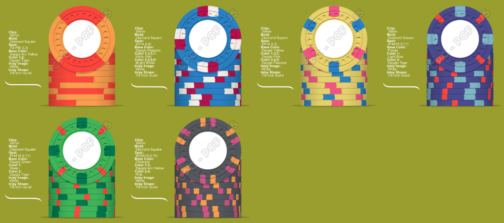
Ignoring the colours for the moment, any thoughts on which spot pattern works best within the context of the other chips:
Options for $1:
Existing spot patterns (I'm pretty set on the spot design for the frac, $5, $25... could change the $100, but it will see the least amount of play):
Rhodeman77
Straight Flush
Be careful with shared colors on multiple chips. I can see dirty stack issues with the $1 and $20 for sure. Also having blue on the $1 & $5 could create issues too. especially if you are using pink and reds as well.
Love the fun animal theme idea, I just placed an order with a fun animal theme too. You could use the same animal in different poses, costumes too for each chip.
Love the fun animal theme idea, I just placed an order with a fun animal theme too. You could use the same animal in different poses, costumes too for each chip.
It's certainly one of the things a few have mentioned and that I will work to avoid. I must have mocked up 20 different line-ups this weekend.Be careful with shared colors on multiple chips. I can see dirty stack issues with the $1 and $20 for sure. Also having blue on the $1 & $5 could create issues too. especially if you are using pink and reds as well.
Love the fun animal theme idea, I just placed an order with a fun animal theme too. You could use the same animal in different poses, costumes too for each chip.
Ignoring the colours atm, any thoughts on the spot pattern for the $1 in the context of the other chips?
I'm waiting to hear back from @Johnny5 and will see what we can come up with. At this point I'm leaning towards one design for all denoms, but with different inlay designs for each side of the chips.
Rhodeman77
Straight Flush
It's certainly one of the things a few have mentioned and that I will work to avoid. I must have mocked up 20 different line-ups this weekend.
Ignoring the colours atm, any thoughts on the spot pattern for the $1 in the context of the other chips?
I'm waiting to hear back from @Johnny5 and will see what we can come up with. At this point I'm leaning towards one design for all denoms, but with different inlay designs for each side of the chips.
you have a to 1/4 spots across the $1, $5, $20 chips. I would want to break that up some. Either the $1 or $5 I would use the 3DS316 or 3DS416 respectively.
you have a to 1/4 spots across the $1, $5, $20 chips. I would want to break that up some. Either the $1 or $5 I would use the 3DS316 or 3DS416 respectively.
Threw together a few dirty stacks. The $5 seems to play nice with the $1s in both versions, but I see the potential issue with the $1 and the $25. The 4D14 is a bit less problematic than the 4DSA316, but I think I'll have to tweak further in any case.


Changing the 18 spots on the $25 to something lighter seems to help the issue with the $1. A green spot probably works better for the $5... I just really love the DG pink/DG blue combo for the $5. Time to go back to the lab...

The more I play, the more my brain starts to hurt from all the possible combinations out there... and the more respect I gain for PCFers who seem to put out grail set after grail set.
Rhodeman77
Straight Flush
It would probably be best to look at a different base color for the $20/$25. Lavender or retro lavender could both be good choices.
when I did my Cali colored set I tried to go as far opposite on the $1/$20 chips.
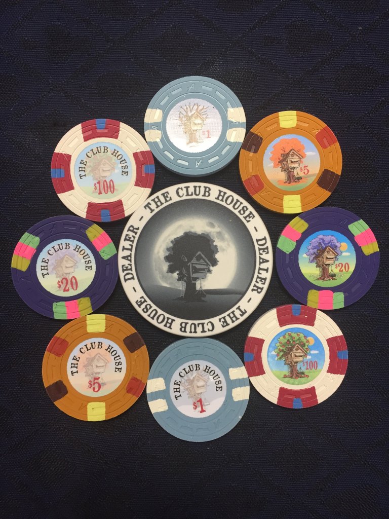
when I did my Cali colored set I tried to go as far opposite on the $1/$20 chips.
Rhodeman77
Straight Flush
The way I like to do it is decide what chip is most important to you and make that chip how you want and then adjust the rest from that one.
If the $5 with DG pink DG peacock is what you want stick with it.
here is a possible line up that uses it and doesn’t have dirty stack issues.

If the $5 with DG pink DG peacock is what you want stick with it.
here is a possible line up that uses it and doesn’t have dirty stack issues.
Thanks @Rhodeman77. Yeah, I've played around with lavender as well for the $20/25, and it's likely the better option in the context of the whole set, even though I like purple as a base more.
I think I'll have lots of time on my hands to figure out the colours though, as it seems like Johnny5 is pretty busy atm based on what others have mentioned.
I think I'll have lots of time on my hands to figure out the colours though, as it seems like Johnny5 is pretty busy atm based on what others have mentioned.
Pinball
Full House
I like the 4D14 for the $1.00. Maybe you could use White and Tiger as spot to avoid dirty stavks with the 5
Me too, though I think the 3D14 also works well within the line-up. Depending on the edge spots, the 4DSA316 would be an option, but I think I prefer the first two options.I like the 4D14 for the $1.00. Maybe you could use White and Tiger as spot to avoid dirty stavks with the 5
So I've heard back from the designer, so now the priority is to nail down a name, I think! It's actually turning out to be more difficult than I had thought to come up with something - though I'm likely just overthinking it! 
I'd like a nod to "Canadiana" in the name. Some current ideas:
- Hoser's Poker
- Hoser Hut Poker
- Maple Syrup Lounge
- Maple Leaf Poker
- Great White North Card Room
- Double Double Poker
- Rocky Mountain Poker
I'd be grateful for feedback and thoughts, eh!
I'd like a nod to "Canadiana" in the name. Some current ideas:
- Hoser's Poker
- Hoser Hut Poker
- Maple Syrup Lounge
- Maple Leaf Poker
- Great White North Card Room
- Double Double Poker
- Rocky Mountain Poker
I'd be grateful for feedback and thoughts, eh!
Rhodeman77
Straight Flush
So I've heard back from the designer, so now the priority is to nail down a name, I think! It's actually turning out to be more difficult than I had thought to come up with something - though I'm likely just overthinking it!
I'd like a nod to "Canadiana" in the name. Some current ideas:
- Hoser's Poker
- Hoser Hut Poker
- Maple Syrup Lounge
- Maple Leaf Poker
- Great White North Card Room
- Double Double Poker
- Rocky Mountain Poker
I'd be grateful for feedback and thoughts, eh!
Sugarbush
Sugar shack
Tap Room
Ice House
Beaver’s Den
Seeking Alpha Social Club
4 of a Kind
BonScot
Straight Flush
Here’s one I prepared earlier...
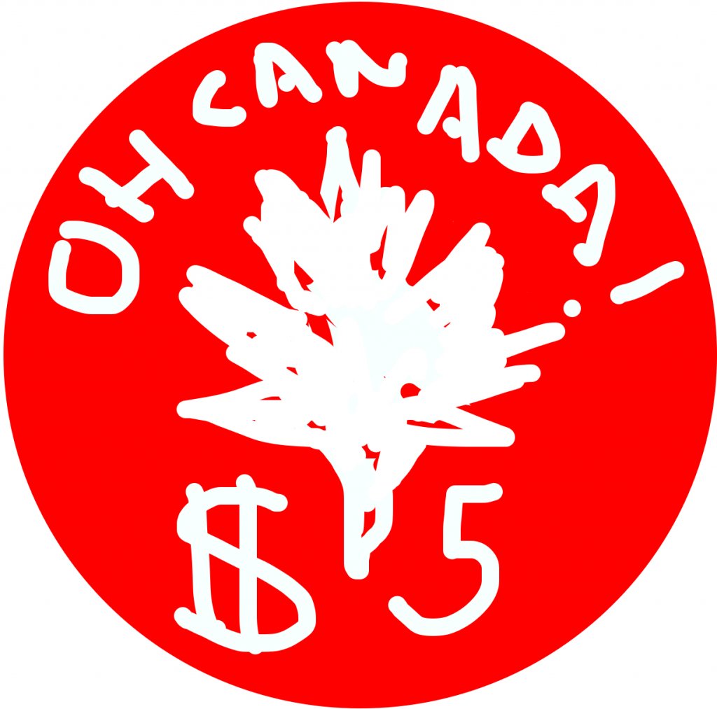
I swear I can see an exploding ballerina in there....
Jeevansluck
Royal Flush
I see you may have become confused about drawing a Maple Leaf or a Spliff! LMAO!!!
It can be confusing when such a large bunch of us Canucks are beer wolfs and weed is being consumed everywhere it seems.
Think I found my dealer button!
The one thing I'm realizing with all these iterations is just how much I wish CPC had a couple of different edge spots available, namely some V-edge spot patterns and the 4TSA18 bearclaw design.


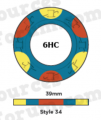
Given that the 3TRIM+ is an option, I also wonder if a 6TRIM+ version (equivalent to Paulsons 6HC) would be an option at some point?

Not that I'm complaining too loudly, as I think the options are pretty good... but that's the dream right there!


Given that the 3TRIM+ is an option, I also wonder if a 6TRIM+ version (equivalent to Paulsons 6HC) would be an option at some point?

Not that I'm complaining too loudly, as I think the options are pretty good... but that's the dream right there!
Attachments
buzzmonkey
Flush
the Show Me chip is something I hadn’t considered. I like it
Pam Anderson Show Em chips?

Good luck on your flannel fantasy set!
BonScot
Straight Flush
Here you go... along with custom Scrub Moose!!Think I found my dealer button!Just need to change that $5 text
Similar threads
- Locked
- Replies
- 20
- Views
- 1K
- Replies
- 5
- Views
- 324


