Dont forget that CPC allow different sides and also different labels per denom. So you can all have what you want provided you order a 100 chip minimum. The easiest thing would be to replace “riverside” with commemorative for Mr Beck and replace “Jessie Beck” with commemorative (or something else) for those that want to keep “riverside”.
You are using an out of date browser. It may not display this or other websites correctly.
You should upgrade or use an alternative browser.
You should upgrade or use an alternative browser.
Jessie Beck fracs (1 Viewer)
- Thread starter arch3r
- Start date
- Status
- Not open for further replies.
churlbut18
Full House
Something else for consideration. Similar to the Dunes commemeratives, you could add the dates of operation as a differentiatier from the original (I.e. 1923-1976)
Side A:
JESSIE BECK'S RIVERSIDE (black text)
smaller version of "R" shield/logo (replacing photo)
25c (red denomination)
RENO 1970-1978 (black text)
Side B:
JESSIE BECK'S (black text)
large "R" shield/logo, flanked with red 25c denomination on each side
COMMEMORATIVE (black text)
Close enough to pass as part of the original set, dates of operation or commemorative text on each side, and no copyrighted photo (doubt anybody's gonna miss Granny). Run it by @David Spragg for approval, but I think it will fly. Can always slightly modify the R logo if needed without losing the flavor of the design.
I'm in for a rack, either tri-moons or quarter-pies (undecided on colors, and maybe a rack of each).
Side A:
JESSIE BECK'S RIVERSIDE (black text)
smaller version of "R" shield/logo (replacing photo)
25c (red denomination)
RENO 1970-1978 (black text)
Side B:
JESSIE BECK'S (black text)
large "R" shield/logo, flanked with red 25c denomination on each side
COMMEMORATIVE (black text)
Close enough to pass as part of the original set, dates of operation or commemorative text on each side, and no copyrighted photo (doubt anybody's gonna miss Granny). Run it by @David Spragg for approval, but I think it will fly. Can always slightly modify the R logo if needed without losing the flavor of the design.
I'm in for a rack, either tri-moons or quarter-pies (undecided on colors, and maybe a rack of each).
I like it, although I would like a grandma Beck on the chip ( was thinking my mom but I doubt y'all want that ). So I'm running @BGinGA's ideas past @David Spragg and waiting to see if we have the OK. Then I'll have J5 do the mock up. Looks like this thing just may happen!! Stay tuned.
Ok, ran @BGinGA's ideas past CPC and David said they seem acceptable, but would need to see the mock-up to be sure. So I am having @Johnny5 do the mock-up. The one addition to BG's suggestions was to also consider other replacements to grandma Jessie. I found some images of matchbooks and drink coasters that had other JB and different riverside logos on them. Thinking one of them may work better than shrinking the logo from the other side of the chip? Anyway, its in J5's hands now and I'm sure he'll come up with something that looks great.
Well now that the inlay is in the hands of J5, I have switched my focus on color. I did a lot of mockups in the design tool, but nothing compares to a color sample. What I thought would look good, looked horrible IRL. Below is what I think looks the best. Would love others thoughts.
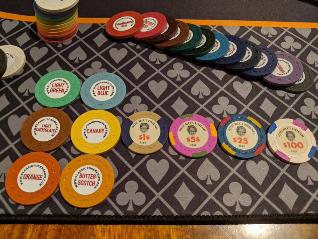
Canary ftw
Think canary and orange 1/4 pie or with white tri moons.
It seems like the edge spots match base colors (kinda) of other chips, hence maybe white tri-moon since orange is nowhere to be seen in the other chips. But I like the idea of 1/4 pie, so gravitating to it with orange, maybe a green since in the $5
It seems like the edge spots match base colors (kinda) of other chips, hence maybe white tri-moon since orange is nowhere to be seen in the other chips. But I like the idea of 1/4 pie, so gravitating to it with orange, maybe a green since in the $5
Last edited:
Shaggy
Full House
Would you say the height difference is between worn and new... or CPC vs original TRK? If CPC and TRK, which is thicker? CPC?
Photos:
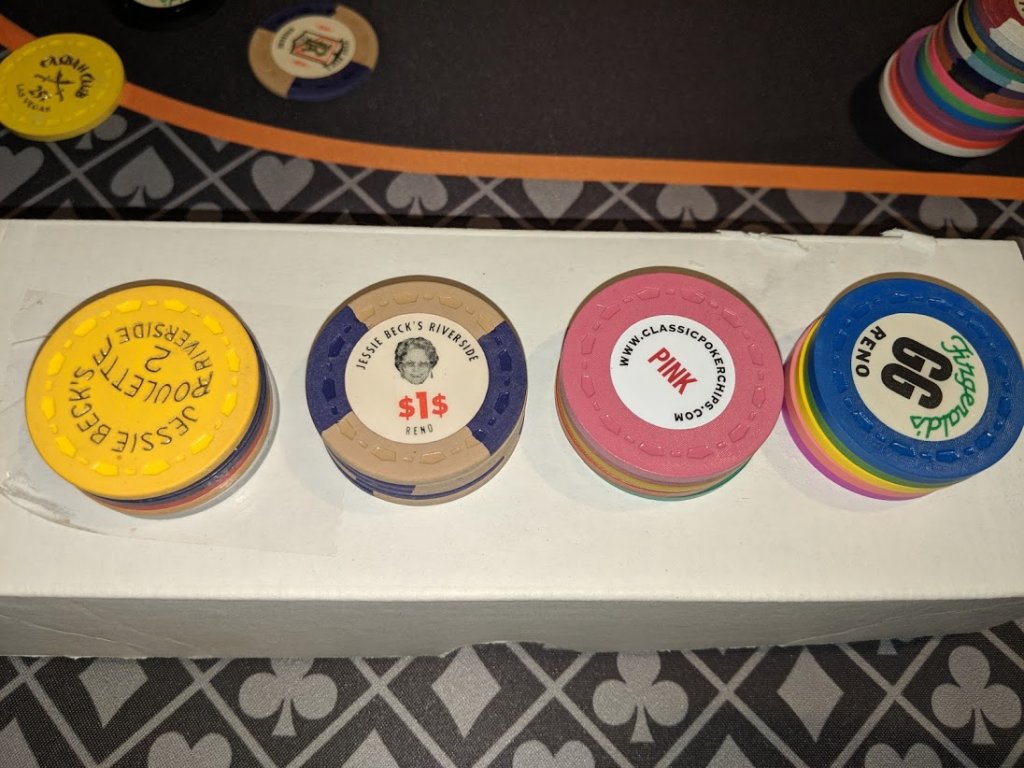
Side view - not so bad with just 5 chips...
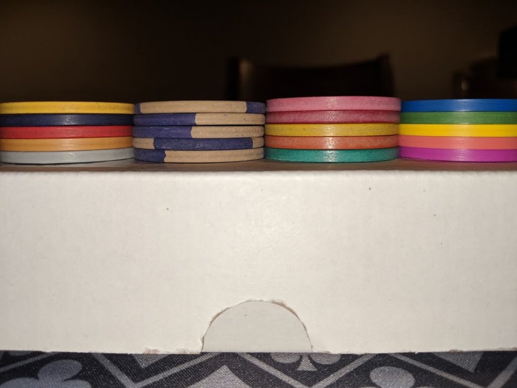
But a barrel of JB $1 and $5 vs a barrel of CPC scrown smaples...
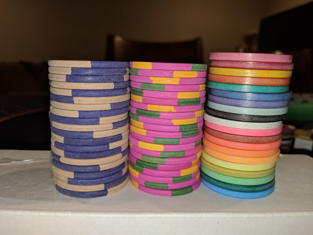
Still won't stop me from getting a rack or 2 of CPC quarters made. I was expecting the CPCs to be taller.
Side view - not so bad with just 5 chips...
But a barrel of JB $1 and $5 vs a barrel of CPC scrown smaples...
Still won't stop me from getting a rack or 2 of CPC quarters made. I was expecting the CPCs to be taller.
I like the canary, but to me, the light chocolate solid has a cool old school feel, or maybe light chocolate/chocolate half or quarter pie.
But I don’t own any Jessie Beck’s, so my opinion counts for absolutely nothing.
But I don’t own any Jessie Beck’s, so my opinion counts for absolutely nothing.
Photos:
View attachment 242023
Side view - not so bad with just 5 chips...
View attachment 242024
But a barrel of JB $1 and $5 vs a barrel of CPC scrown smaples...
View attachment 242026
Still won't stop me from getting a rack or 2 of CPC quarters made. I was expecting the CPCs to be taller.
Yes, this is what I saw. Even more pronounced here than on the ones I saw. Thanks for putting some pictures together.
It seems like TRK's stack height's are all over the place. They're like a box of chocolates... I recently bought some monogrammed solids. Two different lots of similar condition & vintage. Twenty high stack heights are almost a chip difference. I did notice one stacked like bricks while the other not so much, so warping could be the cause. I'll take some shots of them later and post some pics.
Shaggy
Full House
More concepts from the chip tool.


moose
4 of a Kind
Charcoal with a single tiger spot.
I received the initial mock-up from J5.
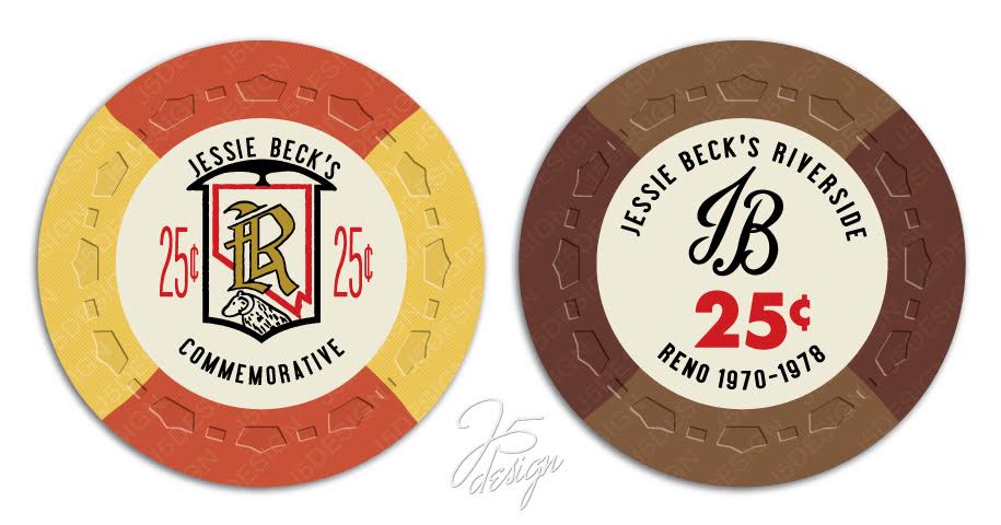
I like the fact that it's been 'roughed up' a bit and not perfect. He said he did that to mimic how the real chips look.
As for the replacement of Grandma Jessie with just the initial JB, I'm not sold on that. What do you'll think?
FYI: He pulled the JB initials from a matchbox photo that I found and shared with him.
Shaggy
Full House
I think I like the grandma better... but the direction these are going are very good.
I think I like the grandma better... but the direction these are going are very good.
I like the grandma too, but with potential copyright issues, it needs to be changed enough so that CPC will approve it. Talked to my mom and she's Ok with using her likeness. And since her last name is Beck too, it'll be almost the same thing as having Jessie Beck herself. And she kinda looks like Jessie as well.
Me, my mom and my sister at my Mom's surprise 80th B-Day party.
I feel exactly the same way. The 1/4 pie looks great with the set. But I'm thinking since my game plays small, not many $25s are ever in play, so having the quarter as a tri-moon would probably work well, with the three chips in play all with distinct spots. And yes, Canary and Orange seems to be the right color combo for this frac.Although I like tri-moon spots, I think the 1/4 pie fits into the set better. Liking the canary/orange over the brown.
@arch3r
Do we have a time frame to submit to CPC? If I was reading the mold pressing post correctly, it might be closing in on the time for the small crown mold "soon"? Think there were a few molds left before it still?
I had not thought that far ahead. :-( Where do you look up that info?
- Status
- Not open for further replies.
Similar threads
- Replies
- 35
- Views
- 2K
- Locked
- Replies
- 41
- Views
- 2K
- Replies
- 51
- Views
- 2K
- Replies
- 102
- Views
- 8K
