dirty moose
Two Pair
Hey everyone,
Been working with Steve (p5woody) for a Four Suits design for me. Love that darn logo!

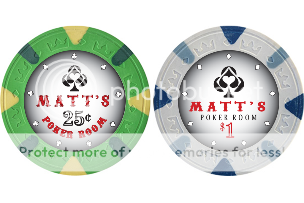
This one on the right side is in the lead.
what do you guys think?
p.s. Steve is awesome, he's made every change I've asked him for!
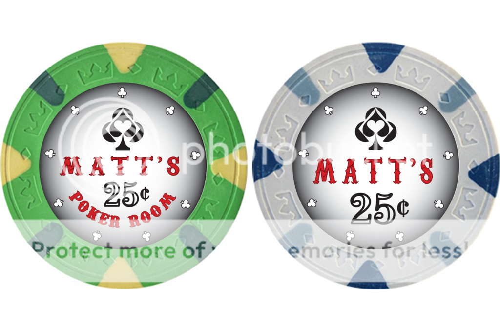
Been working with Steve (p5woody) for a Four Suits design for me. Love that darn logo!


This one on the right side is in the lead.

what do you guys think?
p.s. Steve is awesome, he's made every change I've asked him for!

") I don't have any suggestions
I don't have any suggestions
