I liked the previous version of the $1. More interesting to my eye (and a pseudo-Flamingo tribute to boot).
You are using an out of date browser. It may not display this or other websites correctly.
You should upgrade or use an alternative browser.
You should upgrade or use an alternative browser.
Fat Tire Cash Chips... Design Discussion (7 Viewers)
- Thread starter Trihonda
- Start date
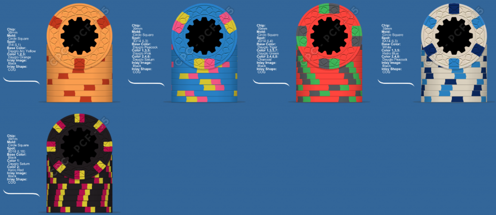
@inca911 I really like those colors. Here's another version/direction. I was liking the 1/4 pie for the frac. and was contemplating a different red for the $5. However, I think the colors you chose look amazing too. The mockup below actually drops down the $1 and $5 two levels, which is a big price break. But that said, I vowed this cash set wouldn't sacrifice in that department to save a small bit of money.
But after seeing your post above, I did a little tinkering... Here's the result:

But after seeing your post above, I did a little tinkering... Here's the result:
Psypher1000
Straight Flush
But after seeing your post above, I did a little tinkering... Here's the result:
I think I like the frac and $5 from the top set, and the 1, 20, and hundo from the bottom. Would be interested in seeing those all together. If I had to choose one of those two line-ups as a whole, the bottom one wins for sure - less dependence on white & orange throughout the set. I think I like the flow of the spot progression in the top set just *slightly* better than the bottom, but the one on the bottom is still good...nothing jumps out at me from it.
I think you got your chips in 1990??? They started that beer in 1991 so no problem!I have no idea what you're talking about...
I do know there's a beer company that stole my theme, but it's a pretty small company, so I've heard.
Psypher1000
Straight Flush
They started that beer in 1191...
Can I get a fact check on isle 1191, please?
wow - Fat fingered again!Can I get a fact check on isle 1191, please?
1991
I like the changes especially going with the CSQ over Scroll
@inca911 I really like those colors. Here's another version/direction.
All I did was cut paste an earlier mockup of yours! ;-) Can't take credit for your work, but liking what this is going....
12thMan
Full House
Csq such a bad ass.
chipjoker
Flush
I like this iteration, the hundo and twenty are really cool looking...
Mr. Cheese
Full House
Still playing with this. Although due to other expenses, the timeline for this set has been delayed, but it's still in the docket.
View attachment 71257
I think having "25" on each chip is going to be confusing
That being said I like how these are shaping up!
RowdyRawhide
Full House
IMO the only chip that fits the "neon" feel is the $1 out of the most recent, perhaps this isn't what you are going for any longer. That said I still like the idea of bright white on the $20 and still like the DG Tiger fivers.
IMO the only chip that fits the "neon" feel is the $1 out of the most recent, perhaps this isn't what you are going for any longer. That said I still like the idea of bright white on the $20 and still like the DG Tiger fivers.
I love the idea of a tiger five dollar chip, however it is so close to the quarter color, and it is pretty bright. The set is supposed to have bright colors, but the tiger is just a little too bright orange for my taste as a five dollar chip
Ok Here are a few color a runs. I have to admit, the tiger looks amazing in the photos, and also in person. But in person, it's much more vivid an orange. If you look at my T5k, I used the spots to drastically tone down the glaring orange-ness. I'm not opposed to a Tiger $5, but it's def a wild choice. I'm not sure the 616 spots will be enough...
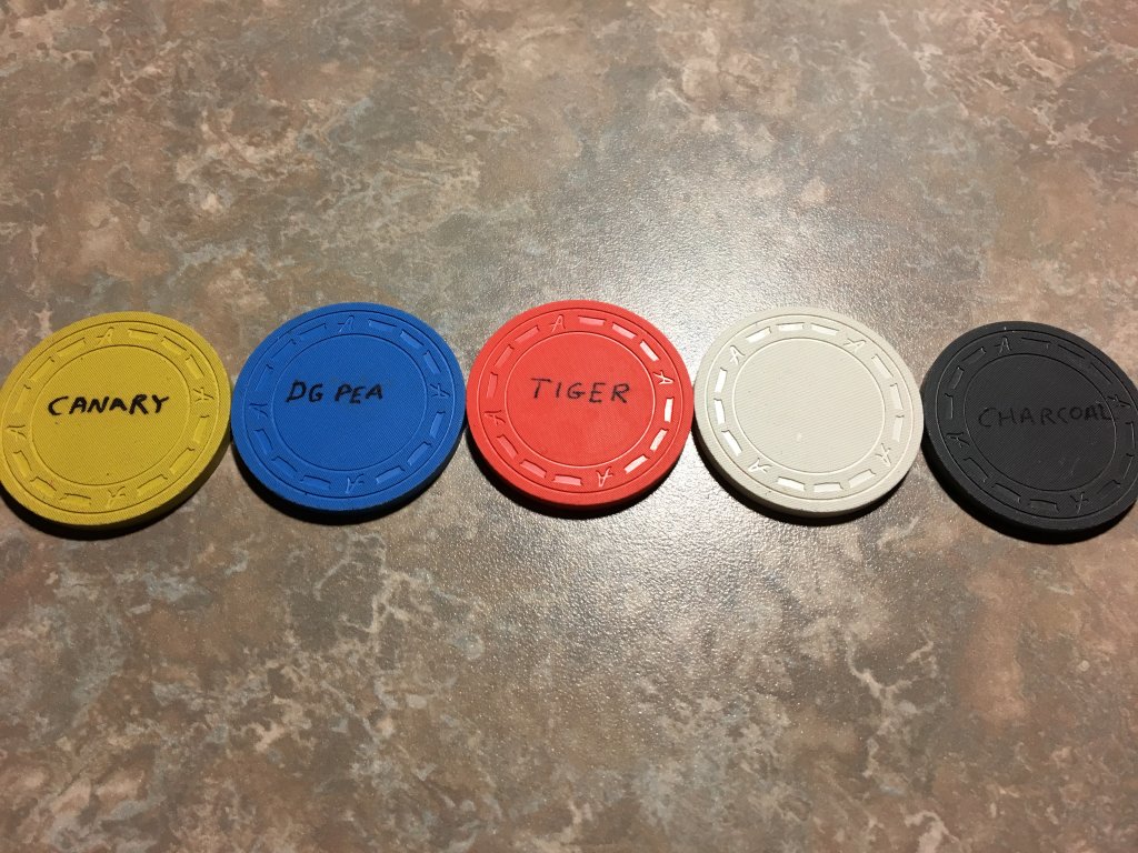
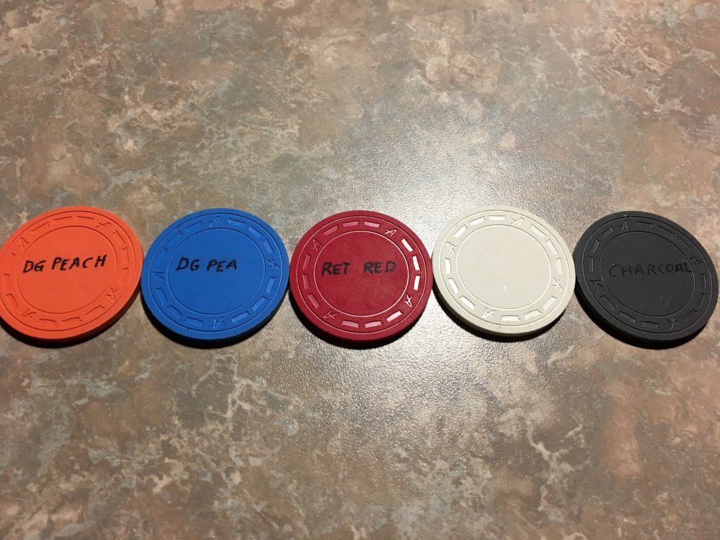
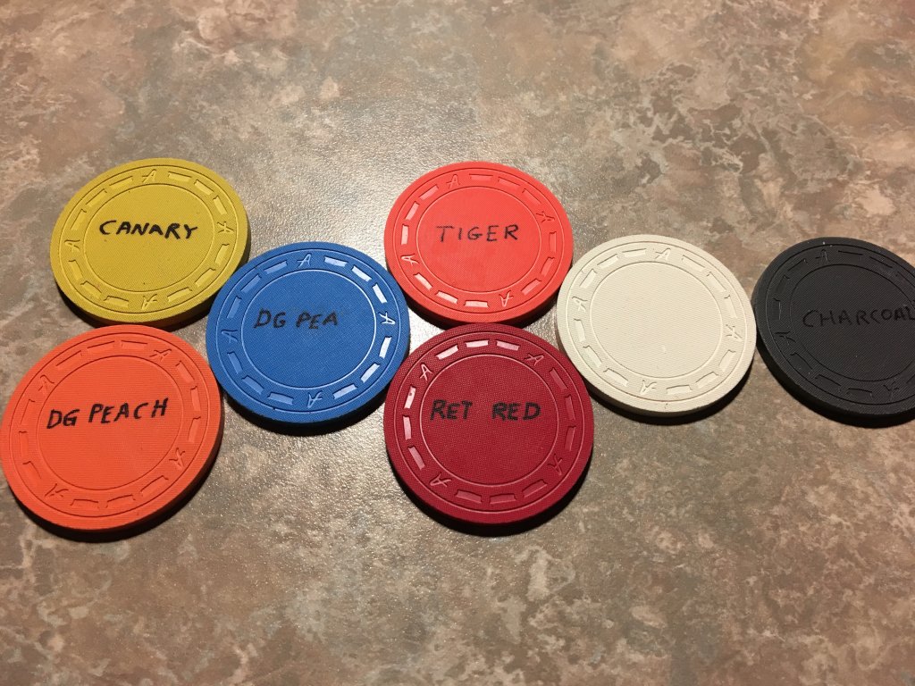
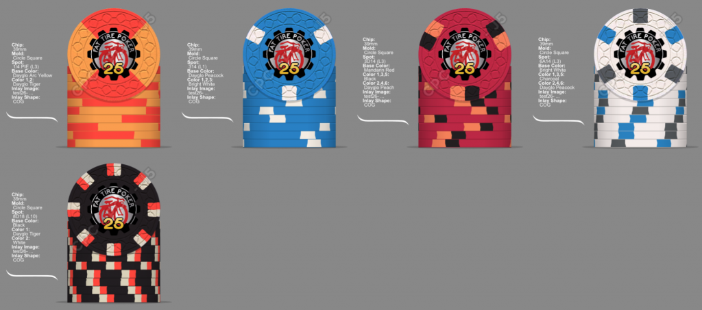
Thanks to @Ray-Col for the cool rendering in my poll thread. An overwhelming number of votes went to a canary (yellow) frac. I agree, as it ties in perfectly with the colors in the sign (white, red, blue, and yellow). I didn't want to sway opinions by sharing mine until the voting was completed.
Here are the renderings by Ray-Col.
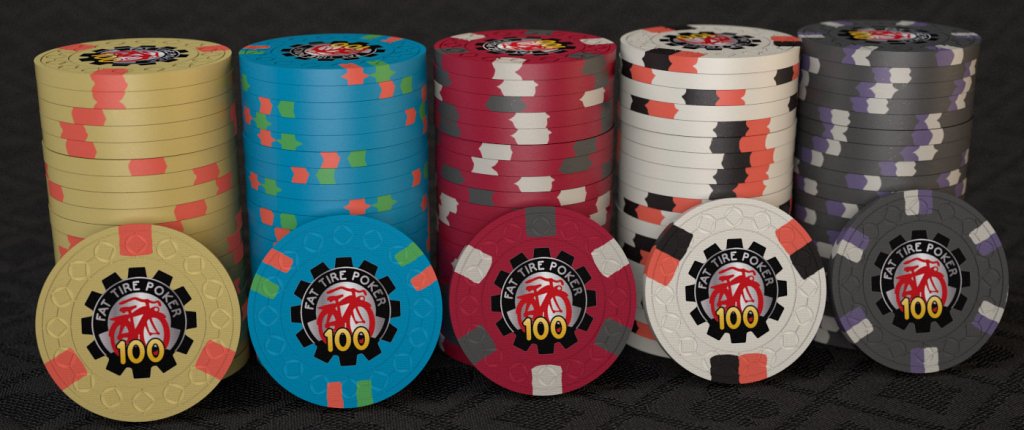
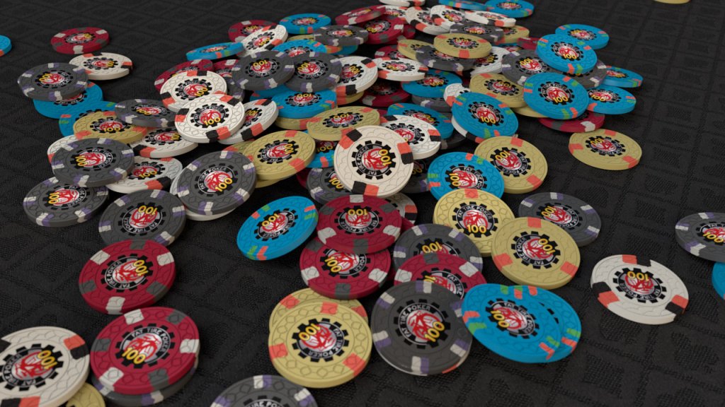
Here are the renderings by Ray-Col.
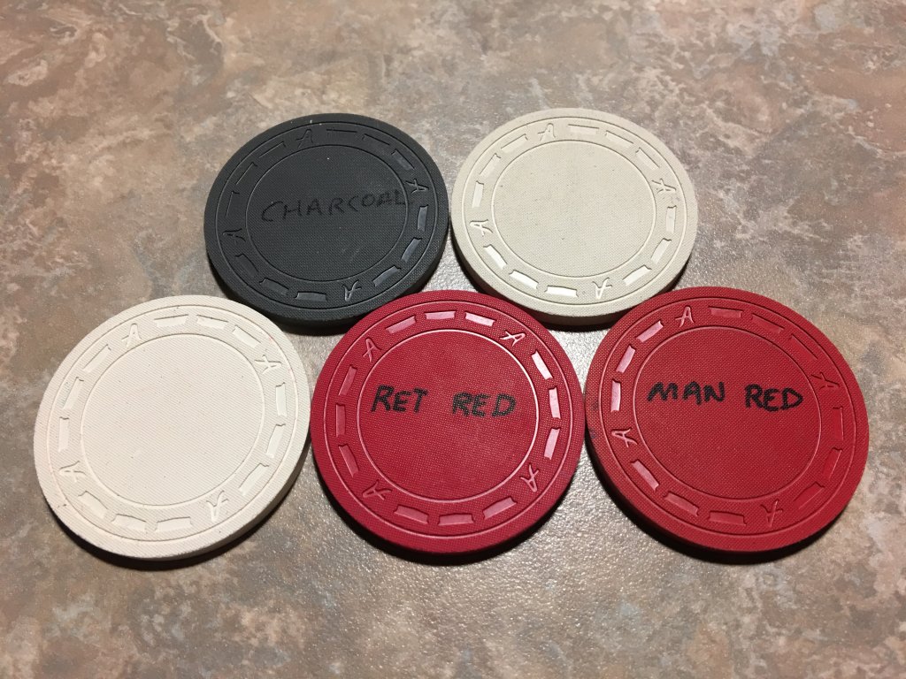
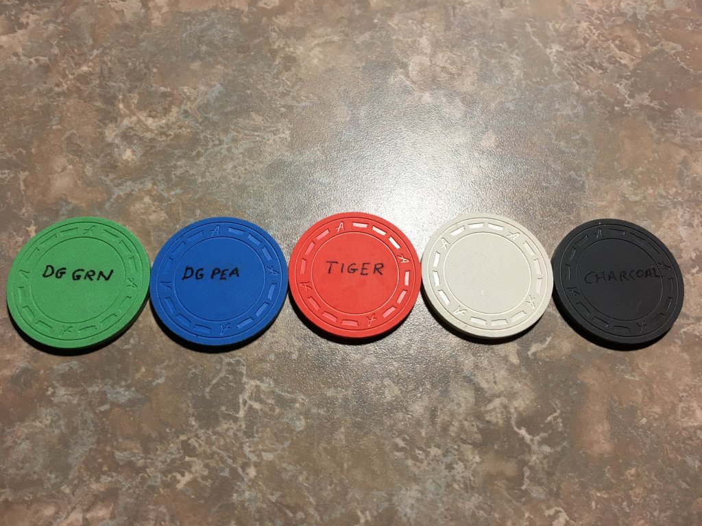
Just to provide feedback, the renderings by Ray-Col seem a tad light in the color saturation department. It very well could be my monitor settings? However, the images on the screen seem a bit faded compared to their real life counterparts. In fact, I just posted a second pic, which includes pics of the pic of a pic... I'm sure we're getting into some form of quantum physics, and hopefully I don't rip a hole in the space-time continuum... However, I do see some saturation loss from image to image. The final verdict is that your monitor (maybe just mine) will likely never show the true amazingness of the in-person chips...
I think the actual chips will look absolutely electric in person. Regardless, the renderings are very very cool.
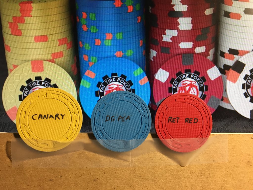
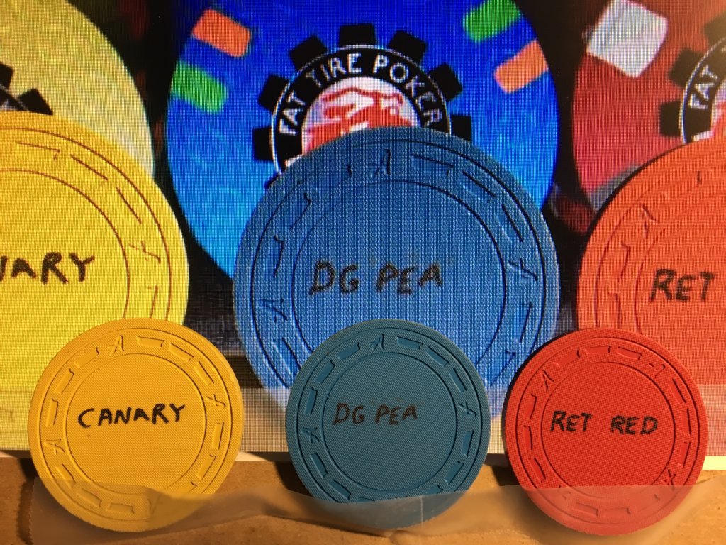
I think the actual chips will look absolutely electric in person. Regardless, the renderings are very very cool.
Last edited:
Now... anyone have spot or spot color tweaks or suggestions before we lock this away in a vault until it's time to order? Unfortunately, I can't order before the pricing model will increase these drastically... However, I think I'll be in a better place financially (chip wise) down the road a bit...
There are so many variables in play ... light temperature, camera settings, monitor calibration ... your DG peacock sample looks like it's almost darker than retro red - mine is much, much lighter and really pops. My first rendering had a strictly neutral setup - I always derive from there - the second mimics typical warm indoor light.Just to provide feedback, the renderings by Ray-Col seem a tad light in the color saturation department. It very well could be my monitor settings?
But the universe will live on, no matter what.
In my defense I can just post a similar setup from me where the rendered (and printed!) colors are matching at least reasonably with the real chips sunfly printed eventually.

Mr. Cheese
Full House
Ray Col posted a better (warmer) version. The colors pop much more.
View attachment 71845
Pretty much a match, eh?
View attachment 71846
This really came together nicely! You will love the CSQ mold. It's my favorite all time mold that CPC has. I think it looks great as is! Great job on the renders @Ray-Col!
This really came together nicely! You will love the CSQ mold. It's my favorite all time mold that CPC has. I think it looks great as is! Great job on the renders @Ray-Col!
Yes, but torn... the CSQ mold is going into a new pricing category, and coupled with the 2017 price increases, it'll bring pricing up $.50/chip... Waiting a few months isn't gonna be cheap...
Mr. Cheese
Full House
Yes, but torn... the CSQ mold is going into a new pricing category, and coupled with the 2017 price increases, it'll bring pricing up $.50/chip... Waiting a few months isn't gonna be cheap...
That mold is one of the best trust me! I just double checked the pricing increase and it looks like it's about .22 per chip increase for what levels I looked at. I know its more money but these are going to be your custom babies so a extra money is worth it in the long run to get what you want (if in fact you want CSQ).
That mold is one of the best trust me! I just double checked the pricing increase and it looks like it's about .22 per chip increase for what levels I looked at. I know its more money but these are going to be your custom babies so a extra money is worth it in the long run to get what you want (if in fact you want CSQ).
The CSQ mold is going into a new category, and will also see the 2017 increases as well...
But you're right, it's only $.22/chip ish. That's palatable. Not sure where I was getting the $.50 per chip? I guess I can take it back down to defcon 1

I liked the version of the $1 with the yellow edge spot over the green (pseudo Flamingo tribute). Pic is just for the $1.
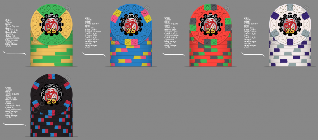
The sign has yellow but no green, and the green sticks out a little much for my tastes. With yellow, you have good connectivity between the new chips:
The sign has yellow but no green, and the green sticks out a little much for my tastes. With yellow, you have good connectivity between the new chips:
- A yellow spectrum color from the quarter base in the $1 edge spot
- A red spectrum color from the $1 edge spot in the $5 base
- A white from the $5 edge spot in the $20/25 base
- A black spectrum in the $20/25s edge spot in the $100 base
I liked the version of the $1 with the yellow edge spot over the green (pseudo Flamingo tribute).
Like this???
Or this iteration:
What do people think of swapping the $1 and $20 spots?
Last edited:
I like the bottom $1 chip (but I'm thinking more reddish than pinkish to better bridge to the $5 chip), as it fits with the bike frame + the color progression. Can you post a pic of that with the current "final" other chips? I think there's something off a bit with the spots, but I'm focusing on color ideas right now.
RowdyRawhide
Full House
just me trying to be different... yadda yadda...
I thought about this too. However, I have a set with a blue quarter, white dollar, etc.. And those colors aren't bad, but...
And a red five
DG Tiger!! Here is as NEON as I think I can get
!
The last 4 are alternate quarters, the DG tiger there since your hell bent on a red $5
Similar threads
- Replies
- 31
- Views
- 1K
- Replies
- 21
- Views
- 578
- Replies
- 7
- Views
- 425
