You are using an out of date browser. It may not display this or other websites correctly.
You should upgrade or use an alternative browser.
You should upgrade or use an alternative browser.
Edge Spots : Function vs. Aesthetic (9 Viewers)
- Thread starter MrRossKeys
- Start date
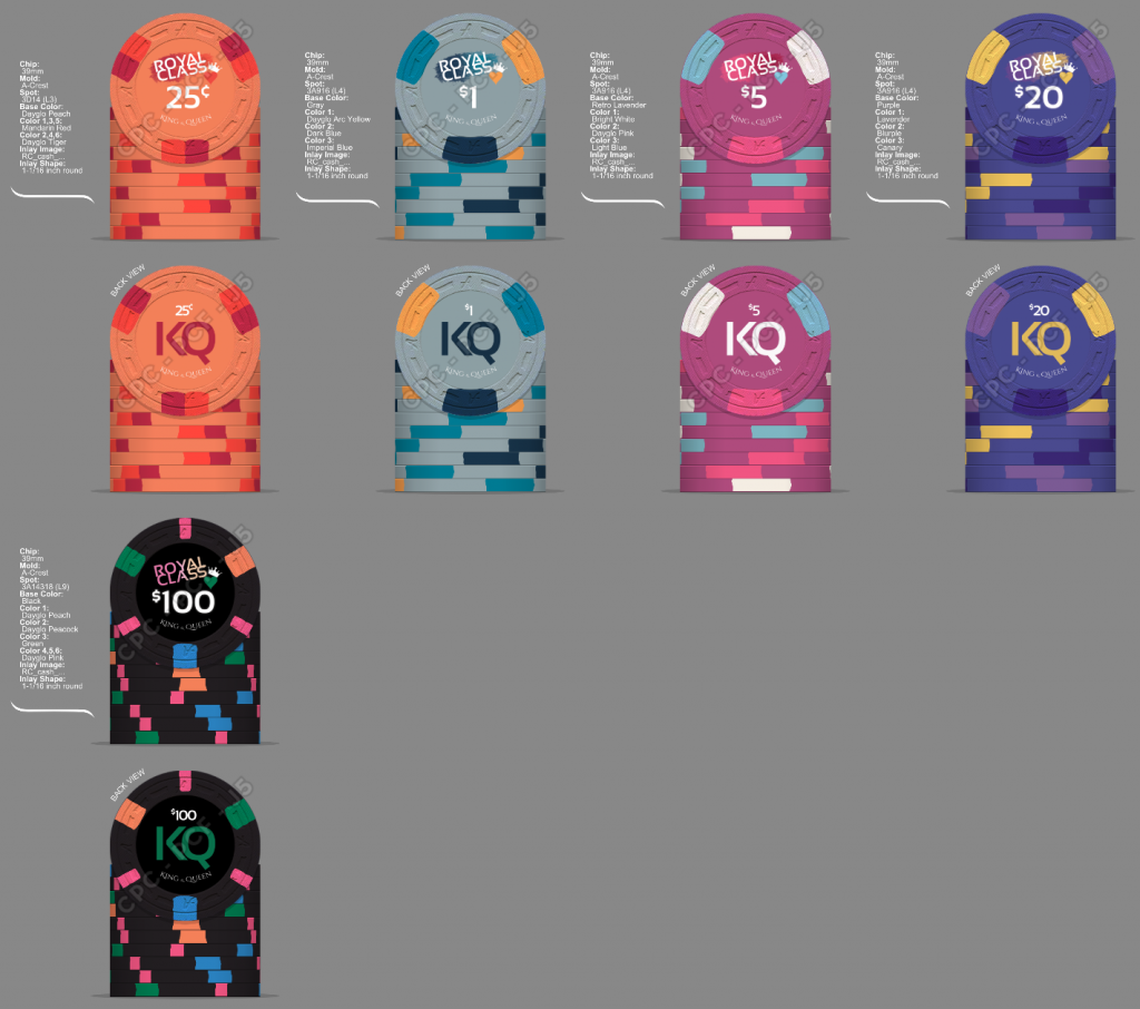
Bottom spot on the 20 almost indistinguishable from the inlay. Perhaps a shade darker at retro blue? Or go the opposite way to DG Green?
Maybe DG yellow as the base color of the 25¢? I think that would pop more.
Your 1 and 100 are awesome.
Maybe DG yellow as the base color of the 25¢? I think that would pop more.
Your 1 and 100 are awesome.
These are all work in progress. I am playing with the idea of removing the gradient and keeping the inlay background color the same as the chip color. That would differentiate the inlay and spots.Bottom spot on the 20 almost indistinguishable from the inlay. Perhaps a shade darker at retro blue? Or go the opposite way to DG Green?
Maybe DG yellow as the base color of the 25¢? I think that would pop more.
Your 1 and 100 are awesome.
These are all work in progress. I am playing with the idea of removing the gradient and keeping the inlay background color the same as the chip color. That would differentiate the inlay and spots.
I normally don't get samples of other people's customs, but if you keep the 100 like it is now, I'll likely get a sample just to have one of those.
My 2 cents worth
i don't know if anyone has said this yet but just in case focus on you hundo and your 1000 chips they are the workhorse of a tourney. start with the workhorse then go the others.
then if you play cash have a different set. and remember the cash chips are cash. treat them like that.
i don't know if anyone has said this yet but just in case focus on you hundo and your 1000 chips they are the workhorse of a tourney. start with the workhorse then go the others.
then if you play cash have a different set. and remember the cash chips are cash. treat them like that.
Not sure what this comment is referring to...My 2 cents worth
i don't know if anyone has said this yet but just in case focus on you hundo and your 1000 chips they are the workhorse of a tourney. start with the workhorse then go the others.
then if you play cash have a different set. and remember the cash chips are cash. treat them like that.
Sweet! Yea I like the $100 chip a lot too... not going to change that.I normally don't get samples of other people's customs, but if you keep the 100 like it is now, I'll likely get a sample just to have one of those.
This is my current look for the chips. I'm digging the modern look of these compared to where I started. I realize the set as a whole leans orange/yellow, so I may tweak an edge spot here or there to balance (though I like each chip individually so far).

LinkyBabe
Flush
They're your chips but I still prefer the gradient in the inlay.
Makes sense. I am torn between with / without gradient. I don’t think it works with the gradient behind the Royal Class text so I’d be choosing between that as well.They're your chips but I still prefer the gradient in the inlay.
With a slighter gradient it looks pretty cool

Similar threads
- Replies
- 2
- Views
- 279
