Donkwoods Mockup (1 Viewer)

manamongkids

Full House
Joined
Feb 25, 2014
Messages
4,402
Reaction score
3,547
Location
Usa
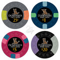
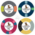
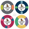
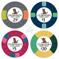
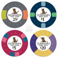
Ok folks, looking for feedback on inlay, color choices, and edgespots.


I had a similar set made for some PGI china clays a while ago, that set only had one singular donkey across all the denoms.


This set is inspired by my poker beginnings, played a lot in high school but spent the majority of my poker playing on Full Tilt poker playing cash games.


Had one intense night where I deposited $50 at about 11pm, only playing heads up, ran it up to $1500 by 5am. Started with my whole roll at .25/.50 and eventually went up to play 3/6 by the end of the night.

Also inspired by my favorite casino, Foxwoods!


Anyways, please provide any feedback you may have.
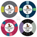
al_dw1a.jpgal_dw1b.jpg
 

stocky

Full House
Joined
May 6, 2013
Messages
4,295
Reaction score
3,305
Location
The Wall
Love the white inlays. Black not so much.

Great chip choices also but I would be a bit concerned on how dark the $1 and $20 are together. Also the 25¢ and $20 might clash.

- - - - - - - - - Updated - - - - - - - - -

What about a grey and lavender qpie $20?
 

jbutler

Royal Flush
Joined
Oct 28, 2014
Messages
10,669
Reaction score
10,708
Loved this inlay as an 8V set, adore it as a CPC set. White all way no brainer imo. I really do love all the spot colors and choices, too. Can't wait to see them in stacks.
 

manamongkids

Full House
Joined
Feb 25, 2014
Messages
4,402
Reaction score
3,547
Location
Usa
Torn on the $20. I love the Dark Blue $1. Not sure how much it would clash with the $20, as dark blue and black from afar are difficult to distinguish.

IMO the 25c, $1, and $5 are locked and loaded. Just need to settle on the $20. Love the 1/4 pie as my edgespots. I'm open to suggestions on colors though.
 

snooptodd

3 of a Kind
Joined
Nov 6, 2014
Messages
715
Reaction score
544
Location
Upstate NY
This seems small, but I feel like the confused (for lack of a better word) donkey on the $1 should go on the $.25, and the conventional looking donkey on the $.25 should go on the $1. Have the dumbfounded one be on the smallest value.
 

slisk250

Straight Flush
Joined
Dec 9, 2014
Messages
9,243
Reaction score
20,102
Location
Rocky Mountain High
I like the black inlays. With the color choices the denoms pop and that makes them a clear winner here IMO.
 

manamongkids

Full House
Joined
Feb 25, 2014
Messages
4,402
Reaction score
3,547
Location
Usa
This seems small, but I feel like the confused (for lack of a better word) donkey on the $1 should go on the $.25, and the conventional looking donkey on the $.25 should go on the $1. Have the dumbfounded one be on the smallest value.

Hmm, I gotta think about this one, it makes sense. Just gotta think about the order in more detail
 

manamongkids

Full House
Joined
Feb 25, 2014
Messages
4,402
Reaction score
3,547
Location
Usa
10.PNG11.PNG

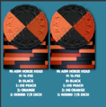
Leaning towards changing the 25c to charcoal base, purple/dg saturn edgespots.

for $20 the leaning towards the black base, dg peach/dg orange egdespots.

I am slightly copying the T25,000 from the WSOP One Drop. I think it is a WSOP secondary chip, but I love it.


feedback?
 

jbutler

Royal Flush
Joined
Oct 28, 2014
Messages
10,669
Reaction score
10,708
Sorry those changes cannot be approved. Original frac is dead solid perfect imo. Maybe MAYBE try some other colors in place of the grey on the $20. Bright white? But I love the look of black/retro lav/various light colors.
 

manamongkids

Full House
Joined
Feb 25, 2014
Messages
4,402
Reaction score
3,547
Location
Usa
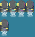
9.PNGsome iterations of the qpie with purples

- - - - - - - - - Updated - - - - - - - - -

Capture.PNGreally digging the black/gray spots
 

BGinGA

Royal Flush
Tourney Director
Joined
Oct 29, 2014
Messages
26,951
Reaction score
44,748
Location
Atlanta
View attachment 6047View attachment 6048

Leaning towards changing the 25c to charcoal base, purple/dg saturn edgespots.

for $20 the leaning towards the black base, dg peach/dg orange egdespots.

I am slightly copying the T25,000 from the WSOP One Drop. I think it is a WSOP secondary chip, but I love it.


feedback?

Yes -- it's pointless and a waste of time to evaluate bare spot configs unless planning hot-stamps. Slap on some inlays, even if temporary stock artwork.
 

ChaosRock

4 of a Kind
Supporting Member
Joined
May 5, 2013
Messages
5,750
Reaction score
10,416
Location
Pure Michigan
I love the white inlay design, the name of your PR, the colors/spots/mold you picked, overall, just terrific!!

I couldn't agree more with jbutler... Your quarter is just a knock-out man... I certainly haven't seen as many customs sets as he has but your quarter color/spot combo is among the best I've seen... The $1 and $20 are also fantastic, and bright white instead of gray on the $20 might just hit the spot...

I REALLY like the $5 as well but I have a comment on that chip... For as much as I like it, it is giving me a vibe of a different era... 25¢, $1 and $20 all have some 'pop' of color but the use of the blue spot on the red birds doesn't have the same effect (imo of course)... Don't get me wrong, I love that chip as well, my comment is just in reference to the $5 in context of the other 3 chips... I've been thinking about other possibilities there and couldn't come up with one...

I know you're already dead set on $5s, so my comment is more like a 'do you possibly see that as well?'...

Again, I think your set is an absolute home-run...


Sorry those changes cannot be approved. Original frac is dead solid perfect imo. Maybe MAYBE try some other colors in place of the grey on the $20. Bright white? But I love the look of black/retro lav/various light colors.
 
Last edited:

72o

4 of a Kind
Supporting Member
Joined
Nov 6, 2014
Messages
5,235
Reaction score
9,815
Location
MA
Nailed it with the first post IMHO. I love everything about everything there :) (with the white inlays). I don't have samples in front of me, but as long as the $1 & $20 aren't too close in color...ship it. Nice work!!
 
Last edited:

Mental Nomad

Full House
Joined
Nov 7, 2014
Messages
3,640
Reaction score
2,465
Location
NJ - NY/NJ metro area
I agree with the most dumbfounded donkey on the extreme - but I'm a little partial to it being on the big chip. As in, "how did the donk get this?"

Also, I like the black inlays, but I think the white outline on the donkey art is making it look bad. Take out the white.

I don't care for the 3-color quarter pie; I feel that, viewed on edge, it can look like a different chip color depending on which way it's rotated. That bugs me. I love 2-color quarter pies, or I can like 3 and 4 color quarter pies if the colors stay more in the same family. So I like the dg peach/dg orange quarter pie. Like the purples, too, but with white/black both in the mix, I'm irked.

- - - - - - - - - Updated - - - - - - - - -

(Mind you, I like the white inlays, too - I just feel the blacks are getting a bad rap.)
 

Ben

Full House
Joined
Oct 29, 2014
Messages
2,548
Reaction score
2,803
Location
"The Sticks"
Wow, just superb. Agreed with others keep original frac, white inlays FTW. Loving the frac, $1, AND $5. I suggest that all of the above-listed issues with colors on the $20 can be alleviated by going with a brighter base, to contrast the darker low denoms? Quarter pies are fine if that's what you want, but leave black and gray out of it IMO - canary yellow, lavender, DG peach, arc yellow, DG green are all colors I'd be looking at.
 

manamongkids

Full House
Joined
Feb 25, 2014
Messages
4,402
Reaction score
3,547
Location
Usa
Oh, I like this a lot.

haha makes sense.

i'll have to look into it, it can be thought of many different ways.

the dumbfounded one could be highest or lowest. whichever one is the dumbfounded one, it would make sense to have the angry one on the opposite side.

angry=25c
normal= $1
happy=$5
confused/dumbfounded= $20?

how does that sound?


In regards to the set in general, I really do love my color choices so far but 100% see where people are coming from for the $20. the black and dark blue are too close together for this set as base colors.

I wanted to incorporate purple into the chip, because no chip has any purple in it. I didnt want to have another color be too cumbersome in the set. Blue is already a major component. So I think that would be out of the question.

Someone post some examples or possibilities. I would like to see what people are thinking for the $20
 

manamongkids

Full House
Joined
Feb 25, 2014
Messages
4,402
Reaction score
3,547
Location
Usa
submitted changes to J5 regarding the donkeys with the denoms. and also mocked up 4 or so new $20s. waiting on his response. will post when received.
 

Poker Zombie

Royal Flush
Joined
Oct 29, 2014
Messages
15,715
Reaction score
32,696
Location
Nashville-ish
I think the look on the donkey's face is a mostly irrelevant topic. Unless you have an eyeglass, The mouth is only going to be a few pixels high. Print it at size and take a look.
 

links_slayer

4 of a Kind
Joined
Aug 24, 2013
Messages
5,327
Reaction score
7,571
Location
Madison, WI
I think they are excellent as is. White inlay wins in landslide. I am already looking forward to the pics!! :)
 

iBetOnEverything

Two Pair
Joined
Nov 6, 2014
Messages
318
Reaction score
354
Location
MA
White labels by a mile.

Agree on zero changes for the .25, $1, and $5.

Maybe make the base of the $20 purple with the black and white spots, or change one of the spots to a color that really really pops.
 

manamongkids

Full House
Joined
Feb 25, 2014
Messages
4,402
Reaction score
3,547
Location
Usa
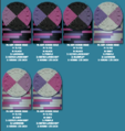
Updated with changes to Donkeys faces and a few more $20s I mocked. I am digging the Canary blurple/lavender. My second choice would be the canary black/grayal_dw2d.jpgal_dw2b.jpgal_dw2c.jpgal_dw2a.jpg
 

Create an account or login to comment

You must be a member in order to leave a comment

Create account

Create an account and join our community. It's easy!

Log in

Already have an account? Log in here.

Top Bottom