courage
Full House
- Joined
- Oct 29, 2014
- Messages
- 4,264
- Reaction score
- 6,741
obviously HHR is perfect for this set, but have you considered moving to the FDL to accommodate the 1 1/16" inlay? the FDL does provide the best approximation of the RHC mold actually used at foxwoods...
Wow, jbutler made a dumbass mold suggestion. I'm marking my calendar.
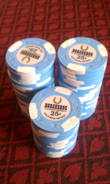
I favor them as is on 1" inlays. imo, the 1" doesn't look awkward on HHR, JimB knows what he's doing. Here are the 3 sizes:


")