Designing for color-blind accessibility (1 Viewer)

GreekRedEye

Flush
Supporter
Joined
Jun 4, 2023
Messages
1,602
Reaction score
2,622
Location
Washington, D.C. area
Edited to add recommendation from @MrCatPants

Maybe there is already a post dedicated to this, but I did not readily find it. Apologies if I am rehashing old ground.

Ran across some threads where chippers with color-blindness chimed in to state if a design was legible or not for them (super helpful info). Made me think we should all be more thoughtful in designing chips that are accessible to more players. There are a few color-blind simulators on the internet where you can upload your designs and photos to simulate various types of color-blindness. Here are a couple:

https://www.color-blindness.com/coblis-color-blindness-simulator/
https://pilestone.com/pages/color-blindness-simulator-1

But I am sure a simulator is not as accurate as real life. So, maybe folks who are color-blind and are willing to self-identify can volunteer on this thread to take a look at people's designs?

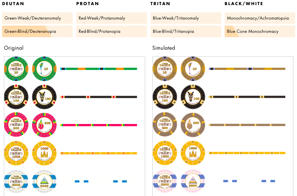
I ran a few images through the simulators including a Gemaco Tropicana set (with very similar spot patterns across chips) and my own design (with varying spot patterns). Some initial impressions I have (but I would love to hear from color-blind chippers who can confirm or correct my impressions):
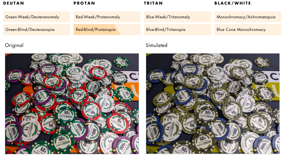
  1. Spot progressions help a lot.
  2. Bright colors that are distant from each other on the spectrum help (from @MrCatPants)
  3. Red/pink and green are hard to distinguish. It helps to use blue, yellow, white, or black spots on one but not the other (e.g. green 25 with yellow spots and red 5 with blue spots).
  4. Blue and purple are hard to distinguish. Maybe avoid them in the same set?
  5. Pink and red are hard to distinguish. Maybe avoid in the same set?

1693856519987.png

photo taken from Tommy's thread here: https://www.pokerchipforum.com/thre...hips-evansville-indiana-made-by-gemaco.93572/

1693856720880.png

Image taken from my thread here: https://www.pokerchipforum.com/thre...k-and-a-designer-consult.106987/#post-2211443
 
Last edited:
Maybe there is already a post dedicated to this, but I did not readily find it. Apologies if I am rehashing old ground.

Ran across some threads where chippers with color-blindness chimed in to state if a design was legible or not for them (super helpful info). Made me think we should all be more thoughtful in designing chips that are accessible to more players. There are a few color-blind simulators on the internet where you can upload your designs and photos to simulate various types of color-blindness. Here are a couple:

https://www.color-blindness.com/coblis-color-blindness-simulator/
https://pilestone.com/pages/color-blindness-simulator-1

But I am sure a simulator is not as accurate as real life. So, maybe folks who are color-blind and are willing to self-identify can volunteer on this thread to take a look at people's designs?

I ran a few images through the simulators including a Gemaco Tropicana set (with very similar spot patterns across chips) and my own design (with varying spot patterns). Some initial impressions I have (but I would love to hear from color-blind chippers who can confirm or correct my impressions):
  1. Spot progressions help a lot.
  2. Red/pink and green are hard to distinguish. It helps to use blue, yellow, white, or black spots on one but not the other (e.g. green 25 with yellow spots and red 5 with blue spots).
  3. Blue and purple are hard to distinguish. Maybe avoid them in the same set?
  4. Pink and red are hard to distinguish. Maybe avoid in the same set?

View attachment 1190663
photo taken from Tommy's thread here: https://www.pokerchipforum.com/thre...hips-evansville-indiana-made-by-gemaco.93572/


View attachment 1190667
Image taken from my thread here: https://www.pokerchipforum.com/thre...k-and-a-designer-consult.106987/#post-2211443
Depends a lot on the form(s) of color blindness. Generally speaking, the colors you mention are the most likely to blend especially when shades are similar. red/pink, blue/purple, and yellow/green. Also darker colors with blacks are not distinguishable either. (I've had to tell every boss I've ever had that I can't see red edits all the time on black text).

Bright colors that are distant from each other on the spectrum, and clear spot patterns help.
That was a lesson for me. In my great ignorance, I assumed there was one kind of color blindness until I started researching today. Which, I think, makes spot patterns all the more paramount as designing color combinations for one type of blindness may not work for another. But it is very enlightening (to me at least) to run a design through a simulator and see how different chips look to other players with sight different from my own.

Your recommendation of using bright colors distant from each other is helpful. Next set I work on, I will keep this in mind. :tup:

I don't know how all players at my game see colors and I want everyone to be comfortable, feel included, and have fun. If I am a bit more thoughtful up front when making my design, maybe I can do that for players with color blindness. It's like jumbo index vs. regular - I see regular fine from across the table and personally prefer the look. But I don't know who may struggle to see the pips, so I always use jumbo index. And an even playing field makes for better play anyway.
 
I'm working on the playing card level right now. Will be contacting a design patent firm soon to see if iterations have already been done.
I thought that was the reason for 4-color designs? I get using the blue color, but wonder why the introduction of green in many color sensitive people have difficulty distinguishing between red and green. Maybe use blue for spades and clubs and keep red for hearts and diamonds?

I am curious to see your design (once you are prepared to make it public).

Makes me think maybe I should change up my cards too or at least have a couple multi-color decks on hand in case someone says they prefer them.

For those who are color-blind, is there a deck you prefer to use? Preferably in bridge size with jumbo index?
 
Protan+deutan checking in.

I have trouble with the $5/$25 in the Trop picture. But I have samples and don't have trouble distinguishing in person.

I can distinguish between the Casa Grande $25/$500 chip in the render just by base color.

I can distinguish between green and red in four color decks.

Generally the hardest colors for me are green/orange and blue/purple, presumably because they often have similar saturation and lightness.
 
For me, it's red/green that are an issue (depending on the test, I'm deutan). For chips, dark blue and purple are identical. For card backs, burgundy / green are not distinguishable. It's why I sold the Four52 and Bicycle burgundy / green decks I used to have. I could not tell them apart at all, especially with the Bicycles. Some dark browns also get confused with dark green.
 
Forget colors, different edgepots for differents denoms is the trick, peoples who can't distinguish colors distinguish shapes, and have learned to focus on this specific aspect of things.
 
Forget colors, different edgepots for differents denoms is the trick, peoples who can't distinguish colors distinguish shapes, and have learned to focus on this specific aspect of things.
But I imagine the colors of the edge spots still matter.. e.g. if you cannot easily distinguish green from red, is having green spots on your red chips is less useful than blue.or.yellow spots?
 
For those very interested. I think this is by far the best resource on the topic.

http://mkweb.bcgsc.ca/colorblind/

I have very bad colorblindness. I see darker reds greens and oranges the same, lighter greens oranges and yellows. My worst are blues and purples which I completely can’t differentiate and I also see pinks grays and light blues all the same.
 
But I imagine the colors of the edge spots still matter.. e.g. if you cannot easily distinguish green from red, is having green spots on your red chips is less useful than blue.or.yellow spots?
obviously, but if you take your mockup, with someone who can't easily distinguish pink from green, 25 and 500 chips will be distinguish from their respective edgespots. not perfect but I imagine peoples affected by colorblindness are trained to this by the time.
 
What I’ll say on simulators and the like is that I think all the issues we usually talk about representing chips accurately on screen/photos gets even more wildly exacerbated like this.

I would put literally no value in what a simulator says for chips lol. The lighting of the chips when the photo is taken plus the camera used then plus the file format (any compression or anything) then into a simulator then viewed through your screen’s color settings.

For me, irl lighting makes the biggest difference. If it’s dark, most people struggle with color differentiation, this is much much worse for me. I think that really needs to be taken into account when thinking about colorblindness.

At @Roslindale’s game last week we used blue Circus Circus $1s red Paris $5s and yet me and the colorblind guy across from me had several times having trouble with the two. He made a couple mistakes. I was just really careful to look at spots instead of base colors. But across a table it was a bit tough. And I wouldn’t say it was especially dark there. All I’m saying is that lighting and angles really affect vision (no shit) and so they super effect colorblindness.

You need to think about that if colorblind accessibility in your chip designs matters to you. Spot designs can go a long way to helping.
 
For those very interested. I think this is by far the best resource on the topic.

http://mkweb.bcgsc.ca/colorblind/
Thank you for posting this resource. It is very helpful. I particularly like the first tab with the "Conservative 8-color palette for colorblindness" - it is a good starting point for chip colors when creating a design.
http://mkweb.bcgsc.ca/colorblind/palettes.mhtml#projecthome

That tab has a "more tips" link to Color Universal Design "CUD" that is broken. I think I located a mirror of it here:
https://jfly.uni-koeln.de/color/

This caught my attention: "In an audience of 8 men and 8 women, chances are 50% that at least one has some degree of color blindness." That reads to me as: if I host a 2-table event, then there is a 50% chance that at least one person will have a hard time reading my chips. Food for thought.
 
For me, irl lighting makes the biggest difference. If it’s dark, most people struggle with color differentiation, this is much much worse for me. I think that really needs to be taken into account when thinking about colorblind
Good to note. I don't like dim lighting myself when playing. Even for those with full-color vision, dim light turns everything more toward a grayscale - I can imagine that is exacerbated for people that struggle with color differentiation. Good lighting will be a priority.

I would put literally no value in what a simulator says for chips lol. The lighting of the chips when the photo is taken plus the camera used then plus the file format (any compression or anything) then into a simulator then viewed through your screen’s color settings.
This makes sense. That said, I think playing with a simulator is a good experience for those who see full color to get that "aha" moment that not everyone sees things the same. But I get that it is not accurate enough (for all the reasons you state) to use as a definitive guide for what colors to go with in real life.

we used blue Circus Circus $1s red Paris $5s and yet me and the colorblind guy across from me had several times having trouble with the two.
This got me thinking, maybe it would be helpful if folks replied to this thread to say which common sets out there (casino or not) are the best/easiest for you to read. And I know it runs into the whole problem of RGBs on a screen versus chips in real life, but with folks planning their new Tina greek mold purchases, maybe listing here the designs that are easiest to differentiate might aid some buyers trying to settle on one of the many great designs.

Last question: should I even be using the term "color blind?" What is the preferred term?
 
Wait... you guys are saying the are actually making poker chips with different colours? :oops:

Jokes aside, i am colourblind and have difficulties with certain shades of red/green/brown and different blue/purple shades along with a few others like dark grey/brown to black and such.

I still love no spot pattern more than 314 throughout the entire set and for me it works well as long as the spots offer a decent contrast or at least all but one.

Lots of fancy patterns actually make it a bit worse for me if the base colours are very similar to me, because i need to focus to tell them apart and lots of different spots make focusing hard.
 
I'm a protan+deutan new member. I'm also a designer. A decade ago I found a scientific paper that identified the "best" color palette for color recognition. I now use it for my default palette on signage in stores, packaging designs, flowcharts and color coding my file folders ( I ordered individual prismacolor art markers to match ).

I've lost the original article, but I screenshot the chart. I've added color values from different color spaces to expand its usefulness. This file follows me to every new CPU, laptop, phone or web storage. Roughly 5% of men and .5% of women have some colorblindness, and everyone's color accuity suffers as they age.

colorblindness.palettes.trivial.png


The number in white is the hexadecimal code useful for the web.
Another design consideration that helps color blind users is applying a patterned color that is differentiated between categories. But it seems that the traditional system already takes care of the pattern.

I'm impressed with the design tools I've discovered on this forum and can't wait to play with them in this color space. Hopefully this will be of some assistance to others, as well!

I should have said color differentiation, not recognition. The color spacing only works when comparing colors within the palette. I would never be able to answer someone who quizzed me on "what color is this one" with the correct answer, but I can tell there is a difference between any two, when comparing colors within the set.

And the need for color matched plastic is problematic. I guess I need to learn about molds now...this is a rabbit hole!
 
I'm a protan+deutan new member. I'm also a designer. A decade ago I found a scientific paper that identified the "best" color palette for color recognition. I now use it for my default palette on signage in stores, packaging designs, flowcharts and color coding my file folders ( I ordered individual prismacolor art markers to match ).

I've lost the original article, but I screenshot the chart. I've added color values from different color spaces to expand its usefulness. This file follows me to every new CPU, laptop, phone or web storage. Roughly 5% of men and .5% of women have some colorblindness, and everyone's color accuity suffers as they age.

View attachment 1256181

The number in white is the hexadecimal code useful for the web.
Another design consideration that helps color blind users is applying a patterned color that is differentiated between categories. But it seems that the traditional system already takes care of the pattern.

I'm impressed with the design tools I've discovered on this forum and can't wait to play with them in this color space. Hopefully this will be of some assistance to others, as well!

I should have said color differentiation, not recognition. The color spacing only works when comparing colors within the palette. I would never be able to answer someone who quizzed me on "what color is this one" with the correct answer, but I can tell there is a difference between any two, when comparing colors within the set.

And the need for color matched plastic is problematic. I guess I need to learn about molds now...this is a rabbit hole!
Thank you! This is incredibly helpful for folks designing ceramic chips.
 
That's the thing about being sensitive to colorblind design, everyone with normal color vision benefits as well. How much easier would stacking/re-racking chips become with spots tied to denomination value?
 

Create an account or login to comment

You must be a member in order to leave a comment

Create account

Create an account and join our community. It's easy!

Log in

Already have an account? Log in here.

Back
Top Bottom